Sunday, October 29, 2023

THIS ONE or THAT ONE....Let's talk about colorful grays


These two bitty sketches are preliminary work to see if I want to do a full 11x14 inch painting of the source photo.


I started out layering in an acrylic wash of hansa yellow over both my 5x7 canvas boards. On THIS ONE I grabbed a couple of my used paint palettes and lightly daubed on brush strokes of mixed colors.....mingling warm and cool colours for a grayed effect. I didn't go too dark in value so's I could use brighter colors in the shadows. On THAT ONE I layered in a medium red and a pthalo blue glaze in varying values over the hansa yellow to make an optical gray, going a tad darker in value to allow for more colourful “bounce” lights.


After this dried, I went over both sketches with more opaque colours to see how far I could push the backlit effect.


 And finally I rummaged around in my studio and pulled out my trusty, “highly technical” view finders......i.e. two pieces of cardboard cut in “L” shapes. I focused in on the people more in THIS ONE and more on the long view of the scene in THAT ONE. I liked the highlit awning and backlit shadows of the figures and streetlamp. The play of grays in the shadows would allow for a lot of interesting side by side color combinations.


Either way I go.....or even if I do this as a full painting.....it's been a fun experiment.


Saturday, October 14, 2023

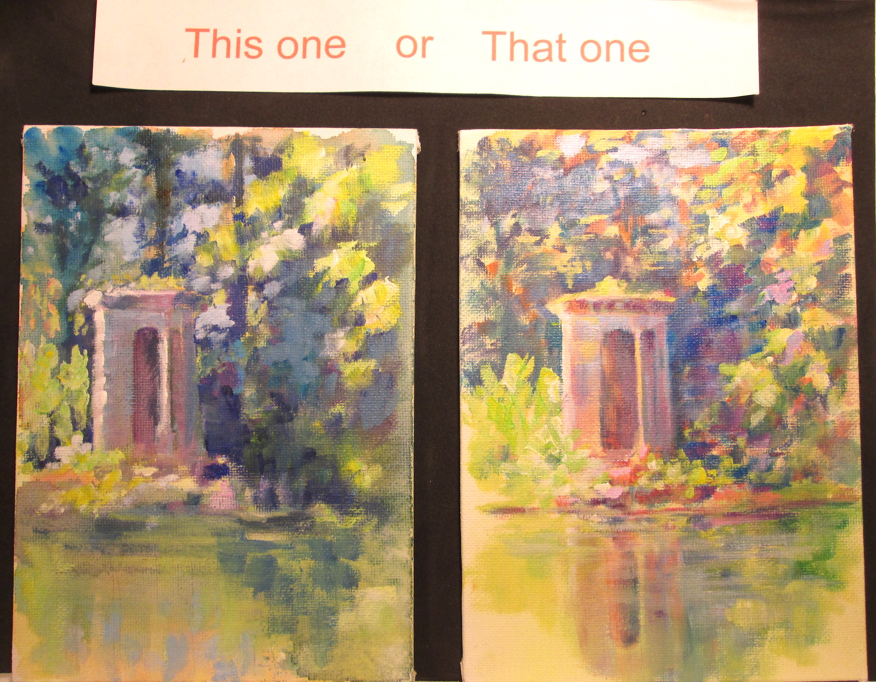
This one or That one : Tiny Pond Park Castle Edition


                                              Two 5 x 7 inch acrylic sketches on canvas board


This time around I'm painting some small colour comps to explore the same subject with low key and high key colours.

I've posted a couple of 5x7 inches acrylic sketches of a “castle” my husband Frank Lyne (sculptor) built, by hand, beside a pond on our farm. Below you can see my painting set up....plastic palettes with colour wheel mixes.....a colour gamut …...and some source photos I took. 


For both sketches, I started out with an under painting of washes....blended using acrylic flow medium. This medium loosens the acrylic binder so the tube paint acts like a watercolour wash. I then switched to acrylic glazing medium to put in more precise shadows, keeping with the maxium to paint shadows transparently when possible. I try to use only one colour at a time, let that dry then go onto the next colour, until I get the value of shadow that I want.

Finally I switched to all Golden OPEN paints for the semi-opaque and opaque lights and high lights. I adore the sparkle that comes from using warm and cool colours side by side. 

  I painted both scenes keeping in mind that a 4 point spread on the value chart results in the effect of sunlight....so if an object had a highlight of 1 then the shadow would be a 4 or darker to get the effect. Value is necessary to have a cohesive image.....but a wider range of effects can be had when you also use warm and cool colours to enhance the image's depth.

The darker or more low key (THIS ONE) version looks closer to the photograph and more realistic to the value compression by the camera. I tried to use mostly the darker set of values on the ten point value chart.

The lighter or more high key (THAT ONE) takes a bit more license with the lights' colours to emphasize the “glow” of the scene. I used mostly the value scale steps in the ligher register. I tried to add back colours that the camera had replaced with black, in that particular exposure.


Which one do you like better??

Saturday, September 23, 2023

NOAPS Art Challenge 2023 or Seeing Red


NOAPS Art Challenge 2023
By
Alison Davis Lyne


This blog post features a small colour sketch I did for a #NOAPSARTCHALLENGE prompt. The reference photo was in color and featured foreground trees and background lake and mountains.

Of course me being me, I had to make changes……so I faded and cooled the background a bit, changed the size of the background trees and lightened the colors and faded them a bit on the two trees on the right. I used somewhat warmer colours in my choice of palette.

That paved the way for emphasis on the foreground tree, shadows and grasses. I wanted to emphasize the warmth of the sunshine on the tree trunk and the highlighted grass clumps.


Along the way I noticed that my values weren’t as I wanted them, but was distracted by the  hi value/intensity colours I’d painted in.  So I went back to an old illustrator trick.  I grabbed an old sheet of red acetate and laid it over both the reference photo and my 5x7 inch sketch. 

The red acetate canceled out the greens, and revealed just the values.  I quickly noticed that the foreground trunk really needed darkening with an extra dash of intensity. I made the appropriate adjustments and called it done!


Sunday, March 26, 2023

2023 Celebration of the Arts Show at WKU Kentucky Museum


 Homage

This bust, Homage was Frank Lyne's entry for the 2023 Celebration of the Arts show by Abound Credit Union in the WKU Kentucky Museum. It's on display March 4th thru April 14, 2023


Blue Heron

This is my painting entry, Blue Heron, in the Celebration of the Arts show in the Kentucky Museum. 


This pic gives you an idea of the size of the Blue Heron painting.


This pic shows Homage on display. Frank's jeans are to the right.


Wednesday, February 16, 2022

Cover for Hairt Before Dawn or It All Started with a Dog

Hairt Before Dawn written by Grace E. Howell

Cover Art by Alison Davis Lyne

You could say it all started with a dog.....this old mutt of a coon hound called Copper Top.....who was wandering around in our neighborhood, looking for his lost love.


But that wouldn't be exactly right. It really started when I got an email from an old SCBWI friend Grace Howell, who had just finished her novel, Hairt Before Dawn and wanted me to illustrate the cover. We discussed the concept for the cover and Grace sent me the book jacket blurb: 

Darkness hides evil lurking to destroy.

In 1904, the Black Patch Wars set neighbor against neighbor in a violent struggle between tobacco farmers and against big business. Fifteen-year-old Harriette Lindstrom, known as dumb Hairt, is caught up in the conflict. But nothing can stop Hairt—not blindness, ridicule nor shunning, not fire demons nor the evil Mr. Dayton. Determined to prove her worth, she follows the spirit of Maybelle her birth mother and leaves the farm, her adopted family, and her faithful coonhound Mutt. At blind school, her dream becomes a nightmare. Only the song in her heart, her love for the boy with the magic voice, and her strong will can pull her through the burning fires of rejection and isolation to face the guns of the dreaded Night Riders.

So with the concept of showing Hairt holding her arms open for her faithful coonhound Mutt, in place, I pulled some reference photos I had on file. I pulled the pic of our neighborhood coonhound, and one of some local woods in a mysterious dawn light, along with a old family pic from Grace Howell. She had drawn the inspiration of how the main character, Hairt, would look from that photo, and I just loved the image. Here I have just started painting the back lit dawn kissed woods. The soft dawn light would be brushed over the dark trees later.


I painted the cover image at a bit bigger than the required size for the cover, 6 x 9 inches allowing enough “wiggle” room for the printer to comfortably place the title and cover text. 


Now you can see most all the important bits are in place, the woods lit with a soft dawn glow, and a bit of a blueish mist of the loving spirit of Hairt's mother, faithful coonhound Mutt and of course Hairt herself.


Now comes the moment of truth for an illustration, when you remove the tape holding the bristol board down to the rigid board, and see what it all looks like. You can see a small bit of buckling from some juicy acrylic washes....but the bristol board does lay flat in the scanner bed.....whew!


One bit of detail in the cover I particularly like is Hairt's gaze. Hairt is going blind, and she wouldn't see very well in early dawn light....yet knowing Mutt is close.....she turns towards the dog, but gazes right past Mutt. This bitty detail gives a hint to the casual viewer that something is a bit “off” with Hairt to provoke the thought of “what's going on here?”

I really love doing book covers. Talented authors, like Grace Howell, get the fun of writing all the lovely bits of their story using many thousands of words. Us book cover illustrators only get the proverbial “one picture is worth a thousand words”, to render a snapshot of the book. 

Here's a link to the book: 

Here's a link to Grace Howell's webpage: 

Wednesday, October 7, 2020

She's a Good Egg....or Beginning Sketches


This blog is a bit about sketching techniques we all learned long ago....but might have forgotten about. This is my take on sketching faces, not necessarily how I do it now a days, but more of how I think about sketching and painting people.

I grabbed a couple of HARD BOILED eggs from the frig and took a sharpie pen and drew three lines on the shell. One vertical line and two horizontal lines, one about a third of the way down and the other a third of the way up from the bottom. 


I then drew outlines for two eyes, a nose and a mouth over the guidelines. Really simple. (Note: no eggs were harmed in the making of this model.....but I make no promises about lunchtime.)


I took a pic of three sides....one full face, one from above and a third three quarter view, and lined them up on my table. 


I took a sketch pad, and with my pencil I drew a rough egg shape, and sketched in the three lines for the eyes, nose and mouth......then I copied off the ROUND egg shape onto the FLAT pencil drawing how the eyes,nose and mouth looked. In other words I located on a flat sketch where I saw the eyes, nose and mouth on the 3D egg shape. 

I then went the other way and grabbed a piece of tracing paper and a few reference photos and traced the egg shape and lines over those photos. I then could see where the eyes, nose and mouth fell on the “egg head” sketch, and it took just a quick pencil line or two to have everything placed like it was needed.


All of this is a fun practice that either reminds us of things we've learned but might have misplaced in our busy days.......or might suggest a new way to approach your own sketching.

With a few practice sheets you can train your eye/brain to look at anyone in person or photo and automatically “locate” the eyes,nose and mouth in your mind. Also drawing a rough egg shape to show where you want your drawing to actually be on your paper keeps you from not having enough room to complete your drawing.


Bonus points: On the photo below of the Abraham Lincoln sculpture, trace off a egg shape and draw your locator lines at the eyes, nose and mouth. What's the first thing you notice about the shape of the egg outlines? (I'll answer that in the next blog post of this series)

Shout out to my uber talented husband, Frank Lyne, for the use of his lovely sculpture.


Wednesday, April 1, 2020

Walkies or Social Distancing on a Sunday Morning

Walkies


11 x 14 inches acrylic paints on gallery wrapped canvas

Tho' it doesn't look it, this painting is inspired by another of my outdoor festival photos. It seemed to be a day for doggies......big doggies, bitty doggies....doggies in tutus! I liked the simplicity of this girl walking her pup in the bright sunlight. I wanted to capture the gestures of both the girl shepherding along her new pup pal, and the lovely dog who is obviously having a ball trotting along checking out all the sights and smells. 

Friday, March 27, 2020

Idea Bounce, A Technique Talk blog post

Etruscan Girl
8"x10" acrylic paints on stretched canvas

This blog post chronicles how a visual idea can bounce from one person to another or even within just one artist's mind. And how easy it is to take a second idea bounce and make a new Main Character, even from a really old clay statue. 

In a recent fb feed, Tracy Barrett (author, SCBWI RA coordinator, dear friend) showed a photo she'd taken of a “Terracotta statue of a young woman: Etruscan, 3rdcent B.C.) in the Metropolitan Museum in NY

The first thing that struck my eye was the statue had chin length hair, rather than the usual long bound hair of that era. Her eyes looked HUGE, with a slightly “sulky” look to her mouth. Right then I began to “see” this young girl in modern dress. 

Based on yet another recent fb share, I remembered seeing some work by an artist that imagined what long ago folks might look like if depicted with today's digital media. 
So I thought I'd take a try at a “statue update” on this Etruscan girl, using my preferred “old school” media, paints.


The finished sketch looked similar to a image of Julius Caesar done by Becca Saladin at https://mymodernmet.com/royalty-now-historical-figures-modern-portraits/


I went on with the full painting you see at the top of this post. I added grown out, multi colored hair with blue tips, some lipstick and a t-shirt with suspenders.But looking at those HUGE eyes I wanted to try to go a bit anime. I sketched out my character, still with the sulky lips, and giving her wild blue hair, rose blush cheeks, generous nose and big highlit eyes.


I did this sketch combining acrylic paints and watercolor paints and pencils on watercolor paper. That way I could easily work in any direction that the drawing needed, without being bound by a single media's limitations.

Monday, March 23, 2020

Meet and Greet

Meet and Greet

11 x 14 acrylics on gallery wrapped canvas

This painting was inspired by a photo I took of a produce seller's sidewalk sign. Unnoticed by me at the time, in the background was this charming vignette of a young couple getting to meet and greet over tables of veggies and flowers

I loved the set up, but did extensive adjustments to the two main characters and the surroundings. Then I painted over and smudged a lot of the details I just can't seem to help painting! To enforce the sense of distance of the viewer from the encounter I added in the foreground a row of produce filled baskets, painted in sharp detail. 

I really enjoyed painting this vignette and working with the body language and gestures. 

Tuesday, March 17, 2020

Memories of a Blue Market

Memories of a Blue Market

8” x 8” inches acrylic paints on gallery wrapped canvas

This small square painting tells my made up story of a couple meeting at an open air market, their afternoon flirtation, and their breakup.....all in one day. I painted the figures using the market setting and gestures from “real life”, but played with features and such to suit my story telling. 
I especially had fun painting the three “fool the eye” photographic images, making them look like they were “taped” to the canvas. They show a head shot of the guy the girl was flirting with, a candied image of her feeding him a cookie and then her view of him walking away at the end of the afternoon.

Monday, March 9, 2020

Fur Baby


Fur Baby
11 x 14 acrylic paints on gallery wrapped canvas

This painting called up the story telling side of my brain. At a recent out door fair, I saw a young lady carrying her perfectly healthy puppy, leash and all. Well that caught my attention, and I got to wondering, why would the puppy's owner be carrying her pet? Aside from the normal fun of carrying a wiggly puppy, I decided that she might have been carting the puppy to “save” it from another barking half-pint poochie. 
I painted this scene from my reference photos, playing with many festival goers appearances and lighting to “set” them all into the scene. I didn't have a photo of a yapping puppy on hand.....but it just so happened that our neighborhood had gotten a new canine resident. And that new little puppy decided that any pedestrian passersby, like Frank and me, were fair game to bark, bark,bark.... and yip yip at. So he ended up in my painting as the bitty yapping puppy.


Saturday, February 29, 2020

US Bank Celebration of the Arts 2020

My painting, Creek Tyme, at the US Bank Celebration of the Arts 
at the Kentucky Museum at WKU

Last night Frank and I attended the lovely US Bank Celebration of the Arts show 2020 held at Western Kentucky University's Kentucky Museum. It had been a while since we'd attended, and it has really grown! With over 150 artist entries and the public invited and with each artist bringing a plus one....or two....or three it was a BIG crowd. As always, the hard working staff at the Museum put on a wonderful reception. We so appreciate all the work that goes into pulling off an art exhibit of this size.

Oh.....and the best part of the event was Frank won 2ndplace sculpture for Reach!!


Here is a blog about the making of Reach


Thursday, February 20, 2020

Busy French Market

Busy French Market

11 x 14 acrylic paints on gallery wrapped canvas

This painting came about from a summer time visit to a farmers market. I wanted to play a bit with composition and “near and far” aspects of the busy market. 

I began with various folks in the market, capturing their gestures with broad strokes of colour and little detail, since they were essentially “background”. I loved the blue “French Market” umbrellas over the attractive veggie laden tables. I took many pics of the luscious veggies, and “stacked” them in my painting with the warmest colors (oranges, yellows, fire engine reds) in the forefront of the painting. Layered behind were less warm colors of onions and red cabbages. I couldn't resist adding in some little price boards with a bit of French. Choux is french for cabbage! 

Sunday, February 16, 2020

All The Angles

All the Angles

11 x 14 inches acrylic paints on gallery wrapped canvas

This painting came out of a photo shoot at the Clarksville Montgomery County Old Courthouse building. The angles produced by the gables and turret towers were were just too lovely to pass up. I got to play with “bouncing” sunlight, (cool on the top and warm in reflected shadows from underneath), when I worked on the statue of Blind Justice that stands atop a pediment on the roof. 

When I looked really closely at the statue's base I saw a flood light fixture. Well to my “bird sensitive” eyes (I am, after all, married to an avid birder.....), the floodlight looked like a red tailed hawk perched on the pediment overlooking the justice building. For whimsey's sake, I immediately painted in a red tailed hawk silhouette, imagining the hawk providing his vision for the use of “Blind Justice”. 

Friday, February 7, 2020

Market Colors

Market Colors
8x8 inches square acrylic paints on gallery wrapped canvas

This bitty painting, only 8x8 inches, was sparked by busy market goer, striding briskly thru the open air market. She had already gotten her market items, and was walking along with her little girl on her hip. 

I represented the swirl of market activity going by at a fast pace,with colourful paint blurs. Until you stop and look at a specific booth, the people and items for sale seem to be a colorful festive jumble. Just part of the charm of an open air market visit.

Wednesday, February 5, 2020

Balcony Seating


Balcony Seating

11 x 14 inches acrylic paint on gallery wrapped canvas

This painting grew out of a rainy grungy day that I really wanted to paint a pop! of a bright colour.

I had in my photograph stash, a photo of a grey unremarkable city building that had a awing over the rooftop and I let my imagination run amok with details. I added some people in the background, some greenery on the bitty balcony and a couple of lovely girls waving at a friend on the street below.
My favorite bit of all is the fun contrast of the orange facade against the contrasting pale blues of the doorways and the deep blue of the shadows in the rooftop awning. It sure brightened up my day....and I hope it does yours too!

Friday, November 8, 2019

Art Tip-Three Ways to Reserve Your Whites in Watercolour


Three of the many ways you might keep your whites.....well, white.....in watercolor are:
  1. Use a colored pencil wax resist
  2. Keep the colors “corralled” with a water “lasso”.To see more about this technique please see this blog post: http://lyneartblog.blogspot.com/2019/10/watercolor-play-day-at-library.html
  3. Use a fluid mask to hold back the watercolors. To see more about this technique please see this blog post: http://lyneartblog.blogspot.com/2015/06/winterglow-or-pouring-it-on.html
For the first technique, a colored pencil wax resist, you are using the wax in a colored pencil to keep your watercolor from soaking into the watercolor paper where ever you have drawn your line. Use of colored pencil, especially without erasing it, is not really an American Watercolor Society accepted practice.....but if following a juried show rule is not an issue.....I've found it does the job quite nicely.

This is a bitty sample of how it works:
First I drew a small circle using a white colored pencil, and inside of the circle I drew the letter A. I'm not including a photo of this step.....'cause you wouldn't actually see anything!


At the bottom of this bitty test sheet you can see the actual circle containing the watercolor paint. I brushed inside the white wax colored pencil circle with water..... then floated in deep blues and a yellow and let them mingle and then dry. 
After the watercolor was dry, I took a brush with water only.....and brushed the dried watercolor off of the letter drawn with the wax colored pencil. This revealed the white wax colored pencil “A”. It's not a perfect brite white.....but it should blend in with the rest of your painting. It's especially useful when you just need a bit of white detailing. 
The little flower study above has a pink colored pencil outline and the white petals of the flower are a mixture of the water lasso effect and a bit of colored pencil on the tips.

I did a watercolor of a building that shows off a bit about this technique when used in a painting, in this blog post:  http://lyneartblog.blogspot.com/2015/08/window-studyor-new-coat-of-paint.html


I recommend a book Paint Radiant Realism by Sueellen Ross for more about this technique.

Thursday, October 24, 2019

Watercolor Play Day at the Library

Watercolor Play at the Logan County Library

Today I got to lead a bitty guided watercolor play date at our lovely Logan County Library. 

It was open to the public and I planned a couple of watercolor exercises that would suit folks who had never held a brush before.....or folks that were looking to learn how to expand their watercolor techniques.


I decided to show folks about primary and secondary colors by making a color wheel using just three colors....the primaries red, blue and yellow. I also wanted to show we could “corral” watercolor by just painting a circle with water and when we filled it with the watercolor paints......the colors wouldn't go beyond that water circle. We then “encouraged” the watercolor paints to mix when they touched, to make the secondary colors green, orange and purple.


For the second part of the “play date” we drew an apple using my photo (noting the shadow side and the high lit side.)

Again using just water to outline and fill our apple. Then we dotted in yellow for the sunlit portion of the apple, then filled up the rest of the outline with red.....and let the colors mingle.
For extra points we drew the apple's shadow and finally joined the two together.

We worked on some light weight smooth watercolor paper and on some thicker rough watercolor papers, so's folks could see the differences in each kind of paper. 


For folks who might be interested in my experiences with watercolor, here are links to other watercolor technique blogs I've posted in the past:


Thanks to everyone that attended and to Logan County Library for hosting.
I had a blast!