Thursday, December 19, 2013

Little Knitta Kitteh - Found Object Doodle


LITTLE KNITTA KITTEH

This is my just finished doodle in the "found object doodles" game started by  Debbie Ohi.  I saw on FB what cute doodles she and Hazel Mitchell  had come up with.....and I just had to try it out.
My Little Knitta Kitteh is busily knitting herself up.....from her tail up to her waist so far.....she's making herself up in rainbow colored yarn.


Tuesday, December 17, 2013

White on Black.....How do you get there?


This is a itty bitty blog post about the color white. As in how do you get a really good white base to work on, in the middle of a BIG black colored pencil board?

I've started another colored pencil piece using black illustration board as my base. It's sorta like the old Elvis prints on black velvet......an artist gets to take advantage of allllll that lovely black background to paint or draw on. Any colour we use will just POP! Right off the canvas.

My coloured pencil piece called for some areas of really brite colours and others need to be a bit more subdued . I figured a bit of experimentation was called for. I wanted to try a combination approach, but keep the piece mostly all in slightly to really subdued colours.

I took a waste piece of board and laid out three leaf shapes. The first was just a filled in outline of a white coloured pencil base coat. The second was a thin bristol board inlay. The third was a two very light layers of gesso. Gesso is an acrylic primer that painters use on their canvases to seal the fabric canvas and to make it extra white.

The white thin bristol board inlay was done by laying the bit of white bristol board over the black illustration board, and using an Xacto knife held perpendicular to the boards, cut out the entire leaf shape, thru both surfaces. When finished I had the white bristol board cutout EXACTLY the same shape as the shallow cutout in the black illustration board. On the black board, I took the knife and gently pulled up the top black layer of the illustration board, spread a bit of glue (in this case acrylic gel medium) and inserted the white bristol board in the hole. After a bit of burnishing around the edges, I had a lovely inlay of white bristol board in the sea of total black illustration board.

I then drew the yellow leaf with a bit of shadow, in coloured pencil, using the same colors on all three sample leaves.


The first coloured pencil leaf was the most subdued of the three, but just fine if you wanted to stay with coloured pencil throughout the entire piece.
The second leaf (with white paper inlay) ended up being both the brightest and the cleanest in shape. I don't know about the archival quality of this technique....but I have to assume it would be about the same as the entire piece. 'Bout the only drawback is I sometimes would run over the slight ridge of the inlay. Next time I might use a brayer to further flatten the surface and get it flush with the black illustration board.
The third leaf, with the gesso coating as a foundation fell somewhere in between in terms of brightness.

For the inlay technique, I wanted to give a hat tip to Rob Howard, who wrote the Illustrator's Bible. It was originally published all the way back in 1992, but many of the traditional media art techniques it gives still hold up today. This was waaaay before Photoshop saves of today. His index didn't even list computers! He gave the inlay technique as a way to save an illustration “gone bad”.  

Wednesday, December 11, 2013

How I am learning NOT to Draw ALL the Details


How I am learning NOT to Draw ALL the Details (with a big hat tip to Scott M Fischer)

OK.....the first Art Director that I showed my art to (waaaay back in the '90s) said: “Save your details for pen and ink......go bold and impressionistic with your colorwork.”. The most recent Art Director I showed my work to said: “Loose the details on your color illustrations......I like the details and modeling on your black and white work.” So I'm seeing a trend here......over 20+ years or so. I know....... it DOES take me a while to take advice.....but finally I'm working on adding less detailed styles to my repertoire.
After going back to basics in my sketching and drawing, I'm finding out that I don't HAVE to draw every little detail......I just like to! But I can change.....if I have to......I guess! (Hat tip to Red Green's the “Men's Prayer”.)

After a few years of experimenting I've come up with some neat ways to run end runs around my detailing obsession. After reading an article by Scott M. Fischer's in a 2011 issue of International Artist magazine, I became interested in his illustration technique of the moment.

 In that article he took a sketch and made multiple paper copies, and cut out stencils of each color component/block. He then lay down opaque color, whatever (often messy....) way he chose without fear of overlap or loss of form. He would then hardline outline his figures. His loose style allowed and encouraged “coloring outside the lines”......something I'm trying to learn to appreciate.


So my “style of the moment” is to also take multiple sketch copies and do paper cutouts, then apply colors with my sponge brush technique, in the various sections. Just right there I eliminate a LOT of detailing......I mean, you want to cut out as few of blocks of colour as possible......so's to avoid too much time spent “fussy cutting”. This also forces me to draw and plan my sketches with as many “broad colour blocks” as possible.


I use the stencils to apply transparent color washes, in my case acrylic glazes. Then, (as suggested in Scott Fischer's article)........


I put my master sketch under the bristol board with the colour washes, onto a light box. I can see thru the transparent colour washes on the thin bristol board to draw the few “location lines” I allow myself. 


After this step, it's onto refining the color washes to achieve a bit of depth. I prefer that kind of “detailing” rather than using a hardline outline. The softer finish seems to suit me better. I will often take the finished drawing into Photoshop for further refinement.

This technique allows me to side step the detail issue somewhat.....and hopefully find a new kind of freedom and lightness in my style. It's an ongoing learning experience......learning “how NOT to draw” the details.


Tuesday, December 3, 2013

The Art of Thinking Visually by Nancy Kelly Allen


Today I'm posting a “BlogCross Post” by the lovely PB writer Nancy Kelly Allen. Please enjoy “The Art of Thinking Visually”

written by Nancy Kelly Allen, illustrated by Lisa Fields
Pelican Publishing

  At first glance, writing a picture book seems easy. Even after a second or third glance, a picture book seems so simplistic that the text could be scripted in a matter of minutes. But glances can be deceiving. As a writer of 30+ picture books, I’ve learned that there are no rigid rules for writing these books. Every rule can be, and has been, broken. But there are guidelines for structure that benefit any writer.

  The hardest part of writing picture books for most writers, especially me, is the art of thinking visually. Writers are usually not geared to think in pictures; instead, we paint pictures with words. Writing picture books is a totally different set of guidelines. As writers, we have to “tell” enough of the story to get the point across, but leave out enough of the story so the illustrator can “show” the remainder. If that’s not complicated enough, the writer and illustrator usually don’t communicate until AFTER the book is published.

  Picture book text needs action, enough for 14-16 scenes. In “telling” these scenes, I use lyrical language and wordplay in tight writing. For me, tight writing means no excess of words. Picture books have concise text and every word must push the plot/story forward. In my book, BARRELING OVER NIAGARA FALLS, I used this wordplay: When the sizzle fizzled out of teaching music, and the fizzle sizzled out of teaching dance, sixty-two-year-old Annie had no job and little money. “Sizzle” was used first as a noun; then as a verb while “fizzle” was used as a verb and later as a noun. This wordplay has a rhythmic sound when read aloud and all picture book manuscripts should be read aloud just to determine how they will sound as books. After all, picture books are meant to be read aloud.

My goal in writing is to entertain and inspire the reader, but most of all I want to tell a story that children want to hear again and again with illustrations that they can look at over and over and find something new they had not noticed earlier. Text and illustrations work together in this “marriage” called a picture book.

I’m so happy to be a guest author on Alison’s blog. Thanks for the invite.

You can find out more about Nancy at: 
Writing Workshop blog: 
http://nancykellyallen.blogspot.com/


BARRELING OVER NIAGARA FALLS recent listing on Smart Books for Smart Kids, Best Picture books list


Thanks SO much, Nancy, for playing BlogCross Post with me!


Wednesday, November 27, 2013

Ruffy: A Portrait


I recently finished this 8 x 10 inch mixed media portrait of Ruffy, a female rufus hummingbird that stayed with us from October thru the morning of December 31 1 2011. She was supposed to have flown to Mexico in the fall but showed up at our feeder on a bluff and blustery October day. She stayed with us through out the fall and early winter, up to December 31 very early in the morning. Which it turns out was just long enough to be counted in the Christmas Bird count that Frank was involved in that winter. She definitely earned her daily hummingbird sugar water!
Frank had taken loads of wonderful photos of Ruffy, and I just had to use one for a “mostly” colored pencil piece.

I started off doing a sketch of Ruffy which I combined with a sketch of my photo of some fall leaves backlit with morning sun. I sketched on bristol board with a light colored watercolor pencil.....so's I could erase the lines later with just a bit of water.


After that I decided I wanted the background to be pretty dark, to highlight the sunlight coming thru the leaves. I made a couple of paper “masks” of the shape of the leaves and of Ruffy, and sponge painted over the rest of the uncovered background with a bit of acrylic paints mixed with a lot of glazing medium. This covered the background quickly, with a surface I could still draw on with Prisma color (wax based) pencils.


The drawings of Ruffy and the backlit leaves are left pure white Bristol board to keep them the brightest part of the drawing. The outlines I “erased” with dabs of water as I got to them.


I started filling in the lovely colours of the backlit leaves and the form of Ruffy, with Prisma color pencils in multiple layers.


After the leaves and Ruffy were finally finished I went on to add “splashes” of colored pencils in the background. I especially wanted to darken (and make bluer) the areas around the golden leaves and orange tinged Ruffy, to provide color contrasts. I also added a lot more color bursts of muted colors in the background to subtly “activate” the background, but keep it “in the background.”

As a final grace note, on advice from Frank, I added a touch....literally.....of gold leaf to the Rufus hummingbird's gorget. The gold leaf is no bigger than the width of a colored pencil lead, but it catches the light just a little bit.....so very much like the reflective feathers on the hummingbird's throat. We were graced with watching (and watching out for) Ruffy for nearly 3 months.....and we learned so much, and enjoyed her stay greatly.


Friday, November 22, 2013

How NOT to Draw to Make your Picture POP!


This is just a small post about a current colored pencil WIP “All My Ducks in a Row”. This WIP is from a series of photos my husband, Frank, took on a recent nature photo shoot. He found a group of young ducks preening on a huge log, and took a wonderful series of photos. I took them, and with a bit of rearranging, came up with a design I liked. I choose a looooong horizontal frame format, and cut out black illustration board to match.

I traced off the duck images onto the illustration board, using white tracing graphite paper. I dusted it off a bit with an kneaded eraser, and started to work.

My first pass of coloured pencils laid in the brite green leaf to outline the duck's head. As you can see in the second image, the colours were laid in, but the image doesn't really “come together”.

To “outline” the main image I needed to ghost in the background water, which I did using a lite swash of gouche. I found that coloured Prismas go over lite gouche wonderfully, mushing the gouche particles around with very little effort, allowing me to add bits of colour gradually.

By remembering to NOT COLOUR in the black areas surrounding the duck's head, I allowed the figure to POP out against the background and attain it's proper form.

It's a bit of a “backwards thinking” kind of trick, but is essential to remember where “not to paint” to work on a black background. Sorta like working a colored pencil crossword puzzle.

Wednesday, November 13, 2013

Visual Art Tip: Family Jewels-Old family photos can be a treasure trove of inspiration.


Visual Art Tip: Family Jewels-Old family photos can be a treasure trove of inspiration.

I've always been the type of person that just can't leave “well enough alone”, especially when it comes to painting. Going thru a box of old family photos, I came across a lovely old sepia portrait of a young girl.


As you can see from the photo, it looks like she stopped by a old tyme photo booth, and sat for a photo. (Around this period of time, photographers might set up a mini booth at a county fair.) It looks like she just covered her dress with a cloth drape, much like they used to do to us for a high school photo.

I immediately decided that she would make a charming colored pencil portrait, even though her identity remains uncertain. Since red/auburn hair runs in our families, I decided to go with that for her hair color, and used a very fair complexion. So that in turn, gave me the background colour of green. I picked out a suitable (1900's ) complex background wallpaper design.....and a very complex lace dress design of the same period. I wasn't too worried about a total likeness......I just used her as a jumping off point for a "period portrait".

Colored pencil is superb for tons of detailing.....yet works lovely for a smooth peaches and cream complexion. I had a ball taking a relatively routine old photo and giving it detailing and a color 'PUNCH'. I think it's fun to remind ourselves that not everything in history is just plain ol' black and white or sepia. Our ancestors lived in FULL color, just like we do... they just didn't have iPhones to record it.

Check out your own photo archives.....you never know what bits of treasure you might find to bring up to full COLOR!


Tuesday, November 5, 2013

DIDJA KNOW....Since ancient times artists have used precious metals to create or enhance artwork.


Since ancient times artists have used precious metals to create or enhance artwork. Both gold and silver, among other metals, have been used in making art.

From medieval times to the present, silver has often been used in making delicate expressive drawings. One of the most often used techniques is “silverpoint”. This is where a thin pointed strand of silver wire is used as a drawing instrument. Sorta like the lowly graphite pencil of today, the silverpoint tool was used both in “sketching” outlines for further painted artwork and to complete “finished” pieces of art. The silver that was rubbed off the piece of silver wire, with each stroke, stuck to the treated surface (paper, gessoed canvas etc). Over a period of weeks, the silver would tarnish, just like silver candlesticks do today. The soft grayed silver tarnish would give drawings a lovely “glow”. This is a nice Wikipedia article on the practice: http://en.wikipedia.org/wiki/Silverpoint

One of the most enduring metals used in art is gold.....leaf to be exact. As opposed to silverpoint's use of silver wire to make a drawing, gold leafing has been used as a covering, in both 2D and 3D artworks. It can be applied both to a surface of a canvas or paper and onto a sculpture with many details. The main technique for gold leafing is to make the surface you want to cover “sticky” with some sort of liquid adhesive, and apply the extremely thin sheets of gold leaf. After it is dry, a gold leaf coat can be “burnished” to enhance the smoothness of the leafing, and increase the shine. Of course as with any medium, there are a multitude variations on how the gold leaf can be finished, with many different effects. Usually, after the gold leaf is completely finished, a varnish is applied to protect the fragile surface.


This detail of a coat of arms shows how lovely a bit of gold leaf can be. Incorporated into a graphic design, like a coat of arms, gold leaf is a beautiful highlight, that will make most anything look richer. If left un-burnished, the gold leafing will refract light in small sparkles. If the gold leaf is burnished.....or smoothed.....then it will be more mirror like in it's shine.

The coat of arms at the top of this post was completed using gold leaf and oil paints. It has the extra added twist of being done in a “reverse glass” technique. This is painting on glass, but on the reverse side of the glass than it will be viewed. This means that all the normal order of painting is also reversed.....details are put on first, then middle ground items and finally background items. The gold leafing is added last. If you don't go crazy first.....it's a great quirky technique!

Wednesday, October 30, 2013

Visual Art Tip: Cross Purposing Colored Pencil


This post is a little about needlework, and a lot about colored pencil work. A while back I started out playing with and learning about colored pencils. The Prisma color pencils I use are a wax based pencil. This means that they have a wax base into which different colored pigments are mixed, which mixture is then put into the centers of a wooden casing. The resulting pencil is easy to stroke onto paper surfaces.
I usually start out with a outline of the main points of my drawing. I then begin lightly sketching in the various color sections, much like a paint by number kit. You can see my initial outline sketch and light color sketching on the center of this image.


I then lay in a second layer of color pigment over the first one, to deepen the colors. You can also lay in different colors to make a “color blending” happen, in the next step.


Often you want to change or augment one color from the pigments of just one pencil......which you can easily do by layering different colors on top of each other. This sketch of a leaf is a good example. Leaves are really reddish underneath the green chlorophyl. That's why you see reddish colors in the leaves in the fall, when the chlorophyl dies off. I started off with this sketch using dull reds, then layering over some greens. This makes the final green leaf much more realistic in colour than the manufactured pigments often allow.


After you layer your colors, then comes the “magic” of a technique called burnishing. This technique takes advantage of the wax/pigment mixture that makes up the Prisma color pencils. What you do is take a pencil of the final color you want the current section to be, and stroke over and over that section. This repeated firm stroking will slightly melt the wax/pigments already on the paper surface. You end up mixing the previous layers with your color strokes. You can get lovely colours and great detail with this method.


Oh and about the needlework reference? Well these samples of colored pencil steps I did for a talk I presented.....I actually did to decide on colors I wanted to use for a wool needlework cross stitch piece. The design was a 17th century cloth design from a Dover book. I wanted to decide on the colors using colored pencils to draw me a color “map”. You can see the result at the top of the post.

Colored pencils come in wax, ink and watercolor versions, each with it's own speciality. Colored pencils of any type, are a great tool for crafters, artists and illustrators!


Thursday, October 17, 2013

It's All About the Style! Whether it's colored pencil, acrylic or watercolor.....it's your style that will make the artwork.


It's All About the Style! Whether it's colored pencil, acrylic or watercolor.....it's your style that will make the artwork.

As an illustrator, I am a “Jill of all mediums, mistress of none” to para-phrase an old saying...Jack of all trades, master of none. In other words, I try to learn about as many different media as I can, so's I can use the best parts for my illustrations.

This has made me a avid art technique collector. Much like a cook collects food recipes, I collect art techniques.....try them out.....and then use various parts of different techniques to “get the job done”


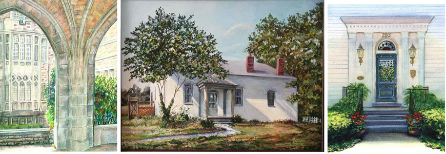
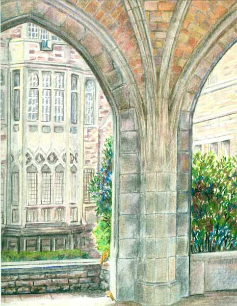
Church Gallery with Sparrows  8x10  colored pencil

This colored pencil building “portrait” is a prime example of what makes colored pencils SO popular. Colored pencils deliver bright, intense controlled color, yet can be blended with just a bit-o-pressure of the pencil strokes, and most importantly.....you can use a ruler to get all those straight lines....well....straight!

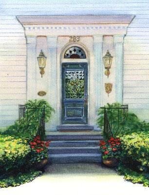
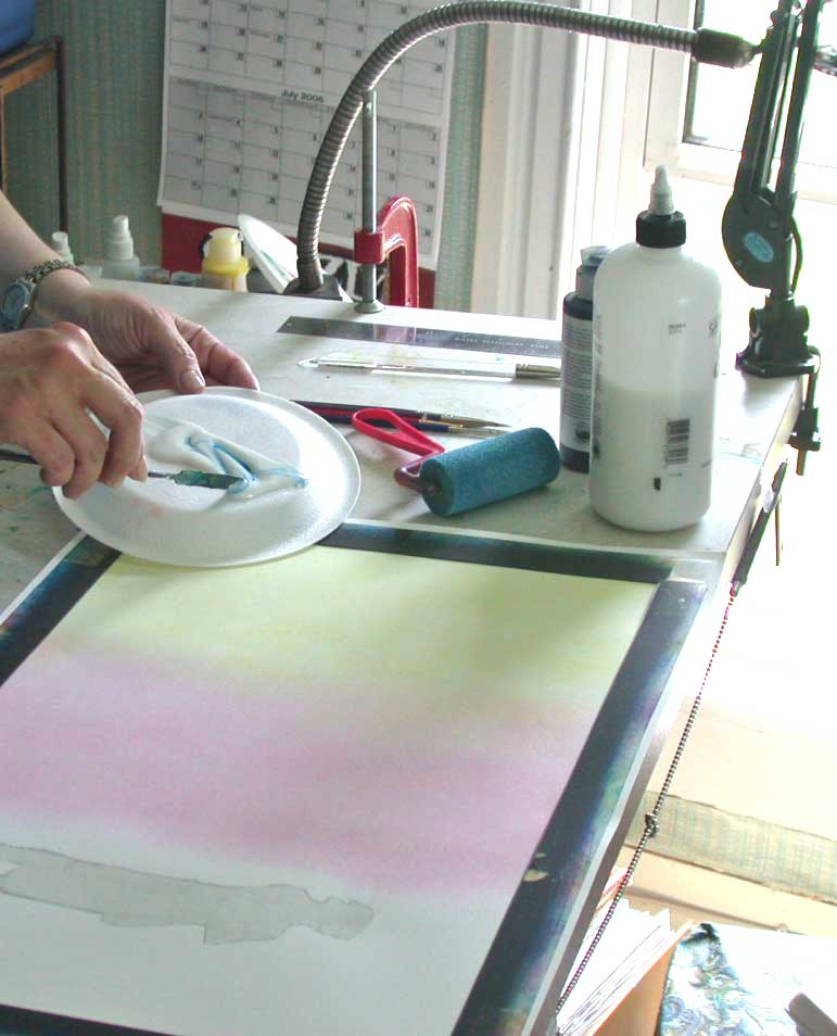
Washington House Doorway  8x10 watercolor

Then there is watercolor. It delivers glowing washes of color....with graduations of colour that are quick and easy to attain, if you let the water do it's natural “thing”. And even better, there is a whole line of watercolor PENCILS.....so you can get those straight lines needed for structures. Yet those very watercolor pencil lines can themselves be moistened and blended!

Kentucky Provencal  18x24 Acrylic

And finally, one of my favorites,... acrylic paints. Acrylic paints have finally “matured”, in that they have been improved to the point that they can mimic watercolours or oil paints, yet remain one of the best mediums, IMHO,for rendering just about anything. This building portrait was painted in a realistic style, with plenty of sunlight, using both impasso (opaque layers of paint) and glazing (multiple layer of transparent paint) techniques. And those straight lines......were a fine brush laid alongside a ruler!

I firmly believe that any artist's body of work reflects their own artistic vision, no matter which medium (or how many or how mixed) you use to make your artwork. And tho' I usually aim to sell my artwork, the journey of learning and discovery in that painting, is a whole “end” in and of itself!


Thursday, October 10, 2013

Smooshing my Morning Glories


This post is a bit about my colored pencil work. A while back I found out just how much fun colored pencils can be. I came across a set of prisma color pencils in my husband's old art materials, and thought I'd try them out.....as a nice change of pace from acrylic paints.

I gathered my reference photos of some morning glories …..


and real life props of some rattlebox, a lovely purple and green “weed” that sports lacy ruffled leaves in the fall.


I started in outlining the morning glory blooms randomly on a piece of beige matt board, then added in some rattlebox leaves and twines of the morning glory vines. I decided to add a colored ribbon to.....tie....things all together.

I then started on the “fun-est” part of coloured pencil work for me, the moulding of the blooms and leaves. I laid in a couple of layers of colored pencil color then got to the.....and I'm using a real technical term here.....”SMOOSHING”....of the colored pencil layers. “Smooshing” is just pressing really hard on the layers of colored pencil you have applied. The pressure and movement of the next colored pencil strokes makes the wax of the colored pencil melt a bit, allowing you to move and blend the colors you've laid down. You can also use a colorless blender pencil, one that is just wax, no pigment. It makes some of the smooshing process a bit easier.


You continue smooshing all your forms till you're satisfied with the result. With colored pencils you've get great details and total control over your blending!

This is a pic of my setup for Morning Glories


Friday, October 4, 2013

Name that PBP (Picture Book Person) : "I have become a pirate, and then come down with a bad case of stripes......"


Figure out the answer to the riddle and you'll learn a bit more about PBs today.  Every time you click on a cover or read a review, or even flip thru a PB in the bookstore, you add a bit more to your knowledge base, which can help you to figure out just where YOU could fit into the current publishing scene.  Whenever I see a neat book (PB or otherwise) at a bookstore......I can almost bet it'll be in my library ASAP.....usually without me even asking for it!  And those few I do ask for.....they gets them.  Your local library is an excellent place to start researching the PB industry.
I have become a pirate, and then come down with a bad case of stripes, not to mention having everyone hollar at me: David,No!.  I've painted everyday life with a sketchy cartoon style, and painted extraordinary impossible things in a realistic style.  My best seller was a Caldecott Honor book with this publisher.  Who am I???

I'll post the answer tomorrow!


The answer to Riddle is David Shannon.  He has both illustrated numerous picture books, and won a Caldecott Honor Book Award  for  "No, David!"  I found another in the series , "David gets in trouble" at my library.  His "little boy gone bad" books are done in a very cartoony style, with a lot of the outlines left showing under the acrylic washes.  Yet for other picture books, like "A Bad Case of Stripes" he paints realistically....at least within the story frame. He's also illustrated a book with his brother Mark, called "The Acrobat and the Angel" which has lovely historical elements, yet he still keeps his own unique stylization of his main characters, within lovely oil settings. His publisher is Scholastic. He is a great example of a multi-styled illustrator.

Thursday, September 26, 2013

ArtView: MINE! illustrated by Patrice Barton and written by Shutta Crum


MINE! By Shutta Crum and illustrated by Patrice Barton published by Penguin Random House. Images used by permission of the publisher.

In most all the reviews for children's picture books, the main portion of the review discusses the writing......well I'd like to reverse that in my reviews....and concentrate on a review of the illustrations, from an artist's perspective. I'll try to tell a little about the book, and then highlight how I see the illustrator "building" the story with his/her illustrations. I'd love to hear if you agree with my summery.....or have other comments.

When I first picked up this almost wordless picture book, I was drawn by Patrice Barton's darling little toddler on the cover. Then I flipped thru the book, and did it again, and counted all of 9 ½ words....repetitions of “Mine!”....... and the puppy saidth “Woof!” once. I would have thought that this kind of book would have been written and illustrated by the same person.....not so! My next thought was just how would that manuscript look????

I went thru the book again and began to appreciate how Patrice Barton had taken the author's “action notes” and woven a lovely playful swooping story of how a toddler proclaims everything is hers......while a giggling, crawling sibling looks on.....and a puppy plots to grab some of the fun for himself! After much grabbing, giggling, splashing, we come to the “punch line”.....er.....word, which is.....you guessed it: MINE! The picture has the giggling, “just taking his first step”, sibling pouncing on the toddler and announcing that she belongs to him! (I'm arbitrarily assigning him/her to the engaging toddlers.....it could go either way)


Patrice Barton's gestural drawings are fantastic....she captures the fluid motions of little ones giggling, solemn watching, then going single mindedly for whatever catches their attention. I've loved Patrice's expressive faces ever since Rosie Sprout's Day to Shine.....and she catches these two little one's glee and giggles with brite eyes and smiles that show every little thought in their quick silver minds. From their poofs of angel fine hair to baggie jumpers the black “pencil” strokes just barely contain these little ones. With what looks like soft pastels colour in the toddlers' faces....there is a blush on every cheek....that really helps round out the little faces. The soft surrounding colours of the floor give this such a sense of safe, soft, giggling fun.


This is such a lovely blending of the author's intent and the visual creativity of the illustrator. It's like they were both “on the same page” in telling this story. The action swoops, and giggles and bounces around.....and only uses 9 ½ words!

Here is a link to Shutta Crum's webpage on MINE! with a darling book trailer and a video featuring Patrice Barton.


Wednesday, September 18, 2013

Name that PBP (Picture Book Person)


Figure out the answer to the riddle and you'll learn a bit more about PBs today.  Every time you click on a cover or read a review, or even flip thru a PB in the bookstore, you add a bit more to your knowledge base, which can help you to figure out just where YOU could fit into the current publishing scene.  Whenever I see a neat book (PB or otherwise) at a bookstore......I can almost bet it'll be in my library ASAP.....usually without me even asking for it!  And those few I do ask for.....they gets them.  Your local library is an excellent place to start researching the PB industry.
I'll post the answer to the riddle tomorrow!

Name that PBP:
I've answered three Russian questions, and with Stillwater have considered the zen of shorts,ties and ghosts.  I let watercolor flow thru my stories, both in black and white strokes, and purpled shadowed colour, with plenty of white space for balance.  My AD is Saylor with a  press as wide as the blue sky.  Who am I?? 


The answer to riddle #2 is Jon Muth.  He both illustrates other's stories and writes and illustrates his own.  The books of his that I first saw were Zen Shorts, Zen Ties and lately Zen Ghosts.  All of them feature his whimsical Stillwater, a zen fable spouting, panda bear.  He lets Stillwater tell little fables (in oriental style, black ink brushwork) illustrating some basic zen concepts.  He manages to infuse a huge black and white playful panda bear with wonderful color, and lets him cast beautiful shadows that connect the different parts of a scene.  His watercolors are a lovely mix of realistic light and shadow, and  beautifully designed images with lots of  white negative space. His publisher is Blue Sky Press, an imprint of Scholastic, with David Saylor as his Art Director.

Here's a link to one of his bios:  http://www.scholastic.com/teachers/contributor/jon-j-muth


Friday, September 13, 2013

Cover Continuity or Visually Brand Your Work

Cover Continuity


If you are lucky enough to get to work with the same author on a book series one of the things you might want to think about first is Cover Continuity. Most book series are written with a over reaching story arch for the entire series.....meaning all the books in a given series might have a continuing set of characters and an ongoing time frame or period for the stories to take place. When you work on book covers for a series it's up to you, the illustrator, to continue that series' “visual identity.”


In an ongoing series of middle grade books by Rosalyn Rikel Ramage, The Tracks, The Graveyard and The Windmill, I've kept the same feel....slightly dark.....and some of the same characters, siblings Emma Mae, Edward front and center on all three covers. And by the author's request all three covers feature “transition” points in all three stories, where the “real” story events make a transition into a bit of fantasy.

Look at all three covers lined up above......they all seem to “hang” together with the same kind of feel and design.


For the next two covers, Bo and the Roaring Pines and Bo and the Christmas Bandit, I used the main character Bo, a young black lab....hero of these middle grade books from Pelican publishing written by Lynn Sheffield Simmons. Bo's all black shiny coat makes a wonderful foil for the brite yellow cover background. That color was suggested by the author. She said that over many author signings and school visits, she'd tried out different backgrounds for posters....and found that the brite yellow color attracted more attention than any other color. So she suggested that yellow as a “branding tool” for her Bo series of books.

Visual branding is a valuable tool that shouldn't be under-estimated in today's “battle for consumers' eyes” and dollars.

Wednesday, September 4, 2013

LITTLE THINGS AREN'T LITTLE WHEN YOU'RE LITTLE--Hot off the press!

Lookee what just arrived on my doorstep.......first copies of Little Things Aren't Little When You're Little.  I couldn't be more excited and pleased at how it turned out!  


Just arrived box of Little Things Aren't Little When You're Little!

To see more about the book check out this previous post   

Monday, August 26, 2013

Riddle Me This: Figure out the answer to the riddle and you'll learn a bit more about PBs today.


Figure out the answer to the riddle and you'll learn a bit more about PBs today.  Every time you click on a cover or read a review, or even flip thru a PB in the bookstore, you add a bit more to your knowledge base, which can help you to figure out just where YOU could fit into the current publishing scene.  Whenever I see a neat book (PB or otherwise) at a bookstore......I can almost bet it'll be in my library ASAP.....usually without me even asking for it!  And those few I do ask for.....they getz them.  Your local library is an excellent place to start researching the PB industry.

Today's Riddle Me This:
I am an Aussie with a love of enigmas. I paint with details and color and great animal characters in mind. My publisher and I both head up the alphabet. Who am I? 

I'll post the answer tomorrow!

The answer to yesterday's riddle is Graeme Base. His current PB is the Legend of the Golden Snail. With this PB he is advancing into the world of the App and 3D side of illustrating.  One of his recent PBs is Enigma. It's a lively riddle all in itself, and is drawn with the author's wonderful color sense. It is chock full of engaging animal characters. The publisher is Abrams.

Thursday, August 22, 2013

VISUAL ART TIP: Sponge Brush Painting is good for both illustrations and paintings


Sponge Brush Painting
This Visual Art Tip is a little about my technique of sponge brush painting as it applies to "fine art" painting. I developed my technique to accomplish a certain look for some illustrations I was working on.....but sponge brush painting can easily work in many "fine art" situations as well.
My initial problem was to get nice smooth graduations in a monochromatic background for a page in an alphabet book. For the illustrations for Easter Day Alphabet, I'd come up with the concept to paint designs as a kind of "wallpaper" background with the main image, text and large alphabet letter going on top.I wasn't using any computer graphics for this particular book, I don't use an airbrush, and I was working in acrylics....not known for their ease of getting a smooth graduation in colours. Unwanted visible brush marks being one of the main problems.
I hit upon the idea of using sponge brushes after looking at a home dec magazine, and reading about faux finishes. You can see more about it in a previous post: I Never Met a Art Technique I didn't like.....
I found that if I puddled a bit of the glazing liquid on my palette then dropped in a drop of fluid acrylics and mixed with a knife.....I got a lovely looking glaze

Smooth sponges allow me to graduate colours. After one coat of glaze dries I can easily smooth on a different colour and seamlessly blend the edge. All this without any muddying of the two colours, as the dried acrylic glazes stay separate. I usually use a gessoed ground on masonite board for my fine art paintings. This accepts the glazing especially well....the light just goes right thru the acrylic glazes and bounces off the white gesso and returns outward with a lovely glow.
For landscapes in the "fine art" mode, I found that skies would be luminous done in layers of acrylic blues and greens, just as Maxfield Parrish discovered using oils. When I wanted to fill in foliage for trees and such, I just grabbed a sea sponge and dabbed away. First using a blue base for shadows, and covering with a variety of greens for the background foliage. Then (following Maxfield Parrish's technique) I would dab on pure white for highlights on leaves, which would later be glazed over with various colours as needed....i.e. oranges for fall, yellow for summer etc. I used this technique for this painting:
LAND'S END 

among others: It was the perfect technique for grasses, clear skies and flowing water.


Thursday, August 8, 2013

COLORING BOOK PAGE - G is for Grits

Here is a brand new FREE coloring book page just for G is for Grits.  Just click on it and print!  Enjoy!


Monday, August 5, 2013

VISUAL ART TIP- How I Learned to Love a Very Emotional Thesaurus or A Visual Take on a Book Meant Mostly for Writers: The Emotion Thesaurus.


VISUAL ART TIP- How I Learned to Love a Very Emotional Thesaurus or A Visual Take on a Book Meant Mostly for Writers: The Emotion Thesaurus.


I've been working recently on my character drawing skills.....and in preparation for a round of sketching I bought Angela Ackerman and Becca Puglisi's latest offering: The Emotion Thesaurus. It was reviewed in a recent SCBWI Bulletin, and I liked the idea of a book of physical signals reflecting emotions.

I was delighted to find full page entries of 75 different kinds of emotional states. I typed up a list of all the emotions (they were arranged alphabetically in the book) and rearranged the 75 listings according to loosely based categories that I put into light, medium and heavy groups. Like the three emotions Conflicted, Confusion and Overwhelmed felt like they should be arranged going from Conflicted which seemed to be a lite emotion, which could escalate to a medium emotion, Confused and which if not resolved, could go into a heavy Overwhelmed mode. These were purely arbitrary categories.

After this I “ran with my scissors”, and cut up all the 75 categories into individual slips of paper, and threw them into a cup. I pulled out one listing to start my sketching, resolving to try to do the same each day or so.

Of course the first slip of paper I pull out from the cup, Conflicted, led me to also pull out Confused and Overwhelmed. After reading the three entries in Emotion Thesaurus, I started sketching. You can see my first efforts below.


While sketching, I was already musing what I could do to “up the ante” on the poses I chose. How to make the kid's expressions “even more so” than my beginning sketch. And I was also thinking ahead about just “WHAT” had elicited these emotions in my models. I'm already thinking that the little boy that's Overwhelmed could be trying to wave off an overly exuberant St Barnard puppy with muddy paws.......or a cat that has just been sprayed by a skunk? The possibilities are endless!

Tuesday, July 30, 2013

ART VIEW-Art Centered Picture Book Reviews-When No One is Watching illustrated by David A. Johnson written by Eileen Spinelli

Less color is more AND is very appealing.


In most all the reviews for children's picture books, the main portion of the review discusses the writing......well I'd like to reverse that in my reviews....and concentrate on a review of the illustrations, from an artist's perspective. I'll try to tell a little about the book, and then highlight how I see the illustrator "building" the story with his/her illustrations. I'd love to hear if you agree with my summery.....or have other comments.


When No One is Watching by Eileen Spinelli illustrated by David A Johnson

I picked up When No One is Watching at my local library just 'cause I found the main character on the cover very appealing. When I read thru the book's lovely text by Eileen Spinelli I was delighted to see how David A Johnson had picked up on her lyrical text and runnnnnnn with it.

The story has a shy mop-haired little girl narrating how she alternates between her energetic activities when she's alone “when no one is watching” (running, jumping, singing, dancing etc.) and when she's with others...she's a shy wallflower with family, classmates, and playing on the playground. In both situations David Johnson makes sure you focus on her, by giving her the most intense colour with everyone else being “sotto voice” in grayed colors. The only background objects are just the necessary props....a chair, bed, ball and a cat. All the focus is on the shy narrator.


The characters look like they are drawn in pen and ink on a spattered mottled warm grayish toned textured board. The outlines are a very expressive thick/thin black outline. There are just a few highlights on the shy little girl's face with her clothes being the brightest opaque colors on the page....I am totally in love with the small patch of pink with a white highlight that David Johnson puts on the little mop haired girl's face!


David Johnson's drawings are SO appealing, and he does so much with his character designs. He is equally “spot on” with expressions and movements. Of course his expertise in picture book drawing comes from a stellar background in editorial and portrait work. I definitely want to study David Johnson's ability to draw his characters half way between realistic and cartoon that allow for both an appealing yet deceptively simple rendering. His color intensity variations between the main character and the backgrounds, makes his storytelling a tour de force of COLOR stage direction.

There is also a cool book trailer here.


Images reproduced by permission of the publisher; all rights reserved