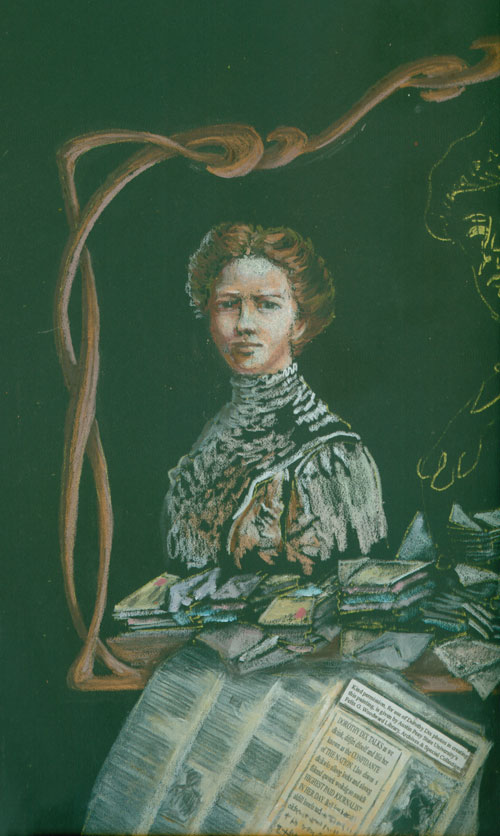
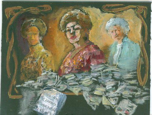
Portrait
of Dorothy Dix (detail)
Mixed
Media (Colored pencils both Prisma & Polys and acrylic paints
with text on paper glued to the surface) on black illustration board
Portraits
painted from Dorothy Dix photos used with kind
permission, of Austin Peay State University’s Felix G. Woodward
Library, Archives and Special Collections.
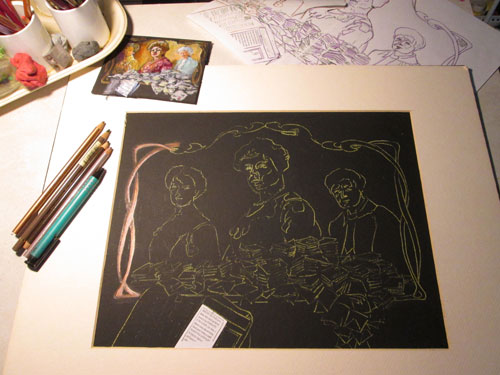
This
week I'm talking a bit about the finish of my portrait of “turn of
the last century” advice columnist Dorothy Dix. She was sort of a
“early day Dear Abby”, who hailed from Todd County, Kentucky.
This portrait along with four of my other historical illustrations,
were featured in Historic Todd County's recently published book: T is
for Todd County. You can see more about this book project and where
you can purchase a copy at:
I
moved onto her elder self, in her 80s. This was also done in coloured
pencils. I wanted this version of her to reflect her almost ethereal
grandmotherly self. She was often referred to as the “Confident of
the Nation” as readers would send letters confiding their problems,
seeking her advice. Finally I painted in acrylic paints in the
center, Ms. Dix in her heyday in her mid 50s.
Here
you can see I'm closing in on the finish:
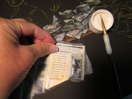
After
I'd gotten the three portraits to suit me, I gave the overall
painting a good review. I had wanted from the beginning to emphasize
the central portrait, of Ms. Dix in her prime career years. I had
emphasized that by making her skin in full colour, working from the
old black and white photo,(as were all three source photos). Painting
the acrylics on the surface
of the black illustration board made the center image “POP!”. I
also painted the most detail, and upped the value contrasts of the
center portrait.
The
other two portraits (in her 30s and her 80s) were in coloured
pencils. This made them recede a bit since the coverage of the
coloured pencils can't compete visually quite as much as the opaque
paints. I still wanted to emphasize this a bit more. So I went back
in with my handy dandy eraser and rubbed out some of the more intense
colours and lights, making those two portraits fade just a bit more.
And
here is the final version of the project:
I've
had a blast working on this portrait, and I've really enjoyed getting
to “meet” Dorothy Dix!
I
wanted to also say a heartfelt thanks to the kind folks at Historic
Todd County for jurying my historical illustrations into this lovely
book project.