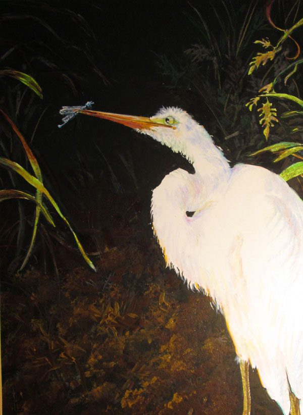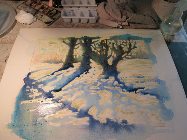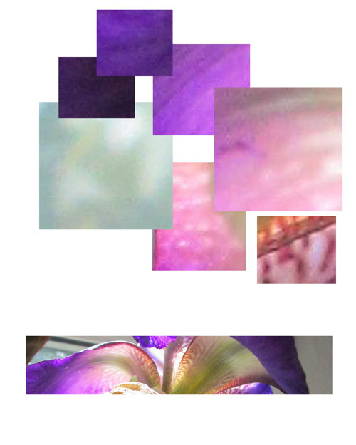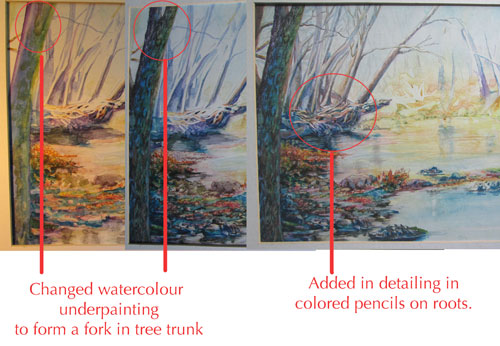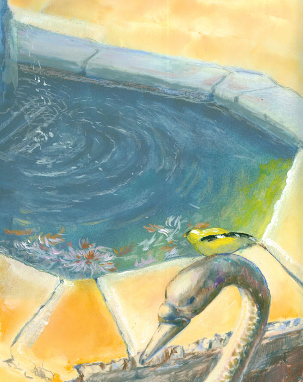
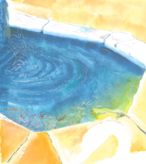
Baker Arboretum Pond with Goldfinch
Colored Pencils (mostly Prismas & Polys)
and acrylic paints on 8 x 10" Duralar film
from my own photos
This
time around I've been doing some 'sperimenting with colored pencils,
acrylic paints on Duralar drafting film. It's made by Grafix, and is
a polyester film that has a matte coating on BOTH sides so's it'll
readily accept both paints and coloured pencils. That matte coating,
while providing a lovely surface for both wet and dry media, also
more importantly, turns a transparent surface into a TRANSLUCENT
surface.
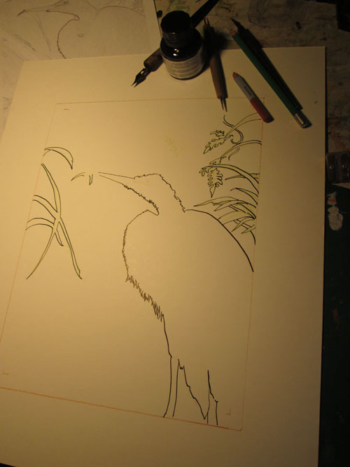
For this
experiment I started out with two source photos...one of which was
“flipped” horizontally....of my photo of a lovely quiet pond in
the Baker Arboretum. I did this so's I could work on both sides of
the Duralar film, and have the pond scene look right no matter which
side of the surface I was working on. I first tried some light marks
on the top side with colored pencils, and wasn't too impressed with
the colour coverage. So I then went back to my “go to” medium of
acrylic paints and sponged in the foreground stones of the pond,
along with the goldfinch.
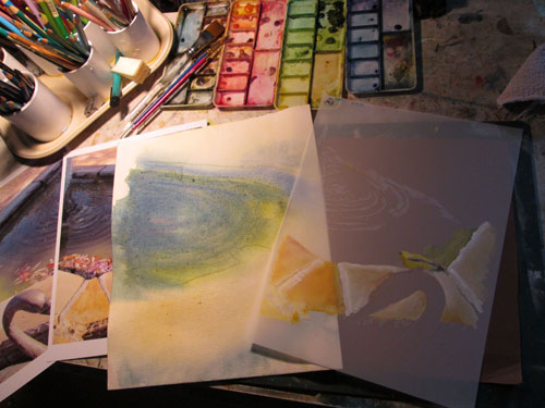
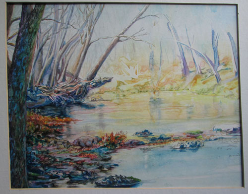
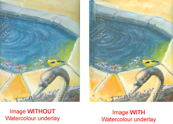
I then
tackled the issue of the pond water. I started out thinking I might
carry the “3D” effect a step further and have an intense
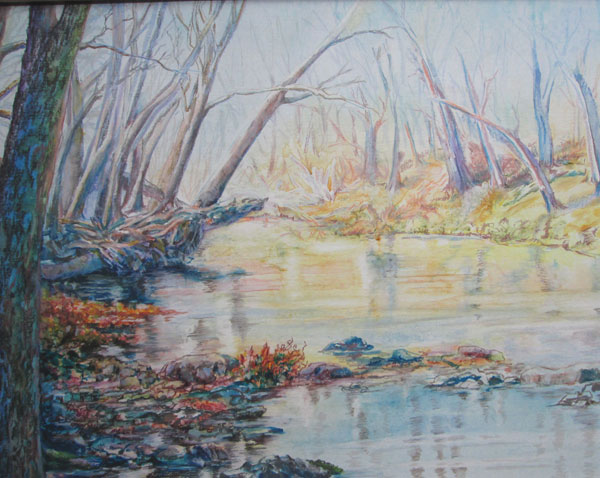
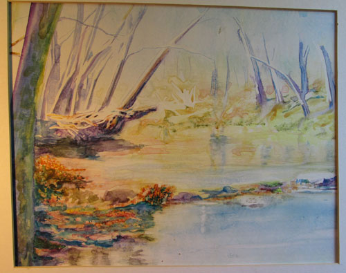
watercolour sketch of the pond to literally provide “depth” to
the Duralar painting. I planned to layer the watercolour sketch
UNDER the Duralar over lay, and have it provide a colour base. Next
I layered, on the UNDERSIDE of the Duralar painting an acrylic
glaze....after all water looks like multiple layers of a blue, while
having light coloured pencil marks, for water reflections, on the TOP
side of the Duralar.
I was
pleased enough with the outcome of using a second image (watercolour
sketch) UNDERNEATH the actual Duralar painting. But I felt that the
Duralar being SO translucent, didn't allow either the watercolour
underlay nor the acrylic glaze on the bottom side of the Duralar to
really show thru with the depth of colour I had envisioned.
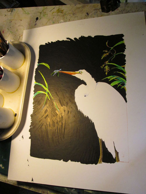
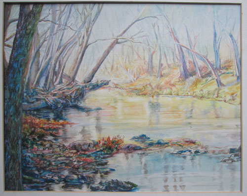
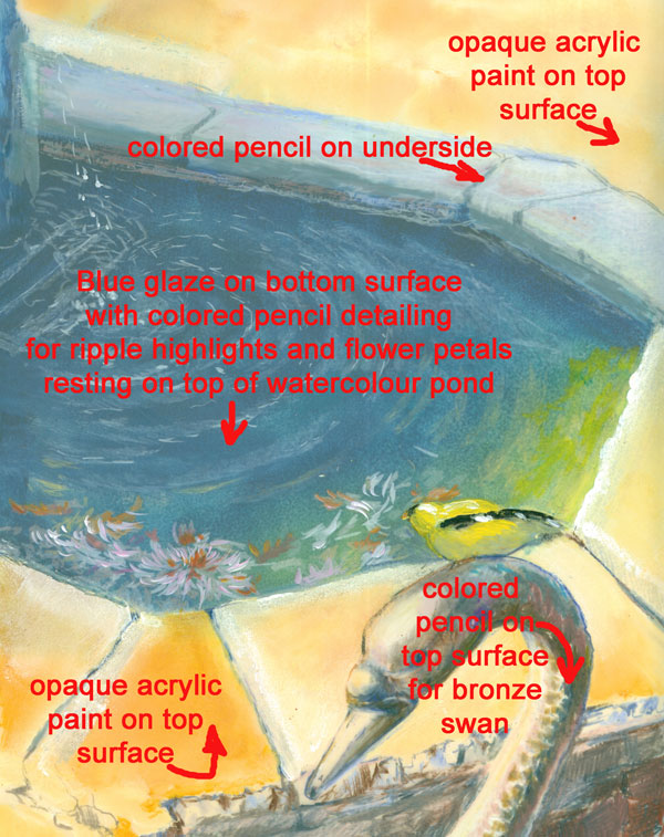
I
continued to add details like shadow shading on the underside for the
far stones of the pond. I then began to detail in the foreground
bronze swan. This is where the colored pencils really began to shine!
The Duralar easily accepted the colored pencils, and even allowed
burnishing to get the smooth finish on the swan's head......yet I
could get the details in of the swan's “feathers” that was
rendered in the bronze work.
I had a blast trying out this medium, but I know that there are a whole lot more ways I can work with the Duralar. It can be a bit like playing 3 dimensional chess.....working with TWO layers. But then again its a LOT like working with Photoshop.....only using traditional media. Yet again, ART reflects LIFE (both real and virtual)