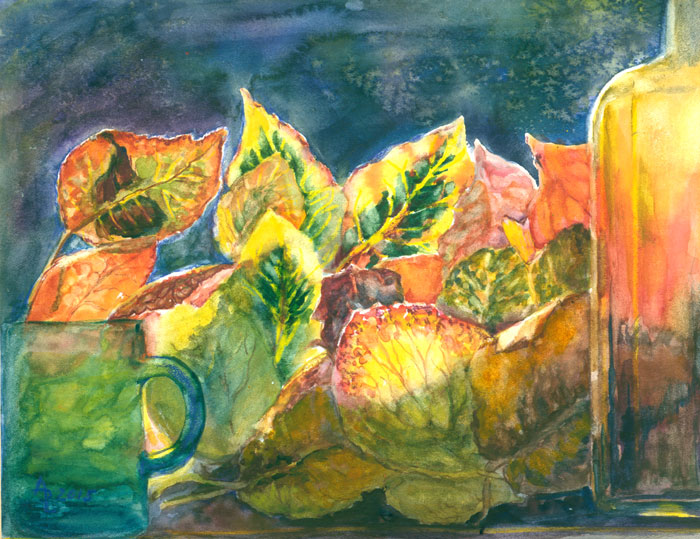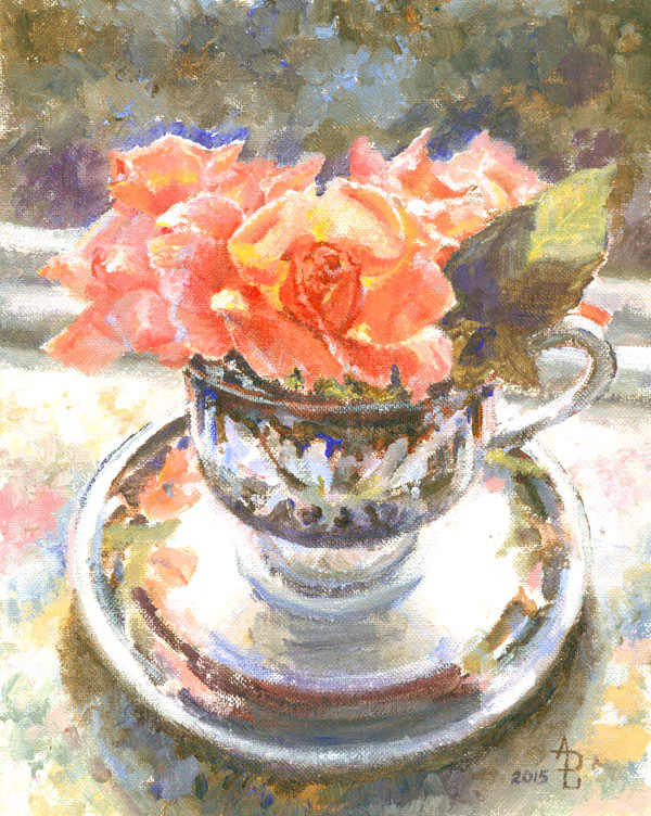
Tea Cup Rose
8x10 inches-acrylic
from my own photo
This
blog post is about my picking back up on an old and very popular
technique.....alla prima...or painting all at one time. In this case
I also am working impressionistically and eschewing as much detail as
I can “artistically” stand.
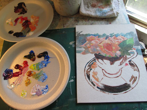
I took
the source photo using a tea cup found at a antique shop, with some
roses from the backyard, all backlit, resting on a needlepoint piece
I'd done years ago. Since the roses were the “main character”
here, I begin painting on them. I was using a few reds, a yellow and
a blue of some Golden Open acrylics.....acrylic paints that closely
mimic oils, both in their painting texture and in their “open” or
wet time. I began daubing paint here and there, keeping all the
colours in a “high” or light colour register. I finished most of
the flower colours, but wasn't too impressed with the painting yet.
I didn't take a pic at that point but this Photoshopped one shows it
about right.
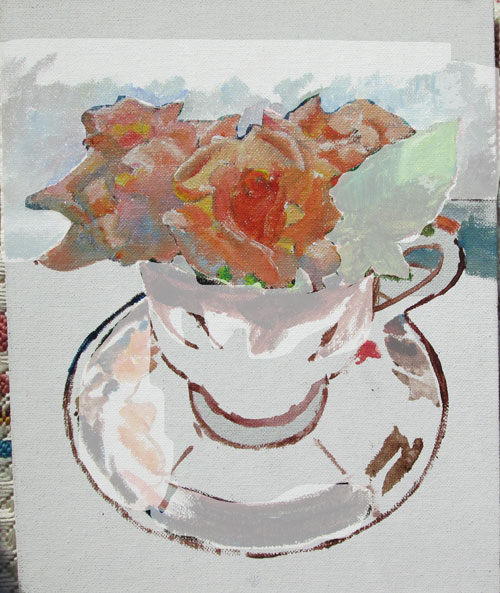
There
just wasn't a lot of “oomph” to this so far. But then I started
to lay in the background of the darkened windowsill to the outside
shrubs, and the shadowed leaf and the black accents of the tea
cup......and the sunlight began to shine! The darks (blue with a
brown) became black and the background (greyed blues and browns and
greens) began to make the peaches of the flowers POP!
I'd been
inspired to try this technique by an article in a magazine, which
offered the advice for this kind of impressionistic, opaque-paint
painting of starting out with your darkest value then keeping in a
“mid range” for as long as possible and finish up with
highlights. The fact that I was also painting on a canvas board, (a
rarity for me.....) helped a bunch when I wanted to paint in more
details and more details, but the painting “said” it wanted to be
more about colours than details.
After I
got most of the rest of the painting laid in, I stepped back to see
what else needed to be done.....
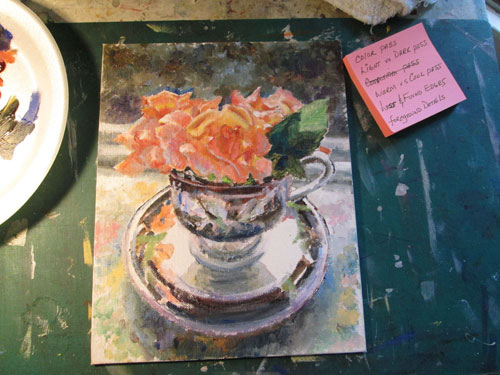
As you
can see in the pic I made up a bitty list of the things I wanted to
check over before I called it “DONE”! I wanted to concentrate my
attention on:
Making
one more “colour pass” to check and see that my colours were
where they needed to be to successfully pull off the illusion of the
tea cup and roses.
Checking
again that my values were in alinement with the rest of the scene. I
intentionally kept the roses and tea cup a bit lighter in all over
values to keep the lively colours in the shadows.
Tilted
the back windowsill just a bit more, to make sure that the
composition wasn't too static, but still looked “right”.
Kept my
warm reds/peaches in the sunlight, and the cooler versions in the
shadows of turning petals. And added the blue reflected lights (of
the sky) where the petals turned over.
Made
sure that the petals further away from the viewer had “lost”
edges (were blurred) and the ones closer to the center sharp focus
were more crisp and sharp, or “found”.
Finally
I allowed a bit more details on the petals of the foreground rose. I
had to almost “slap” my own hand to keep from adding more details
in the cup......but I managed to leave most all “well enough
alone.”