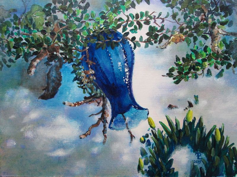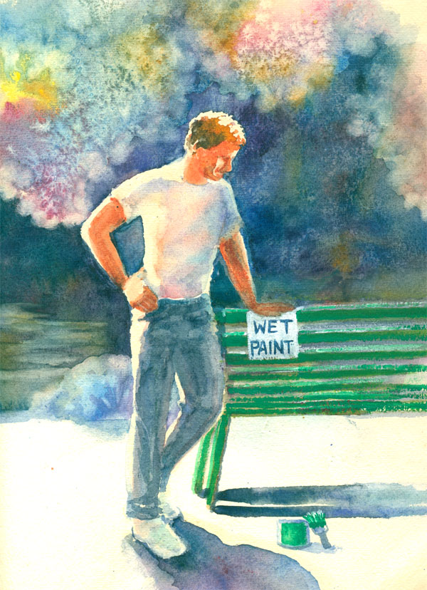
Wet Paint
approx 8 x 10 inches
various watercolour brands, bit of acrylic paint, and some salt
on approx 140 lb watercolour paper, unknown brand
done from my drawing
Both
this blog post and watercolour sketch comes from an experimental
watercolor piece that came to be Wet Paint. It started out from an
old phrase.....”That (whatever is being disparaged) is just
about as exciting as watching paint dry”. Well I happen to luv
to watch paint dry. I can learn a lot from the experience.
I have
a very old stash of various sizes, weights and kinds of watercolour
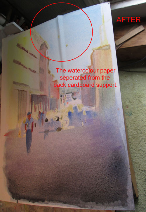
papers. After my disastrous experience with some watercolour board,
a kind soul on a FB forum reminded me about stretching watercolour
papers.
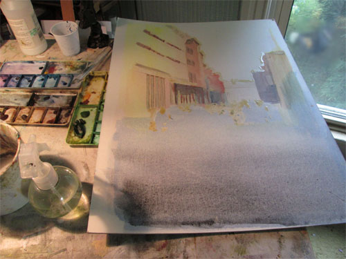
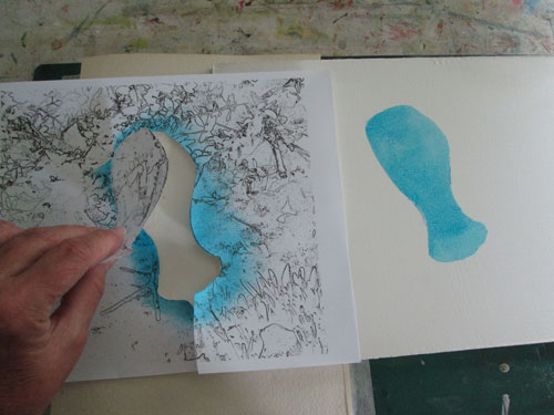
So off I
went on a watercolour voyage of re-discovery. I took a 11 x 14 piece
of approx 140 lb watercolour paper and tried holding it down with
binder clips and masking tape. I decided I wanted a figure and to do
a lot of washes for the background. I took a figure drawing I had,
and laid in liquid misket for the whites and started wetting the
paper for a watercolour pour. Even tho it was held down it
immediately began to buckle. The washes of colour pooled in the
“valleys”. So I took the paper and put it on an old piece of
chip board and proceeded to staple it down stretching as I went
along.

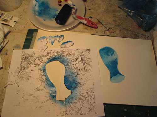
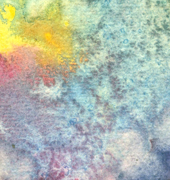
The
second wash buckled as well. So more random colour pools. But the
paper did dry flat....after the washes got really random. If I'm
gonna get smoooooooth transition washes, I marked that in the “need
more research” column.
So I
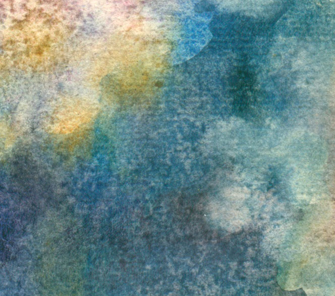
went with the random colours. The next item I wanted to try was salt
blooms. Since I'd never really given this a “scientific” trial,
I did multiple doses of salt. This resulted in a LOT of salt blooms
in just one piece. But I did sorta kinda learn just when to drop in
the salt. It does leave a lovely random lacy pattern.
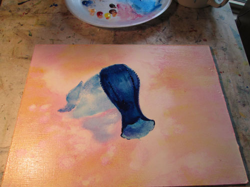
The next
thing I learned was not to be timid when mixing darks. I really went
wild with multiple watercolour hues.....holding mostly to blues and
purples. They stained the deep colours without too much pigment
remaining on the surface. I called that trial a win!
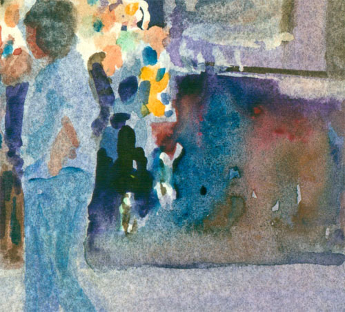
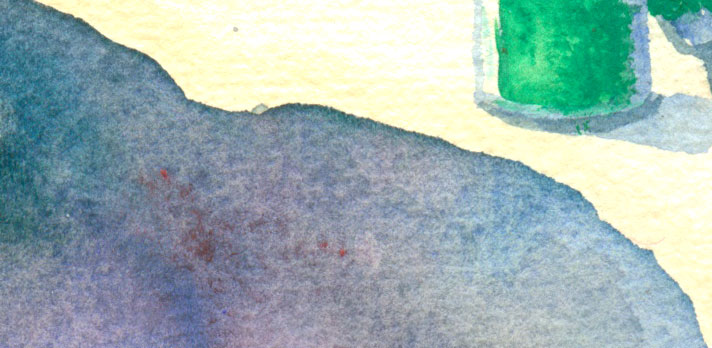
I then
went onto “rub outs”......where you take a hard bristle brush and
a lotta water and rub on already painted paper and remove some of the
already applied colours. It results in a soft ghostly outline and is
a lovely effect.
After
everything else dried, I then removed the misket on the figure's
face. Here I wanted to try just emphasizing the main features and
expression with as little details as possible. As it measured only
less than an inch....it wasn't too hard to do. Just a bristle brush
of paint could change everything. I finally convinced myself to “let
it alone”! Yet another lesson learned.
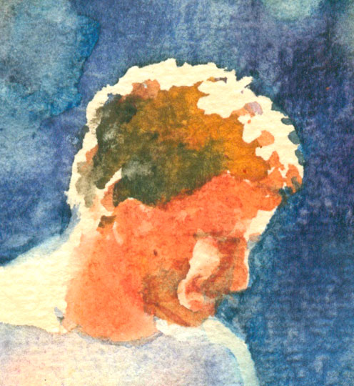
I next
went onto a colour “lesson” I'd learned in acrylics....but wanted
to try in watercolours. The figure had a white T shirt most of which
was in shadow. I wanted that shadow to be luminous so I ghosted in
yellow/rose madder genuine/cobalt blue in a light wash. Once the
misket was removed....it glowed!
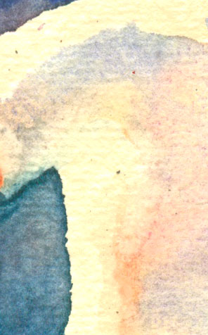
Finally
at the bottom I wanted a real intense shadow. I laid down misket on
either side and really poured on the blues/purples. When I thought,
“This is too much paint” I stopped. When it dried.....it
“matched” the rest of the painting's light perfectly!
So to
recap:
I need
to learn more about watercolour paper prep.
Drop in
the salt on barely wet paper....not too wet and not too dry. Really
helpful, right?
You
can't overdo the watercolor color for a deep color wash....it never
is TOO much.
“Rub
outs” are a lovely way to find your “soft edges”.
If I can
make myself “leave things alone”.....just a few bit of shadow can
“tell my story”.
Ghostings
of the three primaries will give a lovely glow to a “white”
shadow.
Let
graduated colors of a watercolour wash “do the work for you” when
working on shadows.