Sunday, October 29, 2023

THIS ONE or THAT ONE....Let's talk about colorful grays


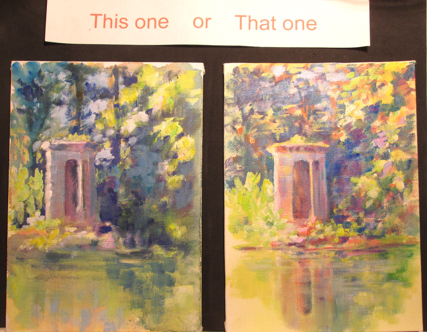
These two bitty sketches are preliminary work to see if I want to do a full 11x14 inch painting of the source photo.


I started out layering in an acrylic wash of hansa yellow over both my 5x7 canvas boards. On THIS ONE I grabbed a couple of my used paint palettes and lightly daubed on brush strokes of mixed colors.....mingling warm and cool colours for a grayed effect. I didn't go too dark in value so's I could use brighter colors in the shadows. On THAT ONE I layered in a medium red and a pthalo blue glaze in varying values over the hansa yellow to make an optical gray, going a tad darker in value to allow for more colourful “bounce” lights.


After this dried, I went over both sketches with more opaque colours to see how far I could push the backlit effect.


 And finally I rummaged around in my studio and pulled out my trusty, “highly technical” view finders......i.e. two pieces of cardboard cut in “L” shapes. I focused in on the people more in THIS ONE and more on the long view of the scene in THAT ONE. I liked the highlit awning and backlit shadows of the figures and streetlamp. The play of grays in the shadows would allow for a lot of interesting side by side color combinations.


Either way I go.....or even if I do this as a full painting.....it's been a fun experiment.


Saturday, October 14, 2023

This one or That one : Tiny Pond Park Castle Edition


                                              Two 5 x 7 inch acrylic sketches on canvas board


This time around I'm painting some small colour comps to explore the same subject with low key and high key colours.

I've posted a couple of 5x7 inches acrylic sketches of a “castle” my husband Frank Lyne (sculptor) built, by hand, beside a pond on our farm. Below you can see my painting set up....plastic palettes with colour wheel mixes.....a colour gamut …...and some source photos I took. 


For both sketches, I started out with an under painting of washes....blended using acrylic flow medium. This medium loosens the acrylic binder so the tube paint acts like a watercolour wash. I then switched to acrylic glazing medium to put in more precise shadows, keeping with the maxium to paint shadows transparently when possible. I try to use only one colour at a time, let that dry then go onto the next colour, until I get the value of shadow that I want.

Finally I switched to all Golden OPEN paints for the semi-opaque and opaque lights and high lights. I adore the sparkle that comes from using warm and cool colours side by side. 

  I painted both scenes keeping in mind that a 4 point spread on the value chart results in the effect of sunlight....so if an object had a highlight of 1 then the shadow would be a 4 or darker to get the effect. Value is necessary to have a cohesive image.....but a wider range of effects can be had when you also use warm and cool colours to enhance the image's depth.

The darker or more low key (THIS ONE) version looks closer to the photograph and more realistic to the value compression by the camera. I tried to use mostly the darker set of values on the ten point value chart.

The lighter or more high key (THAT ONE) takes a bit more license with the lights' colours to emphasize the “glow” of the scene. I used mostly the value scale steps in the ligher register. I tried to add back colours that the camera had replaced with black, in that particular exposure.


Which one do you like better??

Saturday, September 23, 2023

NOAPS Art Challenge 2023 or Seeing Red


NOAPS Art Challenge 2023
By
Alison Davis Lyne


This blog post features a small colour sketch I did for a #NOAPSARTCHALLENGE prompt. The reference photo was in color and featured foreground trees and background lake and mountains.

Of course me being me, I had to make changes……so I faded and cooled the background a bit, changed the size of the background trees and lightened the colors and faded them a bit on the two trees on the right. I used somewhat warmer colours in my choice of palette.

That paved the way for emphasis on the foreground tree, shadows and grasses. I wanted to emphasize the warmth of the sunshine on the tree trunk and the highlighted grass clumps.


Along the way I noticed that my values weren’t as I wanted them, but was distracted by the  hi value/intensity colours I’d painted in.  So I went back to an old illustrator trick.  I grabbed an old sheet of red acetate and laid it over both the reference photo and my 5x7 inch sketch. 

The red acetate canceled out the greens, and revealed just the values.  I quickly noticed that the foreground trunk really needed darkening with an extra dash of intensity. I made the appropriate adjustments and called it done!


Sunday, March 26, 2023

2023 Celebration of the Arts Show at WKU Kentucky Museum


 Homage

This bust, Homage was Frank Lyne's entry for the 2023 Celebration of the Arts show by Abound Credit Union in the WKU Kentucky Museum. It's on display March 4th thru April 14, 2023


Blue Heron

This is my painting entry, Blue Heron, in the Celebration of the Arts show in the Kentucky Museum. 


This pic gives you an idea of the size of the Blue Heron painting.


This pic shows Homage on display. Frank's jeans are to the right.