Learning
Apple
various
watercolors and a few watercolor pencils
on 140
lb weight “mystery” watercolor scrap paper
my own
photo
Recently
I “put on/presented/played at” a little Watercolor Playdate
hosted by my local library Logan County Public Library. (Big shout
out here to the lovely and very helpful staff).
I
decided to do this 'cause I wanted to “play with” a few other
local watercolor folks. I dreamed up an itty bitty program and
gathered together a “kit”....(i.e. Anything to do with watercolor
from my studio) and went to the playdate.
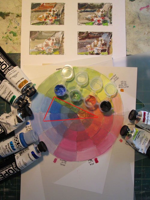
My basic
aim was to show three simple ways to corral your watercolors so's
each color is just where you want it. I showed off misket, wax
colored pencil, and just plain ol' water surface tension.
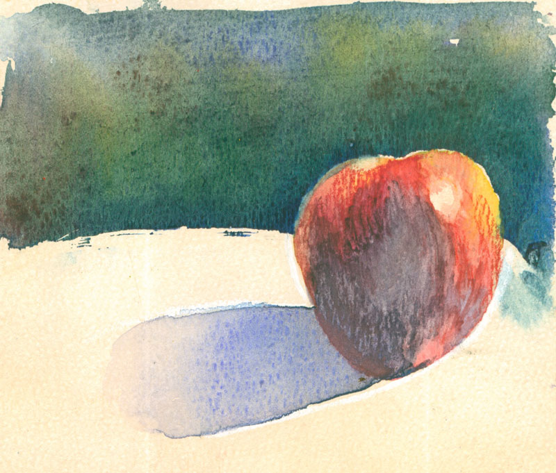
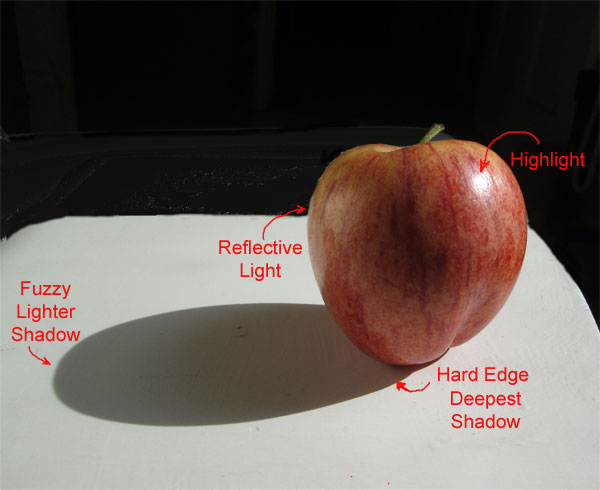
At home,
I made up a photo of a brightly lit apple, drew it out on a bit of
board, and made a quickie template that I used to trace off the
outline of the apple, and the bottom half of the apple with the
shadow. I used that to make up two sets of watercolor sketches on
paper scraps. One with misket separating the apple and table from the
background, so's we could play with dark intense watercolor
backgrounds. Rather than waiting for that to dry.....watching paint
dry is normally a ton of fun for me......but not so much when you
only have an hour for the project, I did a second set of watercolor
sketches with the backgrounds already done.
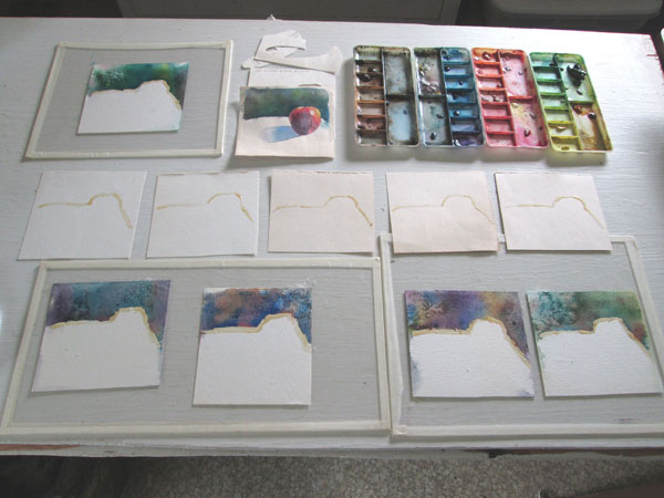
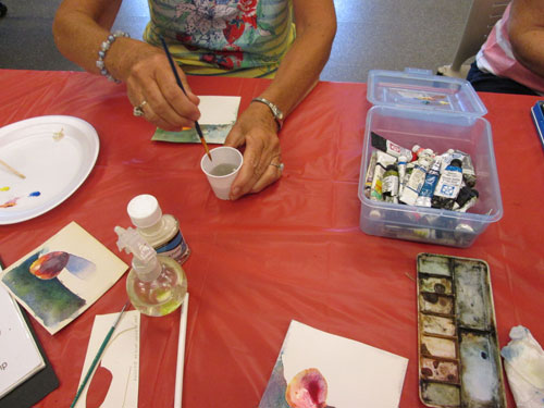
We
started off with soaking the prepared watercolor sketch scraps so's
we could do the “soak and slap” method of wetting and stabilizing
the paper on scraps of plexiglass. I showed off this method on this
blog a while back here. Then everyone started laying in bits of the
background yellow/red/blues watercolor from the three primary
watercolors they'd brought from home. We used styrofoam plates for
palettes.
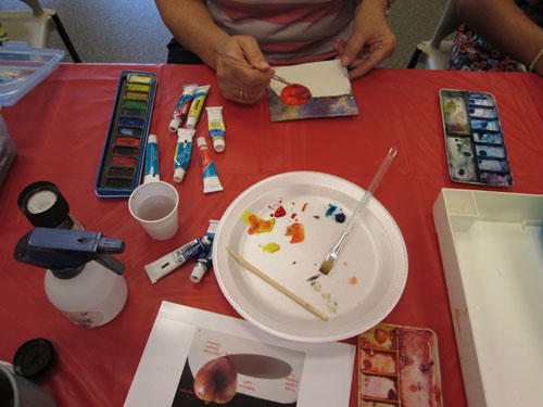
After we
finished with our backgrounds we set them aside to dry and take home
later. Then I brought out the prepared samples where I had already
laid in a watercolor background. I noted that the washes dried about
half again lighter than what they'd looked like when first painted.
I'd also used a bit of salt crystals....... just 'cause.
I let
everyone put in a dot of misket on the apple's highlight spot, remove
the dried misket for the background line, and trace off the bottom
part of the apple and shadow with a wax Prismacolor colored pencil.
I wanted to show that wax colored pencils can be very effective at
corralling a watercolor wash. I did a blog post about this here.
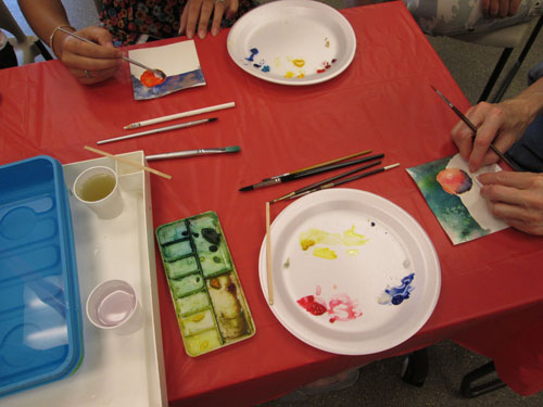
After
the highlight spot was dry, everyone set to painting the apple. We
put enough of a wash of water on the apple that, surrounded by the
dry paper, it bowed a bit. We “encouraged“ it to bow down so's
the red washes would go towards the center shadow of the apple.
Finally
when the apple reds were almost dry, we washed a bit of clear water
over the shadow area of the apple and and followed that with a wash
of blue over the white and over the shadow side of the apple. This
was “corralled” by the white wax pencil outline. We “encouraged”
the blue to pool at the deepest shadow point, the nexus of the apple
and shadow point. We had left the end of the shadow just bounded by
the water tension of the water wash. As we tilted it back and forth
the shadow automatically graduated itself.
After
the washes sorta kinda dried, we looked over each other's work and it
was SO interesting to see just how much the color choices made each
learning apple unique!
Best of
all we all gave ourselves permission to “play with our paints”.
If you are only doing something on a scrap.....you can try
anything.....without guilt or pressure. You never know just what you
might discover when you play!
Give
yourself a “play date”, whether solo or with a few of your
“friends in watercolor”. Grab some scraps of watercolor paper,
some odd watercolors you've been dying to try, your fav watercolor
brush, and an hour of your time. See just how much fun you can have
“watching paint dry”!