Saturday, April 8, 2017

Now that You've Bought It.....Displaying Artwork in the Home


This time around, on the subject of Displaying Artwork in the Home, I'm gonna talk “how” you can display your new artwork. Since Frank and I are constantly creating new artworks, we also try to be creative about displaying those artworks. Since I am 2D and Frank is 3D, I tend to take the walls for my display spaces, and Frank takes any flat surfaces. That being said, we still have a limited amount of display space in our home.....just as is the case with customers that purchase our artworks.

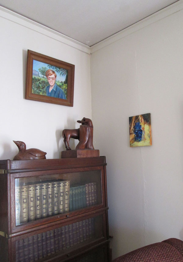
As you can see in the first photo, we have a lovely antique bookcase made of a dark stained wood. This bookcase is a lovely centerpiece for the living room wall, and is perfect for Frank's Fawn and otter along with his Loon. Then your eye is led to his dark wood framed portrait above. I'm also showing one of my Still Life in Blue small unframed less formal paintings as a counter to the larger pieces.
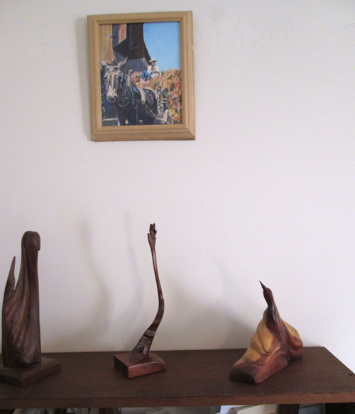
 
On this wall I've arranged a trio of his semi-abstract sculptures that all point upwards in different fashions. They “point” or lead the eye up to a small piece I painted, called Haying. These smaller different sized sculptures make a nice grouping, in and of themselves.
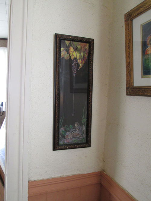


As an artist, I like painting pieces that are slightly different from the standard size and shapes. And I like to think an art consumer, who is willing to hunt for just the right size/shape/orientation might find just that “perfect piece” on our website. This piece, “Rain Drops Keep Falling on my.....” is a perfect fit in this small bit of wall beside a doorway.
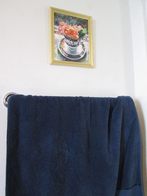
 
Then there are spaces, in “alternative” rooms, like the bathroom, that you don't normally consider a display place. But this little piece, Teacup Rose, fits perfectly in our bathroom, right over a towel rack. The piece goes perfectly with the colour scheme of the bathroom, white with dashes of peach, and navy.
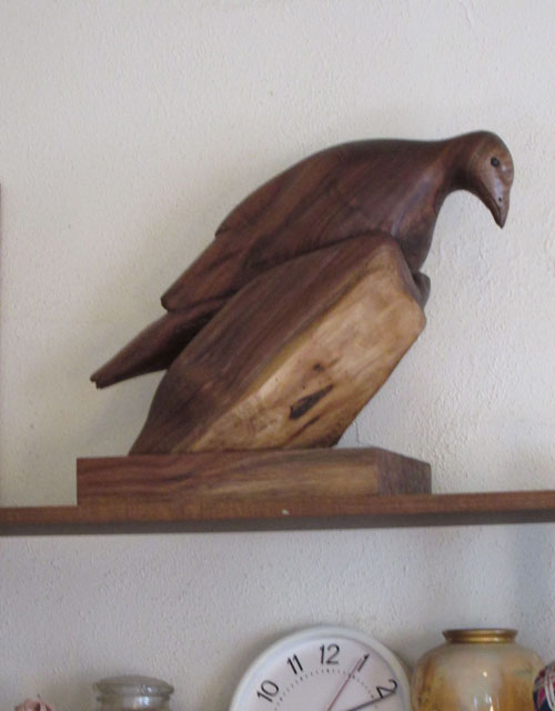
 
Finally, there is always the consideration of just where a piece is displayed to show off the “best views” of that piece. Frank's recently finished piece, Turkey Hollow, puts it's “best beak forward” on this shelf somewhat above eye level. It shows off particularly well the burl of the head and the side grains of the hollow of a tree stump that the turkey is sitting in.

Everyone's home is different and has different opportunities to show off artworks in a person's home collection. All it takes is a bit of creativity and experimentation to show off each piece's best side.

Saturday, April 1, 2017

What He Saw or a Portrait with Lotsa Texture

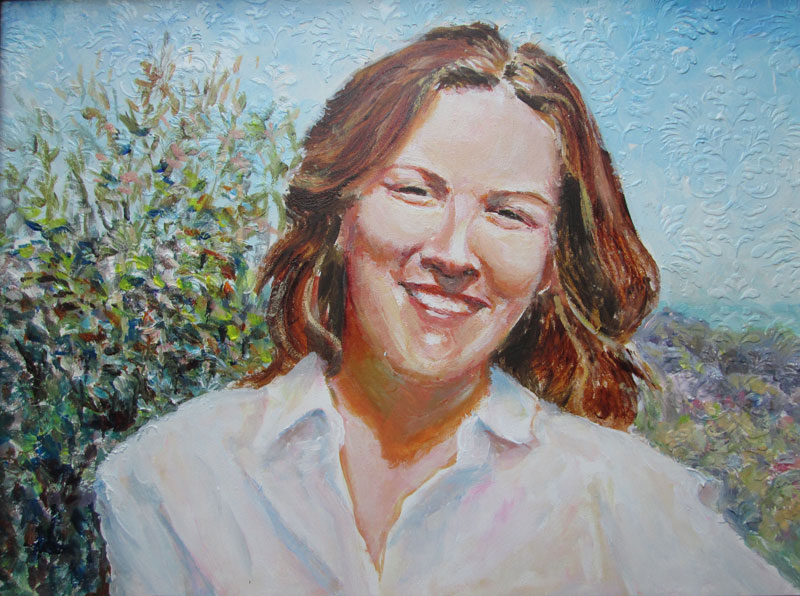
What He Saw
9x12 inches acrylic on gessoed masonite 
  
This time around I'm showing a small 9 x 12 inch acrylic portrait that I just finished. I've been working on getting the 'sunlit” look. One of the guidelines for working with values (shades of black and white) is to indicate what the light is hitting and what is in shadow. For artists, it's usually expressed in a ten step value scale.....with zero being white and ten being pure black.
In a couple of art books I've been reading, it says that sunlight is best represented by using a four step value separation....in other words any object in the sunlight has a shadow four steps from the value of the highlight value. I know......sounds all stuffy and “math-y”. But in practice it's pretty kool.

I set up my 10 step value scale beside my canvas, and each time I painted a bit of color on the face, I first compared it with the portion of the value scale that I was working with. And it did indeed help me to judge the respective values of the shadows underneath the nose and chin and neck.

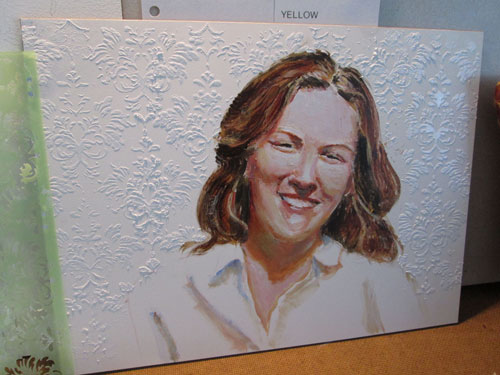
As a bit of an extra challenge, I wanted to add in a bit of funky texture to the painting. The background was just broken colours of a landscape, to be painted in loosely. So before I painted in the background, I laid a stencil on the background, and scooped a palette knife's worth of white paint over the background area. This left a slightly raised area on the background that only showed in a certain light. When I painted the background over this, it visually totally obscured the pattern......unless it was viewed in just the right light angle. Sorta a “secret visual surprise”!


Next painting I intend to go the further step and work on learning more techniques of “sunlight”. I want to play with colour in shadows and with “bounced” sunlight.


Saturday, March 25, 2017

Drum Circle....or Details, Details, Details

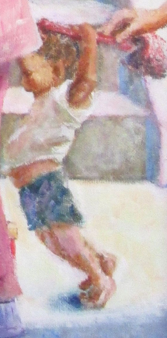
Detail of Drum Circle
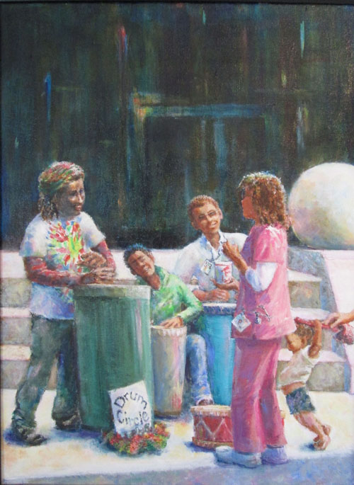
18x24 inches acrylic on canvas
 
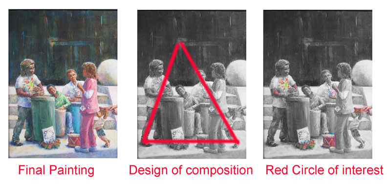
This week's blog is about my recently finished painting, Drum Circle. It's fairly large-ish for me, 18 x 24 inches and my intent was to show a scene with different folks interacting with each other. I also wanted to play with the full value spectrum of light and dark.


Another artistic aspect I wanted to play with was design and composition. By the time I'd firmed up the painting's composition I was working with a triangle, formed by the left hand figure's leg pointing up to the background building's yellow high light and coming down to the toddler's tippy toed feet. I also had a secondary visual “pathway” or circle of interest....hints of pure red in the drum leader's tie-dyed t-shirt, the hat with the Drum Circle sign, the toddler's drum and his drum stick, and the cup of cola in the nurse's hand. Both these visual devices or details are to guide the viewer's eye around in the painting.


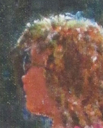
I also had a ball doing subtle brush work details, like the side turn of the nurse's head with just a bit-o-glint on the sunglasses, her nose and lower lip.


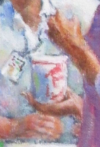
I was also pleased with the free handed brushwork of the nurse's hand holding the white cola cup centered on her co-worker's white shirt. By varying the color and temperature of the different whites, I was able to show them all together yet differentiate between the different white objects.


Along with the detail of the toddler intent on beating his red drum at the top of the post, I had a blast doing different LOD or level of details on different sections of this painting. These different bits of detailing within a complex painting were a classic example of both “the devil is in the details” and the delight to be found in detailing a painting just enough to tell it's story with out over doing the level of detail.

Saturday, March 18, 2017

Illustrating Words


Illustrating Words
This weeks post is a lovely “cross blog guest post”, by SCBWI Midsouth's own Randi Lynn Mrvos, the intrepid editor of the ezine Kid's ImaginationTrain and you can find her at: http://www.childrenswritersworld.blogspot.com

  I love to see how children’s illustrators bring scenes and characters to life. Their choices of color and media unite with the text of a manuscript to turn a story into a book. This made me wonder about the choices the artist would make to illustrate my upcoming book Maggie and the Summer Vacation Show and Tell. I’m curious to see how the artist will capture the essence of my words.

The book contract indicated that I would have some say in the illustrations. I wasn’t sure what that detailed, but when the creative director approached me about my vision for the story I felt privileged. The best way to explain to her how I felt about the story was to show her two of my favorite picture books.

The art in Because of Thursday by Patricia Polacco and Winfred Gordon McDonald Partridge illustrated by Julie Vivas conveyed a whimsical abstract realism with a muted color palette.

http://www.patriciapolacco.com

 
https://www.amazon.com/Wilfrid-Gordon-McDonald-Partridge-Mem/dp/091629126X/ref=sr_1_3?s=books&ie=UTF8&qid=1489851211&sr=1-3


This would be a good fit for Maggie, a Charlie Brown-like character who’s down on her luck and for her rescue dog Trooper.
 
After sending the director my thoughts and the covers of these books, she asked three illustrators to come up with a sketch of a kid. Two were nicely drawn, but a bit cartoony.
The third artist captured the quirky characteristics of Maggie. He used a water color wash to create a curly red-haired Maggie.

Waiting to see the completed art is like wondering what your baby will look like when it’s born. I’m nervous, but excited. If the illustrations are anything like the preliminary sketch, the artist’s choices will engage young readers and get them in the mood to meet Maggie and Trooper.

Randi Lynn Mrvos

                                                      ___________


To see the blog that I "cross blog posted" on Randi's blog just  go to:   http://childrenswritersworld.blogspot.com/2017/03/three-tips-to-help-your-picture-book.html

 I have really enjoyed playing this "cross blog posting" game,and so appreciate Randi playing along with me!


Saturday, March 11, 2017

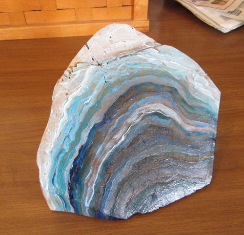
Wooden Geode in Blue

 Wooden Geode in Blue
Acrylic paints on wood with mica chips and salt
  
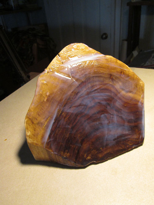
This time around I'm still painting but on an entirely different surface. A few weeks ago, Frank started on Turkey Hollow, and in the process of establishing a level base of the carving, Frank sawed off a angled bit of the billet. I saw it discarded on the saw table, and got an idea. I asked him to smooth off the bottom and sides and a top surface.

I had seen some actual gemstone geodes recently at a nature preserve gift shop, and fell in love with the glow of the colours. I had also seen some highly abstracted wooden ones on Pinterest. When I saw the discarded piece of wood on the saw table, everything came together and I decided to try making my very own wooden geode.


I brought the wooden piece inside and poured on a lotta acrylic gel medium, and actually squeegeed off the excess with a small hand held squeegee. After letting it dry for a coupla days I laid in the first of many coats of gel medium mixed with varying intensity of all the different tubes of blue acrylic paints I had on hand. On the top, I finished off with some pale blue and white for a graduated effect

 
While I was at it, I found an old sample that had come with a paint order, of mica chips suspended in acrylic medium. I also found some small salt crystals in an old plastic “salt grinder”. Both things found their way onto my wooden geode. I continued to cover the salt and mica chips with layers of clear acrylic medium, and the blue parts of the geode with thin layers of multiple shades of blue. As a finish Frank put some tung oil on the still exposed wood sides and bottom of the piece. It's his usual finish for his sculptures.
  
I finished this piece when it's sheen matched what I'd seen of the “real” rock geodes. I guess you could call this project a real “mixed media” piece......both cellulose and crystalline in it's making.


Saturday, March 4, 2017

Us at the US Bank Celebration of the Arts Show

 
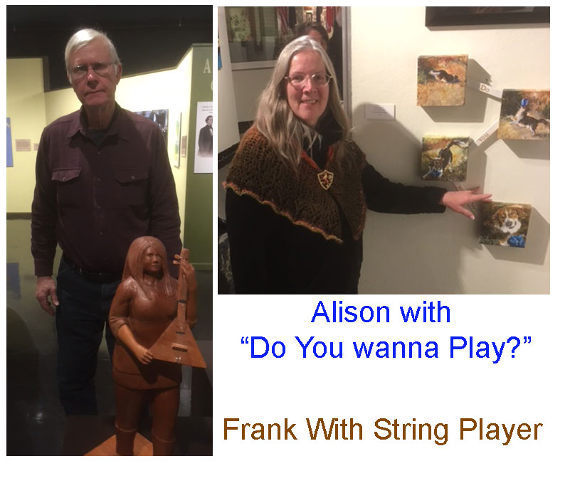
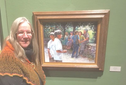
This bitty blog post is just a snapshot of the two of us at the US Bank'sCelebration of the Arts Show reception at the Kentucky Museum on Western Kentucky University's Bowling Green Campus. We both had artwork in the show, some on the bottom floor gallery and some in the upstairs gallery.

I'm pictured with “Do You Wanna Play?”, my motion paintings of our dog Bridge. Frank is standing with “String Player”

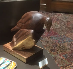
Frank also had "Turkey Hollow" on display:

 
And I also had “Just Messing About” showing:


As always is the case it was fun seeing both how our works looked “out in the (show) world” and seeing all the other artists' works. Western Kentucky puts on a fabulous reception and is a pleasure to get invited and to attend.

Y'all go by the Kentucky Museum and take a look!

Saturday, February 25, 2017

Primary Still Life in Yellow

Primary Still Life in Yellow
8x10 inches Acrylic paint
 
This week's blog post is about a third in a trilogy of small 8x10 inch canvases.....titled Primary Still Lives, one each in blue, red and today's: Yellow. These are of course, the three traditional primary colours of the rainbow or a painter's paint box. I wanted to do these leetle still lives as an experiment in colour composition.
I started this one out with a blue underpainting....yes, blue! The wine coloured drape I'd used for the background folds was a clear claret colour which I wanted to paint using glazes. When glazing a specific hue it's fun to put a different primary color down as a “base” or in this case a shadow. The first glaze is a kinda “road map” for how the painting is laid out. You can see I left white all the spots that were going to be the “star of the show” in yellow.

 
After the blue glaze was dry, I glazed in the magenta color that would rest in the background shadows and be highlit in the little flower vase and in the cloth folds in the foreground, plus a sprig of crab apple blossoms.

I had just begun to ghost in the yellows on the backlit leaf in the foreground, and the more muted yellow of Frank's abstract sculpture on the right. Since the visual focus of this painting was YELLOW, I leaned the background wine colour a bit towards purple, the traditional complementary colour to yellow. A complementary colour is one that is opposite one another on the traditional colour wheel.

 
After a lot more glazing and drying and adjusting I was finished. I decided to display this one on a shelf right beside Frank's carving I'd used as inspiration.