
This is
a itty bitty blog post about the color white. As in how do you get a
really good white base to work on, in the middle of a BIG black
colored pencil board?
I've
started another colored pencil piece using black illustration board
as my base. It's sorta like the old Elvis prints on black
velvet......an artist gets to take advantage of allllll that lovely
black background to paint or draw on. Any colour we use will just
POP! Right off the canvas.
My
coloured pencil piece called for some areas of really brite colours
and others need to be a bit more subdued . I figured a bit of
experimentation was called for. I wanted to try a combination
approach, but keep the piece mostly all in slightly to really subdued
colours.
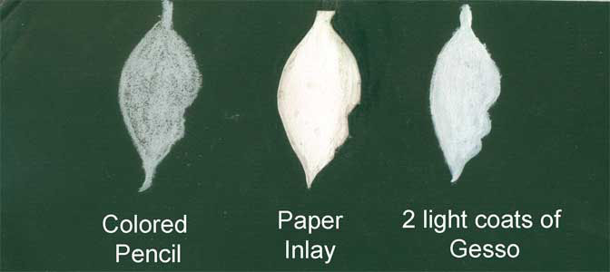
I took a
waste piece of board and laid out three leaf shapes. The first was
just a filled in outline of a white coloured pencil base coat. The
second was a thin bristol board inlay. The third was a two very
light layers of gesso. Gesso is an acrylic primer that painters use
on their canvases to seal the fabric canvas and to make it extra
white.
The
white thin bristol board inlay was done by laying the bit of white
bristol board over the black illustration board, and using an Xacto
knife held perpendicular to the boards, cut out the entire leaf
shape, thru both surfaces. When finished I had the white bristol
board cutout EXACTLY the same shape as the shallow cutout in the
black illustration board. On the black board, I took the knife and
gently pulled up the top black layer of the illustration board,
spread a bit of glue (in this case acrylic gel medium) and inserted
the white bristol board in the hole. After a bit of burnishing
around the edges, I had a lovely inlay of white bristol board in the
sea of total black illustration board.
I then
drew the yellow leaf with a bit of shadow, in coloured pencil, using
the same colors on all three sample leaves.
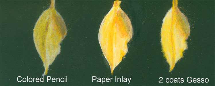
The
first coloured pencil leaf was the most subdued of the three, but
just fine if you wanted to stay with coloured pencil throughout the
entire piece.
The
second leaf (with white paper inlay) ended up being both the
brightest and the cleanest in shape. I don't know about the archival
quality of this technique....but I have to assume it would be about
the same as the entire piece. 'Bout the only drawback is I sometimes
would run over the slight ridge of the inlay. Next time I might use
a brayer to further flatten the surface and get it flush with the
black illustration board.
The
third leaf, with the gesso coating as a foundation fell somewhere in
between in terms of brightness.
For the
inlay technique, I wanted to give a hat tip to Rob Howard, who wrote
the Illustrator's
Bible. It was originally published all the way back in 1992, but
many of the traditional media art techniques it gives still hold up
today. This was waaaay before Photoshop saves of today. His index
didn't even list computers! He gave the inlay technique as a way to
save an illustration “gone bad”.
No comments:
Post a Comment