
This is
just a small post about a current colored pencil WIP “All My Ducks
in a Row”. This WIP is from a series of photos my husband, Frank,
took on a recent nature photo shoot. He found a group of young ducks
preening on a huge log, and took a wonderful series of photos. I
took them, and with a bit of rearranging, came up with a design I
liked. I choose a looooong horizontal frame format, and cut out
black illustration board to match.
I traced
off the duck images onto the illustration board, using white tracing
graphite paper. I dusted it off a bit with an kneaded eraser, and
started to work.
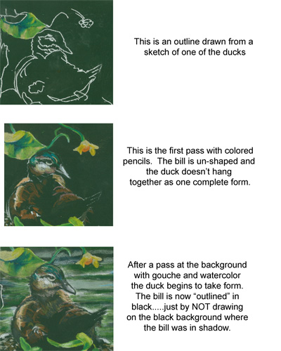
My first
pass of coloured pencils laid in the brite green leaf to outline the
duck's head. As you can see in the second image, the colours were
laid in, but the image doesn't really “come together”.
To
“outline” the main image I needed to ghost in the background
water, which I did using a lite swash of gouche. I found that
coloured Prismas go over lite gouche wonderfully, mushing the gouche
particles around with very little effort, allowing me to add bits of
colour gradually.
By
remembering to NOT COLOUR in the black areas surrounding the duck's
head, I allowed the figure to POP out against the background and
attain it's proper form.
It's a
bit of a “backwards thinking” kind of trick, but is essential to
remember where “not to paint” to work on a black background.
Sorta like working a colored pencil crossword puzzle.
No comments:
Post a Comment