Monday, August 26, 2013

Riddle Me This: Figure out the answer to the riddle and you'll learn a bit more about PBs today.


Figure out the answer to the riddle and you'll learn a bit more about PBs today.  Every time you click on a cover or read a review, or even flip thru a PB in the bookstore, you add a bit more to your knowledge base, which can help you to figure out just where YOU could fit into the current publishing scene.  Whenever I see a neat book (PB or otherwise) at a bookstore......I can almost bet it'll be in my library ASAP.....usually without me even asking for it!  And those few I do ask for.....they getz them.  Your local library is an excellent place to start researching the PB industry.

Today's Riddle Me This:
I am an Aussie with a love of enigmas. I paint with details and color and great animal characters in mind. My publisher and I both head up the alphabet. Who am I? 

I'll post the answer tomorrow!

The answer to yesterday's riddle is Graeme Base. His current PB is the Legend of the Golden Snail. With this PB he is advancing into the world of the App and 3D side of illustrating.  One of his recent PBs is Enigma. It's a lively riddle all in itself, and is drawn with the author's wonderful color sense. It is chock full of engaging animal characters. The publisher is Abrams.

Thursday, August 22, 2013

VISUAL ART TIP: Sponge Brush Painting is good for both illustrations and paintings


Sponge Brush Painting
This Visual Art Tip is a little about my technique of sponge brush painting as it applies to "fine art" painting. I developed my technique to accomplish a certain look for some illustrations I was working on.....but sponge brush painting can easily work in many "fine art" situations as well.
My initial problem was to get nice smooth graduations in a monochromatic background for a page in an alphabet book. For the illustrations for Easter Day Alphabet, I'd come up with the concept to paint designs as a kind of "wallpaper" background with the main image, text and large alphabet letter going on top.I wasn't using any computer graphics for this particular book, I don't use an airbrush, and I was working in acrylics....not known for their ease of getting a smooth graduation in colours. Unwanted visible brush marks being one of the main problems.
I hit upon the idea of using sponge brushes after looking at a home dec magazine, and reading about faux finishes. You can see more about it in a previous post: I Never Met a Art Technique I didn't like.....
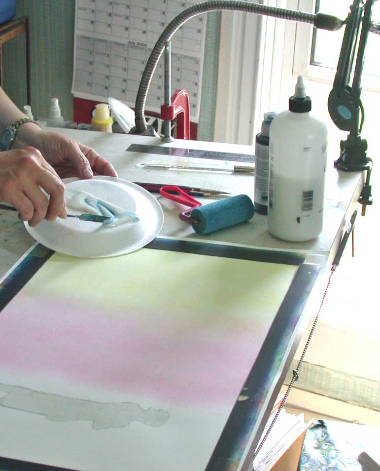
I found that if I puddled a bit of the glazing liquid on my palette then dropped in a drop of fluid acrylics and mixed with a knife.....I got a lovely looking glaze

Smooth sponges allow me to graduate colours. After one coat of glaze dries I can easily smooth on a different colour and seamlessly blend the edge. All this without any muddying of the two colours, as the dried acrylic glazes stay separate. I usually use a gessoed ground on masonite board for my fine art paintings. This accepts the glazing especially well....the light just goes right thru the acrylic glazes and bounces off the white gesso and returns outward with a lovely glow.
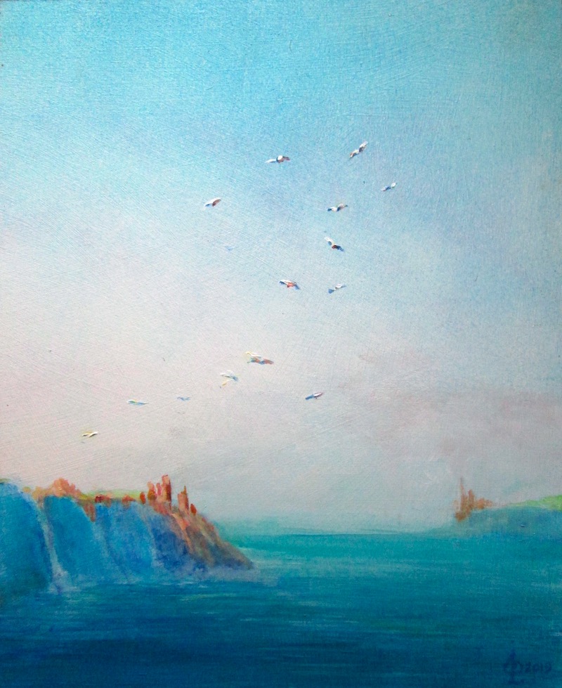
For landscapes in the "fine art" mode, I found that skies would be luminous done in layers of acrylic blues and greens, just as Maxfield Parrish discovered using oils. When I wanted to fill in foliage for trees and such, I just grabbed a sea sponge and dabbed away. First using a blue base for shadows, and covering with a variety of greens for the background foliage. Then (following Maxfield Parrish's technique) I would dab on pure white for highlights on leaves, which would later be glazed over with various colours as needed....i.e. oranges for fall, yellow for summer etc. I used this technique for this painting:
LAND'S END 

among others: It was the perfect technique for grasses, clear skies and flowing water.


Thursday, August 8, 2013

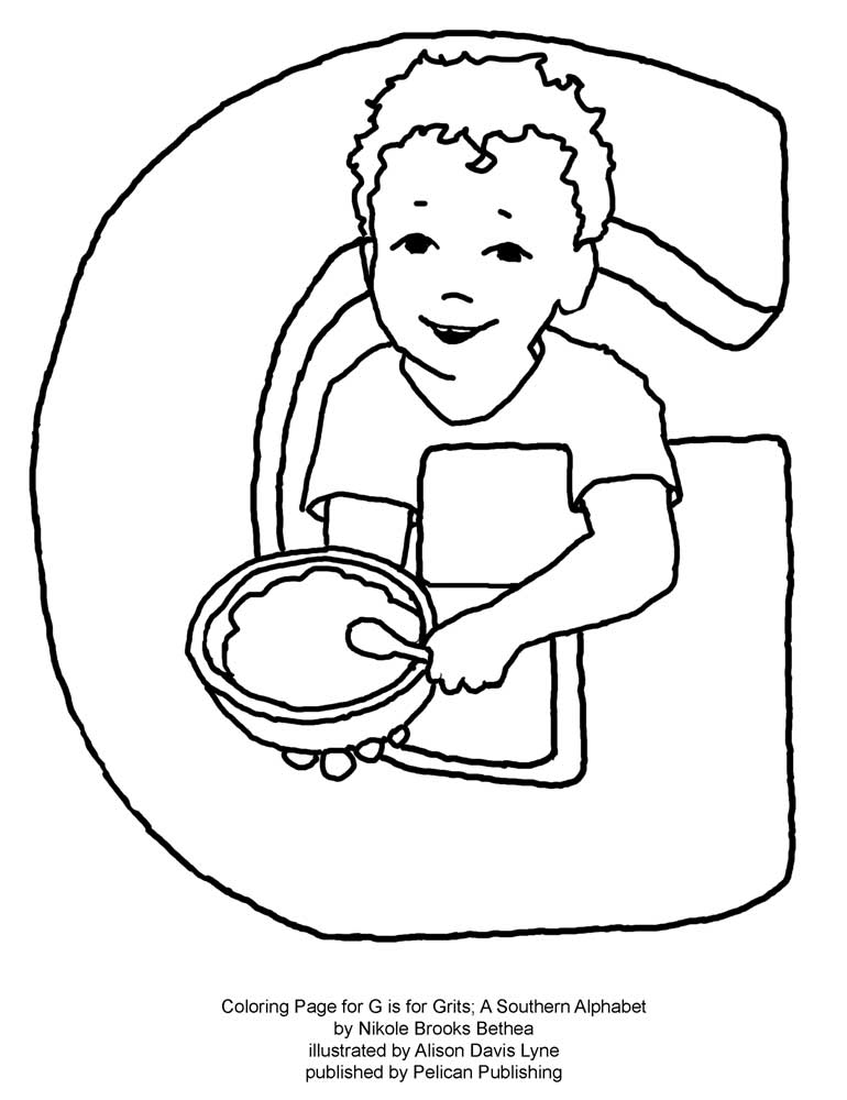
COLORING BOOK PAGE - G is for Grits

Here is a brand new FREE coloring book page just for G is for Grits.  Just click on it and print!  Enjoy!


Monday, August 5, 2013

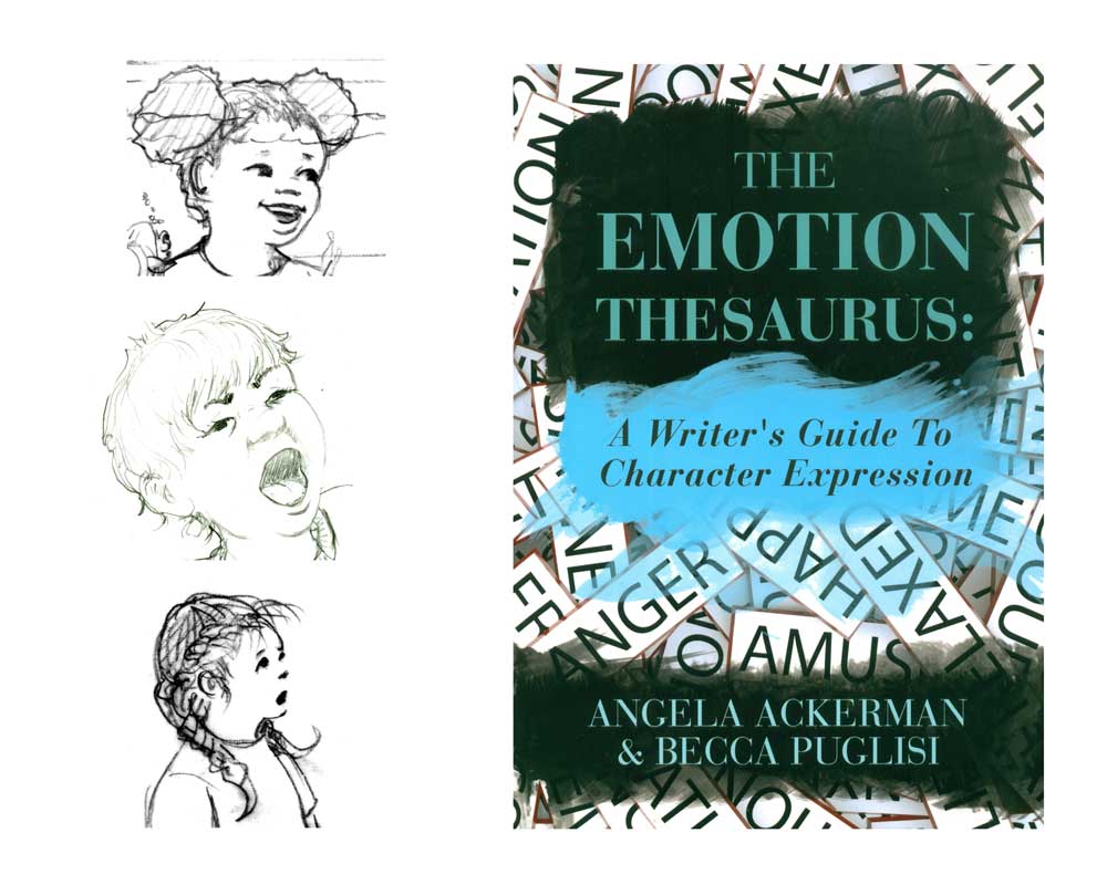
VISUAL ART TIP- How I Learned to Love a Very Emotional Thesaurus or A Visual Take on a Book Meant Mostly for Writers: The Emotion Thesaurus.


VISUAL ART TIP- How I Learned to Love a Very Emotional Thesaurus or A Visual Take on a Book Meant Mostly for Writers: The Emotion Thesaurus.


I've been working recently on my character drawing skills.....and in preparation for a round of sketching I bought Angela Ackerman and Becca Puglisi's latest offering: The Emotion Thesaurus. It was reviewed in a recent SCBWI Bulletin, and I liked the idea of a book of physical signals reflecting emotions.

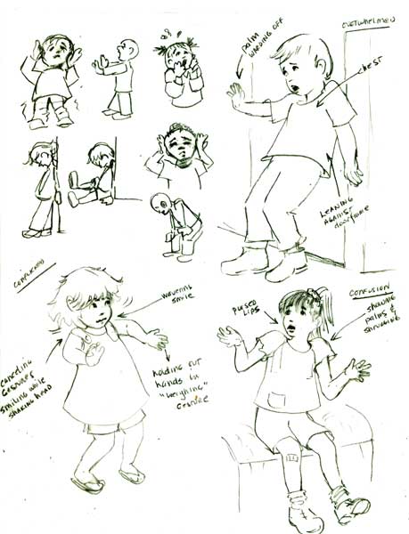
I was delighted to find full page entries of 75 different kinds of emotional states. I typed up a list of all the emotions (they were arranged alphabetically in the book) and rearranged the 75 listings according to loosely based categories that I put into light, medium and heavy groups. Like the three emotions Conflicted, Confusion and Overwhelmed felt like they should be arranged going from Conflicted which seemed to be a lite emotion, which could escalate to a medium emotion, Confused and which if not resolved, could go into a heavy Overwhelmed mode. These were purely arbitrary categories.

After this I “ran with my scissors”, and cut up all the 75 categories into individual slips of paper, and threw them into a cup. I pulled out one listing to start my sketching, resolving to try to do the same each day or so.

Of course the first slip of paper I pull out from the cup, Conflicted, led me to also pull out Confused and Overwhelmed. After reading the three entries in Emotion Thesaurus, I started sketching. You can see my first efforts below.


While sketching, I was already musing what I could do to “up the ante” on the poses I chose. How to make the kid's expressions “even more so” than my beginning sketch. And I was also thinking ahead about just “WHAT” had elicited these emotions in my models. I'm already thinking that the little boy that's Overwhelmed could be trying to wave off an overly exuberant St Barnard puppy with muddy paws.......or a cat that has just been sprayed by a skunk? The possibilities are endless!

Tuesday, July 30, 2013

ART VIEW-Art Centered Picture Book Reviews-When No One is Watching illustrated by David A. Johnson written by Eileen Spinelli

Less color is more AND is very appealing.


In most all the reviews for children's picture books, the main portion of the review discusses the writing......well I'd like to reverse that in my reviews....and concentrate on a review of the illustrations, from an artist's perspective. I'll try to tell a little about the book, and then highlight how I see the illustrator "building" the story with his/her illustrations. I'd love to hear if you agree with my summery.....or have other comments.


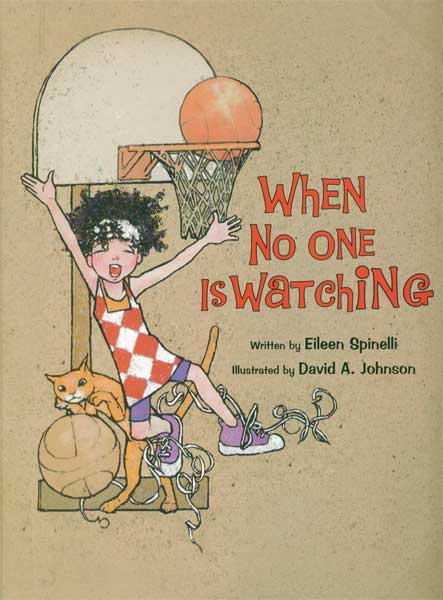
When No One is Watching by Eileen Spinelli illustrated by David A Johnson

I picked up When No One is Watching at my local library just 'cause I found the main character on the cover very appealing. When I read thru the book's lovely text by Eileen Spinelli I was delighted to see how David A Johnson had picked up on her lyrical text and runnnnnnn with it.

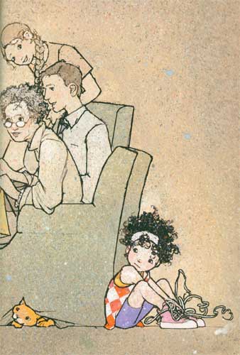
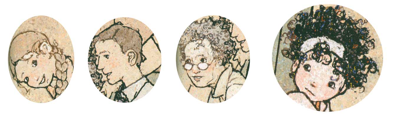
The story has a shy mop-haired little girl narrating how she alternates between her energetic activities when she's alone “when no one is watching” (running, jumping, singing, dancing etc.) and when she's with others...she's a shy wallflower with family, classmates, and playing on the playground. In both situations David Johnson makes sure you focus on her, by giving her the most intense colour with everyone else being “sotto voice” in grayed colors. The only background objects are just the necessary props....a chair, bed, ball and a cat. All the focus is on the shy narrator.


The characters look like they are drawn in pen and ink on a spattered mottled warm grayish toned textured board. The outlines are a very expressive thick/thin black outline. There are just a few highlights on the shy little girl's face with her clothes being the brightest opaque colors on the page....I am totally in love with the small patch of pink with a white highlight that David Johnson puts on the little mop haired girl's face!


David Johnson's drawings are SO appealing, and he does so much with his character designs. He is equally “spot on” with expressions and movements. Of course his expertise in picture book drawing comes from a stellar background in editorial and portrait work. I definitely want to study David Johnson's ability to draw his characters half way between realistic and cartoon that allow for both an appealing yet deceptively simple rendering. His color intensity variations between the main character and the backgrounds, makes his storytelling a tour de force of COLOR stage direction.

There is also a cool book trailer here.


Images reproduced by permission of the publisher; all rights reserved


Saturday, July 13, 2013

Visual Art Tip: Pinball Machine Effect; One Person has an idea who tells another person.....

Visual Art Tip

PinBall Machine Effect: One person has an idea, who tells it to another person, who takes it, and changes it and comes up with another idea, and "bounces" it on to someone else.
This visual art tip is the result of a verbal/visual "pin ball machine" effect. Some while back I'd posted a verbal art tip on the usefulness of combining media, in this case acrylic glazes and watercolor. A few months later I got an email from Connie McLennan that read in part:
I did just have a revelation triggered by reading the word "glazing" in your recent tips thread, though! I have been struggling with creating flow-y blobs that look like ink dispersing in water, which are also permanent enough to allow me to paint the color of the water around them. Have been experimenting with watercolor and dyes, and was planning to spray them with workable fixative before overpainting -- before I read your thread and realized/remembered I could do exactly what I needed to do using thinned acrylics for the flowing blob colors, letting them dry, and painting the color of the water around them (hand slapping forehead.)
Which of course pleased me no end!
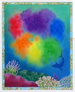
The subject that Connie McLennan was painting were pages for her book Octavia Octopus and her Purple Ink Cloud Sylvan Dell Publishing ISBN 0-9764943-5-3 April 2006. This is the title page showing the floating ink blobs that the book's heroine, Octavia, had made. It shows Connie's success in keeping the coloured "ink blobs" separate, and not mixing and dulling the rainbow effect, and keeping them "in the water", but not mixing with the blues.


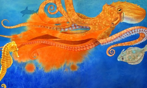
Connie was kind enough to allow me to use her images that show the use of her version of this "art tip" on keeping the flowing feeling of the "ink colors" while surrounding it with water,and not have the two mix. She also said about the pages below: 

"It was particularly important that the edges of the orange-yellow-red colors not mix with the (opposite) blue color of the water."


Reprinted by kind permission of Sylvan Dell Publishing and the illustrator Connie McLennan.


Thursday, June 27, 2013

DIDJA KNOW? That since the seventeenth and eighteenth centuries, Indian Yellow had been imported from the East


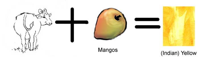
DIDJA KNOW? That since the seventeenth and eighteenth centuries, Indian Yellow had been imported from the east to Europe and used extensively by many famous painters. It's transparency and golden “glow” was highly prized. In the late nineteenth century T.N.Mukharhji wrote he had uncovered the origins of the pigment “peori” or Indian Yellow. It supposedly came from cows that had been fed ONLY mangos.Their urine was heated, which precipitated the solids that made up the pigment. He said that in 1890 legislation was passed to end the practice.
A wikipedia article on the subject says that a later day researcher could find no evidence of this practice.


The actual pigment colorant was a magnesium salt of an acid released by the mango.
Today Inidan Yellow is mostly replaced by quinacridones (discovered in 1896) and nickel azo in varying mixtures. A Raw Siena gives a pale warm colour to a glaze and anything with a quinacridone or diaryide in the paint will give a robust yellow/gold color.