
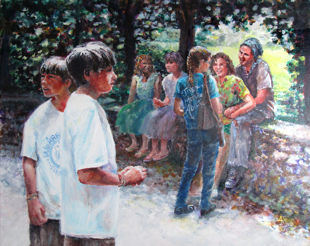
We Are Just Messing About
Acrylic
paints on 16 x 20 stretched canvas, my own photo references and
imagination
This
painting is another one in my Pictures + Words collection. My aim
this time was to show a group of folks “just messing about” in
the park on a sun lit day. My artistic aims were to learn more about
: Composition, values (lights and darks), gestures, color choices and
masses (broad lights and darks to define a form.)
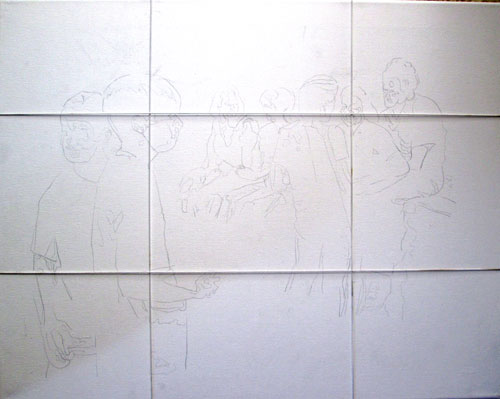
To that
end I gathered some reference photos and began sketching. One little
axiom I'd made up was to “draw tightly, paint loosely” or draw
accurately from my photographic references but draw with the idea of
masses instead of photographic detailing. To help with that, I took
the photos into Photoshop, and reduced them to black and white, then
“posterized” them, rendering the masses of the forms of the
figures without detailing. This allowed for
clothing/color/personalization changes at will, without feeling I had
to adhere to the photos too strictly. These printouts are what I
used to “sketch” onto the canvas. I again used the “power of
thirds” to locate important features at the “sweet spots” of my
canvas. Here is the canvas divided into thirds with my handy dandy
elastic strings.
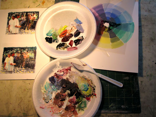
In my
head I was also planning the lights and darks of the whole painting.
Greg Albert, in his The Simple Secret to Better Painting has a bunch
of nice axioms, but the one I chose for this painting was: Mostly,
Some and a Bit. It can easily apply to values, colors and detailing.
I took
my Photoshop posterized sketches and printed out a couple of tiny
ones on some bristol board, and used them for color/compositional
“mini-mes” or thumbnail sketches. I used my color wheel to
decide on a triadic color scheme and proceeded to mix up my basic
paints. From my previous experiments in using greys to keep my color
scheme in balance, I mixed up a set of greyed colours and then used
some of the original tube colors for color “sparks”. I've tried
this on the basis of James Gurney's Color and Light book. Premixing
greyed colors is a great way not to “fight” too raw tube
colors......and allow your color “sparks” to sing
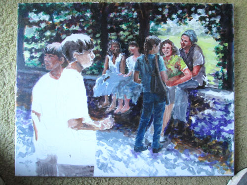
After
establishing my compositional road map, light and dark value road
map, mass and color road maps......I was ready to go. I laid in the
basic lights and darks, making gesture, and facial changes, from the
original photos, as I came to them. I wanted to make all these
disparate folks look like they were all hanging out together. I then
pulled up an oldie but goodie technique of glazing. I glazed the
background tree masses till they were just distant background blurs,
the better to focus on the people. As you can see I started off with
a lotta greys, but the final painting is very colourful.
The
planning process is a bit new to me, but I'm learning SO much from
each one I do. It pulls together many things I've learned over the
years......but have never combined quite this way in my painting
planning. It's lovely to conceive a painting, with "bookish helpers" (i.e. re-reading from different technique books I have on hand)
whenever I hit a snag in bringing a concept to a full painting.
No comments:
Post a Comment