
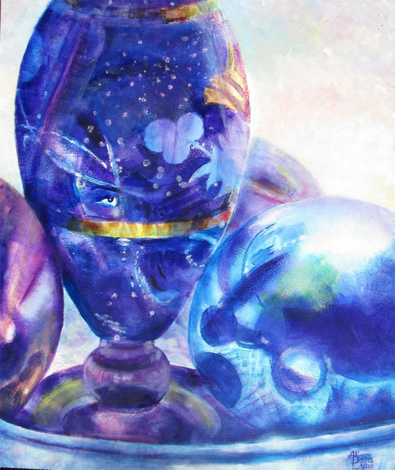
Face in the Glass
16 x 20 inches
acrylic paint
I
started this painting in the dreary heart of last winter. I was so
needing some really intense rich colours in my “world view”, and
this painting sure fit the bill. The photo I was working from was
one I'd taken a while back of a still life setup featuring a teensy
antique perfume bottle surrounded by some reflective easter eggs. I
choose this view because of a reflection that I saw when viewing the
greatly enlarged photos on the computer screen. Just above the gold
reflection band, I spotted a reflection that just looked like an eye,
and a bit of a nose and mouth right below......and viola! my sub
conscious read it as a face. Much like seeing a dragon in clouds or
a puppy in random specks on wall paper.
So I
decided I'd run with that. I gridded the photo I'd printed out, made
a corresponding grid on my gessoed masonite board and got to work
sketching. At the same time I made some paper “templates” of
different objects in the painting. I knew I wanted to use sponge
brushes (both square and roller) to evenly spread my acrylic glazes.
Using paper cutouts to mark off the working areas was a technique I'd
used many times before in my illustration work.
I really
luv using acrylic glazes (acrylic paint thinned with a Golden Acrylic
glazing medium) to get a graduated glaze of intense transparent
colours.
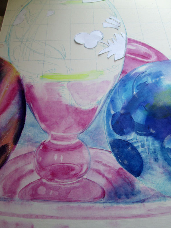
In this
pic I've begun the glazing process for the vase and two of the balls.
Following the photo reference, I've put down the first glaze
defining the reflections for the blue ball on the right. I've just
about finished the magenta glazes on the “red” ball on the left.
I've put in the base glaze for the magenta vase. Note the blue
watercolour pencil gridding that I used for sketching the main
components of the picture. I've also blocked out with paper, the
etched flower design on the vase. I'll paint that in later, as it
should only need one light glaze of blue.
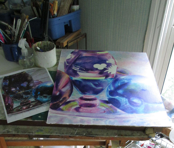
I
continued on with my glazing process. I alternated Phthalo blue
glazes with Anthraquinone blue(a navy blue) glazes and magenta (P.V
19/122) glazes. I used Hansa light yellow and Quinacridone Gold for
the gold touches. This was a primary triad (red,blue,yellow) with
blue as primary. As I progressed with the glazing I needed a bit of a
different surface glaze for the etched flowers and the gold bands.
I'd “reserved” their white spaces with a bit of paper taping
their cutouts down on the canvas. I removed the paper masks, and
begin glazing over these reserved spaces with the appropriate
colours.
This
whole process for the reflected glass surfaces and round balls is
done with a technique similar to watercolour.....working from light
to dark......covering the painted surface with veils of colour. But
in the case of acrylics, I'm using a sponge brush on my canvas...to
mimic the flow of graduated watercolour over the paper. And also
different from watercolours, once an acrylic layer is dry....it is
totally isolated from the next layer of colour. In addition, if I
loose a bit of white needed for a highlight I just paint in plain
white acrylic and off I go. Those highlights can also be adjusted
with more glazes.
I
continued to adjust the blues and purples till I was satisfied with
the 3d look. The colors were deep in a low light, and rich in full
sunlight. For a bit of a change up, I switched to totally opaque
paints (white plus phthalo blue, magenta, yellow) for the background
in a heavily brush stroked blend.
No comments:
Post a Comment