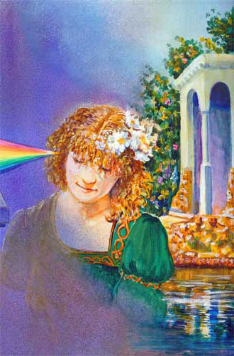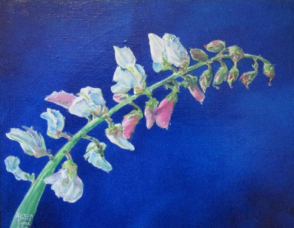
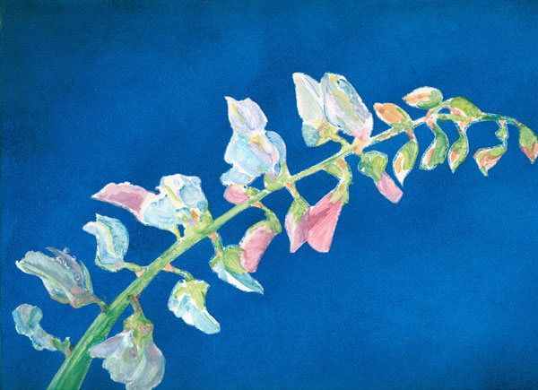
Stick Tight to me Baby!
acrylic on gessoed masonite
11x14 inches
This
blog is to introduce my last painting for 2014.....Stick Tight to me,
Baby. (This title is supposed to be delivered in a Jerry Lee Lewis
voice.)
All
during the spring/summer I took photos of just about every flower we
had in the yard/fields. I became fascinated by the range of luscious
colours to be found in flowers, great and small.
These
stick tight flower blooms grow all along a ridged stem. Both the
flowers, buds and stem are covered in microscopic hairs. Those
microscopic hairs make the stem, buds and resulting seed head “stick
tight” to anything or anyone that brushes against them. This
transfers the seeds to animals which in turn spread stick tights far
and wide. The tiny flowers are maybe a quarter inch, but are
bursting with lovely colours. They start out pink and move to
lavender then, of all things, blue right before they wither and fall
off. They leave behind a pod that contains a triangular seed.
I
started out with the background. I wanted a simple but dramatic
background, so I decided to glaze multiple layers of cobalt and
pthalo blue in a simple pattern. I used an old illustrator trick of
masking off the stem and flowers with frisket, then painting on the
glazed background with a sponge roller brush.
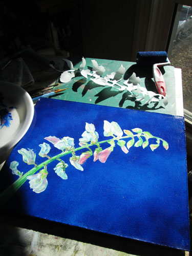
After
all was dry, I peeled off the frisket and began painting the stem and
blooms.
For a
while I have been drooling over the loverly alla prima paintings that
my friend Connie McClennan http://www.connie-mclennan.blogspot.com/
does, and wanting to work in that style. I can't seem to let go of
my glazing style entirely........but I can pair the two styles. So I
began to paint the delicately colored blooms in a more painterly
style. Using the paint a bit heavier than I usually do, I painted the
lovely mix of colours on the painting itself, rather than mixing colours on the
palette.
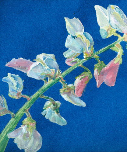
I
continued to work on the blooms, from the bottom up to the top buds.
I followed the pattern of light and dark I'd laid down in my first
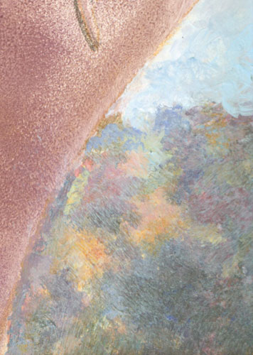
pass at painting the blooms. You can see I've done the first three
blooms on the left......detailing the petals and even the drops of
dew. The surface tension of the teensy tiny dew drops seems to hold
even better on the microscopic hairs of the stem.

I had a
blast working on this painting, especially playing with the subtle
colours of the paint, and working alla prima with the acrylic paints
themselves.