Less
color is more AND is very appealing.
In
most all the reviews for children's picture books, the main portion
of the
review
discusses the writing......well I'd like to reverse that in my
reviews....and concentrate on a review of the illustrations, from an
artist's perspective. I'll try to tell a little about the book, and
then highlight how I see the illustrator "building" the
story with his/her illustrations. I'd love to hear if you agree with
my summery.....or have other comments.
When
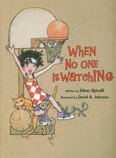
No One is Watching by Eileen Spinelli illustrated by David A Johnson
I
picked up When No One is Watching at my local library just 'cause I
found the main character on the cover very appealing. When I read
thru the book's lovely text by Eileen Spinelli I was delighted to see
how David A Johnson had picked up on her lyrical text and runnnnnnn
with it.
The
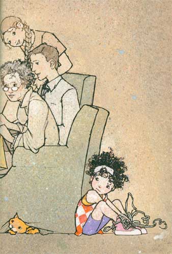
story has a shy mop-haired little girl narrating how she alternates
between her energetic activities when she's alone “when no one is
watching” (running, jumping, singing, dancing etc.) and when she's
with others...she's a shy wallflower with family, classmates, and
playing on the playground. In both situations David Johnson makes
sure you focus on her, by giving her the most intense colour with
everyone else being “sotto voice” in grayed colors. The only
background objects are just the necessary props....a chair, bed, ball
and a cat. All the focus is on the shy narrator.
The
characters look like they are drawn in pen and ink on a spattered
mottled warm grayish toned textured board. The outlines are a very
expressive thick/thin black outline. There are just a few highlights
on the shy little girl's face with her clothes being the brightest
opaque colors on the page....I am totally in love with the small
patch of pink with a white highlight that David Johnson puts on the
little mop haired girl's face!
David
Johnson's drawings are SO appealing, and he does so much with his
character designs. He is equally “spot on” with expressions and
movements. Of course his expertise in picture book drawing comes
from a stellar background in editorial and portrait work. I
definitely want to study David Johnson's ability to draw his
characters half way between realistic and cartoon that allow for both
an appealing yet deceptively simple rendering. His color intensity
variations between the main character and the backgrounds, makes his
storytelling a tour de force of COLOR stage direction.
There is
also a cool book trailer here.
Images
reproduced by permission of the publisher; all rights reserved


