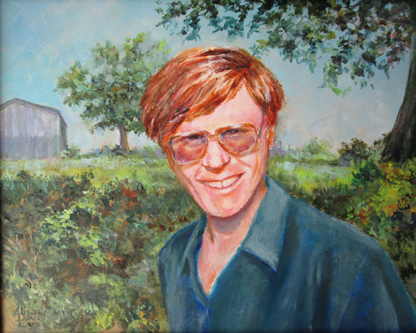
Recently
I was commissioned to do a house portrait of a small brick home and
surrounding buildings. It was painted from various photos supplied by
the client, and was to be set in the spring. This commission came at
a great time for my ongoing colour studies.
I set
myself an artistic technique goal within the commission's outlines: I
wanted to replicate the muted less saturated or grayed tones of the
photos while keeping the 4 step values that show mid day sunlight and
shadows. My “normal” work flow is to use a series of acrylic
glazes to get the values while emphasizing the colour intensity. In
this case I decided to switch to an opaque painting style......using
my premixes of Golden OPEN colours to maintain the right values/hues
over various painting sessions.
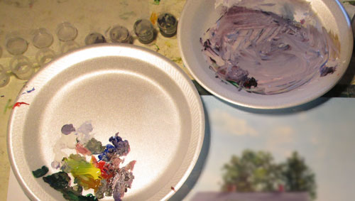
I
started out with the usual suspects of a medium red, cobalt blue and
a yellow. I added in a phthalo green, raw umber, and ultramarine blue
for my darkest darks. I premixed a drab olive green, and an almost
black grey green, a redish dark and a slightly lavender dark. You can
see where I stored these premixes in the itty bitty capped plastic
containers. They kept the OPEN acrylics wet through out the two
months or so I was painting on this commission. I used the grayed
lavender mixing dish to pull the color slightly towards blue for
highlit surfaces....i.e roof, driveway and asphalt road. I pulled it
towards red for shadows in the brick house.
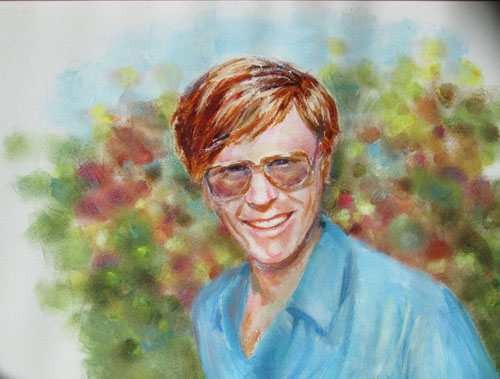
Lately
I've seen pics from some websites, that are color swatches, showing 4
or 5 colors that go well together. They can be used for inspiration
for color schemes for anything from interior decorating to coloring
books. This is a color swatch I made for this painting:
This
swatch was done AFTER the painting was finished....NOT before as a
useful color reference might be. But it is very useful to 'splain
back to myselves just how color theory can work. I've been reading
lot from the lovely painting books by James Gurney of Dinotopia
fame.
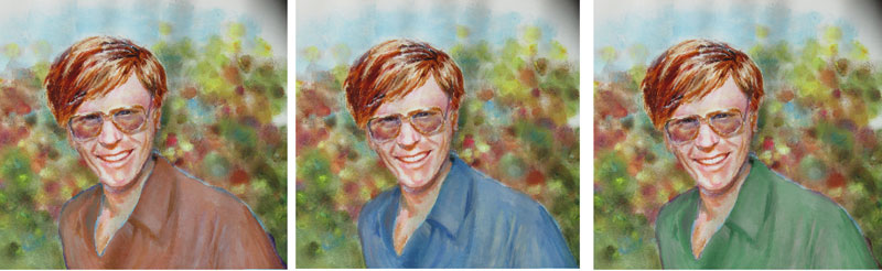
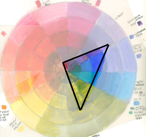
he
suggests that gamut masking can suggest a wide range of colors that
will “hang together” no matter the subject. The “why” for
that can be shown with my home made color wheel and a triangle cut
out of frosted plastic.
The open
triangle shows the colors that appear in the painting, which were
“copied” from a real to life photo. The muted reds,lavenders,
blues and greens “hang together” because they appear in adjunct
spots on the color wheel outlined by the triangle....or a triad color
scheme.
In my
next painting I definitely want to try this kind of color exercise
BEFORE I start to paint.

