
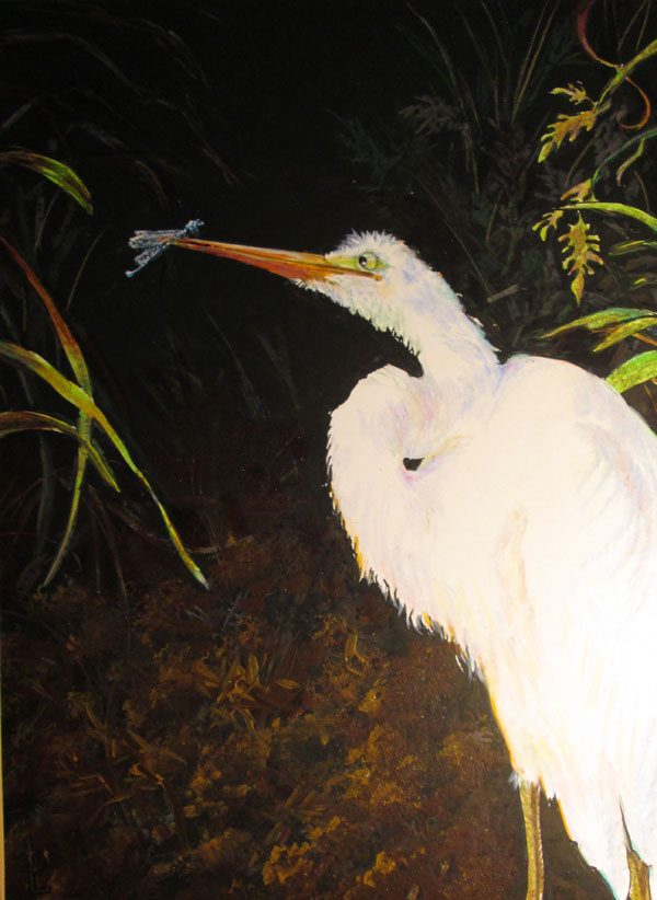
Colored
Pencils (various brands), india ink, and a bit of acrylic glazes
on Hi
Line Illustration board
11x14
inches
Photos
used with permission and approval of Frank Lyne
This
piece is another experiment in mixing media. Frank had taken a
dramatically lit photo of an Egret that stopped by our pond this
summer. The camera captured the totally white Egret against a
background of the very dark muddy brown pond dike bank, but struggled
a bit to encompass the two extremes. I thought it was an excellent
time to try to work again with using coloured pencils over a black
india ink base.
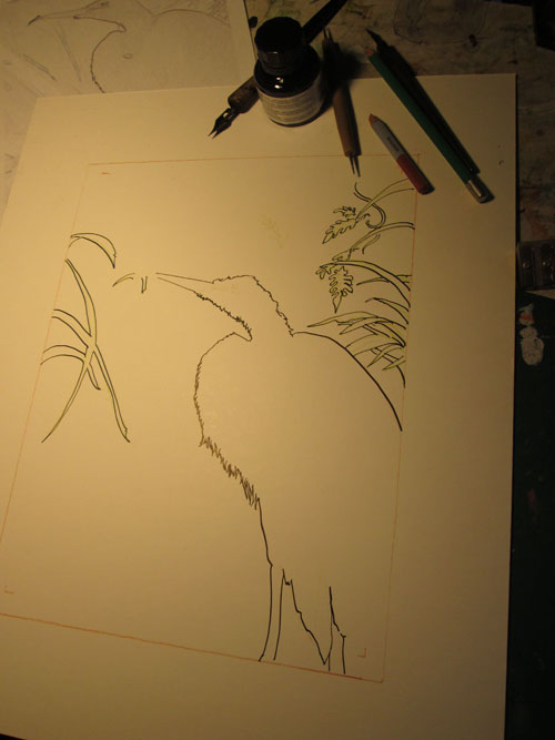
I
sketched out the egret and a few leaves in black india ink. Then the
fun began!
Taking
an old cheap brush, I laid in black india ink all over the
background. I tried to brush the ink on with broad swoops of ink,
leaving a bit of the white board to gleam thru......to show movement
of the background grasses, ever so faintly. I very carefully drew,
negative style, around my already inked outlines. For this
part I used an ancient speedball quill pen. As any of y'all who have
inked in graphic novel kinda work knows......it really takes
concentration to ink in ONLY the spots you want black.....and leave
everything else alone.
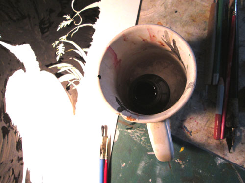
Another
habit leftover from when I did lotsa black and white work......I keep
my bitty bottle of india ink deep inside a stable mug. And ask me why
I do this???? 'Cause gravity + slightly inclined drawing table +
open bottle of ink = very interesting “Rorschach test” spots all
over the floor, my drawing and myself. Lesson learned!
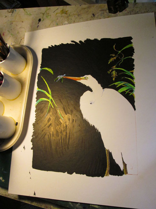
Now we
get to the good parts. I started laying in the brite green base of
the foreground grasses, and the eye and beak of the egret. I first
drew in the damselfly “in distress” sitting on a piece of grass
the the egret had grabbed. But I later decided that the green grass
was too distracting, visually, and did away with it. After verifying
that the size ratio of the damsel fly vs the egret was about OK, I
finished detailing the iridescence of the damsel fly's wings and
body and gave it a gloss of iridescent paint.
I next
worked on the muddy pond bank with a combination of colored pencil
strokes and scrubs. The colored pencils were also used on the
background grasses and leaves. I really liked how the difference of
the coloured pencils on the black color absorbing ink contrasted with
the coloured pencils on the reserved whites of the foreground
grasses. A good case of using what I'd discovered in a previous piece
to get just the effect I wanted on this one. I finished off the mud
with a light bit of sponging (using a sea sponge with a bit of mud
coloured acrylic paints) to abstractly detail the mud clumps at the
pond's edge.
I then
gave the egret a good working over......with very light pencil
shading with pastel coloured “shadows”. I wanted to showcase the
twists and turns of his verrrrrry looooog neck and fluffy
feathers.....but keep the “glow” from the bright afternoon
sunlight. I finished up using some slightly duller greens over the
foreground grasses to keep them a design element....and not
competition for the main character.....the egret.
I really
liked experimenting with this technique. I feel that this technique
lends itself better for gallery work than for illustration. The
extreme value contrasts that makes it exciting when viewed “on
person” in good lighting, might work against the piece if not
scanned in correctly. Digital software can only do so much to
contain a really big value difference in this piece of art.
