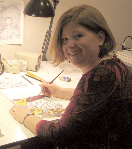
This
is a post about character development in my most recent picture book,
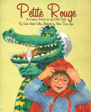
Petite Rouge: A Cajun Twist to an Old Tale, Pelican Publishing 2015.
I
was tagged for this Blog Tour by the lovely and gracious Christine
Mix. Check out her blog tour post, about her picture book
character “Spike” at:
The
first question in this installment of the “Meet My Character”
blog tour:
What
is the name of your character?
The
character's name, Petite Rouge is French/Cajun for “Little
Red”.....or Little Red Riding Hood. Tackling such an old fairy
tale, that has been done so MANY times before, was a bit daunting.
When
and where is the story set?
In
Sheila Hebert-Collins' retelling, even tho' the woods was traded for
a swamp (Cajun = Louisiana = swamps) and the wolf traded for a gator
and the time is “today”.....the basic story was about the same.
What
should we know about her?
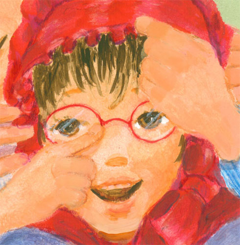
Each
time I'd read the story, I was struck by the same thing; Little Red
Riding Hood, a perfectly “normal” looking little girl, ALWAYS
failed to 1) recognize that the wolf in the woods was the one her
mama had warned her about and 2) realize that the “grandmama” in
the bed, was NOT her grandmama......and I'm going “Wait....what???”
I
know the point is to get the little reader to start saying.....”Watch
out Little Red Riding Hood”.....and “know” something that the
main character doesn't seem to pick up on.....but seriously???
So
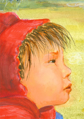
in my version, I gave an explanation that makes sense to me. Little
Red Riding Hood or Petite Rouge is near sighted, and wears glasses.
The villain steals her glasses rendering her incapable of seeing that
he had taken her grandmama's or grandmere's place.
Now
this was something I could work with.
What
challenges did you have in telling the story?
Shelia
Hebert-Collins gave me a wealth of scenes and dialog to work with in
telling Petite Rouge's story. But to add in my bit-o-verve in the
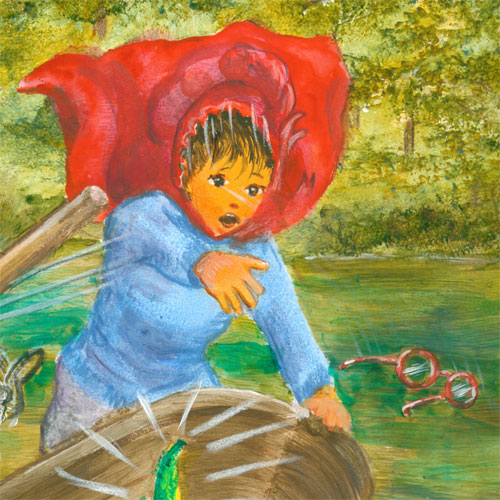
story, I picked up on one line that told of Petite Rouge taking a
small boat thru the swamp to get to her grandmere's house. During
that boat ride, the evil gator BUMPS the boat and knocks Petite
Rouge's red glasses off her nose.......
and
into the swamp....where he swallows them down.......
rendering
her only able to squint to try and see who she is really talking to.
What
goals did you set for yourself in telling this story?
My
main task was to tell the story as written by Shelia Hebert-Collins
adding my own bits of (color) spice to the mix. One of the first
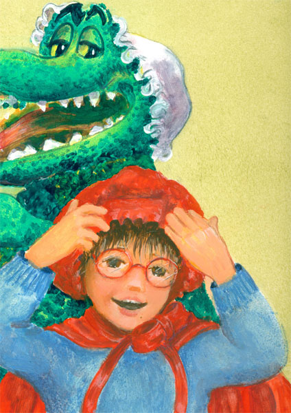
things I found I could use was the actual color play of the RED cloak
and hood ( garde-soliel or sun bonnet) that Petite Rouge always
wears, against the intense GREEN of the evil gator.
I
intentionally lowered the chroma (color intensity) of the background
swamp/house interiors to allow the eye to go directly to the very
very RED of Petite Rouge's clothing and the virulent evil GREEN
(Phthalo green glaze over a arylide yellow underpainting )of the
wicked gator. Secondly I found that I could emphasize the fact that
Petite Rouge wore glasses by making them red. I had both her mother
and grand mother also wearing red glasses, since near sightedness
often runs in even fictional families.
I
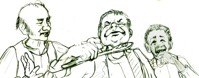
also had a blast working with a few of the secondary characters.
These secondary characters.......
had
been in a sketch done years ago, and found their way into the book.
They are pivotal at the end of the story where they........oops! No
spoilers! You'll just have to get the book to see how Petite Rouge
gets on.
And
now onto the next in line for the Meet My Character Blog Tour here......
my
Midsouth SCBWI friend, the totally: “Fabulous Illustrator” Mary
Uhles:
Mary
Reaves Uhles has created illustrations for clients such as Cricket
Magazine Group, McGraw Hill, Magic Wagon Press, and Thomas Nelson.
She is currently working on THE LITTLE KIDS TABLE, a picture book for
Sleeping Bear Press, available in the Fall of 2015. Previously she
illustrated BEYOND THE GRAVE, a chapter book in the Up2U Adventure
series from ABDO Publishing. She has twice been awarded the Grand
Prize for Illustration from the SCBWI Midsouth Conference. Her piece,
Eat, was a finalist in the 2014 SCBWI Bologna Book Fair. Prior to
beginning her career as a freelance illustrator, Mary worked as an
animator on projects for Warner Brothers and Fisher-Price
Interactive. A PAL member of the Society of Children's Book Writers
and Illustrators, Mary lives with her family in Nashville,
Tennessee. Since creating characters and stories is her favorite
thing in the world (even more than mocha fudge ice cream) she feels
mighty lucky to do it every day in her hilltop studio.