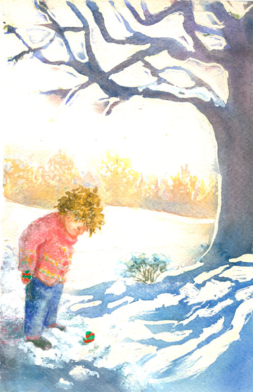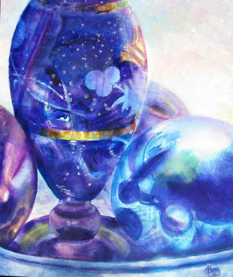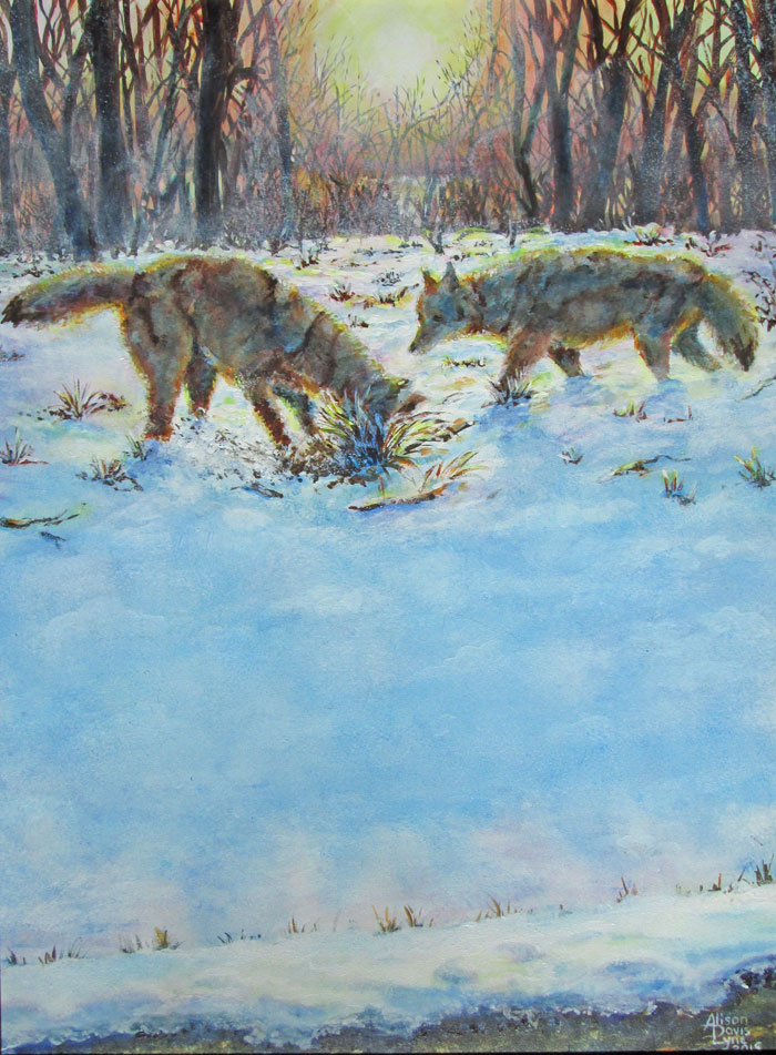
Coyote Sunset
12 x 18 inches
Acrylic
This
post is a continuing of my (warm weather) interest in painting all
things snow. Frank got me some lovely snow shots this winter and the
last, and I've been pushing back against 90 degree temps and
humidity, by painting all sorts of snow scenes that I just couldn't
even contemplate while the temperatures were 0.
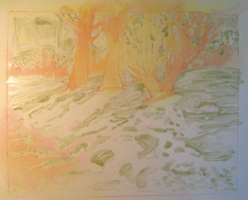
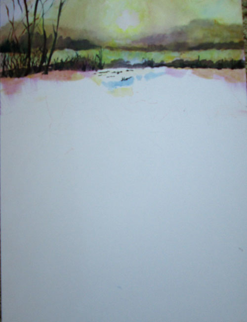
For this
painting, I choose a late sunset snow scene, and paired it with a
couple of shots of coyotes, that Frank had gotten a few years ago. I
wanted to work in acrylic paints, using them both impasso style and
glazing. I started out with glazing the late afternoon colours in the
background trees, to get the translucent atmosphere of a late winter
sunset. I painted in more of the background trees, leaving the mid
ground alone.
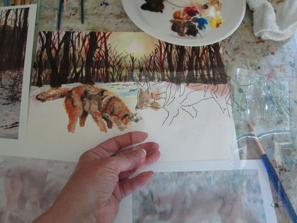
After
that had dried I began with opaque impasso painting of the coyotes.
I purposefully choose the reference photos because they DIDN'T have a
lot of detail. I tend to really add in details, which sometimes is a
good thing.....and sometimes it can work against the “feel” of a
painting. In this case, compositionally, I wanted the main action
to be in the upper third of the painting, leaving the other two
thirds for the snow shadows. This put the coyotes in the middle/back
ground. In addition, with the low light of the sunset, the coyotes
were going to be backlit, and have a sunset “halo” in their fur.
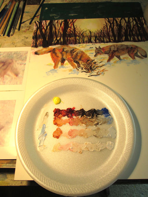
I painted both coyotes impasso style.....i.e. With broad strokes of colour to mould their forms, fur and all, and leaving off details. I used earth colors for most of their forms, but left the “raw” reddish hues of sienna and umber, since I was going to glaze over it later. Since I was using "open acrylics" i.e. slow drying acrylics, I made a quickie color value grid on my palette.
After I
got the coyotes to suit me, I began the glazing process for the
coyotes' shadowed sides. I glazed cobalt blues over the coyotes and
snow shadows. I followed that with some red glazing and finally a bit
of yellow glazing for touches of the setting sunlight. I alternated
this with heavy white impasso painting where the snow mounded up and
interrupted the shadows. I finally “brushed” out the coyotes'
coats all around their outline for the “haloed” effect of the
backlighting sun, using a bit of yellow glaze for the final effect.
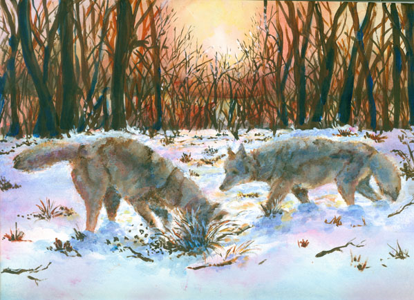
After
finishing the coyotes, it was (ahem!) all downhill. Literally! I
sponged in the foreground blue shadows of the hill of the right away,
and the corresponding dip up to the road, leaving white sparkles for
the bit of snow hit by the sunlight. I had fun making the small lacy
slush piles by the road and their corresponding shadows. I
alternated white paint and blue glazing, with just a touch of a red
glazing with the sunlite yellows, to show the effect of the mounded
snow. A few multi colored glazes finished off the black sunlit
pavement. I felt that this painting had a really nice mix of
painting styles and colours and had a blast doing it!