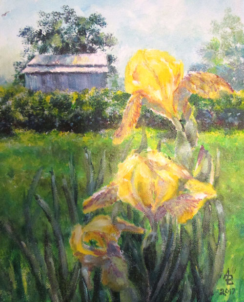
Barn
with Yellow Irises 8x10 inches acrylic
Today
I'm talking a bit about establishing a focal point in your painting.
In this bitty painting, I used a photo I took of one of our barns, in
the background. The foreground interest was some yellow irises in the
back yard. I decided to paint this on a small canvas, changing the
focus from the foreground yellow irises to focusing on the barn in
the background.
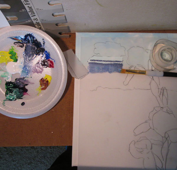
I began
with a pencil outline on tracing paper of the photo. I cut out the
barn outline on the tracing paper, and laid it over the canvas'
already painted blue sky. I then painted in the barn's reflecting
roof and darker metal sides. This only took a few brush strokes of my
already mixed colours.
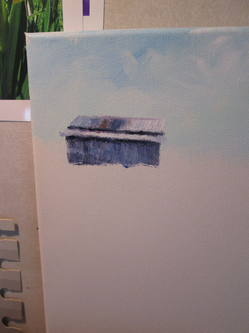
You can
see here how well the stencil worked to lay in the barn, just where I
wanted it, with a minimum of fuss. I easily got a nice sharp outline
to focus the eye on the main subject of the painting.
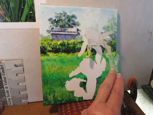
I
proceeded to work on each section of the landscape in the same
manner. Here I've gotten to the foreground irises which I had left
outlined when I painted in the surrounding grass and bushes. The
tracing paper stencil left me a beautiful outline of the iris blooms
without a bit of pencil sketch showing thru, since I didn't use any pencil to sketch!
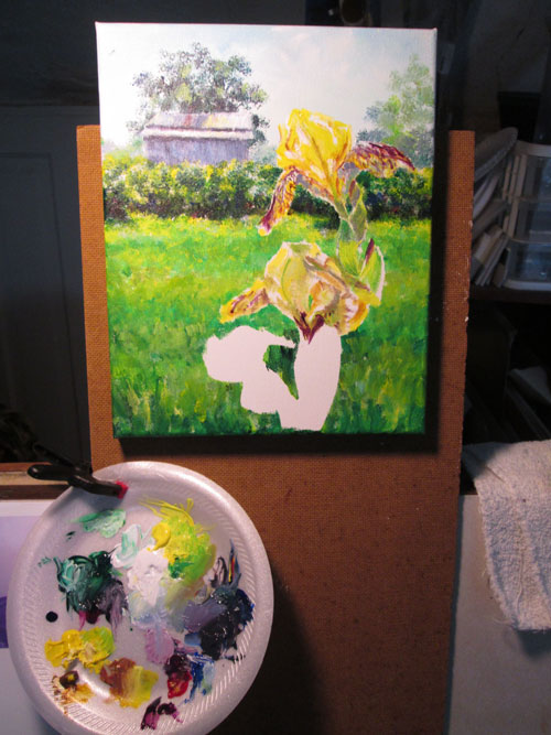
Here I'm
working on the yellow irises. Tho' I worked a fairly tight detailed
painting on the irises at this point......I later went back and blurred the
petal outlines, and reduced the chroma (intensity) of the wine
coloured lines on the petals. All done to leave the impression of
backlit yellow petals in full sunlight, but leading the focus of the
painting back to the barn. This was helped by the detailing I painted
on the barn, it's straight lines and intense shadows pulling the
viewer's eye back to the area of higher contrast in value and
detailing.