Tuesday, October 9, 2018

Blue On Blue......Did I Mention It's Blue?

Blue on Blue
12 x 12 inch gallery wrapped canvas
Acrylic paints
From my own photo

This is a bitty blog about a bitty blue painting called “Blue On Blue”. 
It might be I have a certain fondness....uhmmm..... maybe a teensy obsession....... with “midnight blue” or cobalt blue or Phthalo blue. The other day I found an old photo of some bluebells I'd photographed in a mini photo shoot, dramatically lit with cloth drapery. I pulled out a small 12 x 12 inch canvas and began to paint

I decided on a analogous (colors close together on the color wheel) color scheme, with ultramarine blue, phthalo blue, and a deep magenta violet with a compliment of a warm deep brown. A few light grace notes were included for the pastels of the budding pink bluebells.


I saw immediately saw I would have to drastically simplify the background in order to focus on the delicate flowers. As you can see from my photo reference I cut out all the extraneous background items and kept it a deep dark value. You can see my little post it reminder to check: Light vs Dark, Sharp edges vs Soft ones, Linear lines of the glass vase vs the masses of the cloth and bright intensity of colors like the green backlit leaf vs the greyed drapery behind.


The painting quickly came together, and I got my “blue” fix for a little while.

Wednesday, September 19, 2018

Creek Time

Creek Tyme
36” x 36” gallery wrapped canvas
Acrylic paints
My photo references

This week's painting is an homage to the “good 'ole summer tyme”, here in the waining days of summer. Frank has taken so many lovely photos of our local creek, I really wanted to incorporate one in a painting. I picked one beautiful photo showing a bend in the creek with overhanging trees and a shaft of sunlight streaming in the breaks in the leafy canopy. I paired that with heavily changed bits and pieces of photos of folks from different events we've attended in the past. I wanted to give the feel of families going for a late summer day picnic at a local watering hole....of the scenic and swimming type.

I composed my painting to fit the somewhat unusual square shape canvas I had on hand. I began the painting with a flat colour lay in of basic shapes.


The painting went pretty quickly as I had already done my prep work. Here you can see I have taped on the canvas for quick reference, a bitty color thumbnail sketch showing the figures' changes in light and shadows, my original pencil sketch of the figures and small pencil sketch on tracing paper taped onto the photograph of the creek to find just the right placement.


I had intentionally made the composition fit into the square space by using the pointing finger of the left hand mom as a starting point for a swirl of sunlit points that led up to the far bend in the creek and swept up into the leafy sky.


I enjoyed picking out the details of the two busy mom's “mom buns” and cell phones in back pockets, along with the second mom's backpac with extra diapers and sippy cups. I luved that the two moms just took time to pull on plain white t shirts and jeans and pulled their hair back in scrunches and buns. But you can tell one mom took the time to dress her toddler in a fancy new jean jumper and a bow for curly hair. And the other mom gave in and let her little girl wear the frothy dance skirt she's been living in, while doing her hair up in a ballerina bun to match her mom's. Painting in these kind of details plus capturing gestures of closeness was extra fun to paint in contrast to the magnificent nature view.


Tuesday, August 14, 2018

Beaches or a Dip Back in Time


Beaches
16 x 20 inches
Acrylic paints on gallery wrapped canvas

This painting is a hat tip to the “good ole' summer time”......with the emphasis on the “old”. I found a lovely old sepia coloured family photo showing this neat seashore scene. The figures were blurred but did show turn of the last century swimsuits......for the men what looks like a long t-shirt and knee shorts. The women......a knee length pair of “bloomers” over stockings covered over with a knee length dress and perched on their heads a “shower cap” swimming cap. And a lot of this is made of a wool (?) blend of fabrics......in the summer.....in the water.


I started out by roller brushing on the blue sky and bluer still water. I'd masked off the figures to reserve the white and their outlines. I added in the water line in the sand.

You can see the sepia toned photo I was working from in the upper left of the pic. The outline drawings directly above the painting is pen on clear acetate. I often use this to check where I have located my figures, when the paint is still wet.


I established the main two figures to get a “read” on how they should look. You can see the reserved white outlines of the other figures. I just begun to model the sand and waves breaking on the shore.

I carried on with fleshing out the other figures, and had a great time doing the waves coming in, the splashing of the children, and the wave-lets coming to shore on the sandy beach.

Saturday, August 4, 2018

Street Festival or a Study in Light and Shadow

Street Festival
24 x 35 inches gallery wrapped canvas
Acrylic paints
My own primary source photo

This is a bitty blog post about a really BIG (for me anyway) painting. I decided I wanted to do a city scape painting with dramatic shadows and this old photo I had,fit the bill. I did some judicious rearranging of a few of the elements to get the “look” I wanted and began painting.

I first laid in big blocks of flat colour using a lotta really dark red for the shadowed side of the building. I used a T square to reddi-up the white window frames and doors.

After laying in the shadowed windows, I went over with a roller brush, the really dark shadows of the building with a muted brick red. I wanted the brick texture without details. This was going to be glazed over in the final steps of the painting.

To establish the lightest lights of the painting I turned to the background buildings which were in direct sunlight. I painted in just enough of the buildings details to establish the 3D-ness of the buildings....but not much else.

Towards the end of the painting I experimented with a lighter tone for the foreground pavement. It looked “OK”......but I'd lost the drama! So as I finished up the crowd under the blue awning and the foreground people.....I quickly switched back to a really dark foreground pavement colour, and got back my “POP”!

I finished things off with multiple dark glazes in the deeply shadowed areas with a few bright and light colour highlights, like the red tent and the toddler's balloon as he rides on his daddy's shoulders.

Saturday, June 30, 2018

Winter Wheat Sunlight or Portrait of a Blade of Grass

Winter Wheat Sunlight
24 x 30 inches acrylic on gallery wrapped canvas
photo reference my own

This painting I decided to stay a bit closer to home......in fact right outside our house. This barn is at the top of the hill in the front field. The deep green grass by the fence row in the foreground is actually planted in winter wheat. This is done, in the early fall, mostly to keep the bare ground from washing away with winter rains. One really neat thing about winter wheat is that is sprouts in the fall, just when all the summer greens have faded, and even the trees are starting to loose their fall colours. Often in the dead of winter, when everything is a shade of gray......you'll see a field of winter wheat, all bright and spring green......and it'll remind you that spring isn't too far away.

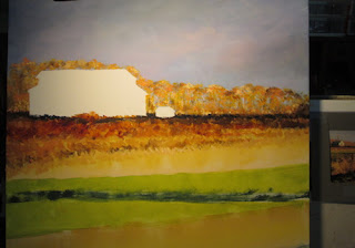
I took my source photo, that we'd taken one afternoon on our walk, and I laid it out on a vertical canvas, using sponge brushes. I was interested in using the late afternoon shadows to compose a “Z” type pattern. 


I had left the barn covered while I painted in the sky and line of trees, so's I didn't have to be too persnickety about staying in the lines of the barn.


By now I had basically done the top half of the painting. For the bottom half I needed to establish the winter wheat and the afternoon shadow......but without too much detailing.....after all I was going to paint grass all over it!


Here I am using a loooooong brush to paint in the many, many, many blades of grass. I know it looks like I'm painting too many grass blades......but it's really kinda relaxing. After you get the flow of how you need to swish up then down with the brush......it's fun!


After I finished the painting, and had it hung up on the wall.......it was a treat to have the afternoon sunlight flow across that winter wheat green.....and really light it up! Nature and art co-existing!

Saturday, June 23, 2018

Romantic Roses or Mapping out a Technique

Romantic Roses
8 x 10 inches- stretched canvas
Acrylic paints from my photo

This blog post is all about organizing steps to a particular painting technique....and some pretty roses. I wanted to cement in my mind some basic steps to painting with opaque paints in a slightly impressionistic stye. Flowers are really great for exploring technique.....they have lovely colours, they usually are great “models” for resource photos, and they have many complex surfaces that do really nice things for shadows.

So I picked a reference photo out of my stash, choosing one that had the flowers backlit in the sunlight on the counter. The first step was to get rid of the “white canvas syndrome” by setting up the composition in stark black and white terms.....by outlining the roses with black paint and just leaving a white silhouette of the roses. I then began to lay in some “local color” i.e. pinks for the actual roses. I'm just laying in swaths of colour without doing much of anything for detailing. I just want to “sketch in” the form of the roses.


The first stark black and white only layer was to get my value composition set. It was the strongest the composition was ever going to be.....but it lacked any colour/detailing/beauty. By layering in greyed pinks I began modeling the roses in colored values. This allowed me to put in just those colours that showed the modeling of the form of the roses while still keeping the strength of the stark dark and light of the original layer.

After having done the composition and value portions of the technique flow.....I next turned to the aspect of warm and cool colors and the “push/pull” of how they can be used to visually push back or pull forward a form. The flowers were in a “high key” or very light in value, so I put out some light value warm and cool colors and began painting. 


As I modeled the roses' forms, I tried to constantly remind myselves that I only needed those details that established the roses' forms and that what the painting “needed” was the most important goal. I wanted the focus of the painting to be on the lowest rose so I did the most modeling/detailing on that rose. It also had the most intense colours and the most contrast of value and warm/cool colors. 


I think I accomplished my immediate goal of trying out my “simplify” plan of painting......and showing off some pretty pink roses.


Wednesday, June 6, 2018

It's Raining Kewpie Dolls!......or How a Media Blitz Helped Win the Vote for Women

It's Raining Kewpie Dolls
8 x 11 inches Watercolours and acrylic paints on watercolor board 
Basic photo reference a family photo of my grandmother

This week's blog is about a fun mixed media piece called It's Raining Kewpie Dolls. I had done the original watercolour painting of the two women dressed in 1910 era clothes a while back. I did the watercolour from an old family photo of who I believe was my grandmother and a relative (?) who was pointing up in the sky. In my watercolour, to show what the relative was pointing at, I made up the shadow of a bi-plane .....and adjusted the second figure so she was looking up. But once I was finished with adding colours …... I didn't quite know where the watercolour needed to go to finish the itty bitty story. It sat in the finished bin until recently. 

I've been working on a painting series about the effort to win women the right to vote. The 100 year anniversary for the passage of the 19thAmendment is coming up in August 2020. In my reading I came across a neat story about what would be called today a media event. Apparently in November 1914 a convention of the National American Woman Suffrage Association was held in Nashville Tennessee. A week after the convention, at the Nashville Fairgrounds a female pilot, Katherine Stinson staged an air plane demonstration. As she flew over the assembled crowd, she let loose a shower of Kewpie dolls with little banners saying “Votes for Women”. The itty bitty dolls floated down on tiny yellow parachutes. Well, I couldn't let an artistic opportunity like that pass me up!

I pulled out the watercolour, and began sketching Kewpie dolls.


I did a bit of altering of the original watercolour to fit the facts on the ground, so to speak. Since the Kewpie doll event was actually in November and was described as quite cold, I gave the girl looking up a heavy white suit coat to go along with her elbow length gloves. Using acrylic paints, I changed the background scenery to a more autumn dull green. Then I got down to painting Kewpie dolls. I made up a parachute, and painted them “raining down” on the crowd.

A quick bit about Kewpie dolls......they were popular line of figurines based on illustrator Rose O'Neill's cherub-faced comic strip character. She became one of the highest paid female illustrators in the country from the use of the Kewpie image in advertising as well as sale of the dolls. They became a household name.....and in addition to appearing on a throng of household items, were used by Rose O'Neill to promote the women's suffrage movement.
Needless to say, I was quite gratified to learn that in that even in that era (1910), a (female) illustrator not only thrived.....but flourished with her art!

I got to tell a bit about a past era's effort to win the vote for women.....and got a great story ending for my original watercolour painting.

Wednesday, May 16, 2018

My Robert Penn Warren painting on the cover of Kentucky Humanities


This is just a quick blog post to show off the lovely Spring 2018 Kentucky Humanities cover, which is my recent painting of Robert Penn Warren. This painting also appeared in Historic Todd County's book; T is for Todd County. 
I so appreciate the nice folks at Historic Todd County for choosing me to do the Robert Penn Warren portrait along with four other interesting portraits of people and events in Todd county. I also want to say how much I appreciated the wonderful help of the Dept. of Library Special Collections, WKU for providing me with just the perfect reference photo to use in the making of the painting! Thank y'all!

Tuesday, May 15, 2018

Networking-Old School


Networking-Old School
24 x 30 inches acrylic paint on gallery wrapped stretched canvas
Photo reference for the interior room ( Clarksville TN. Photographs, Drane Collection titled Interior of Room) used with the kind permission of AustinPeayStateUniversityFelixG.WoodwardLibrary,Archives&SpecialCollections

This time around I'm talking a bit about my most recent painting, “Networking-Old School”. I started out with an idea for a painting showing how suffragists might have begun their networking in support of getting the “votes for women” or the 19thAmendment passed in 1920. I wanted to show how local ladies would gather at one person's home or another, have refreshments and mingle and chat......about the weather....or the possibility of getting to vote, and the impact that could have on their everyday life. 
In a local Clarksville history, I found a listing noting that in February 1918 a CESL (Clarksville Equal Suffrage League) meeting was held at the home of Emma Lupton. Then a lovely local volunteer researcher found me images of both Emma Lupton and Lulu Epperson another Clarksville Suffergist. The final icing on my “research cake” was lucking up on an interior photograph of a (sadly un-named) Clarksville home of the period. With the kind permission of theAustinPeayStateUniversityFelixG.WoodwardLibrary,Archives&SpecialCollections I had the final piece of the painting in place. 

I sketched off the basic structure of the room and the lovely old wood marble top table, as my focal point. I positioned the two main characters...Emma Lupton and Lulu Epperson interacting with an un-identified lady. Here I was just feeling my way as to overall composition and colours. I decided that I wanted three younger women grouped in the second room.


Then I began developing the painting along, one section at a time. I wanted to show interactions between the foreground ladies.....


with Lulu Epperson talking animatedly to a smartly dressed friend.....while Emma Lupton, the hostess, fondly looks on at Lulu's enthusiasm. The striped dress Emma Lupton is wearing comes from an old family photo I had of an ancestress posing on a sunny porch.


Aside from the enjoyment I had getting all the bitty details like I wanted them.....the glint of the light off the marble table top and the sheen of the bronze vase holding the yellow roses (also a symbol of the suffragist movement) I added two or three women's suffragist pamphlets and newspapers. In addition I wanted to add a photo credit for the use of the photograph of the home's interior. I did this with help of a bit of computer wizardry. I typed up the photo credit in a computer program, scaled it to fit as a magazine on the painting, “twisted it” perspectively to look like it was laying down on a shelf and printed it out on a sheet of paper. I physically cut out the paper and glued it down onto the canvas, and glazed over it with clear acrylic varnish. 


This was an all together fun painting to work my way through......solving different ways to make it look like what I had seen in my mind's eye. I especially enjoy bringing into view, the small unsung, everyday bits of a BIG historical movement.....one little vignette at a time.

Wednesday, April 11, 2018

Music Hall...Playing on a Mixed Media Theme

Music Hall 16 x 20 inches
Acrylic, Watercolours, and Colored Pencils on watercolor board

This painting is another entry in my ongoing play with different media, in this case using acrylic paints and clear gels, watercolours and some colored pencils. 

I got the idea for this violinist from an old 1920s family photo. Apparently this ancestress played the fiddle in a band in the 1920s. I had another photo of her in this glam dress from the same era. So I took yet another photo of an un-related girl playing her fiddle.....and combined them all together.....taking great liberties with the features and background. I envisioned the young lady playing her fiddle in a 1920s era “music hall” or pub. 

My other motivation for this painting was to play with a technique I discovered a while back. I wanted to do a mullioned stained glass window......but without having to do all that pesky lead work for the design. So I started out taping off my window and glazing it with a couple of watercolour washes to show the evening lights coming thru the stained glass....


After the watercolour was totally dry, I laided a plastic stencil over the watercolour wash and brushed a clear acrylic glaze over the entire wash area.....


You can see here how the clear acrylic glaze seals the watercolour wash under the “glass” pieces.....but NOT where the stencil covered what will be the leaded strips.

Then I took some watercolor darks....browns, blacks, blues......and washed them OVER the entire window square, excluding the music hall lettering. The watercolours sank into the un-glazed portions of the window leading.....but was easily wiped off from the clear acrylic glazed window panes! Instant window leading.

I continued with the rest of the painting, using watercolors, coloured pencils and some acrylics. I used watercolours where I wanted an “organic” graduated wash, like the dress silhouette and the wall. I used coloured pencils for the violin, window sash and lettering since I needed the preciseness of the pencil tips. I finally used acrylics for her arms and face and for texture in the wall.


And this is the outcome.......hung on a wall in an art show.


Wednesday, March 28, 2018

Garden Party-Chairs...or How I got out of a Compositional Corner


Garden Party-Chairs
10 x 20 inches acrylic painting on gallery wrapped canvas

This week's painting was a “twice-finished” painting. I “thought” I'd finished this painting last year.....but after a while of walking past it again and again I felt that I hadn't quite finished it. Here's what it looked like:


As you can see most of the main elements of the painting have been done, but it somehow lacked cohesion. This is one of those paintings that I started out thinking I had a plan.....but really didn't. I wanted the story in the painting to “read” left to right.....just like you read a book. The composition was horizontal, to fit with the shape of the canvas. But there were gaps in the flow of the action.

So I went back to one of my painting technique books, and found a solution. A lot of paintings' composition can be roughly compared to letters in the alphabet. Some paintings have a “C” type of composition, others more like a “L”.....and I decided that my painting needed to be shaped more like a “T”. To that end, I added in more chairs to the center of the painting, to lead the eye into the painting.
I added another small figure in the background to help balance the new larger female figure looking off to the right. I also added a small poochie running after the little rascal that caused the boy to upend his chair along with his hamburger. Both these characters are being egged on in the chase, by their dad who is laughing.......
This doesn't seem to bother the young courting couple in the center left......

or the father and son (in matching outfits and red glasses) on the far left. They don't seem to be bothered by the uproar at all, if the little boy with his two hot dogs and huge piece of cake is any judge.

And if this isn't enough....I added a bit of whimsy on either end of the gallery wrapped canvas.
On the right side I have the little girl scampering away, giggling, after she goosed the boy and made him overturn his chair and chase her.


While on the left hand side I added a puppy licking his chops eyeing the dropped hamburger, while he plots how best to steal it.


Sometimes too much in a painting can add up to being just enough!

Wednesday, March 14, 2018

Before the March – Clarksville Suffragists

Before The March
11x14 inch acrylic painting on gallery wrapped canvas

This blog post is starting off an occasional series of paintings featuring my take on the local suffragist movement to pass the 19th Amendment granting women the right to vote. I want to highlight local women's contribution to that cause. In researching the suffragist movement, I found a lovely photo on the Clarksville Arts and Heritage website.....


Clarksvillian Constance Rudolph (first row, center) is only one identified, date unknown.
(photo courtesy of the Montgomery County Archives)

Seeing all the lovely young ladies in white, being shepherded by two women leaders in dark suits and bowler hats......I couldn't help but wonder what the scene might have looked like as they were gathering together before their march. I love imagining what might have happened before/after a photograph was taken.

So I began to design a composition.....

I settled on a sunlit bit of grass for the suffragists to gather together into their march formation. I really wanted to highlight the young ladies white dresses and straw hats or “boaters” against the contrast of the shadowed trees. I also wanted to add in, in the background, a few male onlookers scoffing at the gathering. The symbolism of the gentlemen in dark suits and hats, lurking in the shadows of the trees against the white of the sunlit young women's dresses was a compositional perk not to be wasted. I also liked the “messaging” of the two march leaders.....dressed in “serious” dark dresses and suit coats with the “take charge” bowler hats....usually only worn by men. I did want to note that there was in the photograph, a couple of men in the group....whether sweethearts, brothers, or “suffra-gents”. To add this note, I added one young gentleman talking to the standard bearer on the right.


Here I've gotten the composition firmed up and gotten the basic colours set in. I had added in some white marking a curb......as a design feature. I wanted to draw attention to the urban setting for the march and as visual “pointer” to an out of sight young lady rushing to join her friends in the group. In the finished version I put the young lady running towards the group in the main front view to connect the curb and the background hecklers. This is done on a deep gallery wrapped canvas.....so she is finished out “around the corner” so to speak.


I've had a blast painting this subject, and even more fun researching the stories about this movement. 

Tuesday, March 13, 2018

2018 US Bank Celebration of the Arts Open Art Exhibition


This is a bitty-bitty blog post just to let ya'll know about the 2018 US Bank Celebration of the Arts Open Art Exhibition, at the Kentucky Museum March 3-April 7- Monday thru Saturday 9-4 in Bowling Green Kentucky.

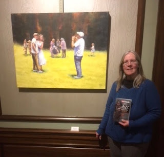
We got to visit the art show last week and took our annual photos of our artwork at the show. Frank and I both had two pieces of artwork in the show. We did have to search through over 400 other pieces of artwork displayed in five different parts of the Museum! I believe that that is a record number of entries for this show......it keeps growing each year.

There were artwork pieces of every kind of description.....anything from a group of kids (of the young goat variety) escaping their leash to ceramic castles with fully furnished interiors! So many artists with such a variety of artistic visions.

Frank had his Teacher and Firebird displayed in two different rooms. I've linked to my blog posts for each sculpture. I had Garden Party and a new piece called Music Hall.