
This
week I'm working on a commissioned piece. I did this color study
chart to determine just how much color I can include, as it's
supposed to sorta kinda “match” a previous portrait by another
artist. It's for a Christmas gift.....so I've fuzzed the image to
protect the surprise.
While
working on this color study, I was struck by a running theme in my
artistic life.....colour. In any bio I've written, no matter the
audience, I reference my love of colour. Ever since I got my grubby
paws on that 64 color crayon box, I've loved playing with color. I
got into fiber arts (knitting, crocheting, spinning), just so's I can
have luscious colours run thru my fingers. Being able to use all the
color I wanted led, in part, to my children's picture book
illustrations.
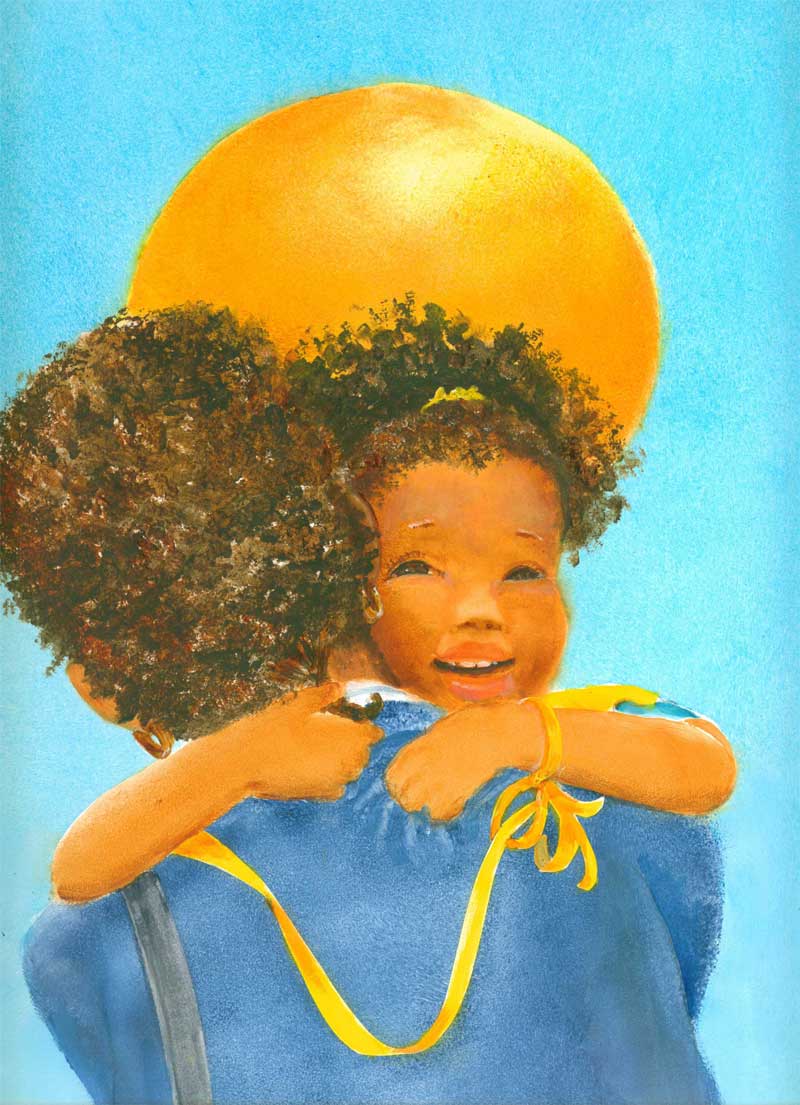
(Acrylic
paints on bristol board-back cover for Little Things Aren't Little When You're Little)
Most
paintings I create, I already know the kind of colors I'm going to
use.....they are often already decided for me, especially if I'm
doing a commission. “Local color” or the native hues of a given
subject....(.i.e. A fire engine is red or an orange is
well....orange), will most often determine a painting's color scheme.
On the other hand, if I'm the one deciding the subject matter, I
will often paint something just for the colors involved;

colored
pencil on bristol board
Or spin
a skein of yarn just to play with multiple color ways,
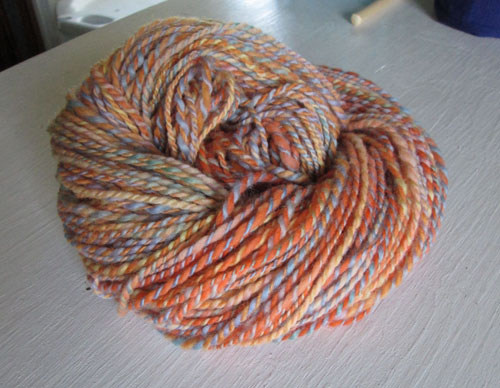
2 ply
spun wool that I hand dyed
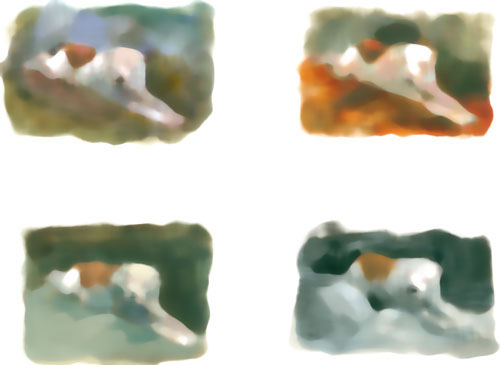
If I'm
working on a commission, and the color choices aren't immediately
evident, I often go back into my artistic “toolbox”, and pull out
some help. With this portrait commission, I've got a white main
subject from the client's reference photo. So what colours do I need
to set off the subject the best? How to best “frame” the white
subject, while keeping the portrait subject....the main event? One
way to find out is to do little colour “doodles”.....and put them
up side by side and see which one looks best.
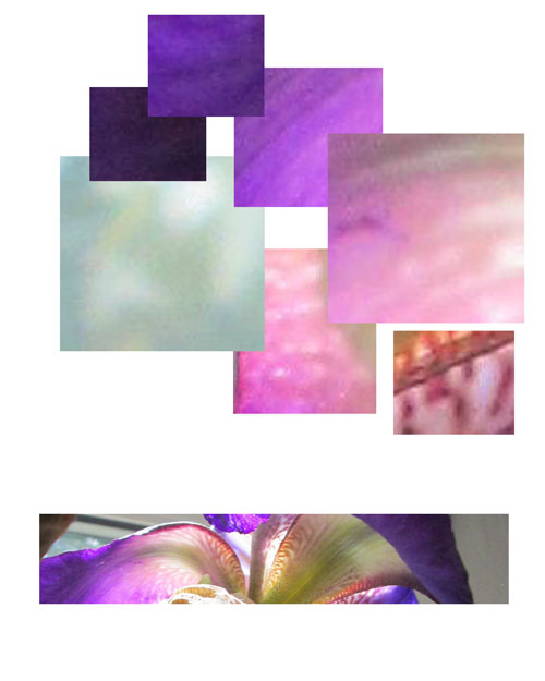
If on
the other hand I want to paint from my own (or Frank's) photos that
inspire me, just 'cause of their hues....then I might do something
like this “purples” chart.....to help me see clearly just why I
fell in “artistic luv” with an image. I have seen a few websites
where they have a program to do this automatically, but I've been
playing with doing it myself in Photoshop. I took one of my photos,
and pulled out the colours that attracted me to the image
in the
first place. This bitty chart is one is of a purple iris:
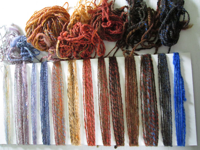
I did
the same kind of thing when I was looking for a good gradient
colorway for a spinning project. I made this chart to preview what
different fibers would look like:
It
doesn't matter what media you are using, paint, pencils or
fiber.....if you have questions about colours....you can often find
the answers in a bitty sampler “colorway chart”. It lets you
have a colourful ,visual, conversation with yourselves......to help
solve an artistic problem.
Your fiber colors are gorgeous, as well as those in your paintings.
ReplyDeleteThank you! I've tried to keep the different parts of my "colourful life" separate....(fine art, illustration,fiber), but they keep on insisting that they can indeed co-exsist! So I'm letting them have their way.**grin**
ReplyDelete