
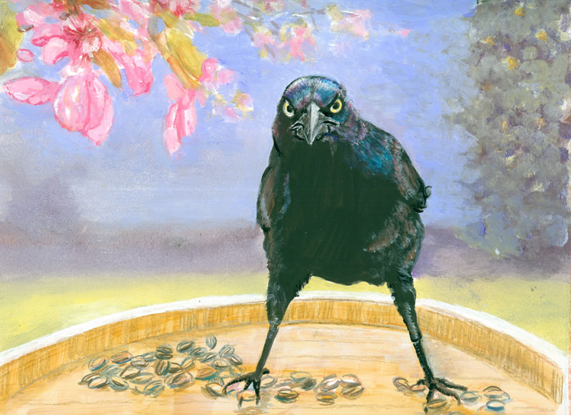
Grackle-Attitude
8 x 10
inches ink, coloured pencil and acrylic paints on illustration board
from Frank Lyne and my photos.
This
time around, I'm showing some stuff that did........ and didn't work,
for this portrait of the ultimate “angry bird”.....the grackle.
I
started out with a wonderful photo that Frank took this winter of a
really intense grackle, guarding his part of the bird seed feeder.
I'd gotten some fun pics of a bunch more grackles jockeying for
position to get to another feeder. I combined those photos with one
I'd taken of some crab apple branches in part shade/part sun.
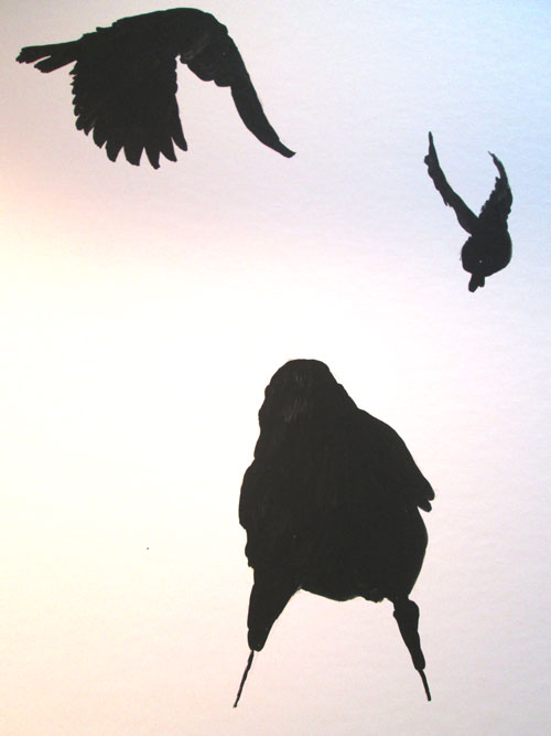
I'd read
of an art technique where a black india ink silhouette was made of
the figure, in this case the three grackles. I positioned them so's
one was extreme foreground, one was flying in and a third was in the
background.
After
the india ink dried, I drew in the eyes, beaks, and feathers of
the three birds with coloured pencils. The first pass of the wax
coloured pencils went on well, the india ink coating accepting it just fine. Then, in traditional coloured pencil style, I went over things
again to emphasize the first lines. This time nothing happened, no
flaking....but no increase in the intensity of my lines.
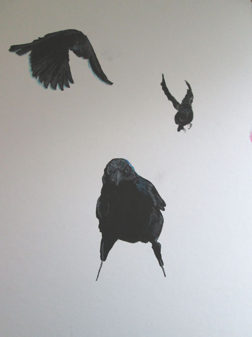
So I
went back to what I KNEW would work....acrylic paints. I went back
over my coloured pencil lines with thin coats of acrylic paints to
draw out the sharp beak, the intensity of the yellow coloured eyes of
the bird. I also did very fine brush lines for the iridescence of the
grackle's head and wings. I painted them in mostly white at first, to
provide a base for acrylic glazing of the final colours.
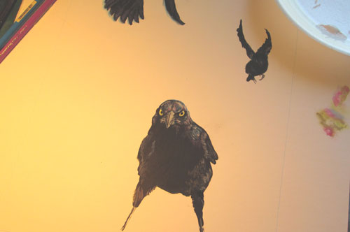
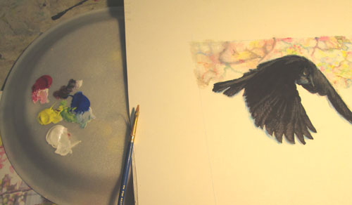
As you
can see in the pic above.....off to the right a bunch of little
pink/green/blue spots....I “auditioned” both coloured pencils and
acrylic paints for the next step of the painting.....the blurred
background of the crab apple blossoms. I decided on acrylic paints,
as I had a large-ish area to cover, and burnishing (smoothing with
hand pressure layers of wax coloured pencils) that much coloured
pencils would be considerable wear and tear on my hands! I started in
painting the blurred background of the crab apple blossoms.
After
I'd painted in the background, I stepped back and looked at what I'd
done so far. I wasn't too impressed with the composition, now that
I'd gotten it filled in. Drastic measures were called for!
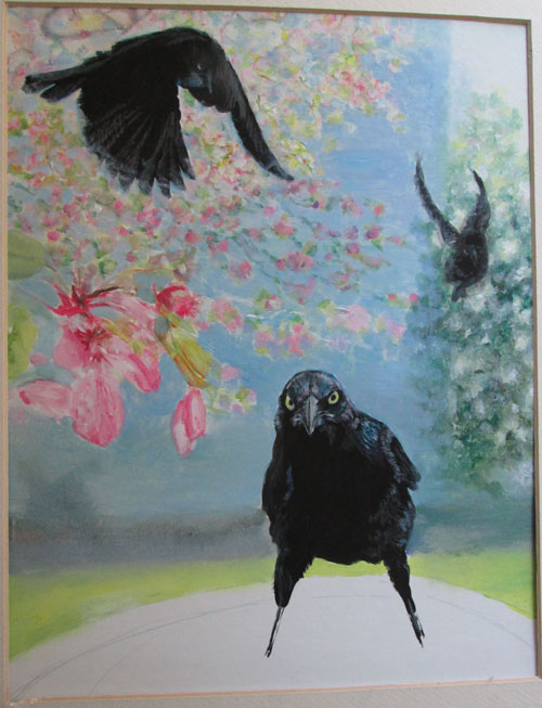
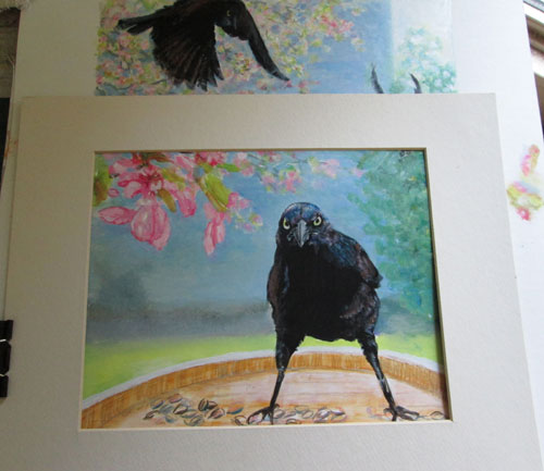
Sometimes
you just have to go ahead and paint something to be able to judge
when it IS and ISN'T working. I grabbed a smaller mat and begin to
“frame” a different part of the painting to see if it would work
better just showing a part of the original composition. I ended up
liking the horizontal “landscape” view the best.
No comments:
Post a Comment