OK.....I
admit it.....I'm an artist geek! I luv figuring out ways to make my
art work “work” better. Recently I was going thru some old
International Artist mags, and my eye lit upon a ten year old article
about colour. The part that caught my eye was about the importance
of value (lights and darks) in colour work.
I've
been experimenting with colored pencils over watercolour washes. I've
enjoyed using colored pencil marks to join together disparate washes,
while providing “grace notes” of color for highlights.
I've
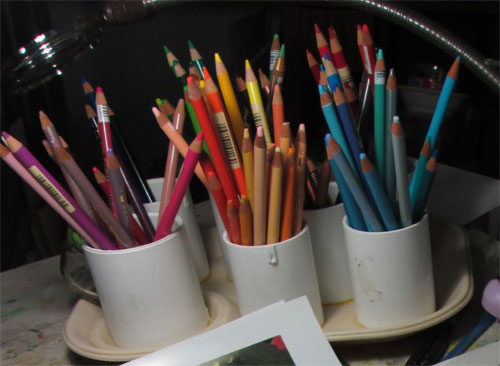
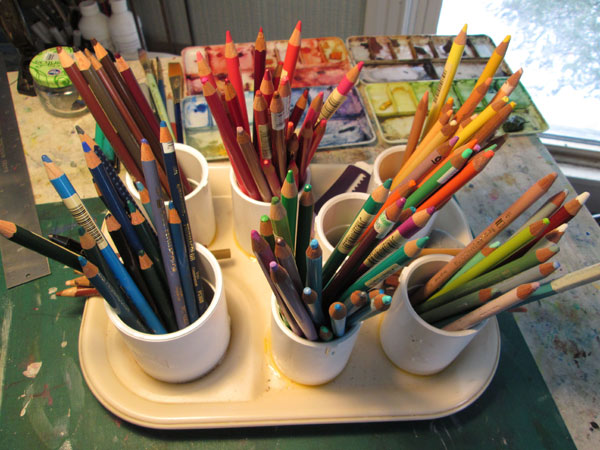
noticed that when I go to my colored pencil holders I more often than
not, go for colours associated by lights/darks. Instead of worrying
as much about the hue (color) or local color of an object I look for values. My
pencils had been arranged loosely by hue or color (i.e. reds, blues,
greens, purples etc)
After
reading this article, I rearranged my colored pencils by
value....lights, brights,medium and dark values....irregardless of
colour.
When I
tried this system out, it made it SO much easier when I reached for a
pencil for a highlight.....or to blend in a face shadow......or
wanted to wake up a dull patch on cloth. It had the added advantage
of forcing me to remember about temperature of colours......and
consider reflected lights.
There is
an old adage: “You are what you eat”. Well in my case, “I am
(in colored pencil work) how I “organize” my colours.”


No comments:
Post a Comment