
If you
are lucky enough to get to work with the same author on a book series
one of the things you might want to think about first is Cover
Continuity. Most book series are written with a over reaching story
arch for the entire series.....meaning all the books in a given
series might have a continuing set of characters and an ongoing time
frame or period for the stories to take place. When you work on book
covers for a series it's up to you, the illustrator, to continue that
series' “visual identity.”
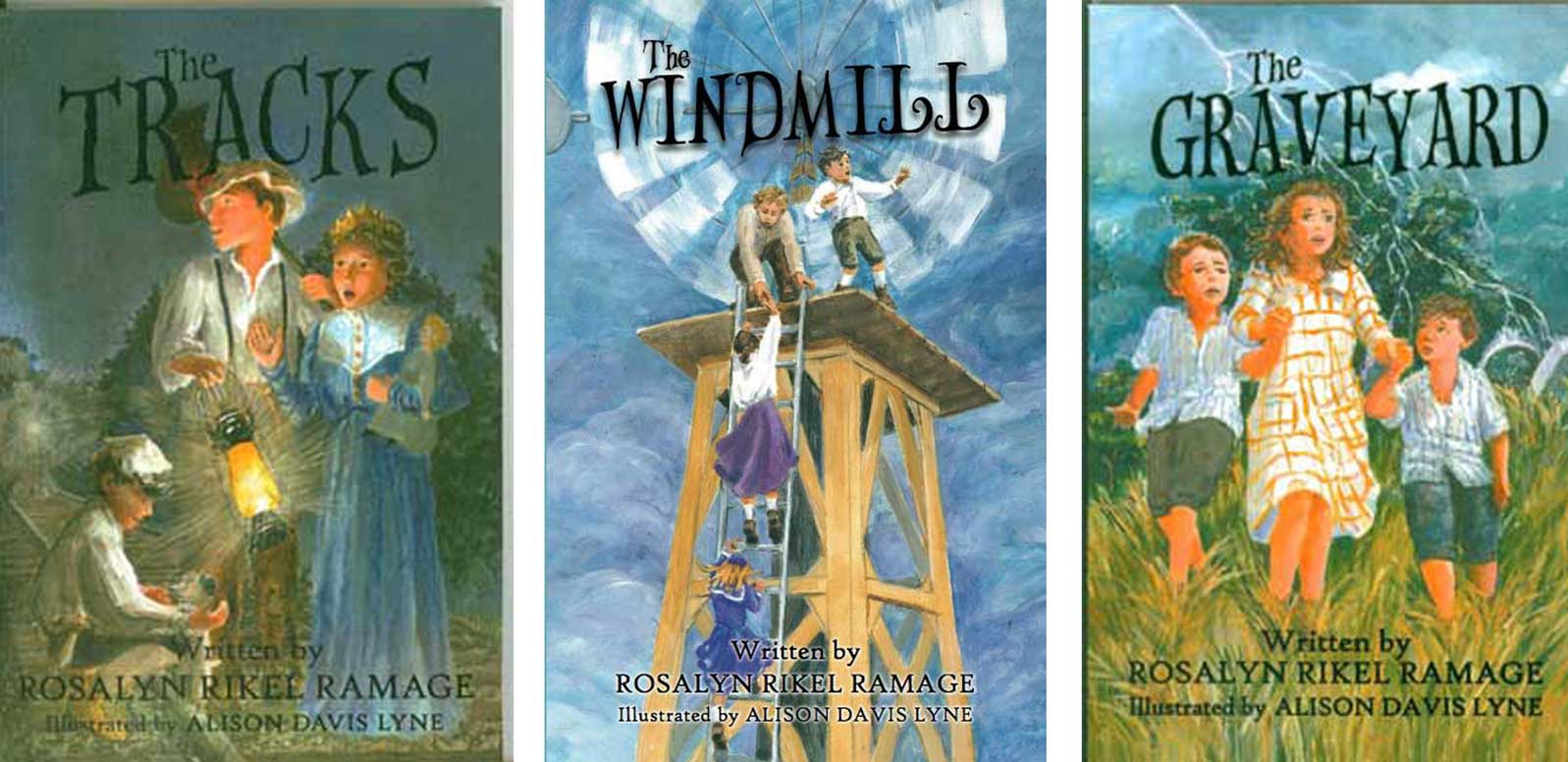
In an
ongoing series of middle grade books by Rosalyn Rikel Ramage, The Tracks, The Graveyard and The Windmill, I've kept the same
feel....slightly dark.....and some of the same characters, siblings
Emma Mae, Edward front and center on all three covers. And by the
author's request all three covers feature “transition” points in
all three stories, where the “real” story events make a
transition into a bit of fantasy.
Look at
all three covers lined up above......they all seem to “hang”
together with the same kind of feel and design.
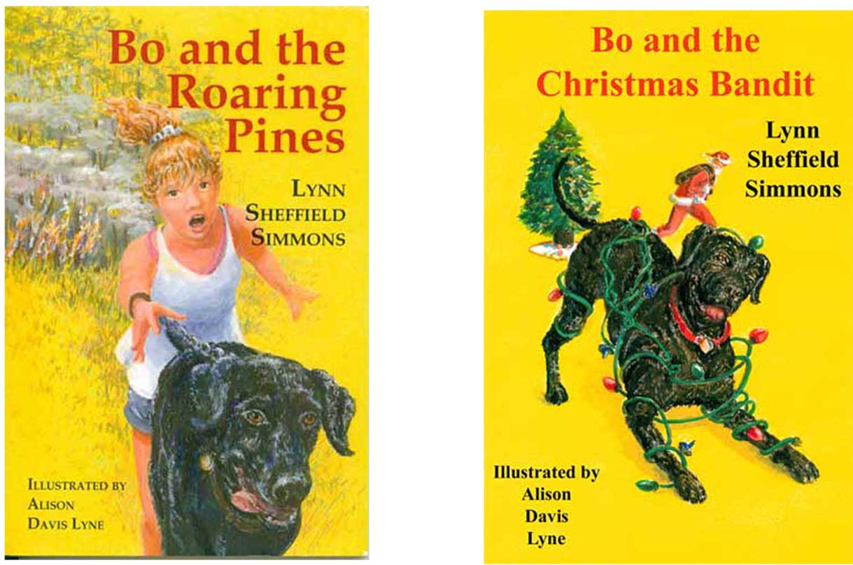
For the
next two covers, Bo and the Roaring Pines and Bo and the Christmas Bandit, I used the main character Bo, a young black lab....hero of
these middle grade books from Pelican publishing written by Lynn
Sheffield Simmons. Bo's all black shiny coat makes a wonderful foil
for the brite yellow cover background. That color was suggested by
the author. She said that over many author signings and school
visits, she'd tried out different backgrounds for posters....and
found that the brite yellow color attracted more attention than any
other color. So she suggested that yellow as a “branding tool”
for her Bo series of books.
Visual
branding is a valuable tool that shouldn't be under-estimated in
today's “battle for consumers' eyes” and dollars.
No comments:
Post a Comment