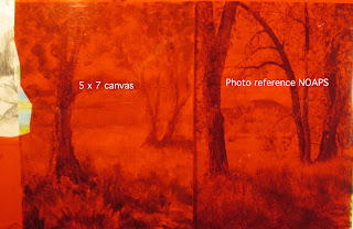
This blog post features a small colour sketch I did for a #NOAPSARTCHALLENGE prompt. The reference photo was in color and featured foreground trees and background lake and mountains.
Of course me being me, I had to make changes……so I faded and cooled the background a bit, changed the size of the background trees and lightened the colors and faded them a bit on the two trees on the right. I used somewhat warmer colours in my choice of palette.
That paved the way for emphasis on the foreground tree, shadows and grasses. I wanted to emphasize the warmth of the sunshine on the tree trunk and the highlighted grass clumps.
Along the way I noticed that my values weren’t as I wanted them, but was distracted by the hi value/intensity colours I’d painted in. So I went back to an old illustrator trick. I grabbed an old sheet of red acetate and laid it over both the reference photo and my 5x7 inch sketch.
The red acetate canceled out the greens, and revealed just the values. I quickly noticed that the foreground trunk really needed darkening with an extra dash of intensity. I made the appropriate adjustments and called it done!


