Thursday, September 29, 2016

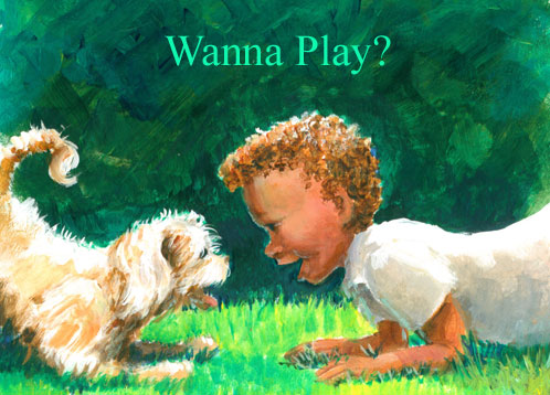
Wanna Play?


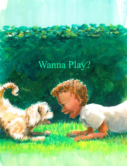
This time around I'm showing a bitty illustration called “Wanna Play”? It came from an idea I've been messing around with for a story line about a “boy and his puppy”. I've been working on visual communication between characters, and I thought it would be cute to show the puppy and little boy “communicating” using a puppy's “play” crouch signal. When you see a dog or puppy doing this crouch.....you just know that he's saying “Do you wanna play with me”?

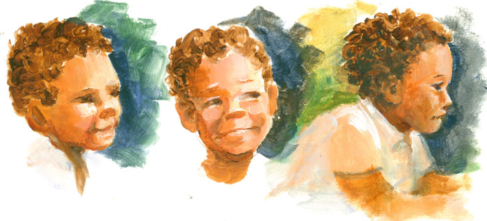
Before I drew the entire scene, I needed to firm up the little boy character a bit. So's I did a few head sketches to see just how I wanted the little boy to look. I'm still working on the whole “keep it simple” thing......but I've found that if I use paint to “sketch” the characters and remain focused on establishing the masses of the characters, I get the feeling/gestures quicker.


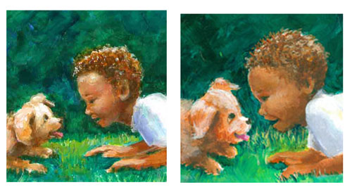
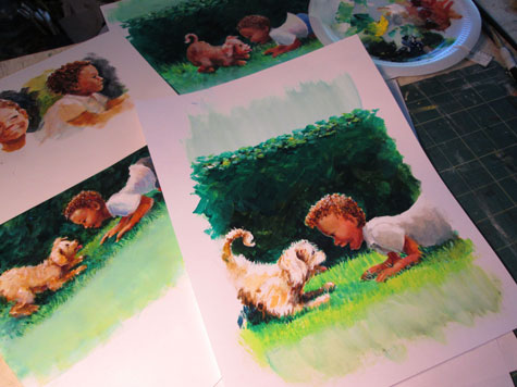
I took what I learned from the sketches, and drew a simplified little boy mirroring the puppy's play pose, using the green hedge to show the bow to the backs of both the puppy and the little boy's. Even without a lotta detailing......I wanted to let the poses of the puppy and little boy “speak for themselves”. But tho' I liked the left hand version of the little boy......it was still a bit too “realistic” for what I had in mind. So's I tried a younger version, but it still didn't quite suit either.


So's it was back to the “painting” board. I tried another version, this time changing the crop from landscape to portrait. I worked on keeping my “realistic” habits in check and concentrated on keeping things simple. I wanted to show the most important part of this scene......the interaction between the two characters. 


I really enjoyed putting a lotta energy in the background bushes, with bold strokes of colour. This emphasized the simpler foreground figures with their warm colors and graduated modeling.


Saturday, September 10, 2016

Illo Prompt SWIFT or Idea Jumpstart

Illustration from the SCBWI idea prompt: SWIFT
 
So........SCBWI does this “thing” for their monthly email INSIGHT segment.....it's an itty bitty contest where members draw something to a suggested prompt. This month's prompt is “SWIFT'.

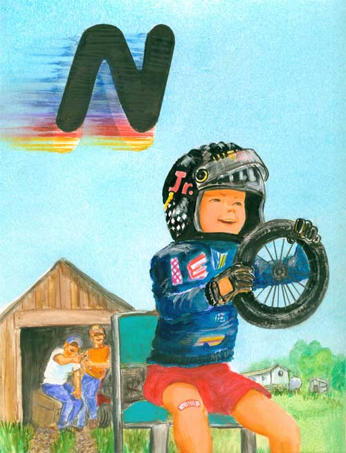
For one of my illustrated books, G is for Grits, A Southern Alphabet, I illustrated a little boy pretending to be a stock car race driver. He had on a toy helmet, was sitting in a chair and was using an old toy wagon wheel as his steering wheel.


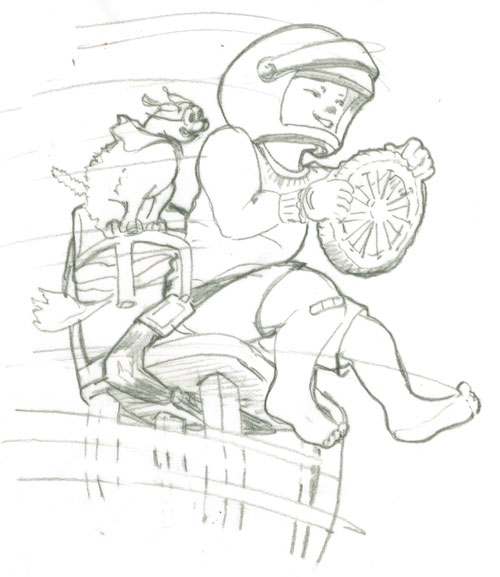
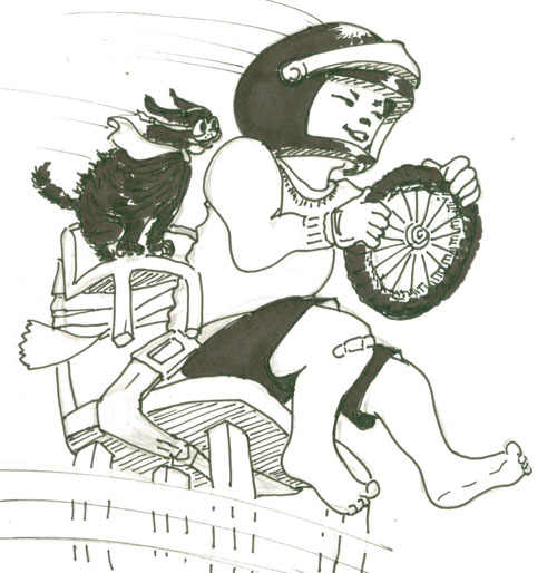
Well, I had always like this illustration, so's I thought I'd do a slightly different version for the prompt. For my sketch this time I added a doggie copilot and speed blurs against a plain background. I made a sketch, including a seat belt for the boy and a tiny chair for the doggie, duck taped to the little boy's chair.

 
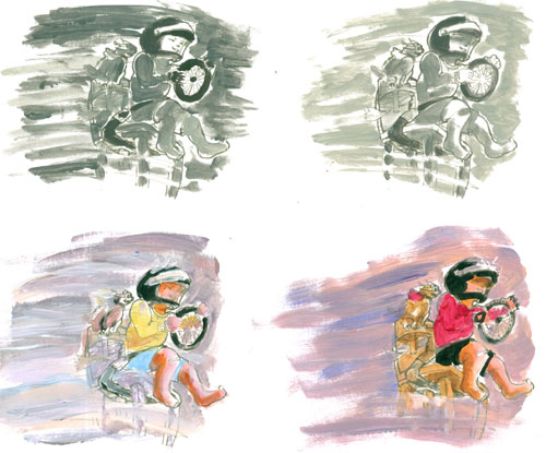
Then I took that sketch and made a sheet with four of them printed out. I used this sheet for a “cheat sheet” studies of black and white values, where I learned that a strong light and dark gave a bit of drama to the scene. I also did a couple of colour sketches, and decided on my colour theme.


And since I'm having trouble silencing that old habit of including EVERYTHING in a sketch, I went ahead and did a teensy black and white line drawing, showing everything in great detail.


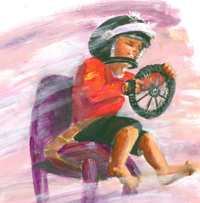
OK......now that I'd gotten that (uber detailed) version out of my mind, I concentrated on being more loose in my colour illustration. Now a days, I'm trying to go for “Draw tightly.....paint loosely”. During the painting process part of this, I ended up jettisoning the doggie side kick.....he was just to “heavy”.....in a visual kinda way. I'm sure he'll show up in a future illo!

You can see the finished illo at the top of the page.


Saturday, September 3, 2016

Illo Experiment for Hidy-Bye Boy


A loooooong while back I wrote a bitty story, Hidy-Bye Boy and made a “dummy” for it. In this case, i.e. children's picture book illustration a “dummy” refers to a practice or mock up of a book idea. It includes the text of the story, laid out in sequence and rough illustrations showing what you have in mind. Especially when an illustrator “writes” a book, quite often a LOT of the story will be told using the pictures......with the words providing key directions. So's a mock up of how the author/illustrator plans on telling the story is crucial in letting a publisher know the author/illustrator's vision for the picture book.

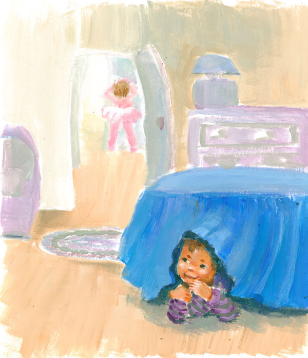
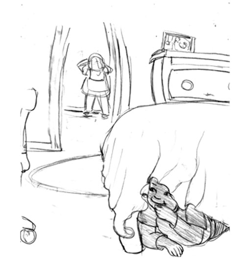
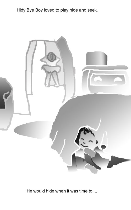
This pencil sketch is the first incarnation of page one of the story's text: “Hidy-Bye Boy loved to play hide and seek. He would hide when it was time to......” It shows the main character, Hidy-Bye boy playing hide and seek with his little sister counting down to go and find him.


At the time I was working on this dummy I was going thru a Photoshop phase, and I decided to “sketch” the dummy page using outlines and “fill” in Photoshop to show what was going on.

 
It had the advantage of being clear about what was going on in the sketch. But I also lost some of the charm of the pencil sketch. So recently, I took up this project again. 

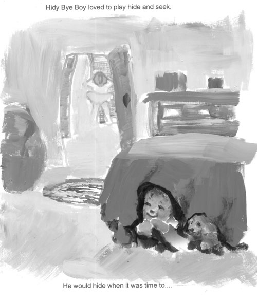
 I've been doing a lot of classical painting of people, landscapes and wildlife. In this painting spree, I've “remembered” or revisited a lot of really nice planning techniques. One of which is to split your painting into only light,medium,dark sections to see if you have the focus on the main point of your composition. So that technique resulted in this little sketch being done again, this time in three gradients of black and white.


So now I had a clue as to a value map for my illustration. I then decided on my colors and matched the light, medium and dark values (and intensity) of the different colors I wanted to use with my black and white color map. You can see the result at the top of the post.