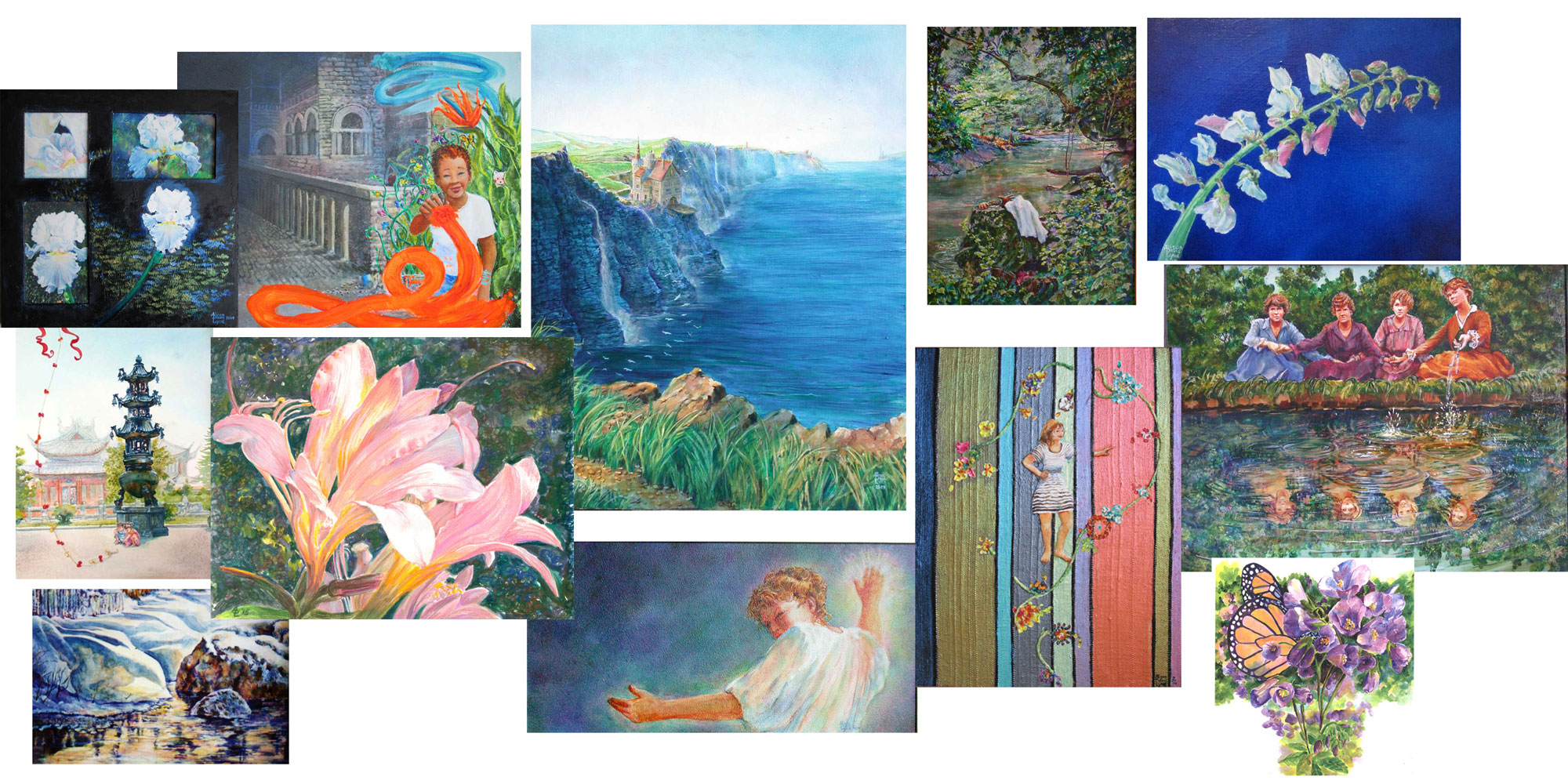
Saturday, January 28, 2017

Fine Art vs Illustration..OR..Fine Art and Illustration, IMHO

 
This blog post topic came out of a discussion about the differences between Fine Art and Illustration. I know it's not a burning question for most folks (!) but can be for artists....and is a topic I've wanted to take a swing at for a long time. These are some IMHO thoughts, and I'd luv to hear what YOU think about it.
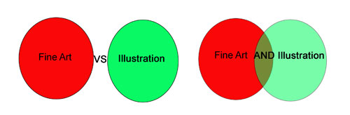
  
So the set up is this: In a lot of educational settings instructors will bring up the topic of Fine Art vs Illustration. Most students, who haven't had the time to look at a lotta art, of all types, will not feel too much one way or another about the topic. Most instructors will give a wikipedia definition of each discipline and let it go. Personally I've been seated, quite happily, on the fence (fine art vs illustration) for most of my artistic life:


For your reading pleasure here's my feelings on rough definitions:

1)  Fine art is made solely by the artist; illustration is made by committee

2)  Fine art is meant to “last for the ages”; illustrations only have to last till they get to the printer.

3)  Fine art is most often used to express emotion by the artist; illustrations are more often created for a specific purpose
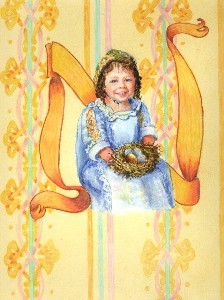
 A watercolor, colored pencil, acrylic illustration in Easter Day Alphabet (Pelican Publishing 2003)

Now I realize that all three of these are in no way defining....for instance:

 1) Fine artists are often influenced by gallery and other people's market preferences; illustrators often make art on speculation that is later purchased for a publication.

2) Fine art is often put on surfaces that are vulnerable to the ravages of time; A lot of 20th century illustrations were done in oils and on canvas

3) Fine art is often commissioned for a specific person/concept/installation; illustrations can be and often are extremely emotional.
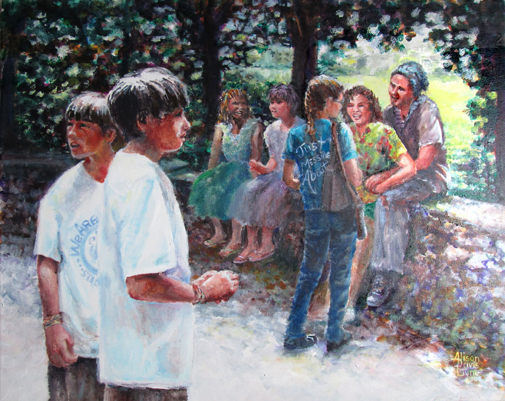


                            Just Messing About, an acrylic painting for a juried art show


Now to suggestions about the real life uses of such musings. When an artist is learning their craft, most techniques, guidelines (i.e. style, composition, colour,value etc), and practice is centered on learning the things that they need to know to produce a visual image that matches their intent. Most educational settings don't give a lotta guidance about what happens to the artwork after it's finished and to the artist who graduates.

Many artists go onto careers as teachers/curators, fine artists, and/or graphic design/illustrators, to name a few. Since all these careers are based on the notion that an artist's work/vision/knowledge will be exchanged for money, we automatically open our selves up to the regard of the public. The gate keepers of our work's exposure, be it schools, galleries, or art directors will usually be responsible for guiding our work to a appropriate slot....be it fine art or illustrative publication.

They make such decisions based on having experienced looking at a WHOLE LOTTA ART. Years and years worth! We as artist can do the same thing. If we, as artists can get a feel for what constitutes a illustration vs what makes up a fine art piece, we are ever so much better placed to get our artwork seen in the best venue.

And that leads me to offer this advice:
 
1) Look at all the art you can manage. Fill up your FB feed with art of all types, whether it's gallery work, or magazine illustrations or comics....it's all a chance to see what your perspective buyers,bosses,judges will be looking for.

2) Go to any art shows that are around, look at any and all print materials. After a while you'll begin to get a feel at what you might expect to see on a shampoo bottle vs what might be shown in a gallery or something you might pick up at a Hallmark store.

3) See what the folks in charge consider the best of the best. In gallery shows, it'll be the prize winners. Often, but not always, the little red dots (which means a sale) will go along with the prize winners. In illustration, specifically children's book illustration, the “oscar” is called a Caldecott award. Each kind of publication will have a different one.
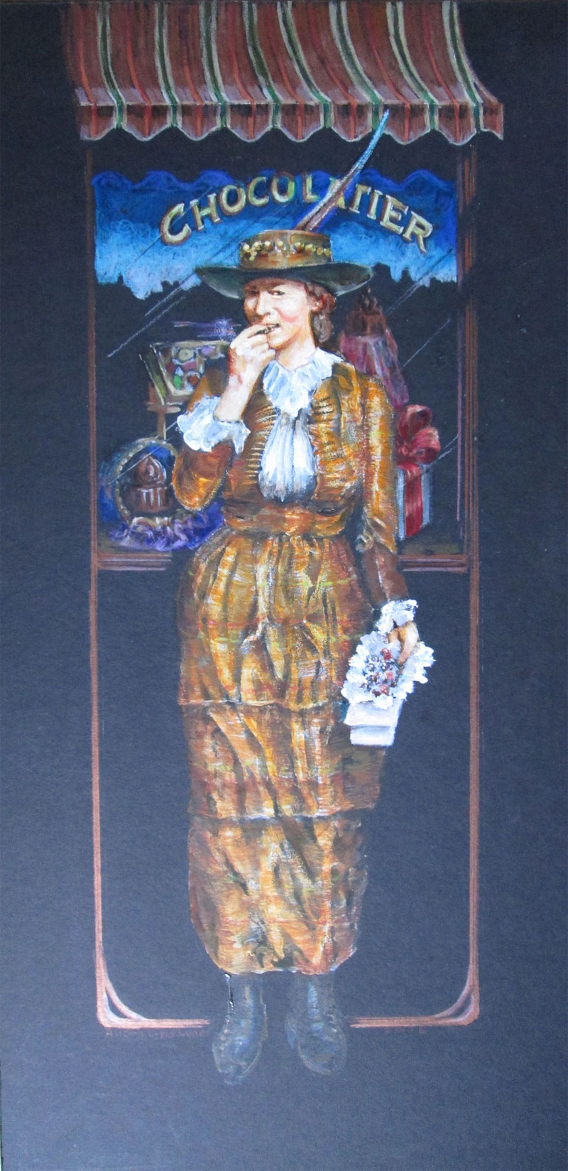


 A Picture + Words artwork; CHOCOLATIER, using acrylic paints, watercolours, colored pencils. Accepted in a KAC Traveling Art show: The Illustrated Word.
 
And finally......I really feel that the statement should be Fine Art AND Illustration. I have never been able to stop telling a story, no matter how big or small. And I always want to tell it with the most possible COLOUR, and richest detailing that I can manage. I believe that the happiest way to pursue my own art, is to continue to work to find fresh and engaging ways to both paint in a “fine art” style, while continuing to tell a story. At least that's IMHO!
 

Saturday, January 21, 2017

Art in the Home, or You Bought It....Now What?


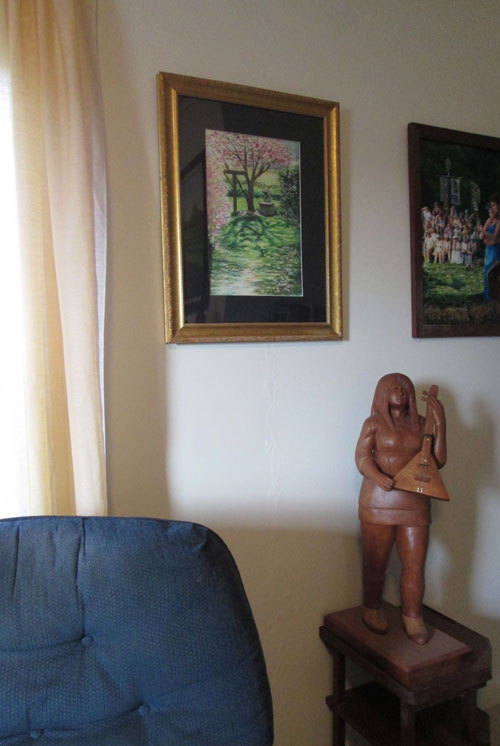
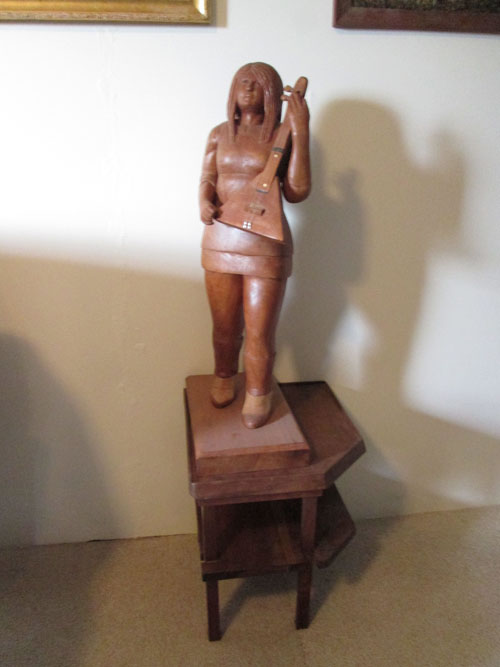
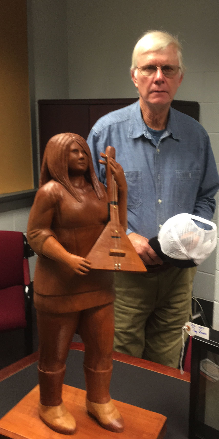
 Recently Frank redid our living room walls, from the ground up. Seriously redid them.....as in installed entirely new walls. In the process, we brainstormed how best to show off both our artworks in the lovely spaces that were made. As a result, our two and three dimensional artworks show up better than ever.


This whole remodeling process has led me to think about neat ways to show off our art “in the home”. Be it on the walls or on flat spaces.

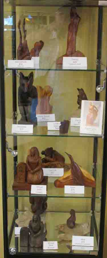
When we show our artworks in an art show, the gallery is the “show place” of our artworks. Whether it is in a glass show case....

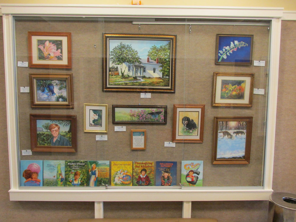
or hanging on the wall...........


But artwork that looks one way, hanging in a gallery or sitting in a case......might look entirely different hanging or sitting in your home.
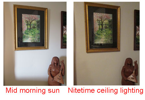
One of the first things I think about for display of either a painting on the wall....or a sculpture on a flat surface, is the amount of light that the art piece will get, through out the day. Will the art be lit fully in the morning....and less so in the night time lighting? 


 Or will the artwork be in full sunlight from the side.....


 Or will it be lit from above with indoor lighting?


As you can see lighting can make a whole lotta difference in how an artwork will look, when installed in your home.

After I finish a painting, I will often try it out for a day or so, in a coupla different places in my living room. To see how much light it does and doesn't get, and in the case of sculpture....what features are highlit or in shadow. Just this simple trick of “previewing” a new artwork in different spots in a room, can make all the difference in “staying in love” with your new artwork purchase.

Saturday, January 14, 2017

Do You Want to Play? Or Bridge Times Four

 
Starting out my artistic new year with a different kind of painting.....something that is a bit outside of the box (of a regular painting canvas) and also, around the outside of multiple boxes. That sounds really confusing.....right?

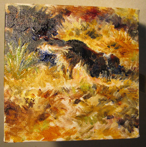
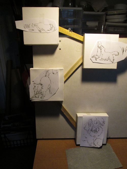
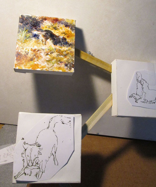
I got an idea to show some movement and passage of time in a painting of our dog, Bridge. (So named 'cause HE adopted US when we passed by a local bridge while on our afternoon walk) If you look Bridge up in the dictionary......waaaaay down the list under “motion”, you'll find a teensy tiny pic of Bridge! His flowing movements just didn't seem to fit within a normal rectangular painting canvas.......so I decided to show him in action “sequentially”.

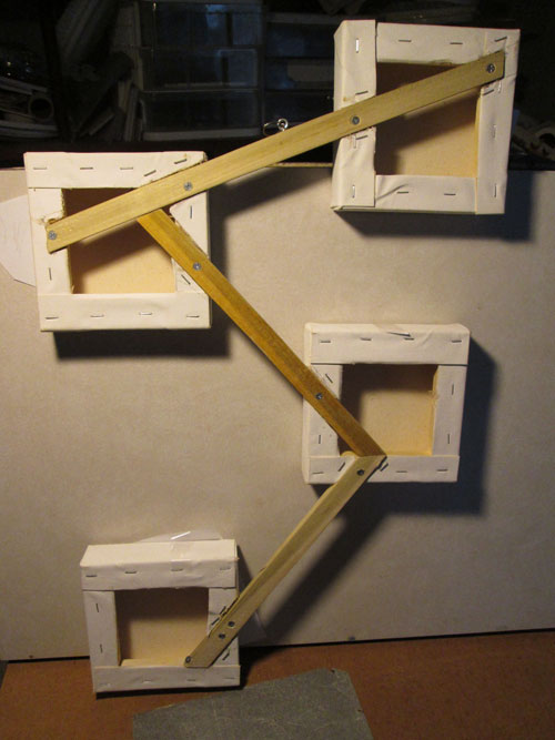
I took four 6x6 inch gallery wrapped canvases , and sketched out an idea for a different kinda hanging set up for the four mini-canvases, all with different views of Bridge. Frank Lyne, (last week's guest blogger) came up with a wonderful solution to hang all four canvases in sequence.

 
Frank not only got the four canvases to hang with one hook.....but made the whole thing so's it hangs flat on the wall. All three of the connecting wood strips are “sunk” into the back of the canvas's frames! A fantastic solution.....

 
So now I was ready to paint. I started at the top, and roughed in the first, far away view of Bridge, busily biting his current chew toy.....an old plastic coffee can. He can have more fun chewing and tossing his can than any fancy toy we could buy. The more teeth marks and the more distorted the shape, the better he likes it!


Next time I'll show another "act" in this “Bridge times Four” artwork.


Saturday, January 7, 2017

Wood Selection or A Kitteh Approved Beginning


 Guest Post by Frank Lyne

When Alison asked me to do a series of guest blogs about the process of wood carving, I said that writing about it on the go would likely change the process, but agreed to do it anyway. Since completing my most recent carving in mid April of 2016, I raised my final tobacco crop and redid the living room. Yesterday seemed like a good time to select a billet for my next carving.
My shop and stable have more shelves stacked with all sizes of wood billets than I can possibly ever turn into carvings. My last selection was made from the shop stores, so for this one, I head to the stable.

 
There's no electricity and thus no light other than daylight in the stable. The day is mild, but overcast with sporadic misting rain. A couple of hundred sticks of my last tobacco crop had been housed in the stable and part of the empty sticks are still strewn about. I gather the remaining sticks and tie them into bundles, this final time separating ancient hewn sticks from newer sawed sticks. Styro-foam transplant trays are scattered about everywhere. I gather them into stacks. Plastic sheets litter the floor in front of the wood stacks. I gather them into large wads into one corner. Finally disorder is subdued enough to appraise the wood stacks. Nothing speaks to me. The light is too low to carefully assess the properties of the assorted billets. Since I split most of my fresh wood in half before storing it, most are irregular half cylinders. But some are cut where a limb branched off from the trunk. Those are the most interesting and challenging billets to work with. My last carving was a fairly ambitious figurative study, so this one should be something other than a figurative study, and maybe smaller than my last piece. Still nothing catches my eye. Another scan.

 
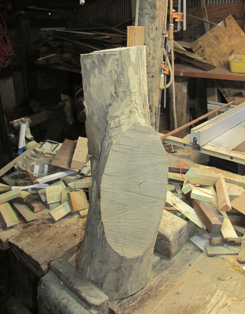
Something in a dim far corner isn't a regular half cylinder. It has a flat area on one side. That's good enough. I take it to the shop where I can see it in good light.

 
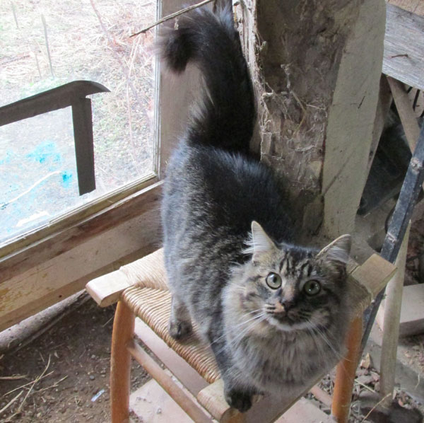
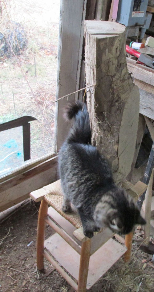
Kitteh appraises it and says, “I think it should be a cat.” But within a few licks with gouge and mallet, I decide that it's going to be a turkey. And I deny categorically that selecting turkey as a motif had anything to do with the fact that it was the most recent thing someone suggested that I try.


Saturday, November 26, 2016

Haying or a Small Bit-o-History

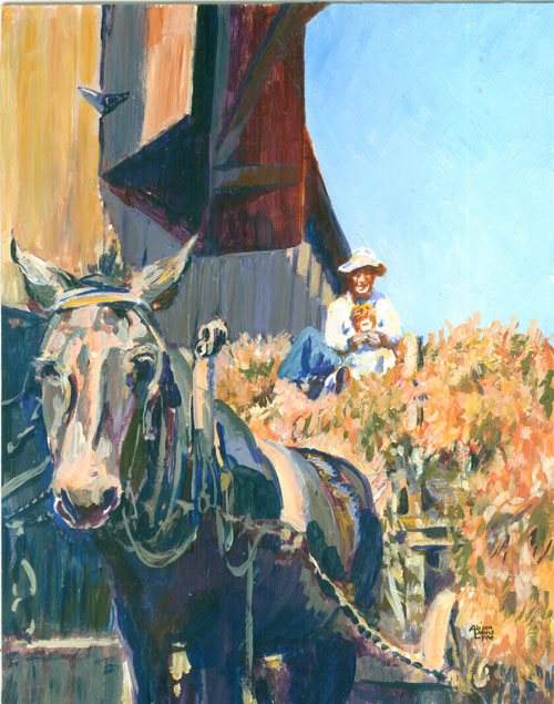
Haying 8x10 inches acrylic paint
 
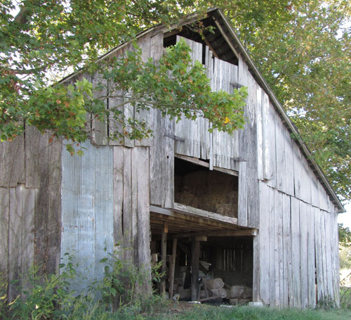
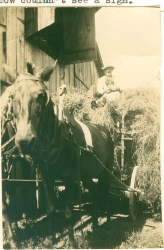
This time around I'm showing a small painting I did a few years ago. The painting is based on an old family photo showing how hay for livestock was handled in the 1930s. Hay was cut, left out to dry and then raked up with a “dump rake” into huge piles. Those huge piles were scooped up by the pitchfork full, into a wagon. Which was transported from the hayfield to a barn via a mule drawn wagon, then scooped up, by a hay fork (think a huge double arm scoop, sorta like what you use in a mechanical arcade game machine with crane claw). It was swung into the barn where it was stored. You can see the opening in the top of the barn where the hay fork came out to scoop the hay up in the loft. Then in the winter it was doled out, again by the pitchfork full, fed from hay racks on the ground floor of the barn. All this was by hand, mind you!

 
I've always been fascinated by the older black and white photos.....they usually have such a wealth of detailing.....you can see almost every blade of grass! Every time I see a really neat old photo, I always want to “see” it in colour. Since I tend to solve a lotta of my desires with paint.....I will often take an old black and white photo and bring it up to colour. It's a nice challenge to see if I can get the black and white values correct.....while still injecting what I feel would be the right colours to fit the scene.

But bringing an old black and white photo into colour, offers another neat opportunity.....a chance to learn about the circumstances that the photo is presenting. In this case, it's revisiting a vanished farming era. Other times, painting someone's family member from an old faded black and white photo, lets me learn more about that person in the photo......and how the person commissioning my painting really “saw” that family member. I always learn SO much!

Saturday, November 19, 2016

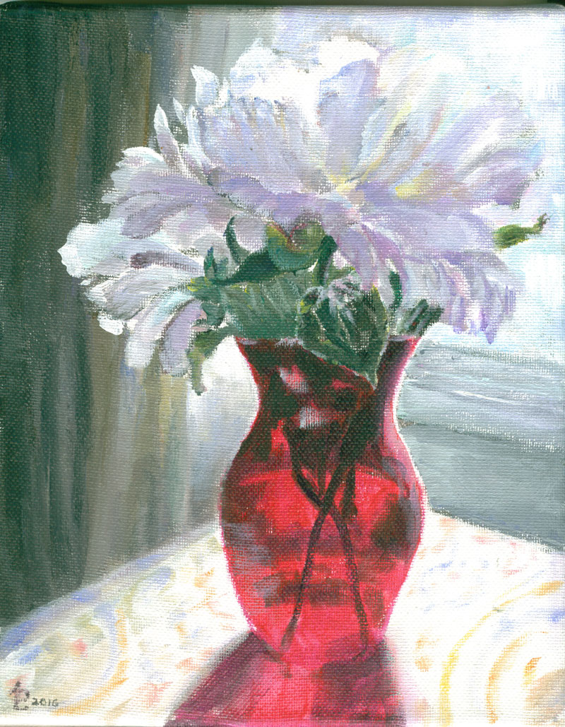
Red Vase or Mostly, Some and a Bit in Red

Red Vase - Acrylic - 8x10 inches
  
This time around I've got another of the small 8x10 canvases that I wanted to do a small still life on......an idea that doesn't really rate a full size canvas. A summer or two ago I'd taken a lotta flower photos in various “antique store finds” vases. This vivid red vase just seemed to beg for the flashy white peonies that had just a hint of the same red in their centers. I positioned it for a back lite “pose” and this one was my fav.

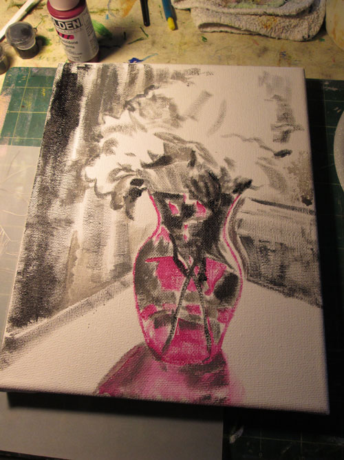
I sketched the photo onto the canvas and started painting. I laid in the bare bones of the painting in the first session:


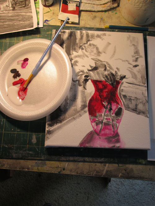
The next session I did some glazes with different reds on the translucent red glass vase. Using three different red glazes really intensified the red of the vase. Since the red vase was the star of this painting, I wanted to paint it first and let everything else literally “pale down” beside it.


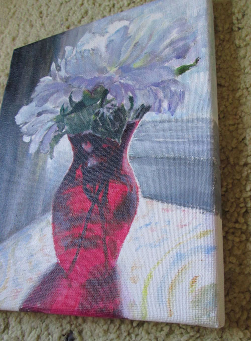
I continued on painting till I felt satisfied with the values of the different flower petals and the other background elements. I was especially pleased that I could contrast the petals on the left against the curtains in shadows. I also like these smaller canvases as they wrap the canvas all the way around the sides to allow me to paint them with a continuation of the painting itself. 


Sunday, November 13, 2016

How I Spent my Saturday....or Christmas Ornaments at the Library


 Last Saturday our local library invited me to do a mini program on Christmas Ornament making. I had been making a bunch of Christmas ornaments while watching nite time TV. After the program director saw some of my designs, she asked me to share some of the techniques I'd been practicing for Christmas ornament making.


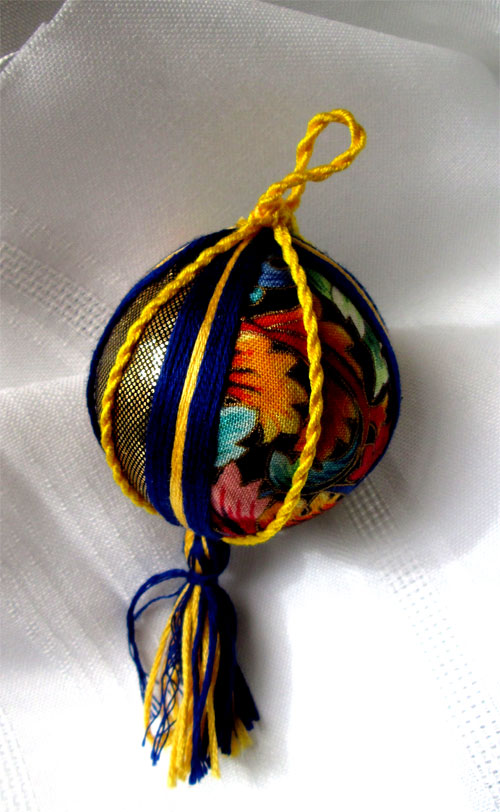
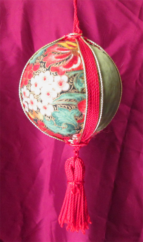
I had a box full of cloth scraps from loooooong ago, along with a bunch of embroidery thread in lotsa colours. So's I came up with some designs for Christmas ornaments, using cloth scraps, and threads covering styrofoam balls.

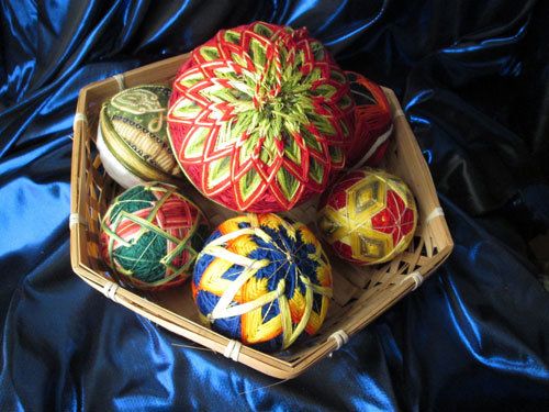
A while back I'd gotten interested in temari ball making.....a Japanese needlework technique also using stryofoam balls and threads. Of course, being me, a lotta colour was involved in the designs.....so I was a happy camper. I'd made some ornaments using the traditional Japanese methods.......


but wanted to do some simpler ornaments using Christmas themed cloth and coloured threads. These are the kind of ornaments we worked on at the library program.


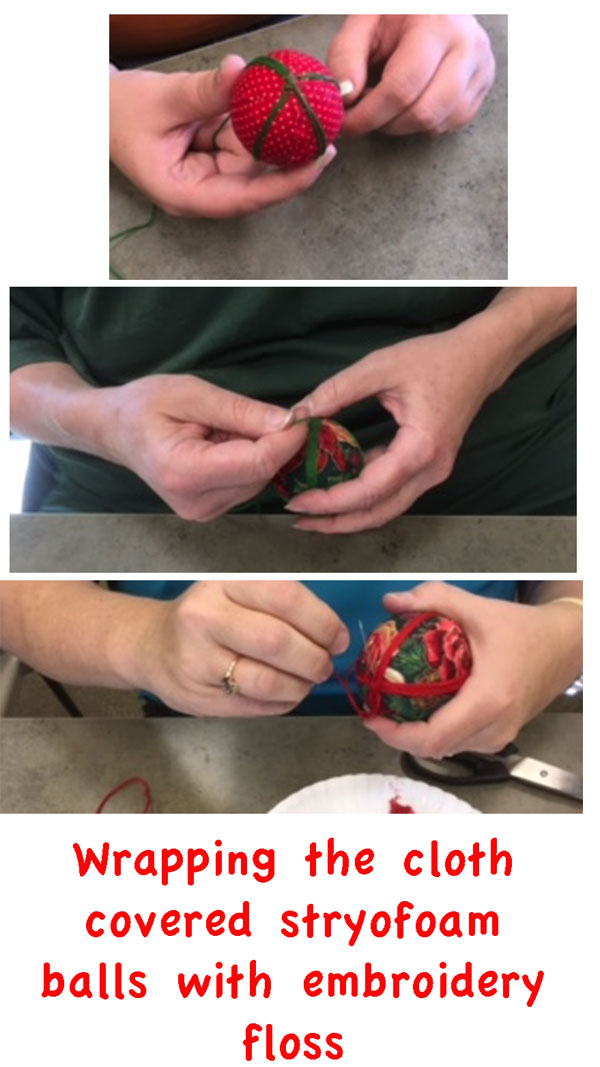
A few lovely ladies joined me at the library on Saturday, and we had a ball (pun intended!) covering stryofoam balls with with fabrics and stitching red and green threads around the centers. We added some hand made cording and hand made tassles and viola! We all had lovely Christmas ornaments to start off the holiday season.

Thanks so much to the Logan County Library for suggesting this event and all the lovely folks who turned out to have a bit-o-holiday crafting fun and share some laughs.