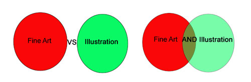
This
blog post topic came out of a discussion about the differences
between Fine Art and Illustration. I know it's not a burning
question for most folks (!) but can be for artists....and is a topic
I've wanted to take a swing at for a long time. These are some IMHO
thoughts, and I'd luv to hear what YOU think about it.
So the
set up is this: In a lot of educational settings instructors will
bring up the topic of Fine Art vs Illustration. Most students, who
haven't had the time to look at a lotta art, of all types, will not
feel too much one way or another about the topic. Most instructors
will give a wikipedia definition of each discipline and let it go.
Personally I've been seated, quite happily, on the fence (fine art vs
illustration) for most of my artistic life:
For your
reading pleasure here's my feelings on rough definitions:
1) Fine
art is made solely by the artist; illustration is made by committee
2) Fine art
is meant to “last for the ages”; illustrations only have to last
till they get to the printer.
3) Fine art is most often used to express
emotion by the artist; illustrations are more often created for a
specific purpose
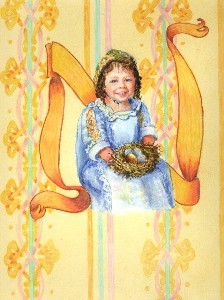
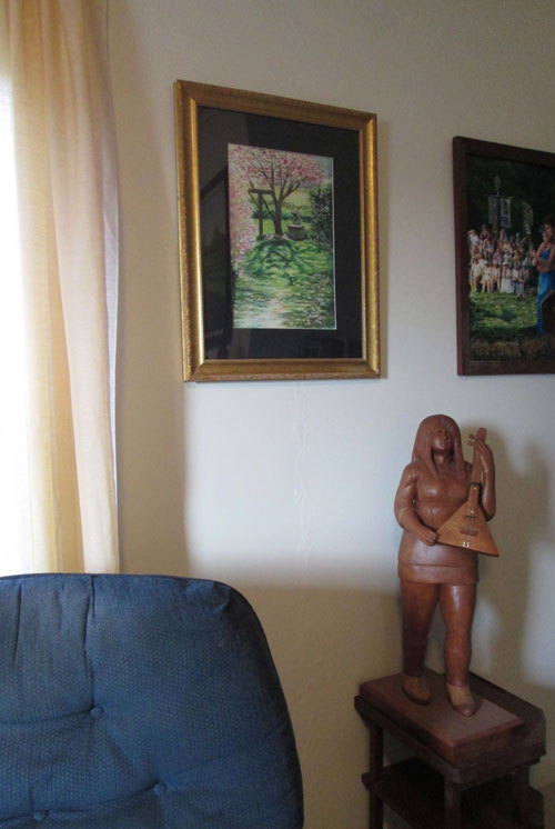
A watercolor, colored pencil, acrylic illustration in Easter Day Alphabet (Pelican Publishing 2003)
Now I realize that all three of these are in no way defining....for instance:
1) Fine artists are often influenced by gallery and other people's market preferences; illustrators often make art on speculation that is later purchased for a publication.
2) Fine art
is often put on surfaces that are vulnerable to the ravages of
time; A lot of 20th century illustrations were done in
oils and on canvas
3) Fine art
is often commissioned for a specific person/concept/installation;
illustrations can be and often are extremely emotional.
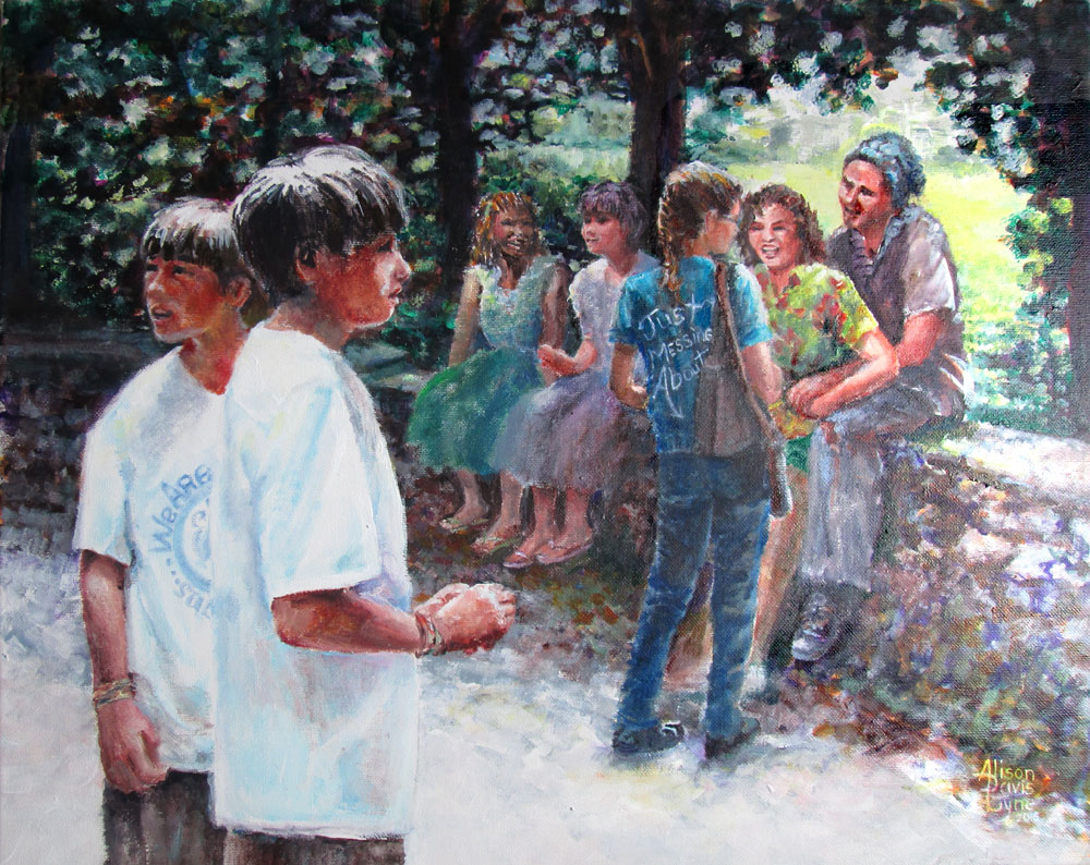
Just Messing About, an acrylic painting for a juried art show
Now to
suggestions about the real life uses of such musings. When an artist
is learning their craft, most techniques, guidelines (i.e. style,
composition, colour,value etc), and practice is centered on learning
the things that they need to know to produce a visual image that
matches their intent. Most educational settings don't give a lotta
guidance about what happens to the artwork after it's finished and to
the artist who graduates.
Many
artists go onto careers as teachers/curators, fine artists, and/or
graphic design/illustrators, to name a few. Since all these careers
are based on the notion that an artist's work/vision/knowledge will
be exchanged for money, we automatically open our selves up to the
regard of the public. The gate keepers of our work's exposure, be it
schools, galleries, or art directors will usually be responsible for
guiding our work to a appropriate slot....be it fine art or
illustrative publication.
They
make such decisions based on having experienced looking at a WHOLE LOTTA
ART. Years and years worth! We as artist can do the same thing. If
we, as artists can get a feel for what constitutes a illustration vs
what makes up a fine art piece, we are ever so much better placed to
get our artwork seen in the best venue.
1) Look at
all the art you can manage. Fill up your FB feed with art of all
types, whether it's gallery work, or magazine illustrations or
comics....it's all a chance to see what your perspective
buyers,bosses,judges will be looking for.
2) Go
to any art shows that are around, look at any and all print
materials. After a while you'll begin to get a feel at what you might
expect to see on a shampoo bottle vs what might be shown in a gallery
or something you might pick up at a Hallmark store.
3) See what
the folks in charge consider the best of the best. In gallery shows,
it'll be the prize winners. Often, but not always, the little red
dots (which means a sale) will go along with the prize winners. In
illustration, specifically children's book illustration, the “oscar”
is called a Caldecott award. Each kind of publication will have a
different one.
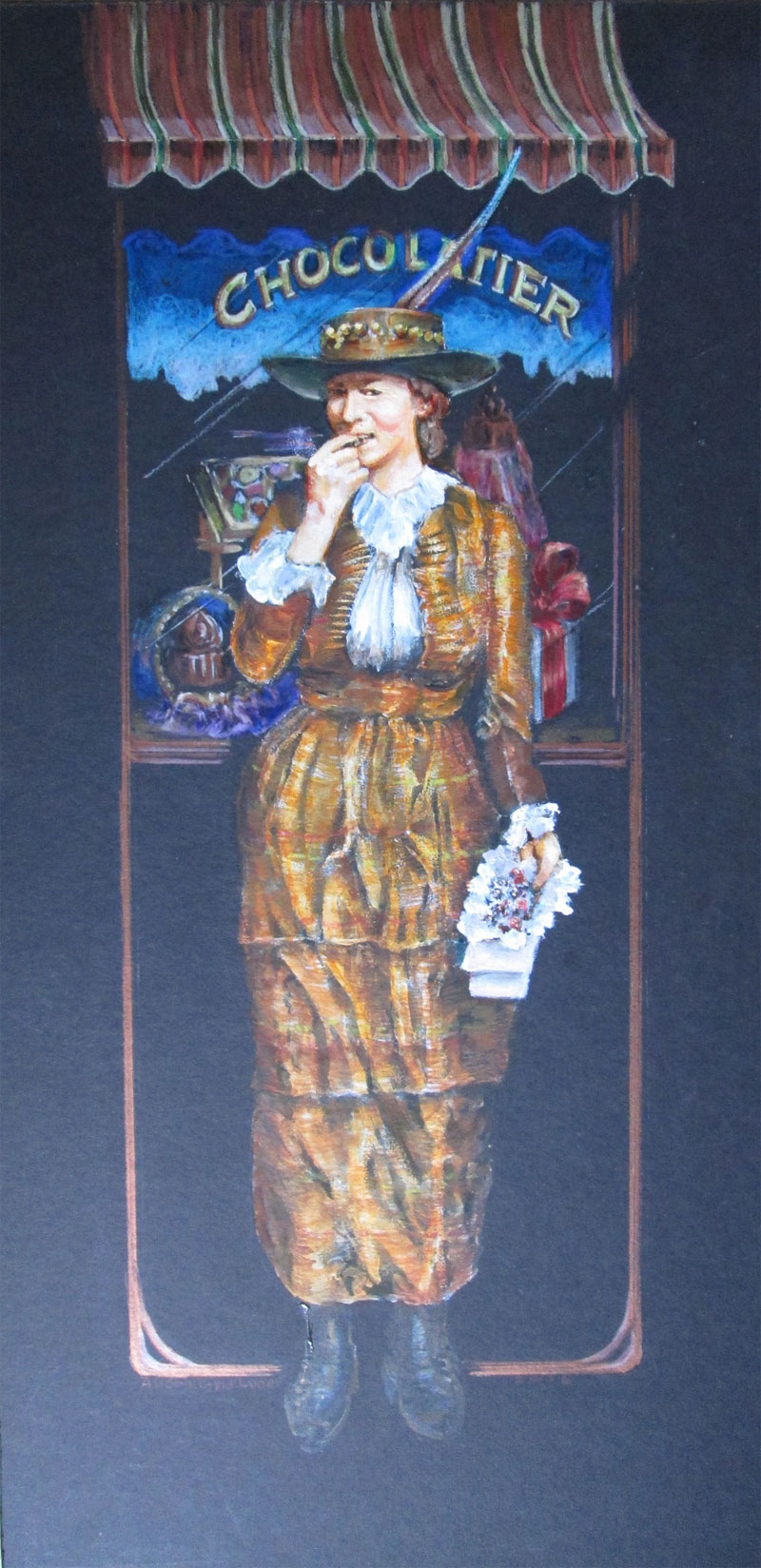
A
Picture + Words artwork; CHOCOLATIER, using acrylic paints,
watercolours, colored pencils. Accepted in a KAC Traveling Art show:
The Illustrated Word.
And
finally......I really feel that the statement should be Fine Art AND
Illustration. I have never been able to stop telling a story, no
matter how big or small. And I always want to tell it with the most
possible COLOUR, and richest detailing that I can manage. I believe
that the happiest way to pursue my own art, is to continue to work to
find fresh and engaging ways to both paint in a “fine art” style,
while continuing to tell a story. At least that's IMHO!