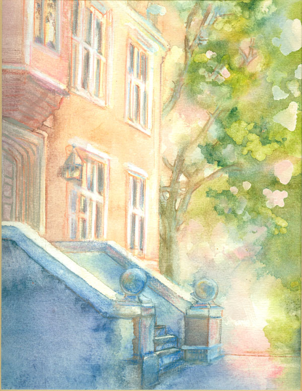
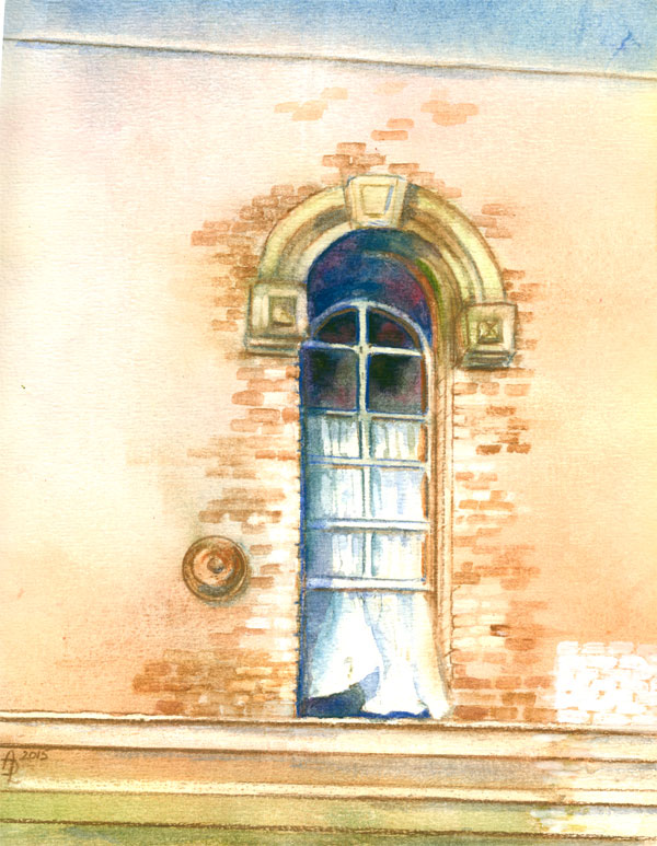
Saturday, August 29, 2015

Window Study...or a New Coat of Paint


A New Coat of Paint
8 x 10 inches on 140 lb watercolour paper, using various watercolour brands,
some watercolour pencils, and a bit of acrylic paint. Reference is my photo.
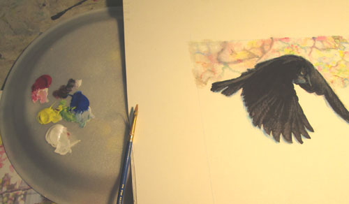
On the 
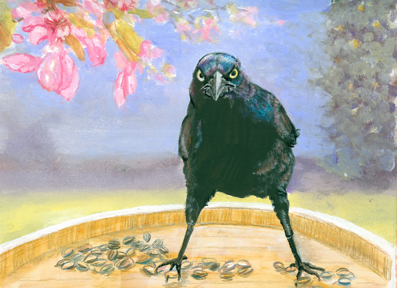
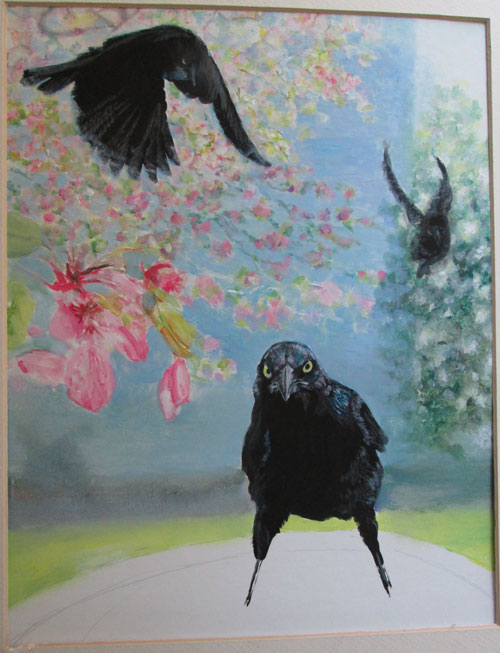
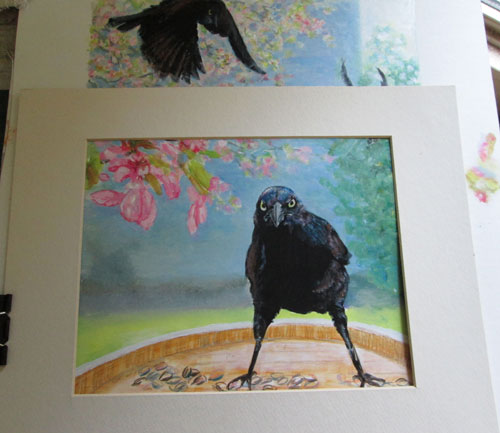
heels of my previous piece, Grackle-attitude, I wanted to continue to explore uses of wax coloured pencils with other media. I decided I wanted to do a watercolour piece that had architectural elements needing straight lines. I picked an old photo of a historic Nashville building, that was going under renovation. The window that was my focus was an old double hung sashing.....it was open both from the top and bottom allowing a breeze to flow thru.
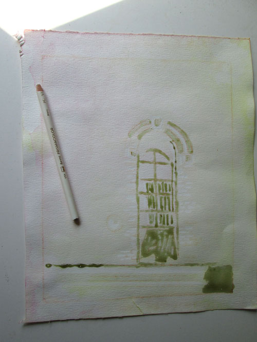
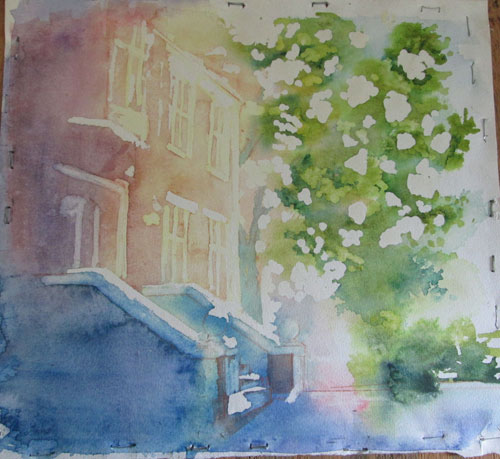

I sketched out the window and laid in lines and curves of the window and curtain with liquid misket....showing here as a greenish grey. In addition I lined off some of the straight lines and bricks with a white wax coloured pencil. If you look closely you can see the bricks embossed with the white coloured pencil.
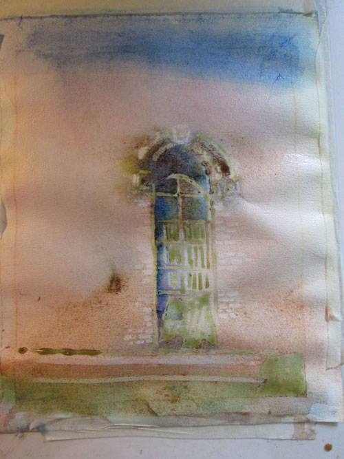
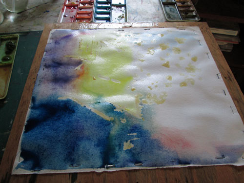

I wet the paper and slapped it onto plexi glass, and taped it all down after applying my first washes. You can easily see where the white wax coloured pencil resisted the watercolour wash on the bricks, in addition to where the liquid misket was located.
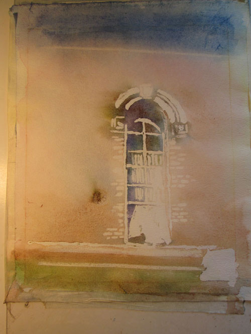
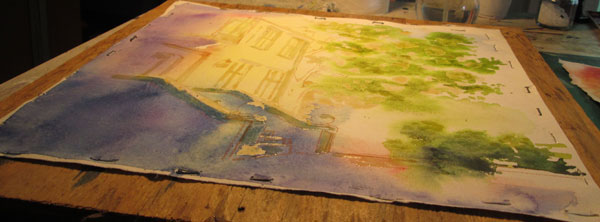

After a couple of more watercolour washes, I removed the liquid misket and lightly erased on the colored pencil bricks to remove puddled dried watercolour. Now I could see where I needed to go next to firm up the window and surrounding wall. I was especially pleased with the top portion of the window, showing the upper arch's depth. I had done a line of the wax white coloured pencil just under the frame, that got covered with my wash. I later was able to gently lift that watercolour residue off the white pencil line. It made it look half in and half out of shadow.
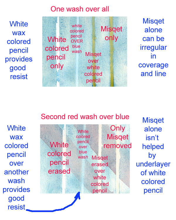
Before I finished the watercolour study, I took a waste piece of watercolor paper, and drew four lines. The first one was a white wax coloured pencil line. Next I left blank. Then I drew a white wax coloured pencil line and I put a bead of liquid misket on top of that. Then finally I drew a line of misket only. I did a light wash of blue over all four lines. When dry, in the blank space I'd left, I drew a line of wax coloured pencil over the blue wash.

After that I lightly brushed a second red watercolour wash diagonally across the paper and lines.When that dried, I erased the first colored pencil line and it came off very clean. The next line over wash I also erased, and again came off very nicely, showing the blue wash underneath. I removed the last two misket lines, and found not a lot of difference in the line. I think that the reserved white from a wax coloured pencil line is most effective when I want that line to remain white (or whatever color I've used). If I want to just “reserve” the white to later apply watercolor over then misket seems the best, tho' the line won't be as straight as the wax coloured pencil. I also like the idea of using the wax colored pencil OVER an already laid down watercolour wash. All these bits of info will play into my next watercolour project.
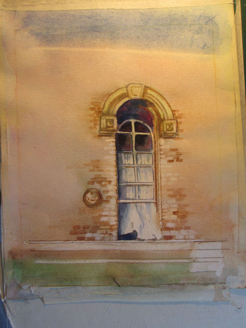
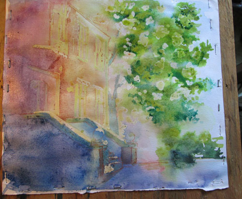


For the finish of this piece, I added in additional “bricks” of various hues around the picture's main focal point. I had reserved the white paper for the new coat of paint on the lower right ledges, but felt it needed something else to 'splain the title. I took a dab of white acrylic paint and applied it over a regular square of bricks to signify that the old distressed bricks were getting a new coat of white paint.

I enjoyed fooling around with the watercolour and the wax colored pencil. It's yet another neat tool in my artistic toolbox.


Saturday, August 22, 2015

Grackle-attitude or Experiments in Ink, Colored Pencil, Acrylic


Grackle-Attitude
8 x 10 inches ink, coloured pencil and acrylic paints on illustration board from Frank Lyne and my photos.

This time around, I'm showing some stuff that did........ and didn't work, for this portrait of the ultimate “angry bird”.....the grackle.

I started out with a wonderful photo that Frank took this winter of a really intense grackle, guarding his part of the bird seed feeder. I'd gotten some fun pics of a bunch more grackles jockeying for position to get to another feeder. I combined those photos with one I'd taken of some crab apple branches in part shade/part sun.

I'd read of an art technique where a black india ink silhouette was made of the figure, in this case the three grackles. I positioned them so's one was extreme foreground, one was flying in and a third was in the background.


After the india ink dried, I drew in the eyes, beaks, and feathers of the three birds with coloured pencils. The first pass of the wax coloured pencils went on well, the india ink coating accepting it just fine. Then, in traditional coloured pencil style, I went over things again to emphasize the first lines. This time nothing happened, no flaking....but no increase in the intensity of my lines.


So I went back to what I KNEW would work....acrylic paints. I went back over my coloured pencil lines with thin coats of acrylic paints to draw out the sharp beak, the intensity of the yellow coloured eyes of the bird. I also did very fine brush lines for the iridescence of the grackle's head and wings. I painted them in mostly white at first, to provide a base for acrylic glazing of the final colours.


As you can see in the pic above.....off to the right a bunch of little pink/green/blue spots....I “auditioned” both coloured pencils and acrylic paints for the next step of the painting.....the blurred background of the crab apple blossoms. I decided on acrylic paints, as I had a large-ish area to cover, and burnishing (smoothing with hand pressure layers of wax coloured pencils) that much coloured pencils would be considerable wear and tear on my hands! I started in painting the blurred background of the crab apple blossoms.


After I'd painted in the background, I stepped back and looked at what I'd done so far. I wasn't too impressed with the composition, now that I'd gotten it filled in. Drastic measures were called for!


Sometimes you just have to go ahead and paint something to be able to judge when it IS and ISN'T working. I grabbed a smaller mat and begin to “frame” a different part of the painting to see if it would work better just showing a part of the original composition. I ended up liking the horizontal “landscape” view the best.


Saturday, August 15, 2015

Building Study......Stretch and Staple Watercolour Paper


Building Study
approx 8 x 10 - done from my photo reference
on 140 lb watercolour paper - various watercolour brands with some watercolour pencils

This blog post is the second in a series of watercolour experiments. I'm playing with different ways to keep watercolour papers flat while working on watercolour pours. Last time I did “Soak and Slap”.....this time I'm trying “Stretch and Staple”. This method for prepping watercolour papers is a traditional one that I thought I “didn't have time for”. But after some disappointing mishaps with watercolour boards.....I've decided to try the technique out.

The first thing is to soak your watercolour paper in water for five to ten minutes. Pull it out of the water and briefly drain. Lay it on some masonite/particle board or other, and gently flatten it out. Then take a stapler/staple gun and beginning at the center edge, staple about every inch or so, gently stretching the paper flat. Continue working out from the center edges flattening and stapling the paper. When done let it dry. It should dry drum taut and flat.

I put in some misket on spots I wanted to reserve in white, then throughly spritzed the entire sheet. I then began pouring on a yellow, a rose madder genuine and a blend of different blues. As you can see it buckled a lot!


Looking at the buckles and the valleys where the watercolour was pooling I despaired of a smooth blending of colours. BUT I remembered another component of the “pour” technique......MOVING the watercolour around on the paper and finally pouring the excess watercolour off the paper. So I proceeded to do just that, I tilted and turned the board till I had gotten a good wash and then poured the rest off into a cup. Almost immediately the buckles began to subside. As the paper began to dry just a bit......it also began to flatten back out.


By the time it was dry it was once again totally flat, and the wash I'd done was pretty even!
I wanted slightly stronger colours.....remembering that watercolours always dry lighter than when wet. So I did a coupla of more washes, repeating the pouring method, with the same results.....a flat sheet when dry.


Once the washes were dry I removed the misket. It was skewing my eye when evaluating the wash placements. I went on to line in with watercolour pencils more of the details of the building and the tree branches. I was not as pleased with the stark outline of the misket on the leaves and scrubbed out some of the more harsh lines. The misket had also not stayed straight on building highlights that really needed to be straight. But all in all this study has been a ball to do. I've gained valuable know how about basic watercolour painting and very much enjoyed bringing a bit-o-colour to a sometime plain brick building.


Saturday, August 8, 2015

Dragon Illustration: “I Choose YOU!”


Dragon Illustration:"I Choose YOU!"
Approx 8x10 inches - watercolour-various brands, acrylic paints with paper cutouts 
on 140lb watercolour paper -Text added digitally

This blog post is about some watercolour experiments I've been doing over the summer. This time I've been experimenting with ways to treat watercolour papers while painting. My first goal was to see how much watercolour pours different watercolor papers would take. I decided to try out different ways to use watercolour on papers, and end up with a flat piece of art.....not the art.....but the actual paper!

The technique I started out with was one I've nick named “Soak and Slap”. It's quite simple really......you take a smallish piece of watercolour paper 8x10 or 10x14 inches and soak it in water for five or ten minutes. Take out of water, drain slightly and slap it onto a slightly larger piece of plexiglass.....smoothing it down all around. The water suction holds the soaked paper in place and you are ready to paint. The paper is already wet so it will accept watercolor washes poured over the wet paper......mingling beautifully as the colour moves over the paper. It's as simple as that!


I let the paper get almost dry, while applying some salt blooms, then I peeled it off the plexiglass. By the time I had applied some misket on spots I wanted to preserve.....the paper had started to buckle. 


So I tried an alternate method to keep things flat. I spritzed the back of the paper and clamped it all down and worked on things a bit more. But the paper stayed buckled.


So I went back to the original “drawing board”.... the plexiglass. I heavily spritzed the back of the drawing and slapped it back down on the plexiglass. I added a bit of masking tape all around the paper.
I had decided that this piece would be a children's book kind of illustration. I sketched up a dragon and decided on the action I wanted. I worked on laying in the white acrylic “underpainting” for the dragon. While I was working on the dragon, the paper gradually began to dry.....but stayed FLAT!!


So.....leaving the paper where it was......I painted in the dragon in acrylic glazes over the white underpainting. On a separate piece of paper I painted a little girl in a pink pajama set. I cut her out and taped her down, placing her exactly where I wanted her, on the watercolor painting. Once everything was dry I scanned in the whole thing, took it to Photoshop, and put in the text.....”I choose YOU!” and was finished.
This time around I've learned that when I use the “Soak and Slap” method of painting on watercolour paper.....keep it there through out the entire painting process.
On to the next method......”Stretch and Staple”.