Saturday, November 26, 2016

Haying or a Small Bit-o-History

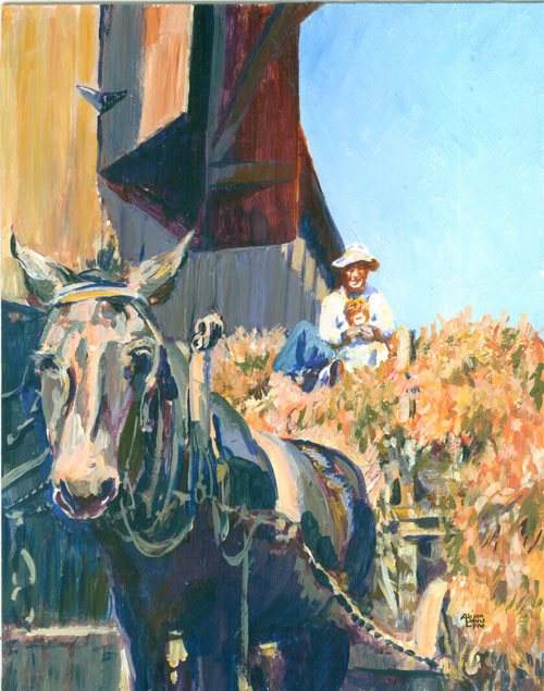
Haying 8x10 inches acrylic paint
 
This time around I'm showing a small painting I did a few years ago. The painting is based on an old family photo showing how hay for livestock was handled in the 1930s. Hay was cut, left out to dry and then raked up with a “dump rake” into huge piles. Those huge piles were scooped up by the pitchfork full, into a wagon. Which was transported from the hayfield to a barn via a mule drawn wagon, then scooped up, by a hay fork (think a huge double arm scoop, sorta like what you use in a mechanical arcade game machine with crane claw). It was swung into the barn where it was stored. You can see the opening in the top of the barn where the hay fork came out to scoop the hay up in the loft. Then in the winter it was doled out, again by the pitchfork full, fed from hay racks on the ground floor of the barn. All this was by hand, mind you!
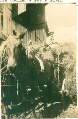
 
I've always been fascinated by the older black and white photos.....they usually have such a wealth of detailing.....you can see almost every blade of grass! Every time I see a really neat old photo, I always want to “see” it in colour. Since I tend to solve a lotta of my desires with paint.....I will often take an old black and white photo and bring it up to colour. It's a nice challenge to see if I can get the black and white values correct.....while still injecting what I feel would be the right colours to fit the scene.

But bringing an old black and white photo into colour, offers another neat opportunity.....a chance to learn about the circumstances that the photo is presenting. In this case, it's revisiting a vanished farming era. Other times, painting someone's family member from an old faded black and white photo, lets me learn more about that person in the photo......and how the person commissioning my painting really “saw” that family member. I always learn SO much!

Saturday, November 19, 2016

Red Vase or Mostly, Some and a Bit in Red

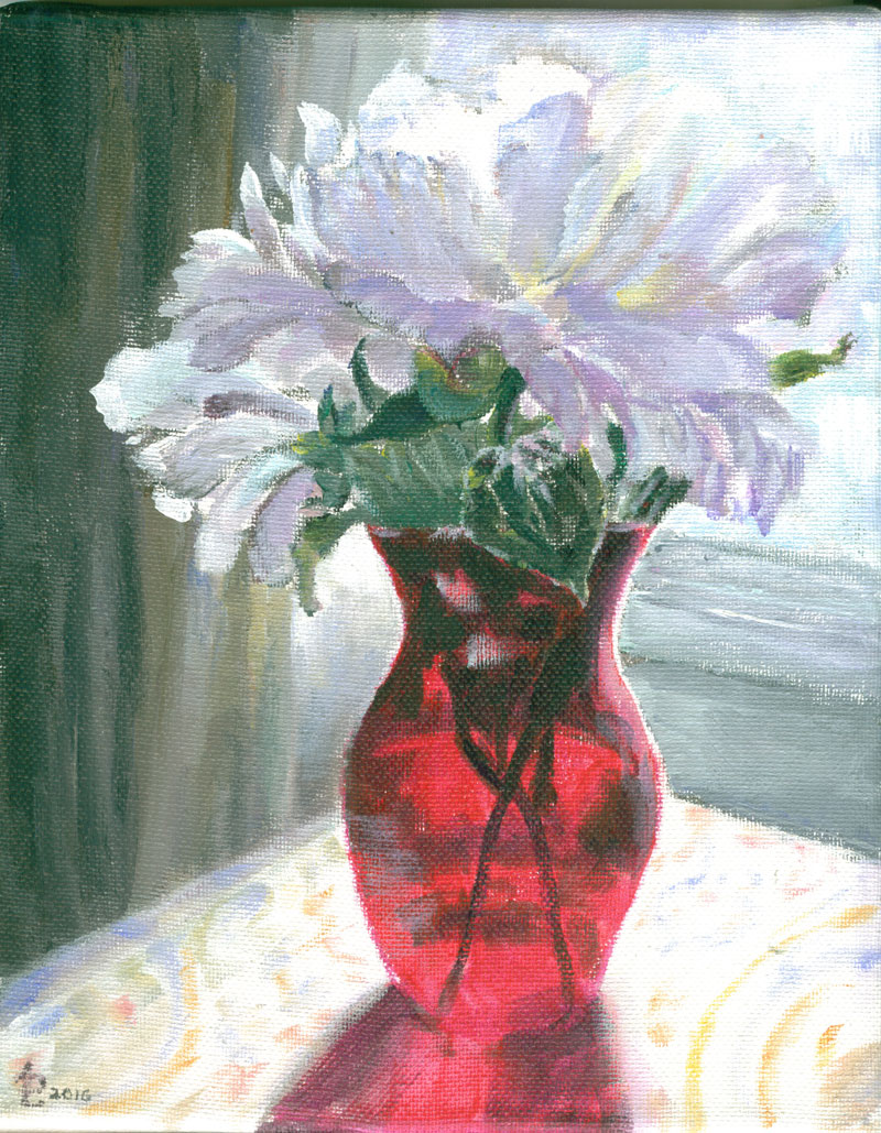
Red Vase - Acrylic - 8x10 inches
  
This time around I've got another of the small 8x10 canvases that I wanted to do a small still life on......an idea that doesn't really rate a full size canvas. A summer or two ago I'd taken a lotta flower photos in various “antique store finds” vases. This vivid red vase just seemed to beg for the flashy white peonies that had just a hint of the same red in their centers. I positioned it for a back lite “pose” and this one was my fav.

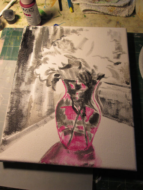
I sketched the photo onto the canvas and started painting. I laid in the bare bones of the painting in the first session:


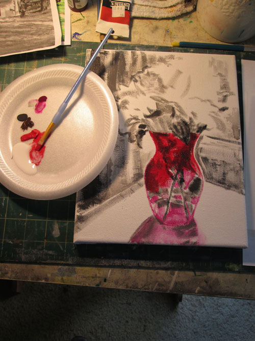
The next session I did some glazes with different reds on the translucent red glass vase. Using three different red glazes really intensified the red of the vase. Since the red vase was the star of this painting, I wanted to paint it first and let everything else literally “pale down” beside it.


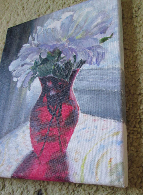
I continued on painting till I felt satisfied with the values of the different flower petals and the other background elements. I was especially pleased that I could contrast the petals on the left against the curtains in shadows. I also like these smaller canvases as they wrap the canvas all the way around the sides to allow me to paint them with a continuation of the painting itself. 


Sunday, November 13, 2016

How I Spent my Saturday....or Christmas Ornaments at the Library


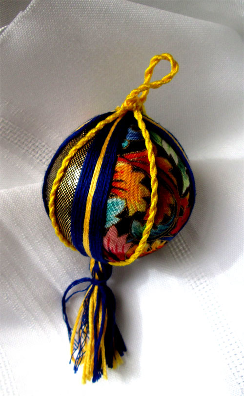
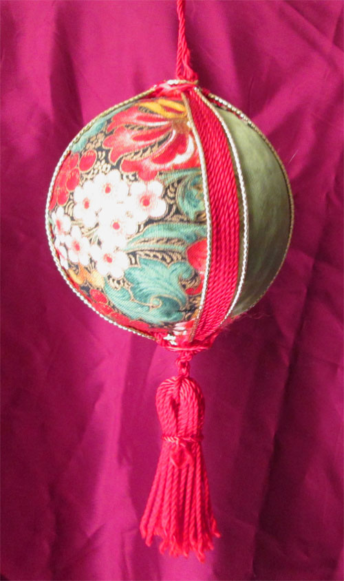
 Last Saturday our local library invited me to do a mini program on Christmas Ornament making. I had been making a bunch of Christmas ornaments while watching nite time TV. After the program director saw some of my designs, she asked me to share some of the techniques I'd been practicing for Christmas ornament making.


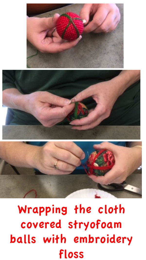
I had a box full of cloth scraps from loooooong ago, along with a bunch of embroidery thread in lotsa colours. So's I came up with some designs for Christmas ornaments, using cloth scraps, and threads covering styrofoam balls.

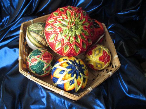
A while back I'd gotten interested in temari ball making.....a Japanese needlework technique also using stryofoam balls and threads. Of course, being me, a lotta colour was involved in the designs.....so I was a happy camper. I'd made some ornaments using the traditional Japanese methods.......


but wanted to do some simpler ornaments using Christmas themed cloth and coloured threads. These are the kind of ornaments we worked on at the library program.


A few lovely ladies joined me at the library on Saturday, and we had a ball (pun intended!) covering stryofoam balls with with fabrics and stitching red and green threads around the centers. We added some hand made cording and hand made tassles and viola! We all had lovely Christmas ornaments to start off the holiday season.

Thanks so much to the Logan County Library for suggesting this event and all the lovely folks who turned out to have a bit-o-holiday crafting fun and share some laughs.


Monday, October 24, 2016

Hopkinsville Art Guild's Pennyroyal Art Show 2016

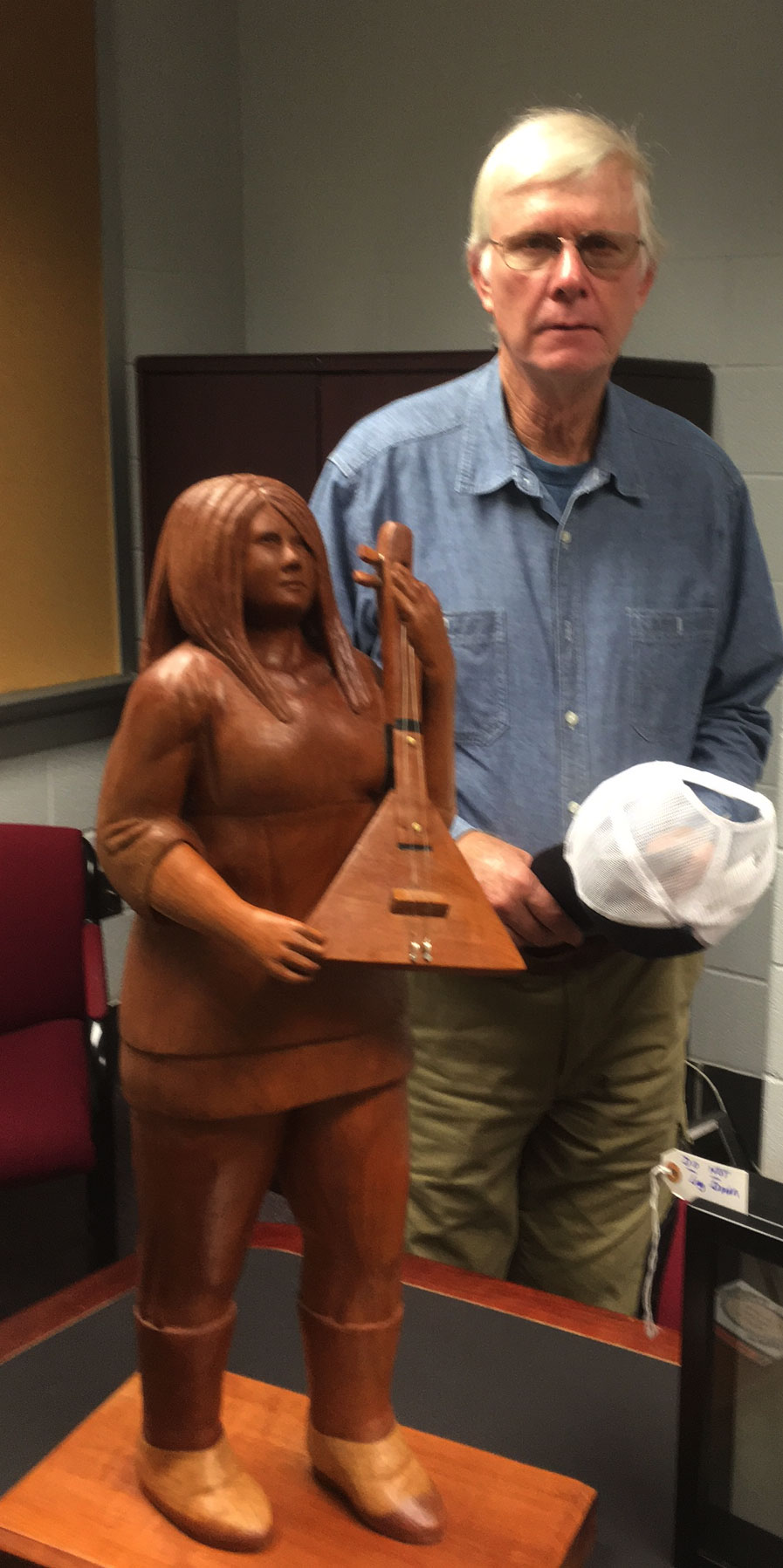
Frank with his sculpture in cherry wood titled String Player
Winning First Prize in 3-D sculpture
at the Pennyroyal Juried Art Exhibition at the Hopkinsville Community College Auditorium Gallery
 
Today I'm sharing a pic I took of Frank at the reception for the Hopkinsville Art Guild's annual Pennyroyal Art show. He's posed with his (first in 3D) prize winning sculpture: String Player. I took the photo with my phone, and it was smart enough to prompt me with a request to identify the “person” with Frank, meaning the sculpture!

I also had a couple of paintings hanging in the show:

 Vine Ripened Puppys for Sale

and

WinterGlow

Here's a link to more about the Pennyroyal Art Show:
 

Saturday, October 8, 2016

Mostly, Some and a bit.....in Yellow

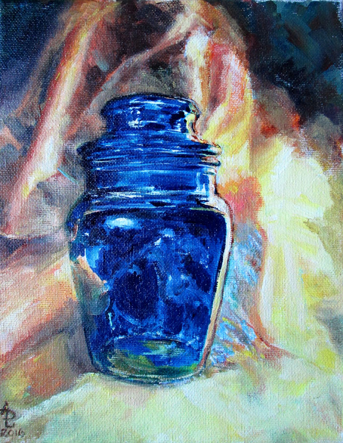
BLUE JAR
 
This blog post shows off a bit about a small acrylic 8 x 10 on stretched canvas piece called Blue Jar. After seeing friends do series of smallish works (8x8 inches or 8x10 inches) I decided I'd try a few. I wanted to try a coupla ideas that I liked, but felt wouldn't rate a full size canvas.

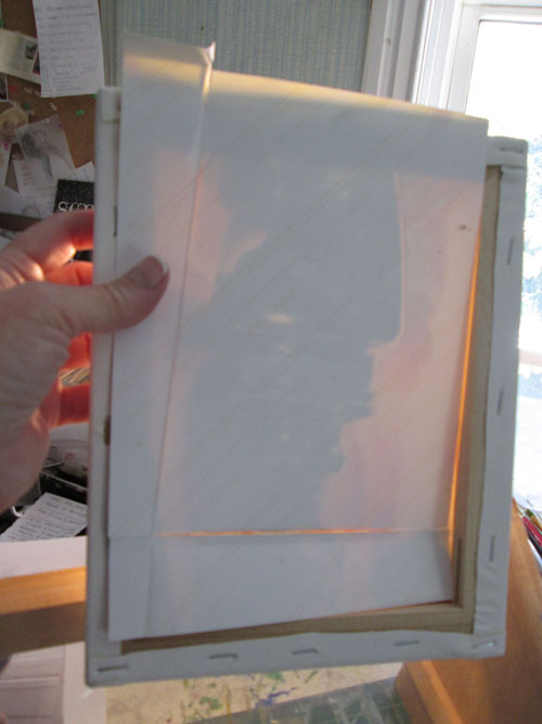
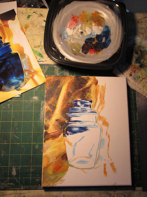
So's I grabbed a two pac of inexpensive stretched canvases. The bad news is the canvases were really thin material, compared to more expensive duck cloth canvases I'd painted on in the past. The good news is the canvas was indeed really thin.......so thin I could use an old illustrator trick of transferring a drawing using a light box. In other words, I put the cropped (both digitally in Photoshop and after printing out....with scissors) photo I'd taken of the jar, and put it behind the canvas. I shinned a bright light behind the canvas and photo, and viola! I could easily trace off the main outlines of the jar with paint. Thus getting the image transferred in one fell swoop! Here's what the backside looked like.


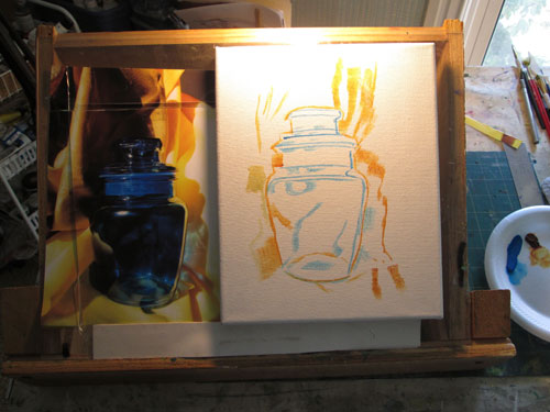
So I had the main outlines on canvas and I could start painting. Tho' the main subject was the cobalt blue jar, I was designing things under the “mostly, some and a bit” guideline. So's it was going to be mostly yellow, some blue, and bits of red......i.e. A triad color scheme.


I got this far in my first session:


I wanted to do this piece fairly quickly and use larger brush strokes than I usually do. My imagination had been fired by some really nice impressionistic artwork I'd seen recently. I have to admit I was drawn in by all the lovely reflections on the jar and found myselves reverting to my old detailing habits. In the end, I went back in and removed some of the excessive brushwork in the background to allow the detailing in the jar to shine.


Thursday, September 29, 2016

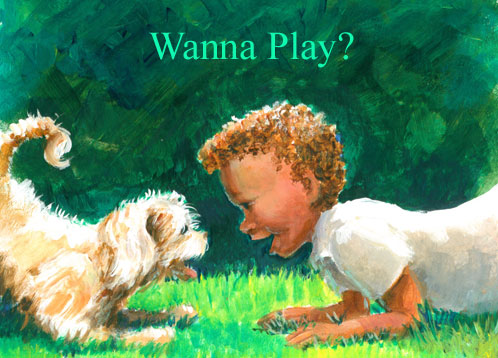
Wanna Play?


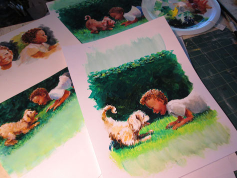
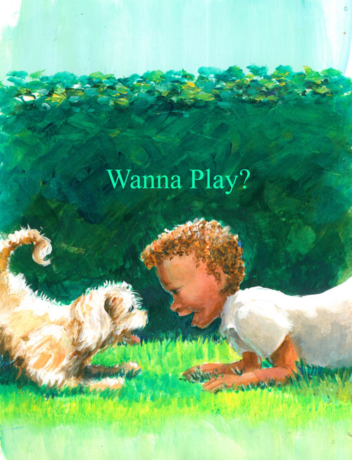
This time around I'm showing a bitty illustration called “Wanna Play”? It came from an idea I've been messing around with for a story line about a “boy and his puppy”. I've been working on visual communication between characters, and I thought it would be cute to show the puppy and little boy “communicating” using a puppy's “play” crouch signal. When you see a dog or puppy doing this crouch.....you just know that he's saying “Do you wanna play with me”?

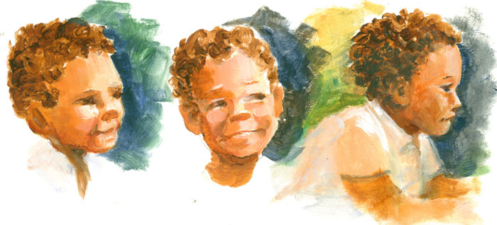
Before I drew the entire scene, I needed to firm up the little boy character a bit. So's I did a few head sketches to see just how I wanted the little boy to look. I'm still working on the whole “keep it simple” thing......but I've found that if I use paint to “sketch” the characters and remain focused on establishing the masses of the characters, I get the feeling/gestures quicker.


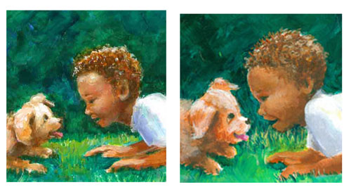
I took what I learned from the sketches, and drew a simplified little boy mirroring the puppy's play pose, using the green hedge to show the bow to the backs of both the puppy and the little boy's. Even without a lotta detailing......I wanted to let the poses of the puppy and little boy “speak for themselves”. But tho' I liked the left hand version of the little boy......it was still a bit too “realistic” for what I had in mind. So's I tried a younger version, but it still didn't quite suit either.


So's it was back to the “painting” board. I tried another version, this time changing the crop from landscape to portrait. I worked on keeping my “realistic” habits in check and concentrated on keeping things simple. I wanted to show the most important part of this scene......the interaction between the two characters. 


I really enjoyed putting a lotta energy in the background bushes, with bold strokes of colour. This emphasized the simpler foreground figures with their warm colors and graduated modeling.


Saturday, September 10, 2016

Illo Prompt SWIFT or Idea Jumpstart

Illustration from the SCBWI idea prompt: SWIFT
 
So........SCBWI does this “thing” for their monthly email INSIGHT segment.....it's an itty bitty contest where members draw something to a suggested prompt. This month's prompt is “SWIFT'.

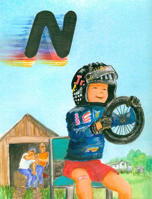
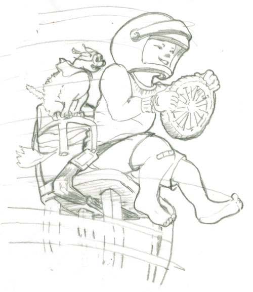
For one of my illustrated books, G is for Grits, A Southern Alphabet, I illustrated a little boy pretending to be a stock car race driver. He had on a toy helmet, was sitting in a chair and was using an old toy wagon wheel as his steering wheel.


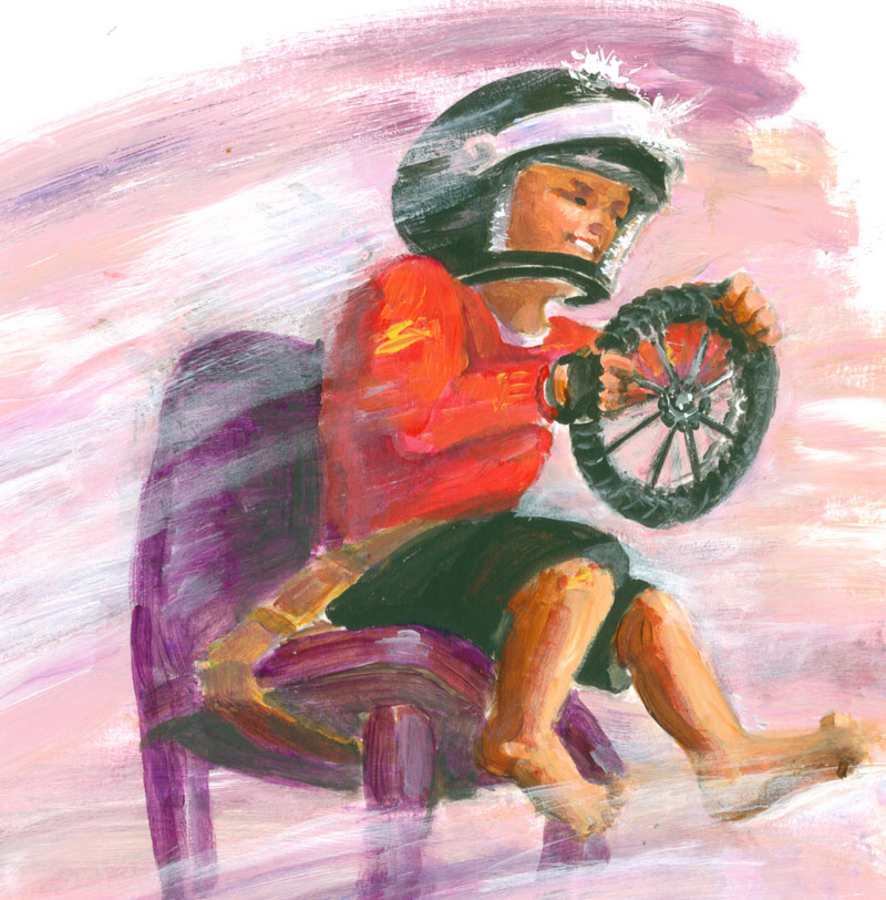
Well, I had always like this illustration, so's I thought I'd do a slightly different version for the prompt. For my sketch this time I added a doggie copilot and speed blurs against a plain background. I made a sketch, including a seat belt for the boy and a tiny chair for the doggie, duck taped to the little boy's chair.

 
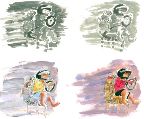
Then I took that sketch and made a sheet with four of them printed out. I used this sheet for a “cheat sheet” studies of black and white values, where I learned that a strong light and dark gave a bit of drama to the scene. I also did a couple of colour sketches, and decided on my colour theme.


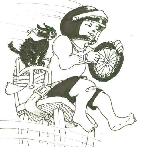
And since I'm having trouble silencing that old habit of including EVERYTHING in a sketch, I went ahead and did a teensy black and white line drawing, showing everything in great detail.


OK......now that I'd gotten that (uber detailed) version out of my mind, I concentrated on being more loose in my colour illustration. Now a days, I'm trying to go for “Draw tightly.....paint loosely”. During the painting process part of this, I ended up jettisoning the doggie side kick.....he was just to “heavy”.....in a visual kinda way. I'm sure he'll show up in a future illo!

You can see the finished illo at the top of the page.