Thursday, September 29, 2016

Wanna Play?


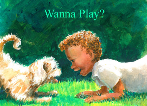
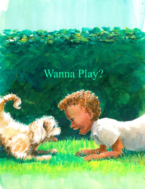
This time around I'm showing a bitty illustration called “Wanna Play”? It came from an idea I've been messing around with for a story line about a “boy and his puppy”. I've been working on visual communication between characters, and I thought it would be cute to show the puppy and little boy “communicating” using a puppy's “play” crouch signal. When you see a dog or puppy doing this crouch.....you just know that he's saying “Do you wanna play with me”?

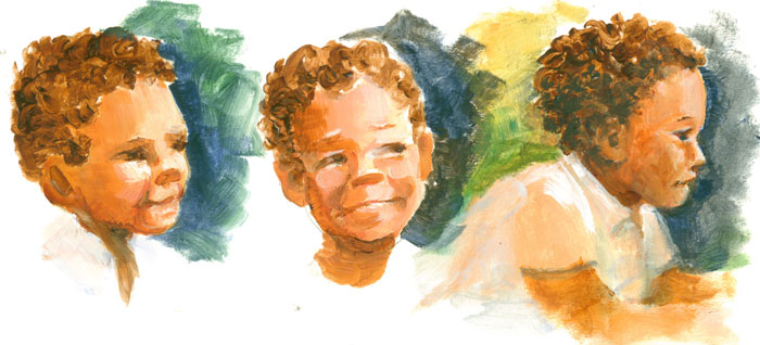
Before I drew the entire scene, I needed to firm up the little boy character a bit. So's I did a few head sketches to see just how I wanted the little boy to look. I'm still working on the whole “keep it simple” thing......but I've found that if I use paint to “sketch” the characters and remain focused on establishing the masses of the characters, I get the feeling/gestures quicker.


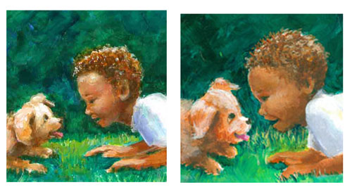
I took what I learned from the sketches, and drew a simplified little boy mirroring the puppy's play pose, using the green hedge to show the bow to the backs of both the puppy and the little boy's. Even without a lotta detailing......I wanted to let the poses of the puppy and little boy “speak for themselves”. But tho' I liked the left hand version of the little boy......it was still a bit too “realistic” for what I had in mind. So's I tried a younger version, but it still didn't quite suit either.


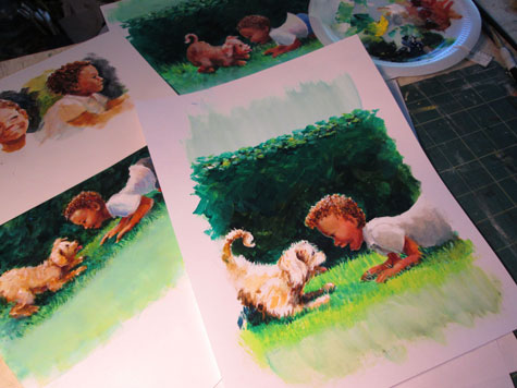
So's it was back to the “painting” board. I tried another version, this time changing the crop from landscape to portrait. I worked on keeping my “realistic” habits in check and concentrated on keeping things simple. I wanted to show the most important part of this scene......the interaction between the two characters. 

 
I really enjoyed putting a lotta energy in the background bushes, with bold strokes of colour. This emphasized the simpler foreground figures with their warm colors and graduated modeling.


Saturday, September 10, 2016

Illo Prompt SWIFT or Idea Jumpstart

Illustration from the SCBWI idea prompt: SWIFT
 
So........SCBWI does this “thing” for their monthly email INSIGHT segment.....it's an itty bitty contest where members draw something to a suggested prompt. This month's prompt is “SWIFT'.

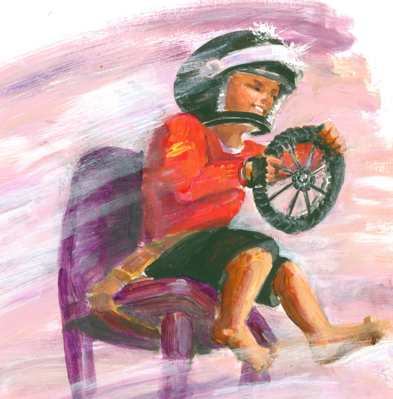
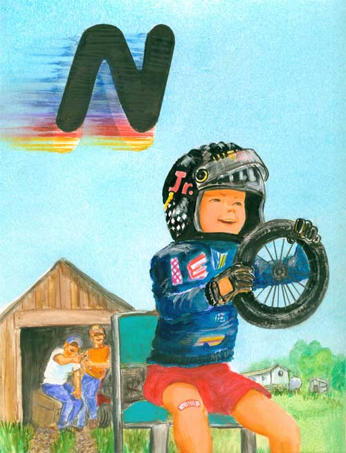
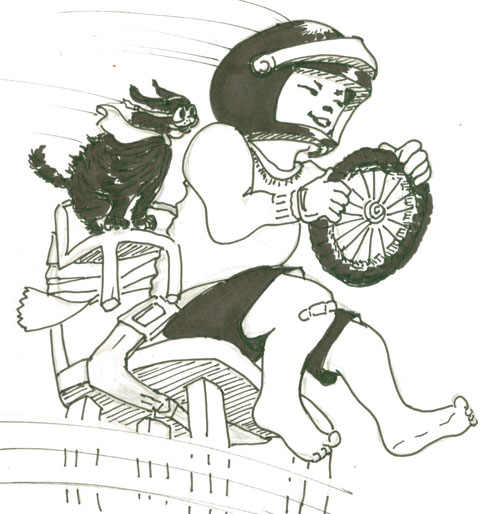
For one of my illustrated books, G is for Grits, A Southern Alphabet, I illustrated a little boy pretending to be a stock car race driver. He had on a toy helmet, was sitting in a chair and was using an old toy wagon wheel as his steering wheel.


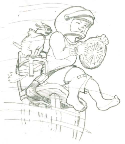
Well, I had always like this illustration, so's I thought I'd do a slightly different version for the prompt. For my sketch this time I added a doggie copilot and speed blurs against a plain background. I made a sketch, including a seat belt for the boy and a tiny chair for the doggie, duck taped to the little boy's chair.

 
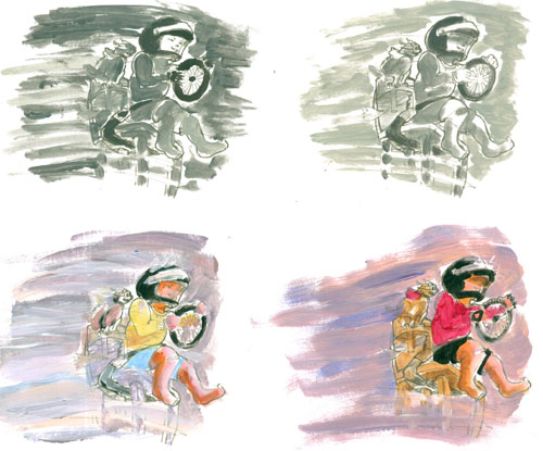
Then I took that sketch and made a sheet with four of them printed out. I used this sheet for a “cheat sheet” studies of black and white values, where I learned that a strong light and dark gave a bit of drama to the scene. I also did a couple of colour sketches, and decided on my colour theme.


And since I'm having trouble silencing that old habit of including EVERYTHING in a sketch, I went ahead and did a teensy black and white line drawing, showing everything in great detail.


OK......now that I'd gotten that (uber detailed) version out of my mind, I concentrated on being more loose in my colour illustration. Now a days, I'm trying to go for “Draw tightly.....paint loosely”. During the painting process part of this, I ended up jettisoning the doggie side kick.....he was just to “heavy”.....in a visual kinda way. I'm sure he'll show up in a future illo!

You can see the finished illo at the top of the page.


Saturday, September 3, 2016

Illo Experiment for Hidy-Bye Boy


A loooooong while back I wrote a bitty story, Hidy-Bye Boy and made a “dummy” for it. In this case, i.e. children's picture book illustration a “dummy” refers to a practice or mock up of a book idea. It includes the text of the story, laid out in sequence and rough illustrations showing what you have in mind. Especially when an illustrator “writes” a book, quite often a LOT of the story will be told using the pictures......with the words providing key directions. So's a mock up of how the author/illustrator plans on telling the story is crucial in letting a publisher know the author/illustrator's vision for the picture book.

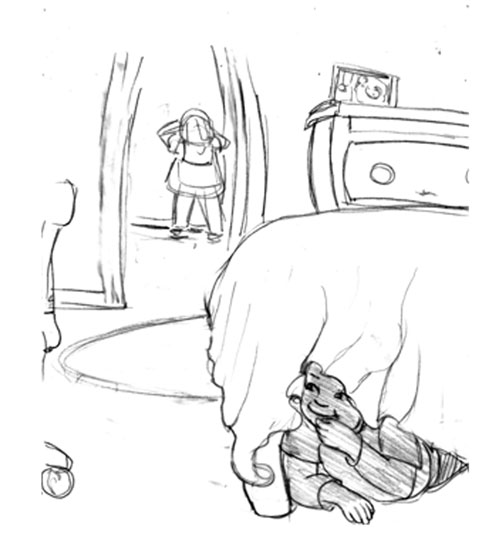
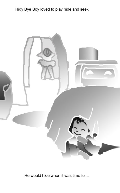
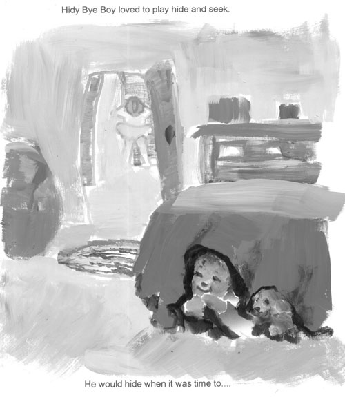
This pencil sketch is the first incarnation of page one of the story's text: “Hidy-Bye Boy loved to play hide and seek. He would hide when it was time to......” It shows the main character, Hidy-Bye boy playing hide and seek with his little sister counting down to go and find him.


At the time I was working on this dummy I was going thru a Photoshop phase, and I decided to “sketch” the dummy page using outlines and “fill” in Photoshop to show what was going on.

 
It had the advantage of being clear about what was going on in the sketch. But I also lost some of the charm of the pencil sketch. So recently, I took up this project again. 

 I've been doing a lot of classical painting of people, landscapes and wildlife. In this painting spree, I've “remembered” or revisited a lot of really nice planning techniques. One of which is to split your painting into only light,medium,dark sections to see if you have the focus on the main point of your composition. So that technique resulted in this little sketch being done again, this time in three gradients of black and white.


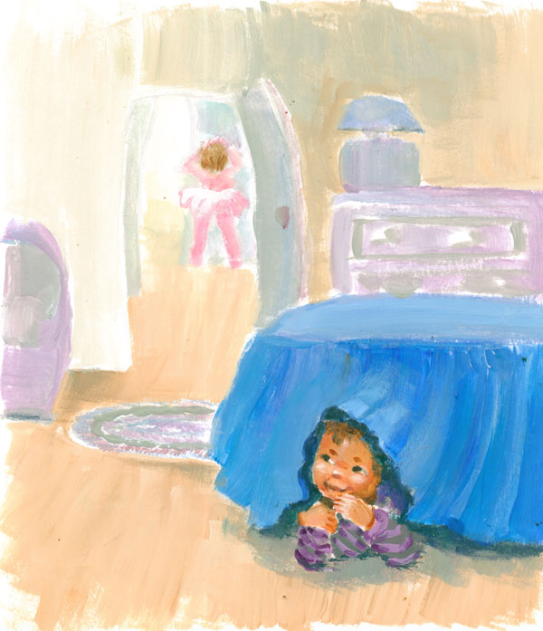
So now I had a clue as to a value map for my illustration. I then decided on my colors and matched the light, medium and dark values (and intensity) of the different colors I wanted to use with my black and white color map. You can see the result at the top of the post.


Friday, August 26, 2016

"Quickie Artwork" Inspiration from a Museum Photo

Wedding dress from Customs House Museum collection
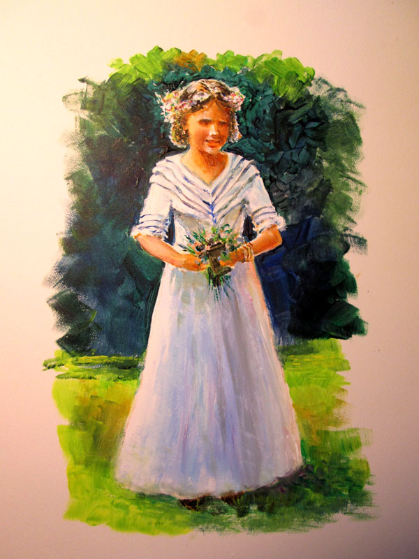
8 x 10 inches painted on bristol board with acrylic paints
  
This bitty blog post is all about inspiration striking from the most a routine online perusal. On Facebook, I ran across a post from the Customs House Museum, Clarksville, TN, that showed one of the thousands of items in their collections.

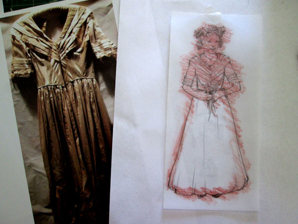
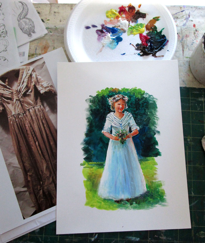
The image was of an old wedding dress worn by Temperance Catherine Joslin in 1844. For some reason that image of an old wedding dress just struck me as something I could make “come alive”. I took the image and drafted up a sketch of a young lady in the dress in a backyard wedding setting. I carefully counted the pleats of the collar..(3 each) plus one going “off shoulder” and a final one not on the sleeves but connecting the sleeves with the bodice of the dress. The bodice had diagonal lines in the bodice itself. The ¾ sleeves each had 3 pleats finishing with a dash of lace. It closely followed heirloom sewing techniques of the period.....i.e bodice shaping and sleeve trims using tucks in the material.
  
  
I transferred the sketch over to some bristol board and painted up the entire composition in acrylics. I wanted it to have a back lit sunny day look.....with a dash of impressionism. I premixed my colours and it “painted up” very quickly. I really enjoyed turning the lines into masses that resolved into a blushing bride in her wedding dress.

 
This was an enjoyable painterly type “quickie” sketch. Something that took advantage of an idea that came across my mind's eye and that I hope brought a bit-o-history to life. Museums, like the Customs House Museum, are great places to get "quickie art sparks".  

An enjoyable bit of artwork like this,  reminds me to be on the look out for chance impressions that can spark an art “quickie”.


Friday, August 19, 2016

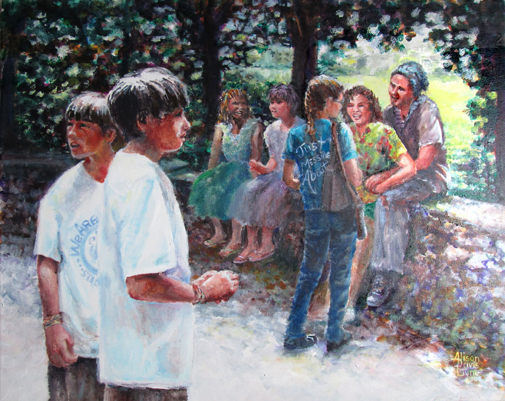
We Are Just Messing About or Another Pictures + Words Painting

We Are Just Messing About
Acrylic paints on 16 x 20 stretched canvas, my own photo references and imagination 

 
This painting is another one in my Pictures + Words collection. My aim this time was to show a group of folks “just messing about” in the park on a sun lit day. My artistic aims were to learn more about : Composition, values (lights and darks), gestures, color choices and masses (broad lights and darks to define a form.)

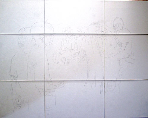
To that end I gathered some reference photos and began sketching. One little axiom I'd made up was to “draw tightly, paint loosely” or draw accurately from my photographic references but draw with the idea of masses instead of photographic detailing. To help with that, I took the photos into Photoshop, and reduced them to black and white, then “posterized” them, rendering the masses of the forms of the figures without detailing. This allowed for clothing/color/personalization changes at will, without feeling I had to adhere to the photos too strictly. These printouts are what I used to “sketch” onto the canvas. I again used the “power of thirds” to locate important features at the “sweet spots” of my canvas. Here is the canvas divided into thirds with my handy dandy elastic strings.


In my head I was also planning the lights and darks of the whole painting. Greg Albert, in his The Simple Secret to Better Painting has a bunch of nice axioms, but the one I chose for this painting was: Mostly, Some and a Bit. It can easily apply to values, colors and detailing.

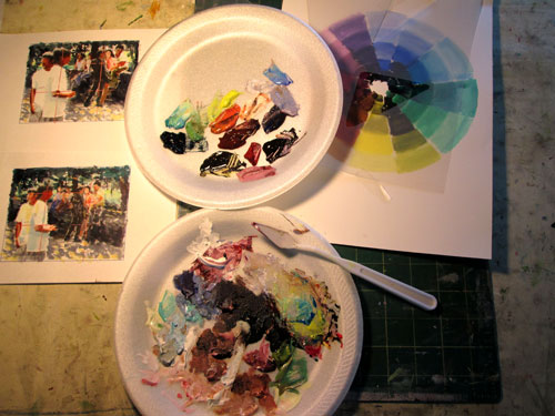
I took my Photoshop posterized sketches and printed out a couple of tiny ones on some bristol board, and used them for color/compositional “mini-mes” or thumbnail sketches. I used my color wheel to decide on a triadic color scheme and proceeded to mix up my basic paints. From my previous experiments in using greys to keep my color scheme in balance, I mixed up a set of greyed colours and then used some of the original tube colors for color “sparks”. I've tried this on the basis of James Gurney's Color and Light book. Premixing greyed colors is a great way not to “fight” too raw tube colors......and allow your color “sparks” to sing


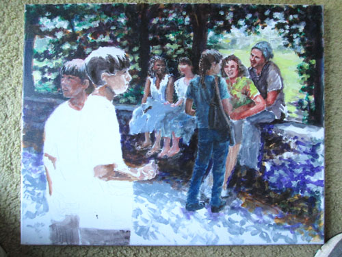
After establishing my compositional road map, light and dark value road map, mass and color road maps......I was ready to go. I laid in the basic lights and darks, making gesture, and facial changes, from the original photos, as I came to them. I wanted to make all these disparate folks look like they were all hanging out together. I then pulled up an oldie but goodie technique of glazing. I glazed the background tree masses till they were just distant background blurs, the better to focus on the people. As you can see I started off with a lotta greys, but the final painting is very colourful.

 
The planning process is a bit new to me, but I'm learning SO much from each one I do. It pulls together many things I've learned over the years......but have never combined quite this way in my painting planning. It's lovely to conceive a painting, with "bookish helpers" (i.e. re-reading from different technique books I have on hand) whenever I hit a snag in bringing a concept to a full painting.

Saturday, August 13, 2016

Green Glow or Grass is Different than Snow

 Green Glow
18x24 inches on Crescent w/c board using various watercolors and gouche
My own photo reference

  This time around I'm doing a watercolor of a scene I see each morning during my AM walk. It doesn't ALWAYS look this way, but springtime around here can be LUSH!

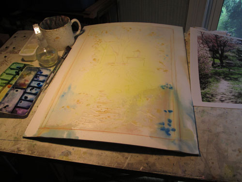
I transferred my drawing of the scene onto the Crescent watercolor board, and laid in some spots of misket, (they are the slightly brownish blobs in the photo). I then did liberal poured washes of yellow, red and bits of blue in shadow areas. You'll note the distinct bow of the watercolour board after all the washes I poured. 

 
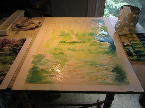
I immediately laid the bowed watercolor board right beside an air vent and left it over night. The next day, I found the board quite dry and totally flat! There was a tensy bit of separation between the paper and the board, but it was minimal and on the edges that go underneath the mat. So I went ahead with individual placements of intense watercolour Phthalo green over the yellows and blues. 

 
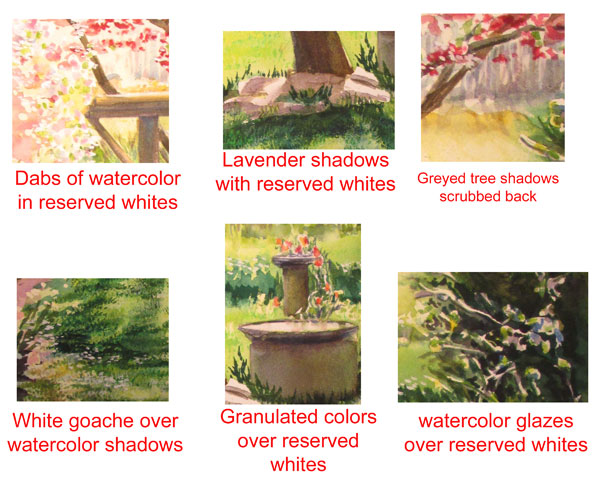
After laying in the pinks of the azalea and dogwood blossoms, the darks of the tree trunk, and the lavenders of the background trees, I removed the misket blobs that reserved the whites I needed for the sunlit water, grass and flowers.


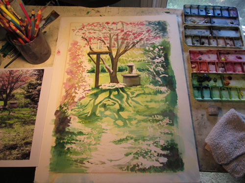
Here I'm laying in detailing in the two birdbaths, shadows of surrounding bushes and grasses, and most importantly the shadows of the dogwood tree branches in the green green grass. Here comes in the “.....grass is different than snow” part. When I originally envisioned this piece, I wanted to do a spring version of this winter snow scene:


But when I used the same strategy of masking the white of the snow and pouring on the watercolor shadows......it didn't look “grassy” at all! I needed grass texture in all that smooth green pour.


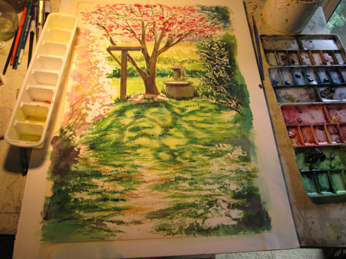
So I began “texturing” the foreground's “glow”. I scrubbed, I daubed, up errant spots of green watercolour, and detailed grass and blossoms and branches. I added deeper colours where needed, and in other spots I added white and yellow and green gouche, (opaque watercolors).


It took a lot of different techniques for this painting, but then a sunlit “glow” takes a lotta effort, if you aren't Mother Nature!


Friday, August 5, 2016

Chocolatier or Chocolates, a Vintage Dress and a Smile....What's Not to Like?

 
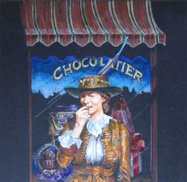
Detail of Chocolatier 20x30 inches on black illustration board
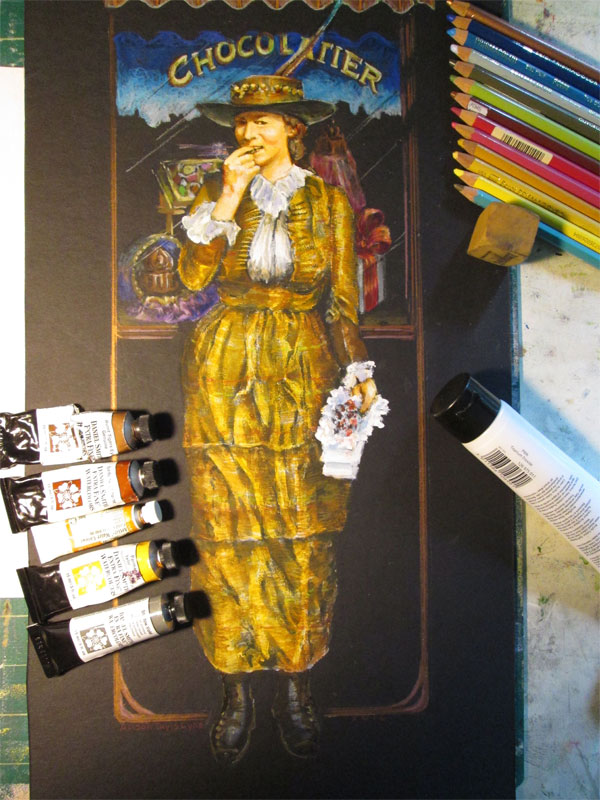
Using mostly Polychromos colored pencils, Daniel Smith watercolours and Golden Open Acrylics – Used an old family photo and my own photo references

 
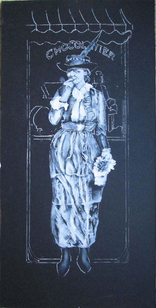
This time around I'm mixing THREE media, using colored pencils, watercolors and acrylics. I ran across a photo of this lovely lady in a stash of old family photos. She was with a few friends posing beside a pond and looking ever so stylish. Her dress, of striped duplioni silk drew me just as much as her smile. I pulled up a pic I'd taken of an old Nashville building and combined them in this drawing I did on black illustration board. The dress, face and hands are actually painted with a thin coat of acrylic white.


I wanted her and her dress to stand out the most, which is why I painted the dress, face and hands with the white paint, to use that as a surface that was already bright. I wanted the background window and awning to stay well.....in the background. So I used mostly Polychromos coloured pencils to draw in the striped awning, window reflections and window display, leaving the black background for the awning shadow and window glass. The Polychromos pencils covered the black wonderfully, but kept their place in the total composition.

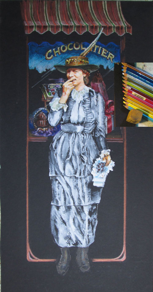
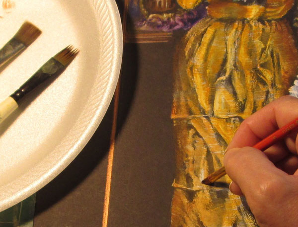
Now comes the watercolor part. In my mind's eye, when I saw the old sepia photo, I “saw” a highly reflective silk dupolni material.....gold coloured shot with a bit of rose and green....sort of a triple gold look. When I looked thru my watercolour stock, the colours that fit the bill were mostly Daniel Smith colours. I put out a few of them, and brushed them on, horizontally across the skirt, using a “fur” brush you can see off to the side. This gave me fine lines to show the cloth's weave. Then the fun part.....”erasing” some of the watercolour paint with plain water, over those brightest highlights in the folds of the cloth. Darker watercolours brushed off onto the plain black illustration board let the dress go 'round the girls body and off into heavy shadow.

 
Here's the completed painting showing what was used where:


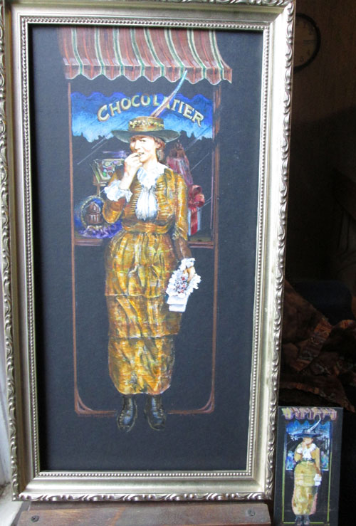
And a final image in the frame, showing the little “mini-me” image that I did before I started. It's sort of a thumbnail, on the black illustration board just to see what the different media would do.