Friday, August 26, 2016

"Quickie Artwork" Inspiration from a Museum Photo

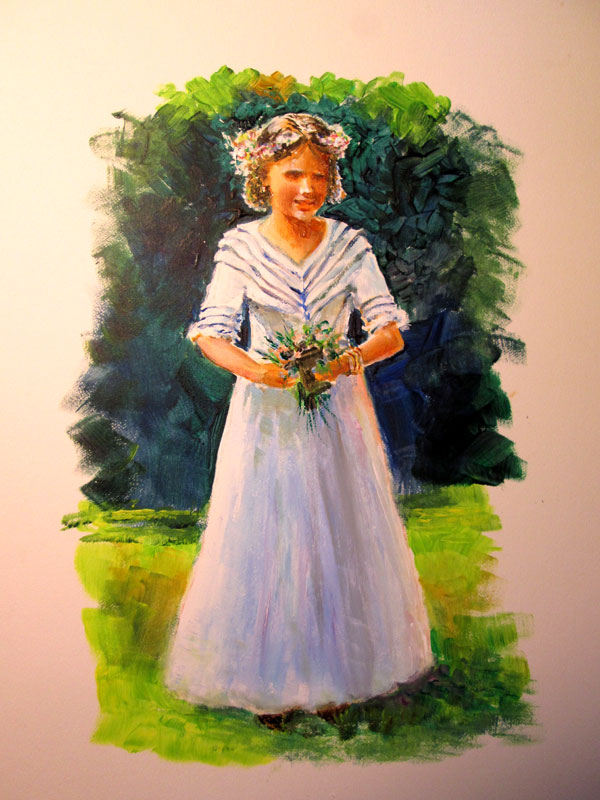
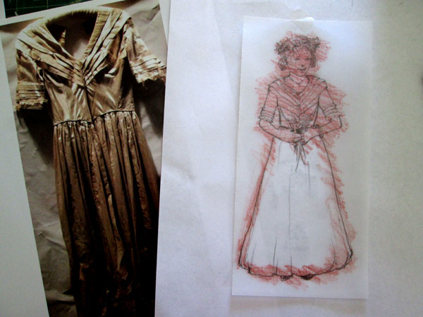
Wedding dress from Customs House Museum collection
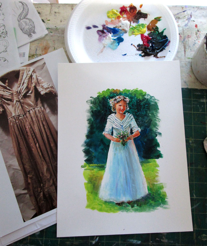
8 x 10 inches painted on bristol board with acrylic paints
  
This bitty blog post is all about inspiration striking from the most a routine online perusal. On Facebook, I ran across a post from the Customs House Museum, Clarksville, TN, that showed one of the thousands of items in their collections.

The image was of an old wedding dress worn by Temperance Catherine Joslin in 1844. For some reason that image of an old wedding dress just struck me as something I could make “come alive”. I took the image and drafted up a sketch of a young lady in the dress in a backyard wedding setting. I carefully counted the pleats of the collar..(3 each) plus one going “off shoulder” and a final one not on the sleeves but connecting the sleeves with the bodice of the dress. The bodice had diagonal lines in the bodice itself. The ¾ sleeves each had 3 pleats finishing with a dash of lace. It closely followed heirloom sewing techniques of the period.....i.e bodice shaping and sleeve trims using tucks in the material.
  
  
I transferred the sketch over to some bristol board and painted up the entire composition in acrylics. I wanted it to have a back lit sunny day look.....with a dash of impressionism. I premixed my colours and it “painted up” very quickly. I really enjoyed turning the lines into masses that resolved into a blushing bride in her wedding dress.

 
This was an enjoyable painterly type “quickie” sketch. Something that took advantage of an idea that came across my mind's eye and that I hope brought a bit-o-history to life. Museums, like the Customs House Museum, are great places to get "quickie art sparks".  

An enjoyable bit of artwork like this,  reminds me to be on the look out for chance impressions that can spark an art “quickie”.


Friday, August 19, 2016

We Are Just Messing About or Another Pictures + Words Painting

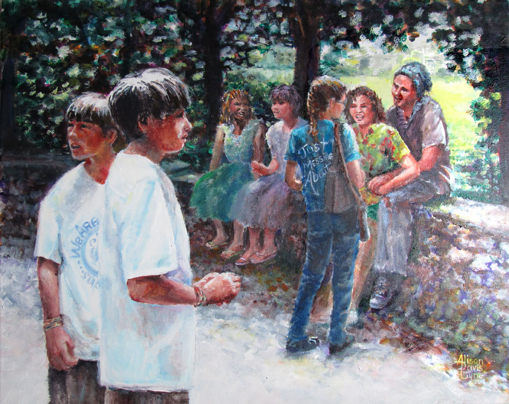
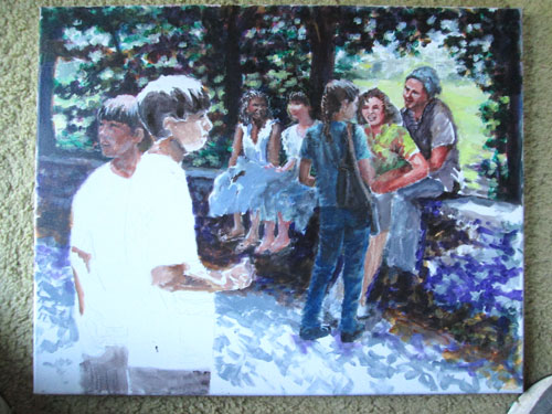
We Are Just Messing About
Acrylic paints on 16 x 20 stretched canvas, my own photo references and imagination 

 
This painting is another one in my Pictures + Words collection. My aim this time was to show a group of folks “just messing about” in the park on a sun lit day. My artistic aims were to learn more about : Composition, values (lights and darks), gestures, color choices and masses (broad lights and darks to define a form.)

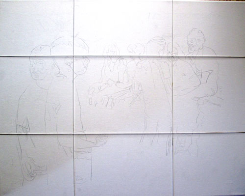
To that end I gathered some reference photos and began sketching. One little axiom I'd made up was to “draw tightly, paint loosely” or draw accurately from my photographic references but draw with the idea of masses instead of photographic detailing. To help with that, I took the photos into Photoshop, and reduced them to black and white, then “posterized” them, rendering the masses of the forms of the figures without detailing. This allowed for clothing/color/personalization changes at will, without feeling I had to adhere to the photos too strictly. These printouts are what I used to “sketch” onto the canvas. I again used the “power of thirds” to locate important features at the “sweet spots” of my canvas. Here is the canvas divided into thirds with my handy dandy elastic strings.


In my head I was also planning the lights and darks of the whole painting. Greg Albert, in his The Simple Secret to Better Painting has a bunch of nice axioms, but the one I chose for this painting was: Mostly, Some and a Bit. It can easily apply to values, colors and detailing.

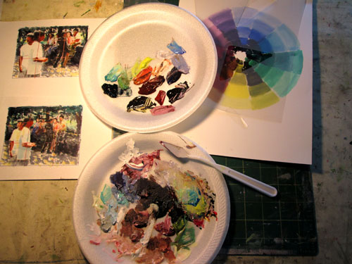
I took my Photoshop posterized sketches and printed out a couple of tiny ones on some bristol board, and used them for color/compositional “mini-mes” or thumbnail sketches. I used my color wheel to decide on a triadic color scheme and proceeded to mix up my basic paints. From my previous experiments in using greys to keep my color scheme in balance, I mixed up a set of greyed colours and then used some of the original tube colors for color “sparks”. I've tried this on the basis of James Gurney's Color and Light book. Premixing greyed colors is a great way not to “fight” too raw tube colors......and allow your color “sparks” to sing


After establishing my compositional road map, light and dark value road map, mass and color road maps......I was ready to go. I laid in the basic lights and darks, making gesture, and facial changes, from the original photos, as I came to them. I wanted to make all these disparate folks look like they were all hanging out together. I then pulled up an oldie but goodie technique of glazing. I glazed the background tree masses till they were just distant background blurs, the better to focus on the people. As you can see I started off with a lotta greys, but the final painting is very colourful.

 
The planning process is a bit new to me, but I'm learning SO much from each one I do. It pulls together many things I've learned over the years......but have never combined quite this way in my painting planning. It's lovely to conceive a painting, with "bookish helpers" (i.e. re-reading from different technique books I have on hand) whenever I hit a snag in bringing a concept to a full painting.

Saturday, August 13, 2016

Green Glow or Grass is Different than Snow

 Green Glow
18x24 inches on Crescent w/c board using various watercolors and gouche
My own photo reference

  This time around I'm doing a watercolor of a scene I see each morning during my AM walk. It doesn't ALWAYS look this way, but springtime around here can be LUSH!

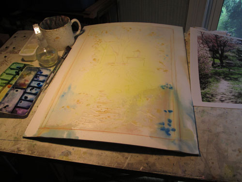
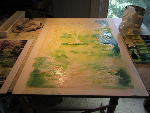
I transferred my drawing of the scene onto the Crescent watercolor board, and laid in some spots of misket, (they are the slightly brownish blobs in the photo). I then did liberal poured washes of yellow, red and bits of blue in shadow areas. You'll note the distinct bow of the watercolour board after all the washes I poured. 

 
I immediately laid the bowed watercolor board right beside an air vent and left it over night. The next day, I found the board quite dry and totally flat! There was a tensy bit of separation between the paper and the board, but it was minimal and on the edges that go underneath the mat. So I went ahead with individual placements of intense watercolour Phthalo green over the yellows and blues. 

 
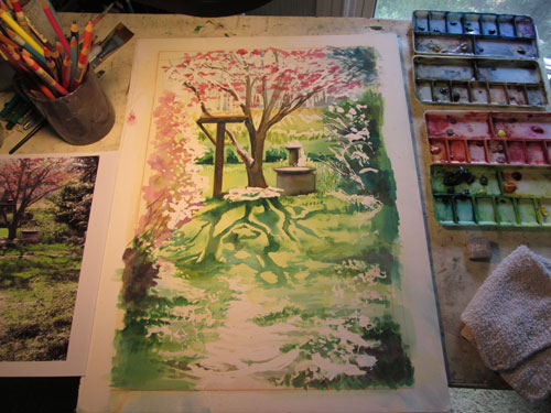
After laying in the pinks of the azalea and dogwood blossoms, the darks of the tree trunk, and the lavenders of the background trees, I removed the misket blobs that reserved the whites I needed for the sunlit water, grass and flowers.


Here I'm laying in detailing in the two birdbaths, shadows of surrounding bushes and grasses, and most importantly the shadows of the dogwood tree branches in the green green grass. Here comes in the “.....grass is different than snow” part. When I originally envisioned this piece, I wanted to do a spring version of this winter snow scene:


But when I used the same strategy of masking the white of the snow and pouring on the watercolor shadows......it didn't look “grassy” at all! I needed grass texture in all that smooth green pour.


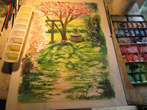
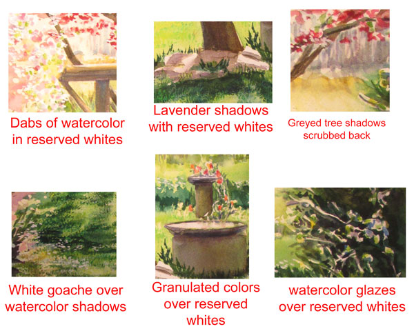
So I began “texturing” the foreground's “glow”. I scrubbed, I daubed, up errant spots of green watercolour, and detailed grass and blossoms and branches. I added deeper colours where needed, and in other spots I added white and yellow and green gouche, (opaque watercolors).


It took a lot of different techniques for this painting, but then a sunlit “glow” takes a lotta effort, if you aren't Mother Nature!


Friday, August 5, 2016

Chocolatier or Chocolates, a Vintage Dress and a Smile....What's Not to Like?

 
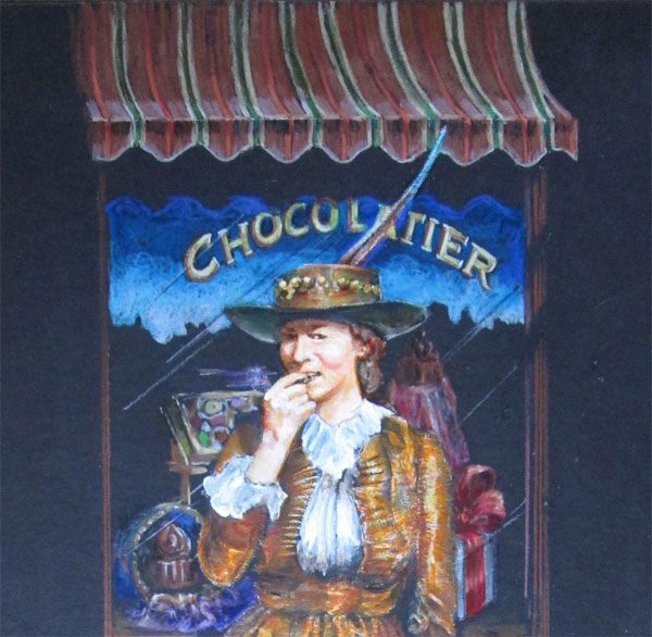
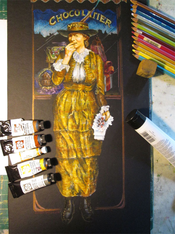
Detail of Chocolatier 20x30 inches on black illustration board
Using mostly Polychromos colored pencils, Daniel Smith watercolours and Golden Open Acrylics – Used an old family photo and my own photo references

 
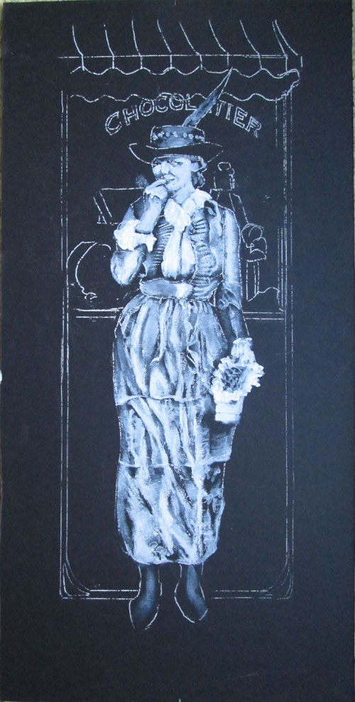
This time around I'm mixing THREE media, using colored pencils, watercolors and acrylics. I ran across a photo of this lovely lady in a stash of old family photos. She was with a few friends posing beside a pond and looking ever so stylish. Her dress, of striped duplioni silk drew me just as much as her smile. I pulled up a pic I'd taken of an old Nashville building and combined them in this drawing I did on black illustration board. The dress, face and hands are actually painted with a thin coat of acrylic white.


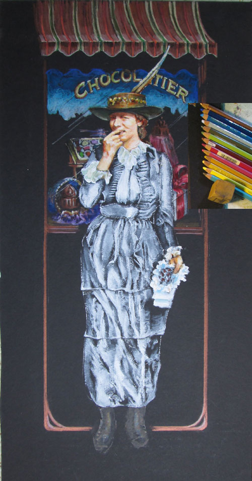
I wanted her and her dress to stand out the most, which is why I painted the dress, face and hands with the white paint, to use that as a surface that was already bright. I wanted the background window and awning to stay well.....in the background. So I used mostly Polychromos coloured pencils to draw in the striped awning, window reflections and window display, leaving the black background for the awning shadow and window glass. The Polychromos pencils covered the black wonderfully, but kept their place in the total composition.

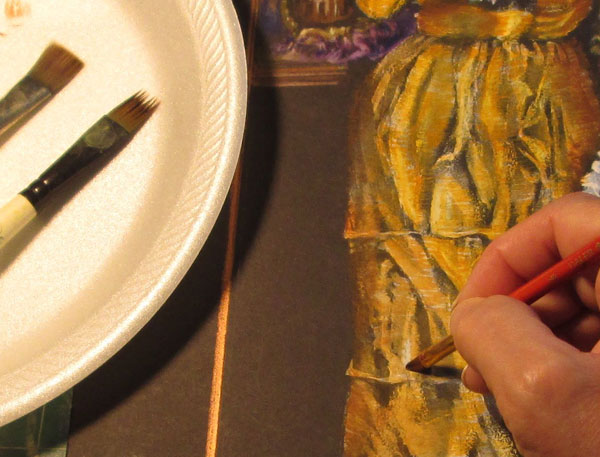
Now comes the watercolor part. In my mind's eye, when I saw the old sepia photo, I “saw” a highly reflective silk dupolni material.....gold coloured shot with a bit of rose and green....sort of a triple gold look. When I looked thru my watercolour stock, the colours that fit the bill were mostly Daniel Smith colours. I put out a few of them, and brushed them on, horizontally across the skirt, using a “fur” brush you can see off to the side. This gave me fine lines to show the cloth's weave. Then the fun part.....”erasing” some of the watercolour paint with plain water, over those brightest highlights in the folds of the cloth. Darker watercolours brushed off onto the plain black illustration board let the dress go 'round the girls body and off into heavy shadow.

 
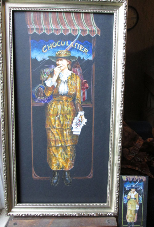
Here's the completed painting showing what was used where:


And a final image in the frame, showing the little “mini-me” image that I did before I started. It's sort of a thumbnail, on the black illustration board just to see what the different media would do.


Friday, July 29, 2016

Watercolor Playdate or Watching Paint Dry CAN be Exciting!

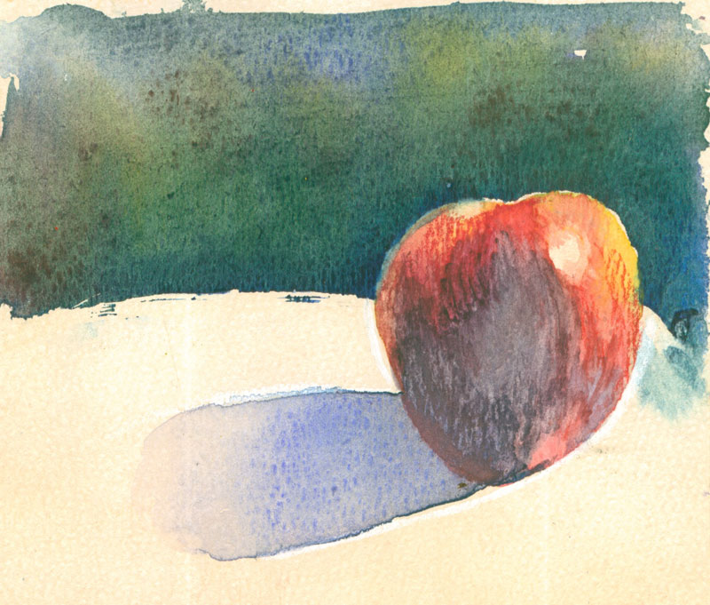
  Learning Apple
various watercolors and a few watercolor pencils
on 140 lb weight “mystery” watercolor scrap paper
my own photo
  
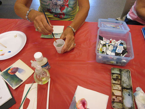
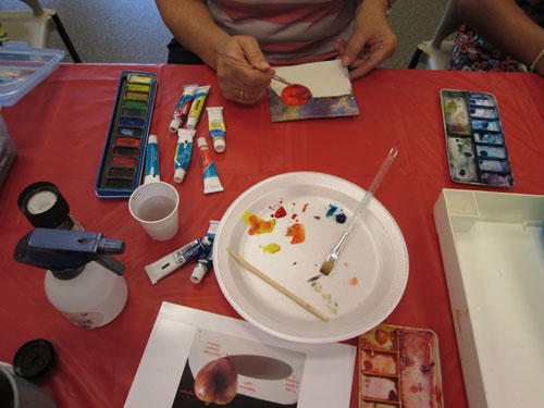
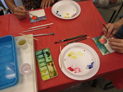
Recently I “put on/presented/played at” a little Watercolor Playdate hosted by my local library Logan County Public Library. (Big shout out here to the lovely and very helpful staff).

I decided to do this 'cause I wanted to “play with” a few other local watercolor folks. I dreamed up an itty bitty program and gathered together a “kit”....(i.e. Anything to do with watercolor from my studio) and went to the playdate.
My basic aim was to show three simple ways to corral your watercolors so's each color is just where you want it. I showed off misket, wax colored pencil, and just plain ol' water surface tension.


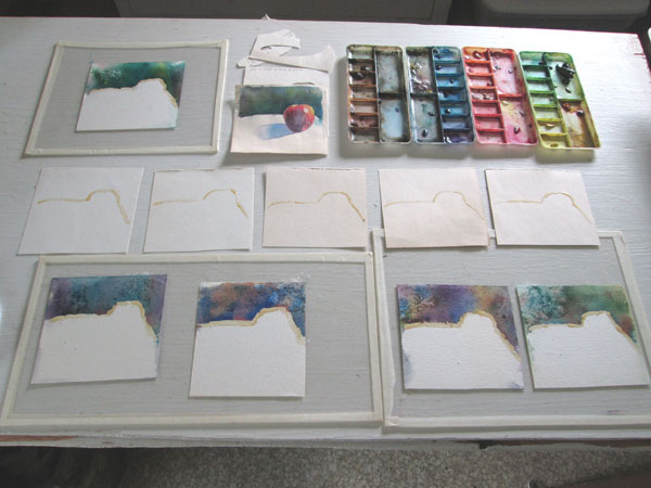
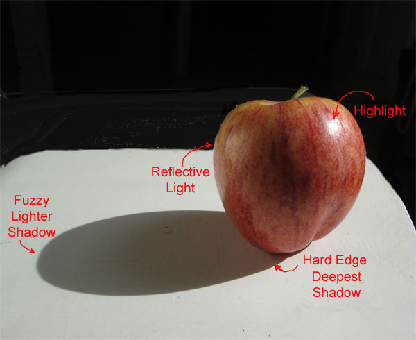
At home, I made up a photo of a brightly lit apple, drew it out on a bit of board, and made a quickie template that I used to trace off the outline of the apple, and the bottom half of the apple with the shadow. I used that to make up two sets of watercolor sketches on paper scraps. One with misket separating the apple and table from the background, so's we could play with dark intense watercolor backgrounds. Rather than waiting for that to dry.....watching paint dry is normally a ton of fun for me......but not so much when you only have an hour for the project, I did a second set of watercolor sketches with the backgrounds already done.

 
We started off with soaking the prepared watercolor sketch scraps so's we could do the “soak and slap” method of wetting and stabilizing the paper on scraps of plexiglass. I showed off this method on this blog a while back here. Then everyone started laying in bits of the background yellow/red/blues watercolor from the three primary watercolors they'd brought from home. We used styrofoam plates for palettes.

After we finished with our backgrounds we set them aside to dry and take home later. Then I brought out the prepared samples where I had already laid in a watercolor background. I noted that the washes dried about half again lighter than what they'd looked like when first painted. I'd also used a bit of salt crystals....... just 'cause.

  
I let everyone put in a dot of misket on the apple's highlight spot, remove the dried misket for the background line, and trace off the bottom part of the apple and shadow with a wax Prismacolor colored pencil. I wanted to show that wax colored pencils can be very effective at corralling a watercolor wash. I did a blog post about this here.
After the highlight spot was dry, everyone set to painting the apple. We put enough of a wash of water on the apple that, surrounded by the dry paper, it bowed a bit. We “encouraged“ it to bow down so's the red washes would go towards the center shadow of the apple.


Finally when the apple reds were almost dry, we washed a bit of clear water over the shadow area of the apple and and followed that with a wash of blue over the white and over the shadow side of the apple. This was “corralled” by the white wax pencil outline. We “encouraged” the blue to pool at the deepest shadow point, the nexus of the apple and shadow point. We had left the end of the shadow just bounded by the water tension of the water wash. As we tilted it back and forth the shadow automatically graduated itself.


After the washes sorta kinda dried, we looked over each other's work and it was SO interesting to see just how much the color choices made each learning apple unique!
Best of all we all gave ourselves permission to “play with our paints”. If you are only doing something on a scrap.....you can try anything.....without guilt or pressure. You never know just what you might discover when you play!

Give yourself a “play date”, whether solo or with a few of your “friends in watercolor”. Grab some scraps of watercolor paper, some odd watercolors you've been dying to try, your fav watercolor brush, and an hour of your time. See just how much fun you can have “watching paint dry”!

Friday, July 22, 2016

Cover Reveal for The Blue Pool....or there was a Flapping Gull, a Flying Fish and a Fierce Pirate who........

 
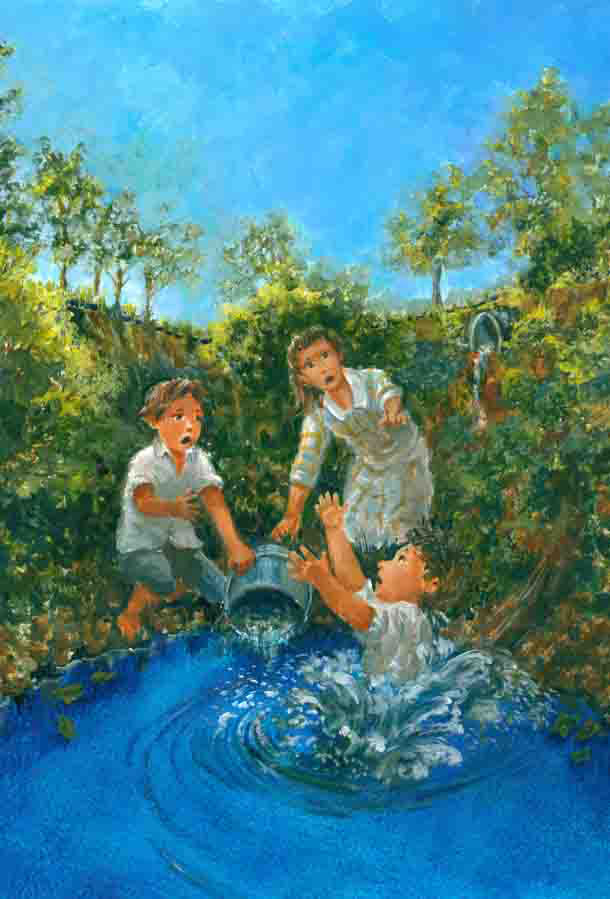
This blog post is doing double duty......both a cover reveal for the latest middle grade adventure, The Blue Pool, by Rosalyn Rikel Ramage and a bit about some of the artwork done by yours truly.

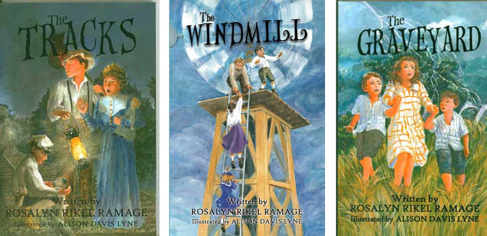
I've been lucky enough to illustrate three other titles for Rosalyn,......The Tracks, The Windmill and The Graveyard. 


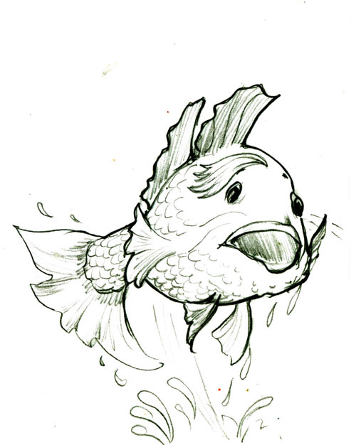
All are about the fictional adventures of a real family set in 1914 western Kentucky. Rosalyn weaves lovely fiction with down home details and a lively dash of fantasy adventure. This latest installment mixes together a talking fish named Jewel,


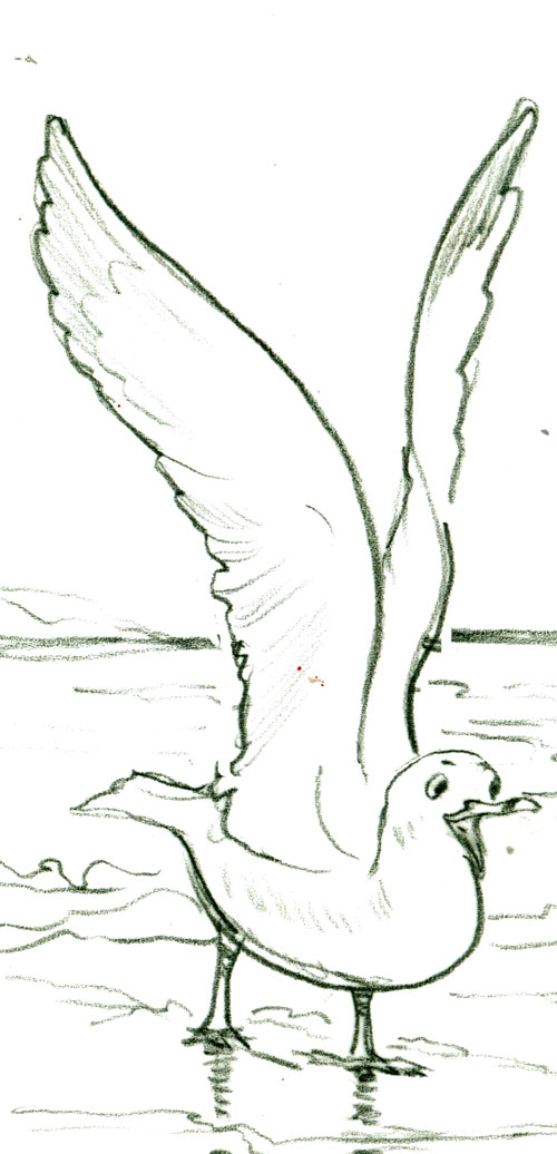
a helpful gull named Quoddy,

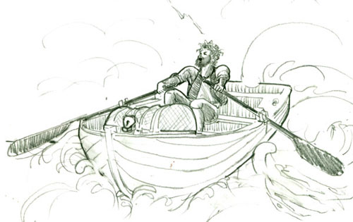
 with a dash of a treasure stealing pirate named Gustav


...and well you'll just have to read the story to see how they all come together!
The three black and white character sketches above, were tightened up and rendered in ink along with a couple of other black and white sketches of important scenes in the book. After inking in the lines, I scanned them in, cleaned them up, and they were ready to send off.

 
I really enjoyed the challenge of painting the cover. I used acrylic paints on some bristol board using strong brush strokes to give the foliage energy. I contrasted that with the stillness of the blue pool right before being disturbed by Little Will's dangerous slipping and sliding into the deep blue pool waters. This was done with multiple glazing to show the depth of the water.

I so appreciated getting to work on this project.....it was a blast to get to follow along with Emma Mae's latest adventures.


Saturday, July 16, 2016

Vine Ripened Puppys for Sale

 
16 x 20 inches on canvas
acrylic paints (both standard drying and long drying)
reference: old family photo and my imagination

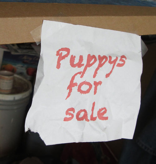
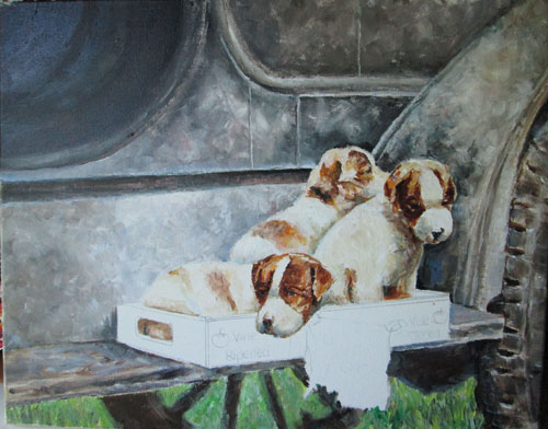
 This painting idea started out with an old sepia colored family photo. I'd seen it around for years, and thought it just SO filled with cuteness. I couldn't help but add my own “bit of the story” by adding the tomato crate that the puppies are sitting in, and the much chewed upon sign with “puppys for sale”.

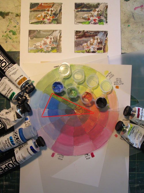
Since the photo was sepia colored or virtually black and white I got to invent all the colors on my own. I started out with my handy dandy home made color wheel and a slightly subdued colour scheme, you can see outlined in red. I picked out my paint tube colors and mixed up four little boxes of base colors for the colour scheme. I then did four “thumb nails” or itty bitty color try outs of which color scheme I wanted to go with.

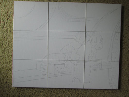
 I then took my pencil sketch and traced it onto the canvas. I double checked my composition strategy of the “Powers of Three” with four stretchy elastic strings wrapped around the canvas....two going one way and two going cross wise. This gave me marking that divided the 16 x 20 canvas into thirds.....AND.....most importantly gave me the four “sweet spots” that suggested where I might locate my most important parts of the painting. One was the head of one of the pups, and the other was the top of the sign: “Puppys for Sale”.


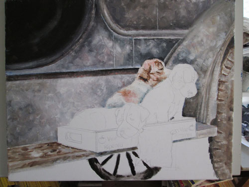
With my idea firmly composed, I confidently set to work painting. I decided, after a bit of research, that this was a Model T car, approx 1900 ish or so. So that made it have to be black. The photo showed the spindly tires and the large running board that the puppies were sitting on. The front seat had no door, just a opening in the car's surface. For the composition, I luved the repetition of half circles broken by the strong dividing line of the running board. I had played around with cropping the source photo till I got an arrangement I liked.

 Once I had the relatively dull Model T black exterior finished with a few warm and cool touches, and put some mud on the tires and running board I was able to go onto the “ice cream work” of painting the puppies. Keeping in mind that so far I had just used the four base colors of red, blue,green and dark to paint the Model T and background grass, I thought I'd introduce a really warm brown to work with in painting the puppies. Both 'cause I wanted to emphasize the importance of the foreground puppy grouping using a new color and 'cause that warm brown was just how I'd always thought they'd look.

 
After finishing the puppies, I quickly painted in the tomato crate with the red“Vine Ripened” lettering. I had taken a photo of a bit of paper with “Puppys for Sale” printed on it. I had taped it to a box and taken a photo of it......so's to get the right perspective. I had crumpled up the paper before taking the photo in strong sunlight, because I wanted to show the texture of the folds in my choice of paint colors for the white paper. (Yes, white paper CAN show colors)

 
Frank came up with the perfect final “bit-o-cuteness” for the painting. He suggested that I have a corner of the sign chewed off and a bit of the remainder hanging out of the mouth of the most soulful looking of the puppies.