Friday, June 24, 2016

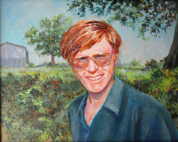
What She Saw

What She Saw
11 x 14 inches
acrylic on gessoed masonite
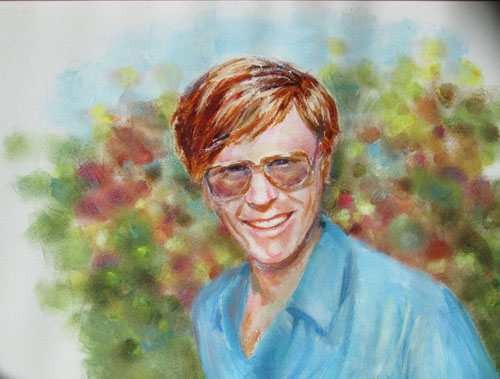
my reference photos

I painted this portrait of Frank with the idea of doing a portrait, but I also wanted to show him in “his” place where he “fits”. I luv doing portraits with a little “value added”, that tell the viewer something about the portrait subject.

I started out with a lovely snap shot I'd taken a “few” years ago. (Hence the title.....I took the photo....so it's “What She Saw”) I painted him in just a couple of sessions. I used some OPEN acrylics that stay wet longer and allowed for some great blending.

 
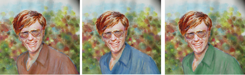
But what to do with the background?

 I tried changing the shirt color in Photoshop......nope, nope, nope! None of these helped. Then I decided to instead change the background. I found a pic I'd taken of one of our barns and surrounding greenery. I painted in the background around the portrait of Frank.....and that led to me settling on a dark blue for his shirt. 

I like the way his hair and face coloring stood out from the surrounding busy background......it emphasized HIM, which is after all what a portrait is supposed to do!


Friday, June 17, 2016

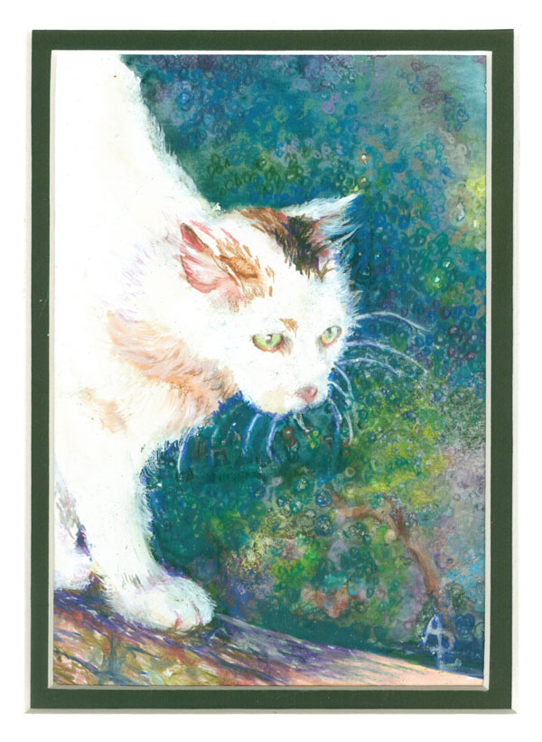
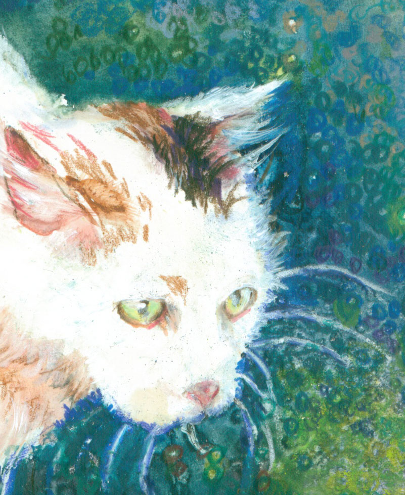
White Kat or Walking on the Wild Side

 
White Kat
8x10 inches on illustration board
Various watercolors and prisma colored pencils
My reference photo

This time around I'm talking about mixing my media again. White Kat is a mix of watercolour and colored pencils. White Kat went over the rainbow bridge a few years ago, but her lovely almost pure white coat, remains an artistic inspiration even today!

Before getting started with my watercolors, I used a wax colored pencil (Prisma) and drew in some white whiskers spreading out from her muzzle. I first layered in a nicely dark greeny/bluey/purply watercolour wash, with just a few yellow highlights. Just for good measure I sprinkled on some salt where I wanted to highlight a bit of twigs and leaves. This left me with a lovely background to work on later. While I had the watercolors out, I ghosted in some warm highlights for her fur. I kept them warm 'cause the light on her was late afternoon, and it provided a good color contrast with the cool background.


Then I started to work her fur over with my Prisma colored pencils. It didn't take much as the watercolor had responded wonderfully to some lite whisking with a damp brush to indicate fur. I had a ball working in her lovely green glowing eyes, leaving just a hint of the original paper showing thru for the highlights. 


Finally I went back into the background with my colored pencils. I used my white colored pencil to reaffirm her white whiskers and show her fur tips against the background. The darker background watercolor washes had “stayed away” from the wax whisker lines I'd laid down in the beginning. I took just about all the dark colored Prismas I had on hand and started drawing teeny tiny dark circles on the dark background to show additional texture. The little salt sparkles, left when the salt crystals slurped up the surrounding watercolors were a perfect target for a colored pencil circle. I used slightly lighter colored pencil circles around the brighter leaves and added in a highlighted branch and wood fence post for a finish.


Thursday, June 9, 2016

House Portrait or In Praise of Grays


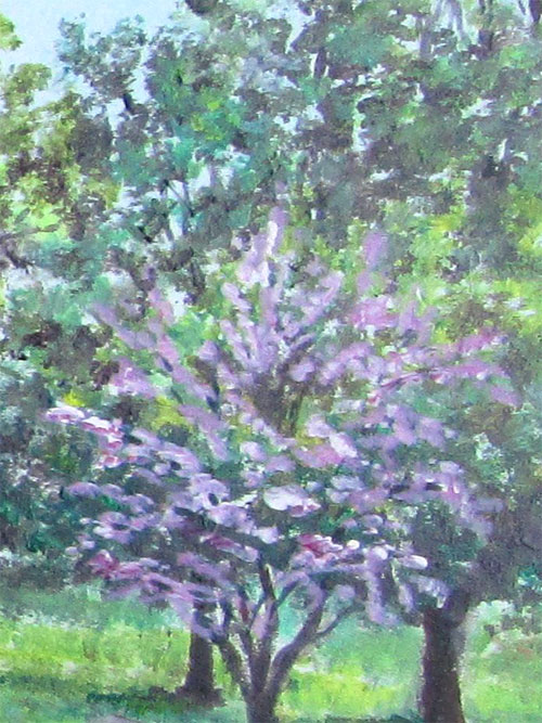
Recently I was commissioned to do a house portrait of a small brick home and surrounding buildings. It was painted from various photos supplied by the client, and was to be set in the spring. This commission came at a great time for my ongoing colour studies.

I set myself an artistic technique goal within the commission's outlines: I wanted to replicate the muted less saturated or grayed tones of the photos while keeping the 4 step values that show mid day sunlight and shadows. My “normal” work flow is to use a series of acrylic glazes to get the values while emphasizing the colour intensity. In this case I decided to switch to an opaque painting style......using my premixes of Golden OPEN colours to maintain the right values/hues over various painting sessions.

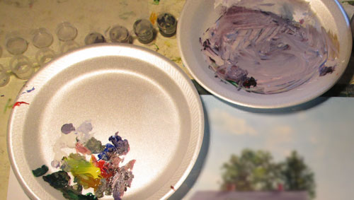
I started out with the usual suspects of a medium red, cobalt blue and a yellow. I added in a phthalo green, raw umber, and ultramarine blue for my darkest darks. I premixed a drab olive green, and an almost black grey green, a redish dark and a slightly lavender dark. You can see where I stored these premixes in the itty bitty capped plastic containers. They kept the OPEN acrylics wet through out the two months or so I was painting on this commission. I used the grayed lavender mixing dish to pull the color slightly towards blue for highlit surfaces....i.e roof, driveway and asphalt road. I pulled it towards red for shadows in the brick house.

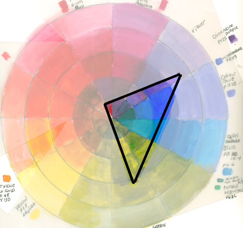
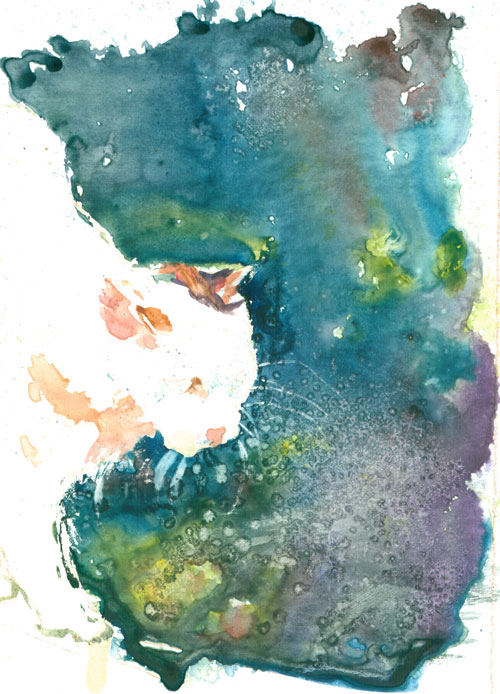
Lately I've seen pics from some websites, that are color swatches, showing 4 or 5 colors that go well together. They can be used for inspiration for color schemes for anything from interior decorating to coloring books. This is a color swatch I made for this painting:


This swatch was done AFTER the painting was finished....NOT before as a useful color reference might be. But it is very useful to 'splain back to myselves just how color theory can work. I've been reading lot from the lovely painting books by James Gurney of Dinotopia fame.
 he suggests that gamut masking can suggest a wide range of colors that will “hang together” no matter the subject. The “why” for that can be shown with my home made color wheel and a triangle cut out of frosted plastic. 


The open triangle shows the colors that appear in the painting, which were “copied” from a real to life photo. The muted reds,lavenders, blues and greens “hang together” because they appear in adjunct spots on the color wheel outlined by the triangle....or a triad color scheme.

In my next painting I definitely want to try this kind of color exercise BEFORE I start to paint.


Friday, June 3, 2016

Clarksville Writers Conference 2016 – Annnnd That's a Wrap!


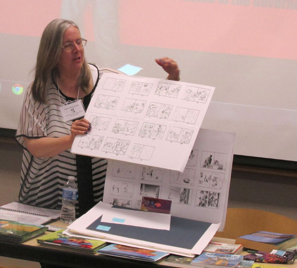
 We attended the Clarksville Montgomery County Arts and Heritage Development Council's annual Clarksville Writer's Conference yesterday, where I gave two workshops.

They were: Making of a Picture Book from Manuscript to Book Shelf-
Learn a bit about the children's book publishing industry and how you as a writer or illustrator can start your journey. Whether it's traditional publishing or self-publishing, the steps to a successful children's picture book are the same. Learn how writers, illustrators and publishers work to make a manuscript the best picture book it can be.
How to Think Like an Illustrator or the Art of the Dummy-
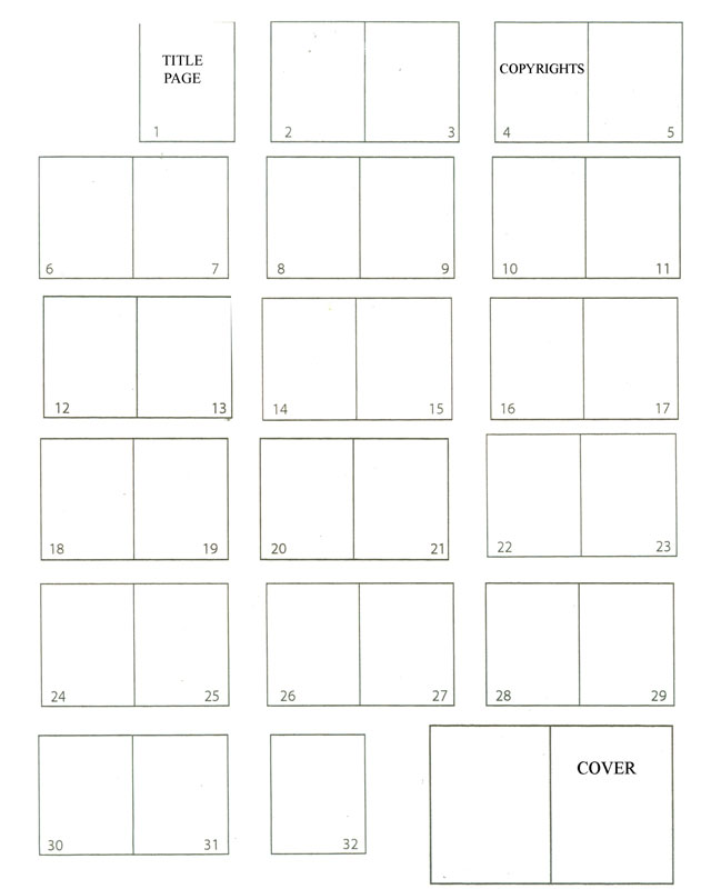
We'll discuss how an illustrator takes your picture book manuscript and breaks it down into page size bites, and what you, as the author, can do to make your manuscript “illustrator ready”. We will look at original manuscripts vs the finished book, and dissect how it was done. We will talk about a picture book dummy (mock up of a real book) and why you should do one.

I had a fantastic time, and so enjoyed talking to all the fine folks who showed up for the talks.

I had a couple of handouts that I wanted to post, in case someone didn't get a copy.

Resource list for good info for your writing journey:

Society for Children's Book Writers and Illustrators http://www.scbwi.org/

Midsouth chapter of SCBWI http://midsouth.scbwi.org/

Predator and Editors website to find out about companies http://pred-ed.com/

Articles about the business of writing/illustrating http://www.underdown.org/

You can find these books and magazines at bookstores or online:
For Children's Writer's & Illustrator's Market books http://www.writersdigest.com/

For the Writer Magazine http://www.writermag.com/

For Highlights Magazine info https://www.highlights.com/

And a copy of the handy dandy all purpose book chart:


Thanks SO much to the Council, the kind sponsers, APSU, and the lovely volunteers!

And thanks to all y'all who showed up for my talks. It's wonderful to give a (writer's) party.....and have such lovely folks show up.

Monday, May 2, 2016

Clarksville Writer's Conference June 2-3 2016


I am an invited speaker at an upcoming writer's conference, in Clarksville, TN. The conference is the Clarksville Writers Conference that is put on by the Clarksville Montgomery County Arts & Heritage Development Council. This is the link:


The faculty is diverse, and is mostly for adults, but they do have some speakers that tend towards kid lit. I'm the only speaker that will talk specifically about picture books.....from an illustrator's perspective. I know.....I know.....it's a "writers conference".....but some of my best friends are writers! Especially the authors of the books I've illustrated.

I'm doing two workshops on June 2nd. My workshop blurbs are:

Making of a Picture Book from Manuscript to Book Shelf-
Learn a bit about the children's book publishing industry and how you as a writer or illustrator can start your journey. Whether it's traditional publishing or self-publishing, the steps to a successful children's picture book are the same. Learn how writers, illustrators and publishers work to make a manuscript the best picture book it can be.

How to Think Like an Illustrator or the Art of the Dummy-
We'll discuss how an illustrator takes your picture book manuscript and breaks it down into page size bites, and what you, as the author, can do to make your manuscript “illustrator ready”. We will look at original manuscripts vs the finished book, and dissect how it was done. We will talk about a picture book dummy (mock up of a real book) and why you should do one.


As always, about any conference.....DO YOUR RESEARCH.....to see if it will be of interest or use to you.


Thursday, April 28, 2016

What You See and Paint is not Always What Your Viewer “Gets”!


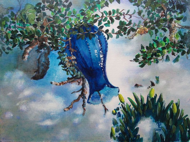
Blue Vase
 
This past week I've had some interesting interactions with people who have viewed my art.

This is the last week of my art show at the Logan County Library in Russellville KY. Various librarians have remarked that they've had a few comments on the artwork. One that was repeated was: “Isn't that painting of the blue vase hung upside down??”

On the one hand I'm pleased that people are looking at my artwork close enough to wonder what's going on with each painting. BUT I'm also confused with the question. In MY mind I know that I painted this vase laying abandoned in the melting snow, with the sun glowing thru the glass. I believed that I had included enough “visual info” to say that to a viewer. That question leaves me wondering if I did my job as an illustrator......


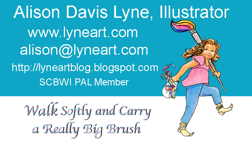
This is one of my business cards I designed a while back. It's also the basis for the blog logo at the top of the page and my FB banner.

The other day I handed this card to a person so's they could email me some info. He looked at the card and then shot me a quizzical look.....and asked me if I did local CLEANING jobs!! Not hearing him totally because of the background noise I replied, that I did picture book illustrations along with house/people/pet portraits.

As you can tell from this exchange.....we were BOTH talking past each other!

Later, Frank pointed out the “disconnect” in the exchange. I have to assume that in a context that had nothing to do with children's picture books, or artwork the term “illustrator” just did not register with this person. Sorta kinda like when Charlie Brown is talked to by a teacher.....all the audience “hears” is “Blah, blah, blah”
On the card the only visual to give a clue is my little girl carrying a huge brush, a pail of paint and walking in her stocking feet. This was my visual for “Walk Softly and Carry a BIG Brush”.
An adaptation to Teddy Roosevelt's quote: “Walk softly and carry a big stick”

Again out of context, I can see where this visual could be construed as someone carrying a washing bucket and mop.

My take away for all this is that an artist can't have too many “eyes on the artwork” prior to a show or publication of the art. The more critiques or editorial advice a illustrator gets, the more likely a lot of these opinions (misguided or not) can be addressed. After all, in the case of a picture book, the illustrator is hoping that THOUSANDS of eyes will eventually “see” the artwork.....and that most of those little eyes will “read” into that artwork exactly what the artist intended.

Monday, April 18, 2016

Southern Kentucky Book Festival Saturday April 23rd


http://www.lyneart.com/CHILDREN.HTM
 
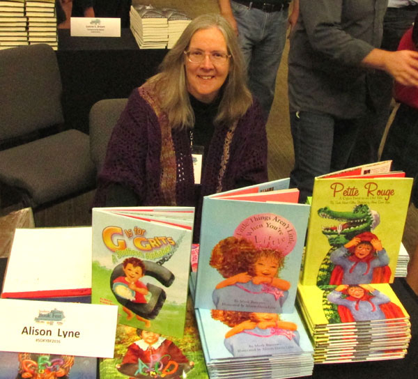
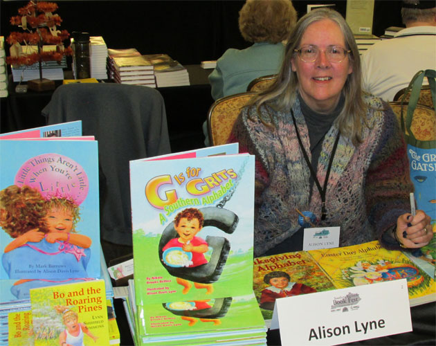
I wanted to let everyone know that I, along with a “few” (about 150 plus) other talented folks will be at the Southern Kentucky Book Festival, at the Knicely Center in Bowling Green KY on Saturday April 23rd, from 9 to 3.

It's a great time to see favorite authors( and illustrators), hear them speak and meet new authors (and illustrators) if you're so inclined.

I, along with a few of my fav Midsouth SCBWI friends; David Arnold, Susan Eaddy, Aileen Stewart, Kristin Tubb, Mary Uhles, Amanda Driscoll, Jessica Young, Donna Driver, Courtney Stevens, Bethany Griffin, Tracy Barrett, Sharon Cameron, Lois Sepahban, Brooks Benjamin, Gail Nall, will be there along with the ever popular “Many Minnie More”.

Do come to listen to the authors/illustrators discuss their work, mingle with other book lovers, and maybe get a book or two for your Christmas gift list....you can be one of those annoying smug folks that finish their Christmas gift list earlier than December 24th

But most of all come 'cause it's a great BOOK party.

See you there.