Monday, May 2, 2016

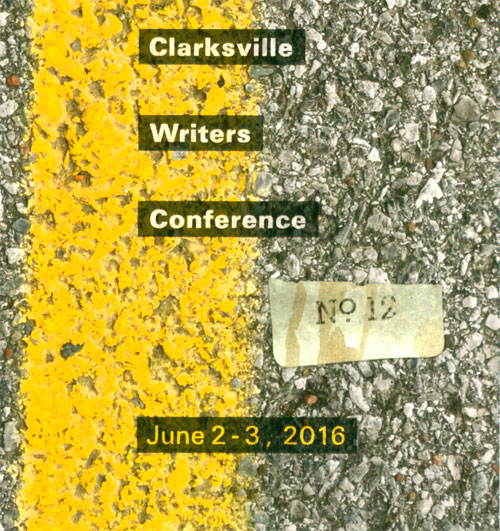
Clarksville Writer's Conference June 2-3 2016


I am an invited speaker at an upcoming writer's conference, in Clarksville, TN. The conference is the Clarksville Writers Conference that is put on by the Clarksville Montgomery County Arts & Heritage Development Council. This is the link:


The faculty is diverse, and is mostly for adults, but they do have some speakers that tend towards kid lit. I'm the only speaker that will talk specifically about picture books.....from an illustrator's perspective. I know.....I know.....it's a "writers conference".....but some of my best friends are writers! Especially the authors of the books I've illustrated.

I'm doing two workshops on June 2nd. My workshop blurbs are:

Making of a Picture Book from Manuscript to Book Shelf-
Learn a bit about the children's book publishing industry and how you as a writer or illustrator can start your journey. Whether it's traditional publishing or self-publishing, the steps to a successful children's picture book are the same. Learn how writers, illustrators and publishers work to make a manuscript the best picture book it can be.

How to Think Like an Illustrator or the Art of the Dummy-
We'll discuss how an illustrator takes your picture book manuscript and breaks it down into page size bites, and what you, as the author, can do to make your manuscript “illustrator ready”. We will look at original manuscripts vs the finished book, and dissect how it was done. We will talk about a picture book dummy (mock up of a real book) and why you should do one.


As always, about any conference.....DO YOUR RESEARCH.....to see if it will be of interest or use to you.


Thursday, April 28, 2016

What You See and Paint is not Always What Your Viewer “Gets”!


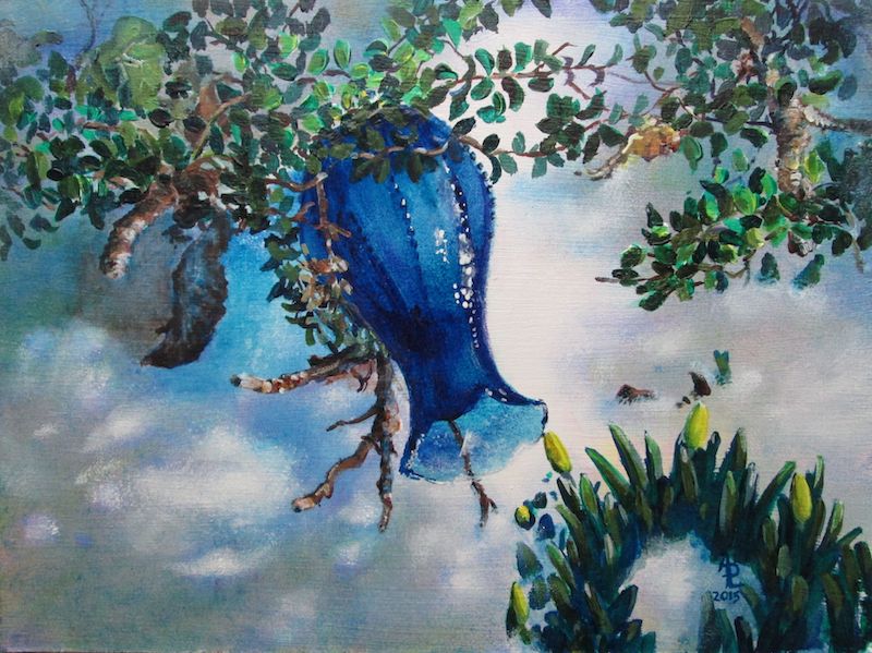
Blue Vase
 
This past week I've had some interesting interactions with people who have viewed my art.

This is the last week of my art show at the Logan County Library in Russellville KY. Various librarians have remarked that they've had a few comments on the artwork. One that was repeated was: “Isn't that painting of the blue vase hung upside down??”

On the one hand I'm pleased that people are looking at my artwork close enough to wonder what's going on with each painting. BUT I'm also confused with the question. In MY mind I know that I painted this vase laying abandoned in the melting snow, with the sun glowing thru the glass. I believed that I had included enough “visual info” to say that to a viewer. That question leaves me wondering if I did my job as an illustrator......


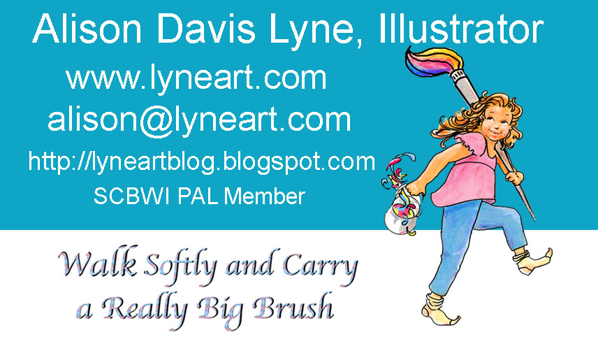
This is one of my business cards I designed a while back. It's also the basis for the blog logo at the top of the page and my FB banner.

The other day I handed this card to a person so's they could email me some info. He looked at the card and then shot me a quizzical look.....and asked me if I did local CLEANING jobs!! Not hearing him totally because of the background noise I replied, that I did picture book illustrations along with house/people/pet portraits.

As you can tell from this exchange.....we were BOTH talking past each other!

Later, Frank pointed out the “disconnect” in the exchange. I have to assume that in a context that had nothing to do with children's picture books, or artwork the term “illustrator” just did not register with this person. Sorta kinda like when Charlie Brown is talked to by a teacher.....all the audience “hears” is “Blah, blah, blah”
On the card the only visual to give a clue is my little girl carrying a huge brush, a pail of paint and walking in her stocking feet. This was my visual for “Walk Softly and Carry a BIG Brush”.
An adaptation to Teddy Roosevelt's quote: “Walk softly and carry a big stick”

Again out of context, I can see where this visual could be construed as someone carrying a washing bucket and mop.

My take away for all this is that an artist can't have too many “eyes on the artwork” prior to a show or publication of the art. The more critiques or editorial advice a illustrator gets, the more likely a lot of these opinions (misguided or not) can be addressed. After all, in the case of a picture book, the illustrator is hoping that THOUSANDS of eyes will eventually “see” the artwork.....and that most of those little eyes will “read” into that artwork exactly what the artist intended.

Monday, April 18, 2016

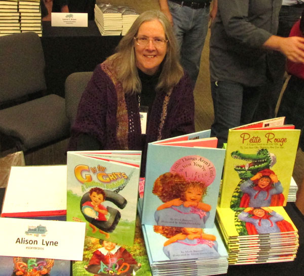
Southern Kentucky Book Festival Saturday April 23rd


http://www.lyneart.com/CHILDREN.HTM
 
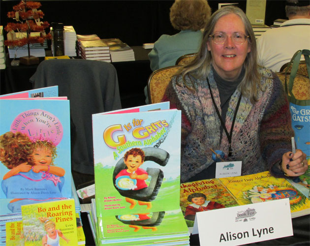
I wanted to let everyone know that I, along with a “few” (about 150 plus) other talented folks will be at the Southern Kentucky Book Festival, at the Knicely Center in Bowling Green KY on Saturday April 23rd, from 9 to 3.

It's a great time to see favorite authors( and illustrators), hear them speak and meet new authors (and illustrators) if you're so inclined.

I, along with a few of my fav Midsouth SCBWI friends; David Arnold, Susan Eaddy, Aileen Stewart, Kristin Tubb, Mary Uhles, Amanda Driscoll, Jessica Young, Donna Driver, Courtney Stevens, Bethany Griffin, Tracy Barrett, Sharon Cameron, Lois Sepahban, Brooks Benjamin, Gail Nall, will be there along with the ever popular “Many Minnie More”.

Do come to listen to the authors/illustrators discuss their work, mingle with other book lovers, and maybe get a book or two for your Christmas gift list....you can be one of those annoying smug folks that finish their Christmas gift list earlier than December 24th

But most of all come 'cause it's a great BOOK party.

See you there.


Monday, April 11, 2016

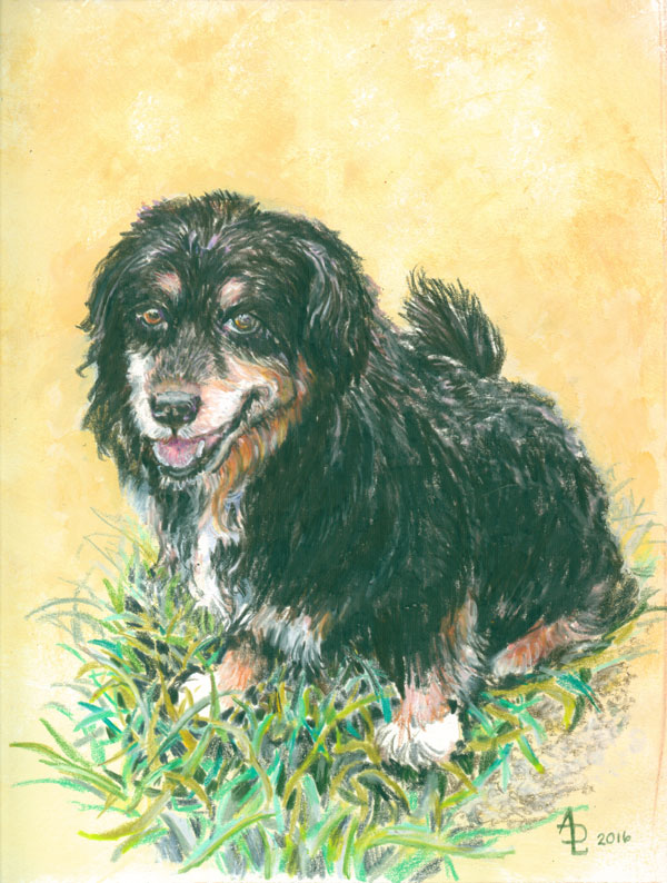
THE Pepper- in Coloured Pencil

  8x10 Coloured Prismacolor pencils 
over acrylic glazed background
on bristol board. My photo reference
  
This post is about a recent doggie portrait I painted. The subject is our faithful (to two separate families at the same time) pup pal, PEPPER, who passed over the rainbow bridge last year.

I took a photo I had of Pepper, and decided I was going to “paint” her in coloured pencils.
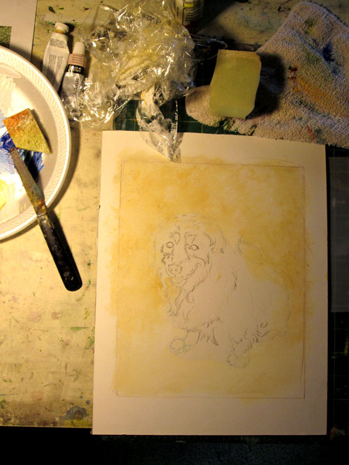
Since my main interest was the Pepper herself, I decided to rough in a mottled background in a light ocher acrylic glaze. I covered her drawing in a frisket cutout and sponged an acrylic wash over the background. I could be a bit sloppy in it's application since I had protected the drawing beforehand, and I've found that coloured pencils work over a thin acrylic glaze with ease.


After the glaze dried, I set to work with my coloured pencils. I started with her expressive eyes first, then roughed in more of her face. I “reserved” the white on her muzzle, chest and paws and worked around those areas with the various browns, dark colours and blacks of her coat.
I also reserved till the last some furry highlights on her black coat. Even with pre-planning, her longish fur gave me a bit of trouble.....showing highlights while maintaining her black fur. It didn't really help that she'd just had a “rough cut” haircut.....the only kind she would allow. She really wanted to hold onto all the cockle burs she picked up running thru the fields chasing after bunnies.

THE Pepper is on display at the Logan County Public Library for the month of April.

Monday, April 4, 2016

Art Show up at Logan County Library


2016 Logan County Public Library
Front Hall 

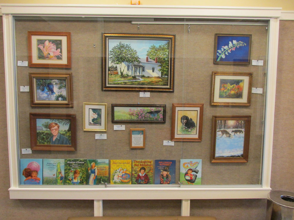
This is just a bitty blog post showing my display at the Logan County Public Library in Russellville, KY. 

These pieces are a few of the paintings I've finished over the past year or so.  Some are watercolor, some acrylic and a couple feature coloured pencils.  
I've blogged about most of the paintings shown.....just scroll down and you'll see some of the same pieces in their very own blog.

Thanks SO much to Logan County Library for the lovely display place.


Saturday, December 5, 2015

Baker Pond or Experiments on Duralar Film


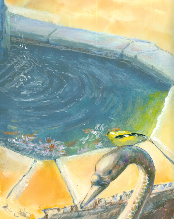
Baker Arboretum  Pond with Goldfinch
Colored Pencils (mostly Prismas & Polys)
 and acrylic paints on 8 x 10" Duralar film
from my own photos

This time around I've been doing some 'sperimenting with colored pencils, acrylic paints on Duralar drafting film. It's made by Grafix, and is a polyester film that has a matte coating on BOTH sides so's it'll readily accept both paints and coloured pencils. That matte coating, while providing a lovely surface for both wet and dry media, also more importantly, turns a transparent surface into a TRANSLUCENT surface.

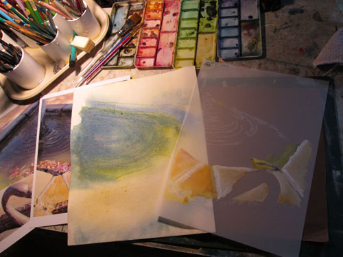
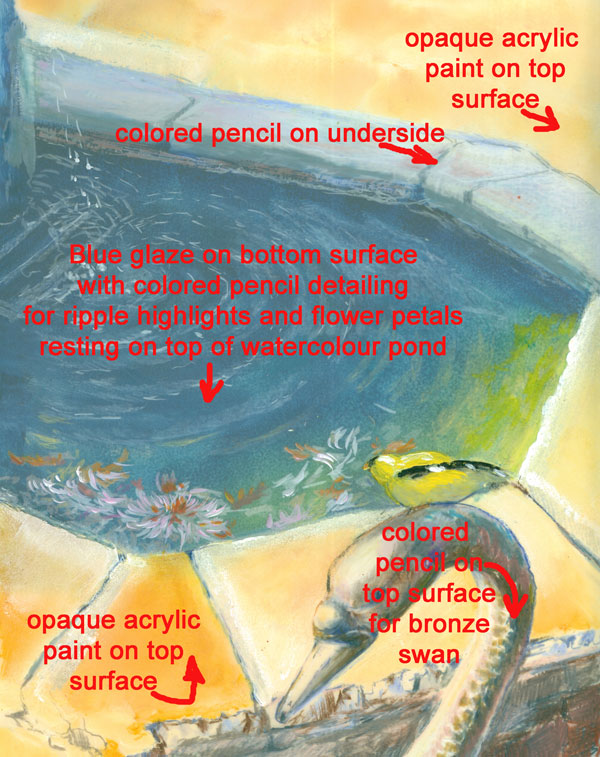
For this experiment I started out with two source photos...one of which was “flipped” horizontally....of my photo of a lovely quiet pond in the Baker Arboretum. I did this so's I could work on both sides of the Duralar film, and have the pond scene look right no matter which side of the surface I was working on. I first tried some light marks on the top side with colored pencils, and wasn't too impressed with the colour coverage. So I then went back to my “go to” medium of acrylic paints and sponged in the foreground stones of the pond, along with the goldfinch.


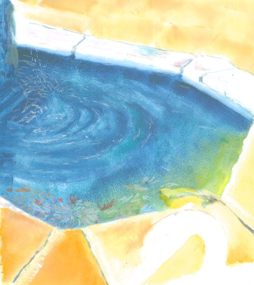
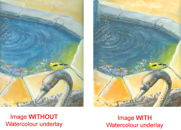
I then tackled the issue of the pond water. I started out thinking I might carry the “3D” effect a step further and have an intense watercolour sketch of the pond to literally provide “depth” to the Duralar painting. I planned to layer the watercolour sketch UNDER the Duralar over lay, and have it provide a colour base. Next I layered, on the UNDERSIDE of the Duralar painting an acrylic glaze....after all water looks like multiple layers of a blue, while having light coloured pencil marks, for water reflections, on the TOP side of the Duralar.


I was pleased enough with the outcome of using a second image (watercolour sketch) UNDERNEATH the actual Duralar painting. But I felt that the Duralar being SO translucent, didn't allow either the watercolour underlay nor the acrylic glaze on the bottom side of the Duralar to really show thru with the depth of colour I had envisioned.


I continued to add details like shadow shading on the underside for the far stones of the pond. I then began to detail in the foreground bronze swan. This is where the colored pencils really began to shine! The Duralar easily accepted the colored pencils, and even allowed burnishing to get the smooth finish on the swan's head......yet I could get the details in of the swan's “feathers” that was rendered in the bronze work.


I had a blast trying out this medium, but I know that there are a whole lot more ways I can work with the Duralar.  It can be a bit like playing 3 dimensional chess.....working with TWO layers. But then again its a LOT like working with Photoshop.....only using traditional media. Yet again, ART reflects LIFE (both real and virtual)


Monday, November 9, 2015

Damselfly in Distress.....Colored Pencil, Ink and daubs of Acrylic


Colored Pencils (various brands), india ink, and a bit of acrylic glazes
on Hi Line Illustration board
11x14 inches
Photos used with permission and approval of Frank Lyne

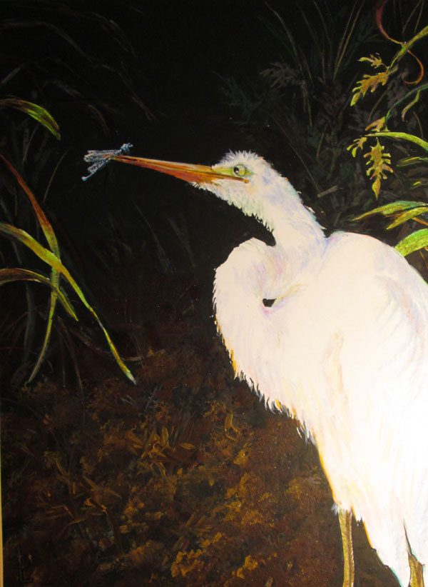
This piece is another experiment in mixing media. Frank had taken a dramatically lit photo of an Egret that stopped by our pond this summer. The camera captured the totally white Egret against a background of the very dark muddy brown pond dike bank, but struggled a bit to encompass the two extremes. I thought it was an excellent time to try to work again with using coloured pencils over a black india ink base.


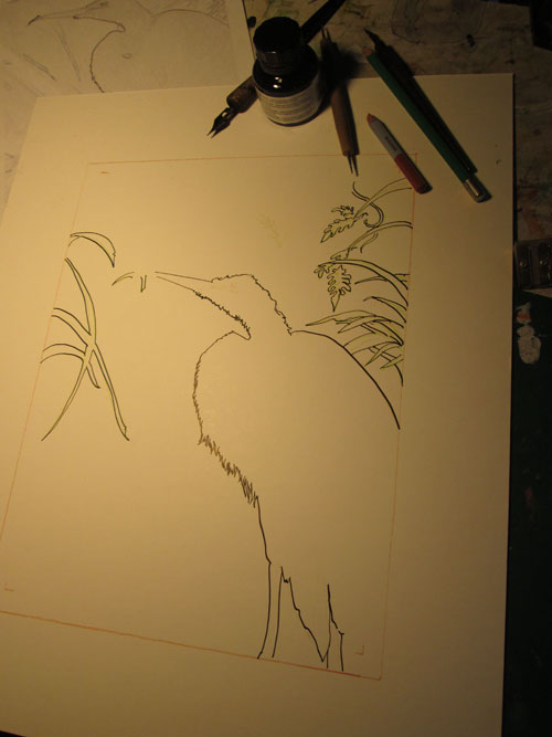
I sketched out the egret and a few leaves in black india ink. Then the fun began!


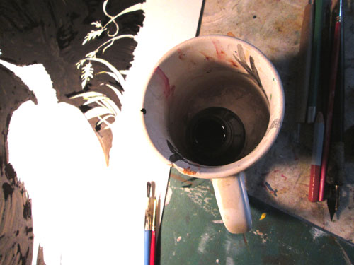
Taking an old cheap brush, I laid in black india ink all over the background. I tried to brush the ink on with broad swoops of ink, leaving a bit of the white board to gleam thru......to show movement of the background grasses, ever so faintly. I very carefully drew, negative style, around my already inked outlines. For this part I used an ancient speedball quill pen. As any of y'all who have inked in graphic novel kinda work knows......it really takes concentration to ink in ONLY the spots you want black.....and leave everything else alone.

Another habit leftover from when I did lotsa black and white work......I keep my bitty bottle of india ink deep inside a stable mug. And ask me why I do this???? 'Cause gravity + slightly inclined drawing table + open bottle of ink = very interesting “Rorschach test” spots all over the floor, my drawing and myself. Lesson learned! 


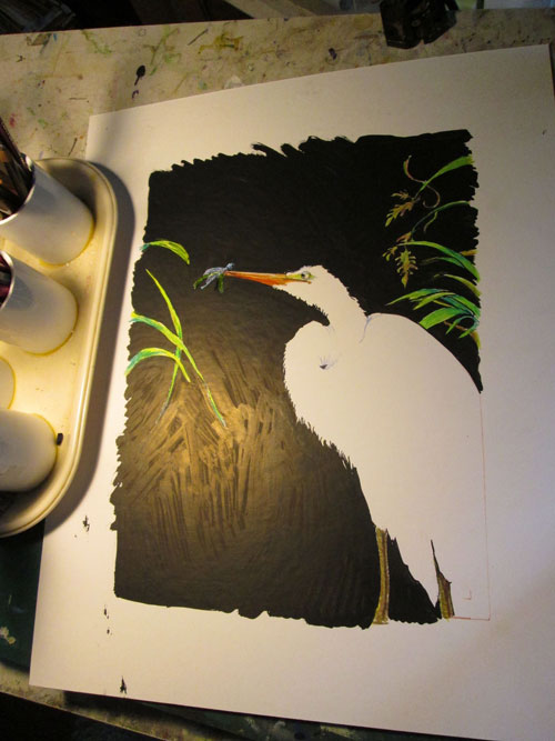
Now we get to the good parts. I started laying in the brite green base of the foreground grasses, and the eye and beak of the egret. I first drew in the damselfly “in distress” sitting on a piece of grass the the egret had grabbed. But I later decided that the green grass was too distracting, visually, and did away with it. After verifying that the size ratio of the damsel fly vs the egret was about OK, I finished detailing the iridescence of the damsel fly's wings and body and gave it a gloss of iridescent paint.

I next worked on the muddy pond bank with a combination of colored pencil strokes and scrubs. The colored pencils were also used on the background grasses and leaves. I really liked how the difference of the coloured pencils on the black color absorbing ink contrasted with the coloured pencils on the reserved whites of the foreground grasses. A good case of using what I'd discovered in a previous piece to get just the effect I wanted on this one. I finished off the mud with a light bit of sponging (using a sea sponge with a bit of mud coloured acrylic paints) to abstractly detail the mud clumps at the pond's edge.

I then gave the egret a good working over......with very light pencil shading with pastel coloured “shadows”. I wanted to showcase the twists and turns of his verrrrrry looooog neck and fluffy feathers.....but keep the “glow” from the bright afternoon sunlight. I finished up using some slightly duller greens over the foreground grasses to keep them a design element....and not competition for the main character.....the egret.

I really liked experimenting with this technique. I feel that this technique lends itself better for gallery work than for illustration. The extreme value contrasts that makes it exciting when viewed “on person” in good lighting, might work against the piece if not scanned in correctly. Digital software can only do so much to contain a really big value difference in this piece of art.