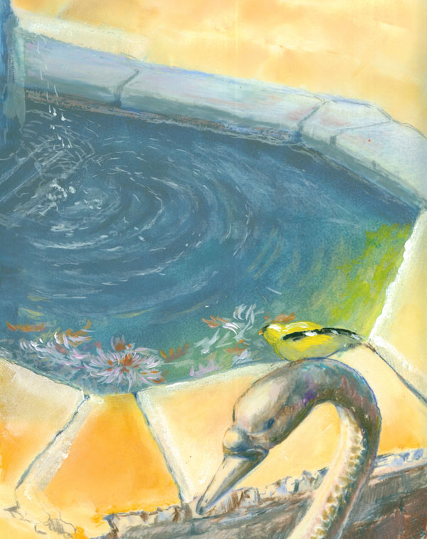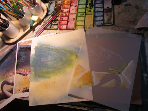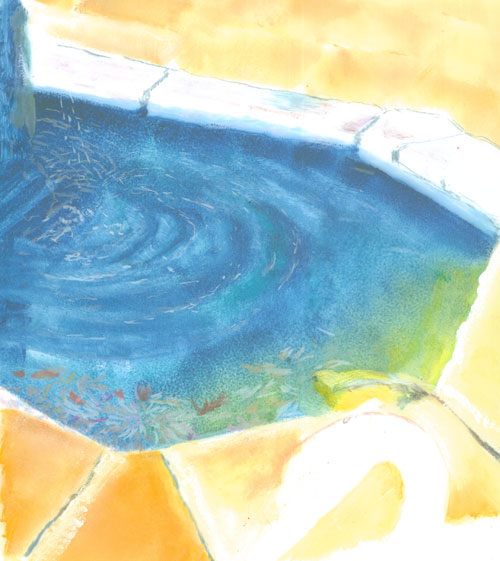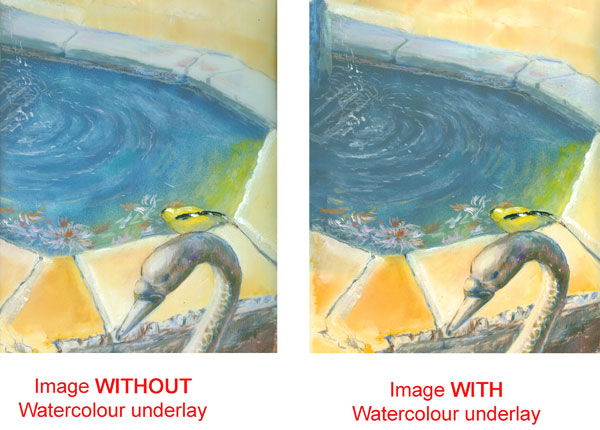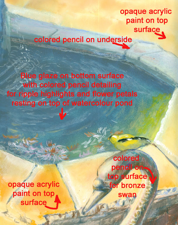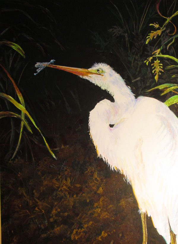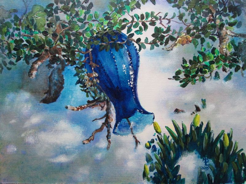
Blue Vase
This
past week I've had some interesting interactions with people who have
viewed my art.
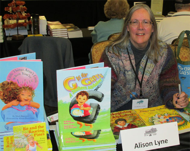
This is
the last week of my art show at the Logan County Library in
Russellville KY. Various librarians have remarked that they've had a
few comments on the artwork. One that was repeated was: “Isn't
that painting of the blue vase hung upside down??”
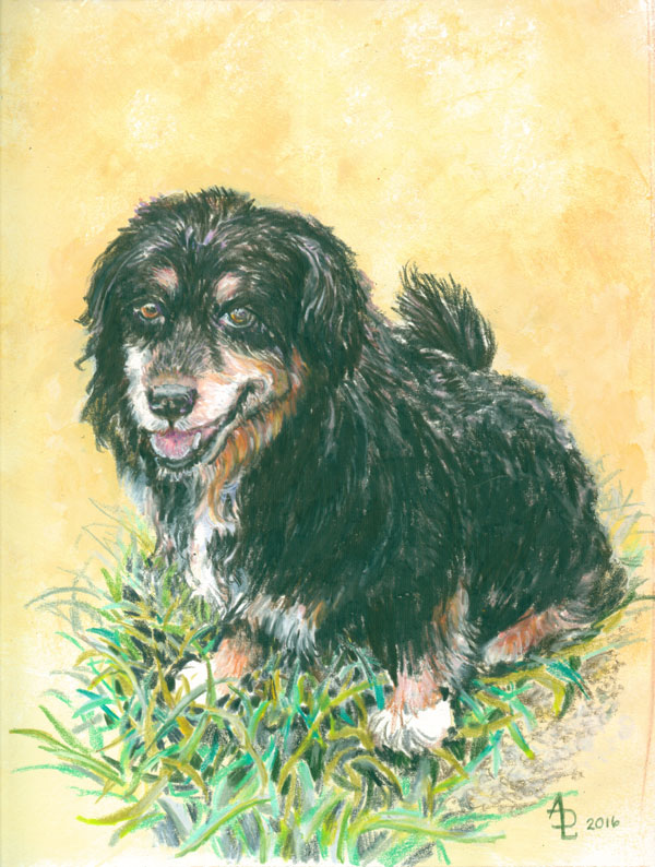
On the
one hand I'm pleased that people are looking at my artwork close
enough to wonder what's going on with each painting. BUT I'm also
confused with the question. In MY mind I know that I painted this
vase laying abandoned in the melting snow, with the sun glowing thru
the glass. I believed that I had included enough “visual info” to
say that to a viewer. That question leaves me wondering if I did my
job as an illustrator......
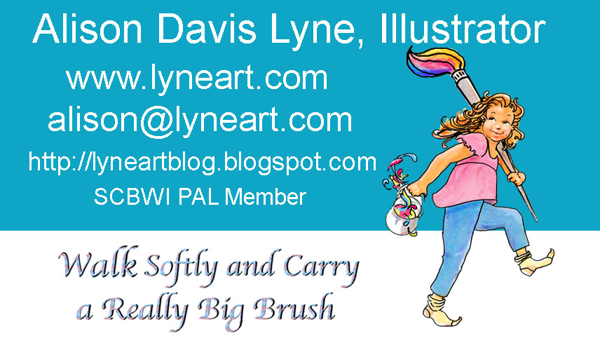
This is
one of my business cards I designed a while back. It's also the basis
for the blog logo at the top of the page and my FB banner.
The
other day I handed this card to a person so's they could email me
some info. He looked at the card and then shot me a quizzical
look.....and asked me if I did local CLEANING jobs!! Not hearing him
totally because of the background noise I replied, that I did picture
book illustrations along with house/people/pet portraits.
As you
can tell from this exchange.....we were BOTH talking past each other!
Later,
Frank pointed out the “disconnect” in the exchange. I have to
assume that in a context that had nothing to do with children's
picture books, or artwork the term “illustrator” just did not
register with this person. Sorta kinda like when Charlie Brown is
talked to by a teacher.....all the audience “hears” is “Blah,
blah, blah”
On the
card the only visual to give a clue is my little girl carrying a huge
brush, a pail of paint and walking in her stocking feet. This was my
visual for “Walk Softly and Carry a BIG Brush”.
An
adaptation to Teddy Roosevelt's quote: “Walk softly and carry a big
stick”
Again
out of context, I can see where this visual could be construed as
someone carrying a washing bucket and mop.
My take
away for all this is that an artist can't have too many “eyes on
the artwork” prior to a show or publication of the art. The more
critiques or editorial advice a illustrator gets, the more likely a
lot of these opinions (misguided or not) can be addressed. After
all, in the case of a picture book, the illustrator is hoping that
THOUSANDS of eyes will eventually “see” the artwork.....and that
most of those little eyes will “read” into that artwork exactly
what the artist intended.