Tuesday, October 27, 2015

Tell yourself (or let your client tell you) what you want....what you really really want.


Since I'm still working on a commission I've been thinking about finding out what you (or if your project is a commission, your client) really want to do. Obviously if it's a commission piece, you have the wishes of your client to guide you. But if you get an idea, and begin to think about how you are going to go about painting your idea, it really helps to first think just why you want to paint a particular subject/style/colours.

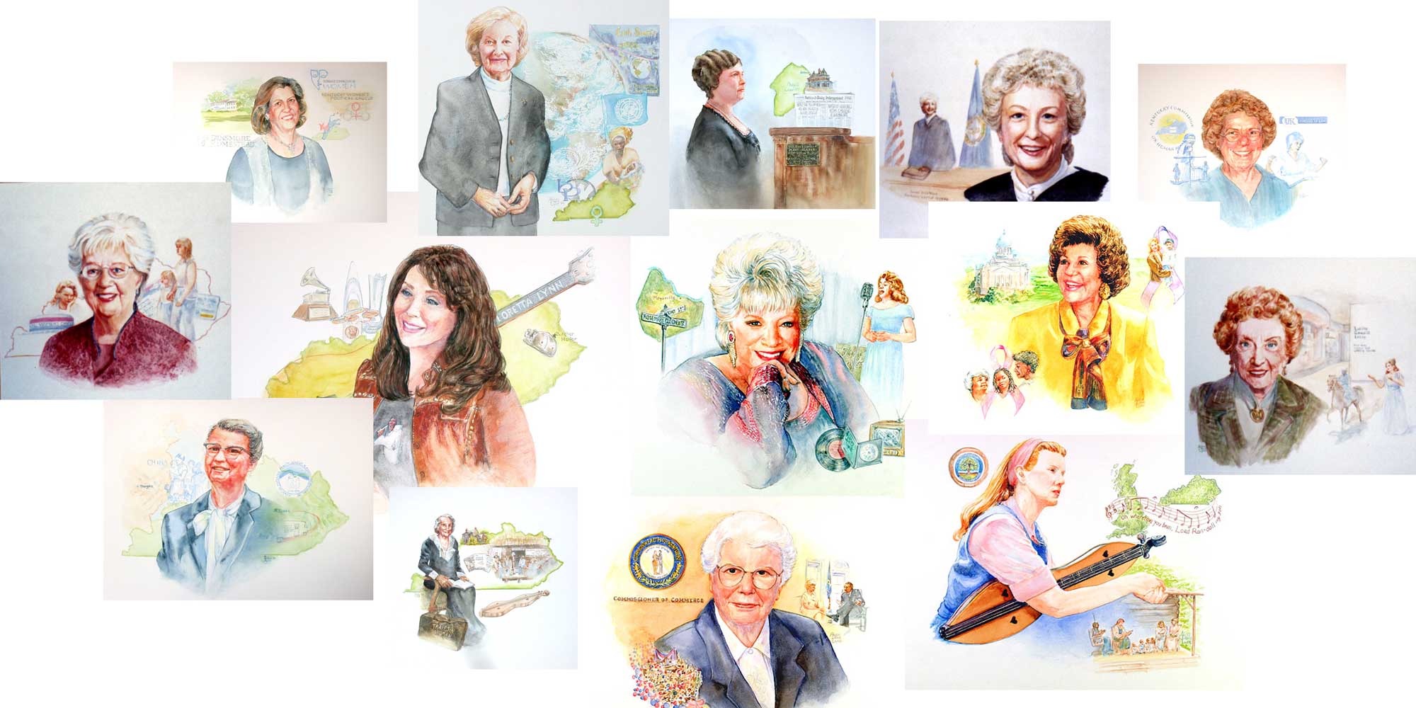
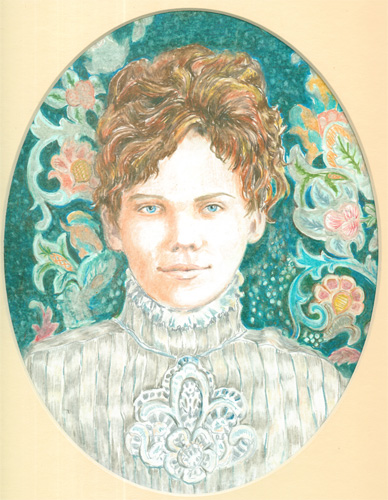
Most commission pieces are portraits. Portraits of people:


or portraits of buildings:
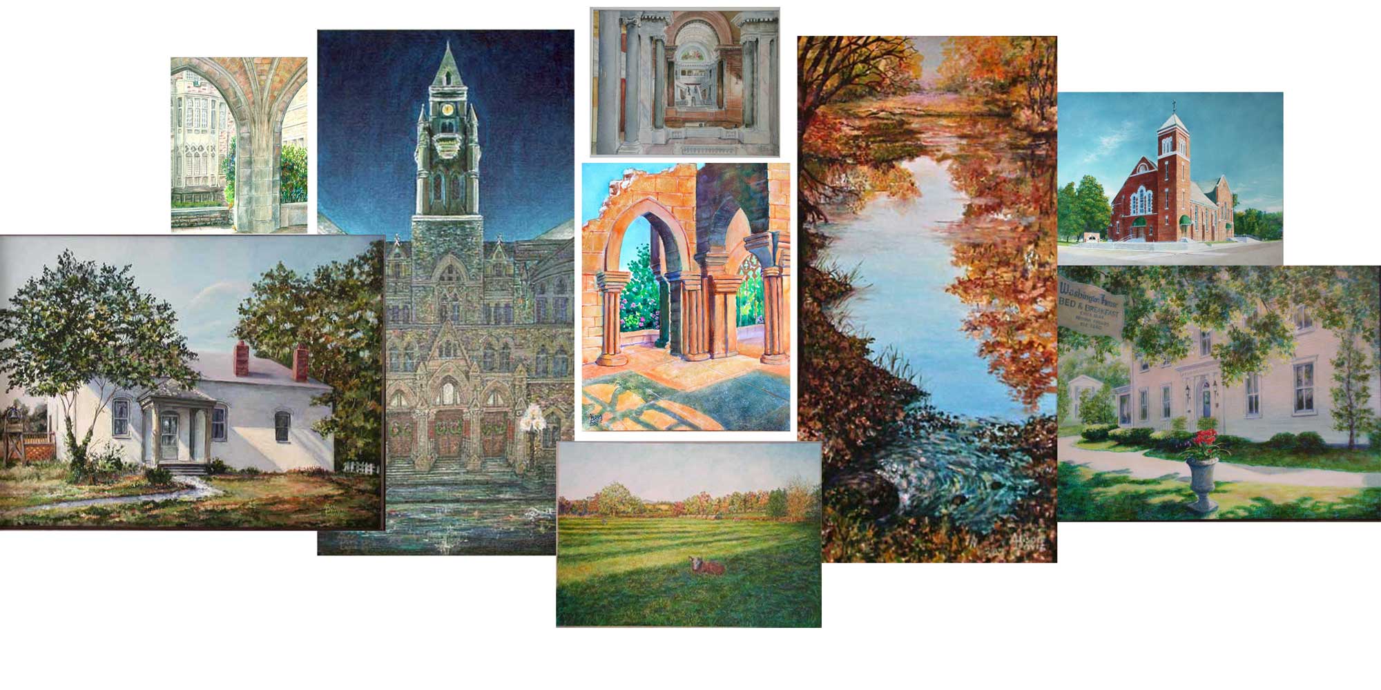

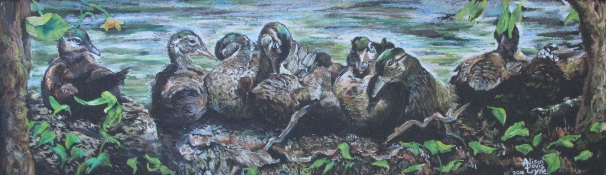
or portraits of animals/pets:


In each case I “talk” both verbally and visually (with sketches) with the client. Communication is vital when working with a commission, because I'm not just painting a face or a random building or just an animal....I am actually reaching inside the client's head and finding out what makes this face, that house, or that particular animal special to my client. I, as an illustrator, may not have an emotional connection to the object I'm commissioned to paint......but you can bet my client DOES! So I listen, really listen to just what my client “really, really wants”.

In the case of children's picture books.....my guide is the author's manuscript. If the author and editor have done their job, the manuscript only tells the author's story with those action words and dialog that are absolutely necessary....no more no less. All the words that the editor had to cut from an author's manuscript.......are what I put back in.....visually. I am guided by the art director's comments of what is “really, really wanted.”


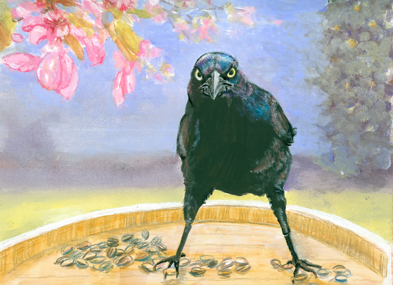
And then we come to the art that I paint, when I'm “on my own time”. Most of those I will put in juried art shows, to be judged and hopefully hung in an art show for people to look at, in the hopes that they see something in my art that they “really, really want.”
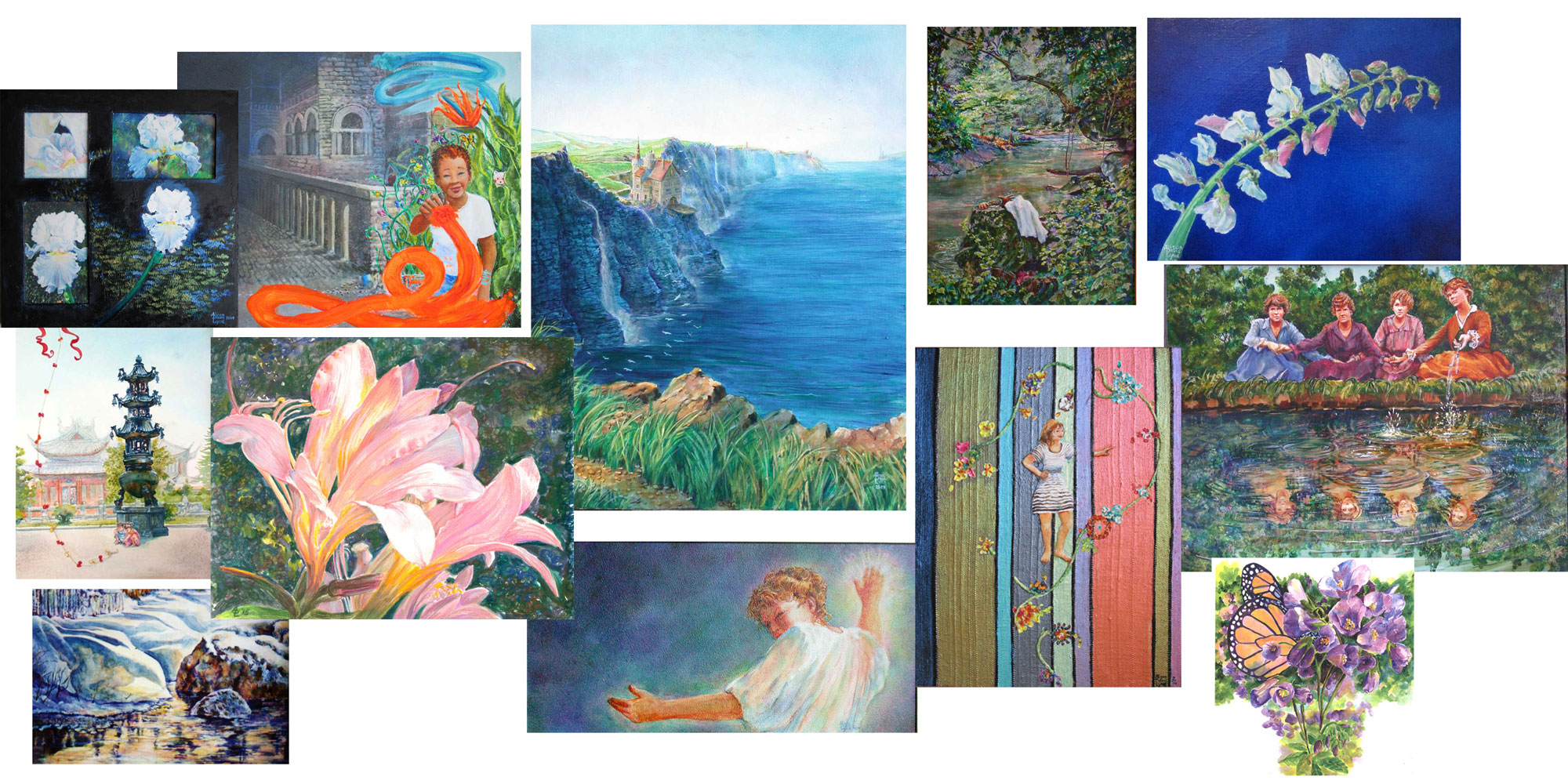

I will often take a passing idea and turn it into a painting.....

or will see a bunch of colours that I really really like and paint them.....just because it pleases me:
Lately I've been experimenting with a “bucket list” of styles and techniques that I've wanted to try, but had to put on the back burner in favor of commissions. Sometimes I'll paint a subject just to experiment with a specific technique. But thru all my experiments, I've been deciding just what was in MY mind's eye, how I wanted the finished piece to look, and what I wanted to accomplish. I've found that the closer I stick to what's in my mind's eye.....the more pleased I am with the finished piece. In other words, once I figure out what I “really, really want” it's a lot clearer sailing to a finished art piece that I really, really want to see.


Saturday, October 17, 2015

Make a Battle...er.. Painting Plan....Then Don't Necessarily Stick to it!


I've found one of the best places to start out your artwork, is with a battle or in this case a painting plan. If you get all your artistic ducks in a row.....you automatically start off with a strong beginning. See the steps in your “mind's eye”, and play out the different ways you think the media will act. I've always been a big fan of the “Learn all about it” slogan. In art you really CAN get closer to the image that you “see” in your mind's eye if you learn more about your chosen artistic style, medium, and artistic techniques.

All my life I've looked at art....art in magazines, books, on museum walls and more recently on digital or Facebook walls. All the images I've seen have been “stored”, if you will, in my mind's eye, for good or bad. Whenever I meet a fellow artist, I often can't quite remember a name, and faces will change, but I never forget a piece of art, and the feelings it inspired in me. So, I will often get inspiration from various bits and pieces of artwork I've seen, along with nature and books. It's also good to remember here, there is nothing new under this sun......so take inspiration where you find it. Don't copy it.....instead make it your own.

Next you want to consider just how you are going to get the same look in real life on your canvas, that you see in your mind's eye. This is where the “learning different techniques” part comes in. Any time you can, experiment with different media, and different ways of doing your art. You can learn when you need to flow your watercolours.....


or when you want just a glaze of colour.....


or set just the perfect bit of detailing....


After you've planned and visualized your art inspiration in your mind's eye, then it's time to start painting. To extend the battle plan metaphor a bit more.....the saying goes....”...a good battle plan only lasts till the battle is joined.” I take it to mean that if you start out with your plan, and something goes awry.....step back and adjust or even toss your original plan.

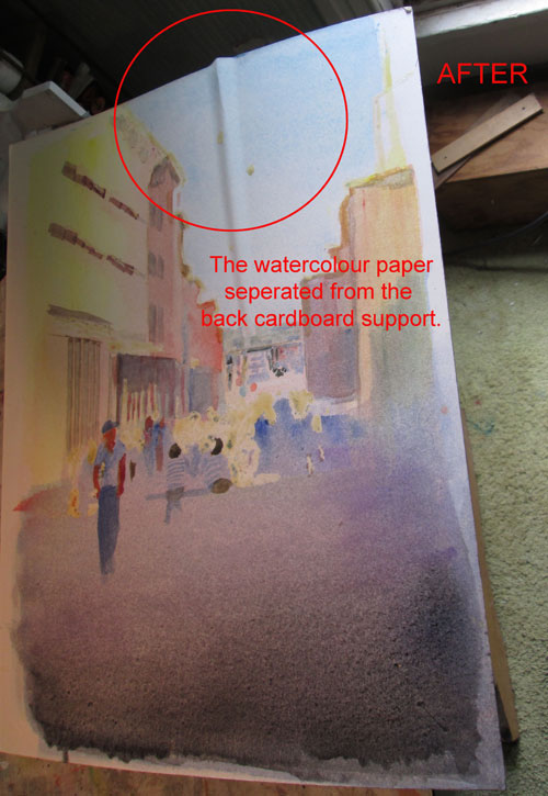
For instance, I did this watercolour street scene and had the paper buckle up, thus spoiling the large painting I had planned....


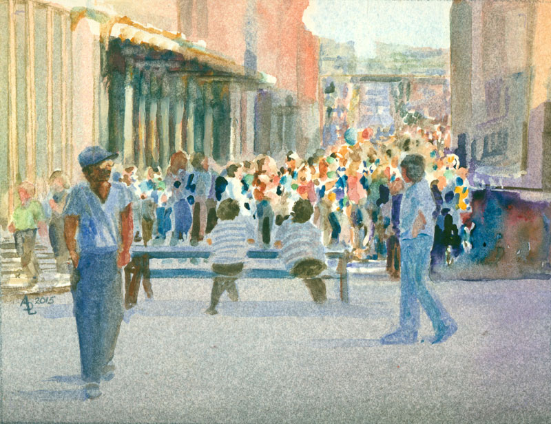
but ended up having a stronger piece with the cropped section.....


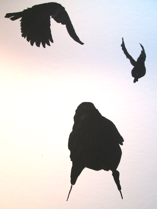
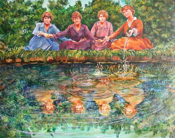
Or I planned a large acrylic painting with three individuals.....


and ended up with a much stronger and more emphatic image with this....


Each time you plan a painting in your mind, you learn from the experience. When you actually go to painting.....it can only make a piece stronger.....and allow your creative spirit to soar.


Saturday, October 10, 2015

COLORWAYS...or I did it all for the COLOUR.


This week I'm working on a commissioned piece. I did this color study chart to determine just how much color I can include, as it's supposed to sorta kinda “match” a previous portrait by another artist. It's for a Christmas gift.....so I've fuzzed the image to protect the surprise.

While working on this color study, I was struck by a running theme in my artistic life.....colour. In any bio I've written, no matter the audience, I reference my love of colour. Ever since I got my grubby paws on that 64 color crayon box, I've loved playing with color. I got into fiber arts (knitting, crocheting, spinning), just so's I can have luscious colours run thru my fingers. Being able to use all the color I wanted led, in part, to my children's picture book illustrations.

(Acrylic paints on bristol board-back cover for Little Things Aren't Little When You're Little)

Most paintings I create, I already know the kind of colors I'm going to use.....they are often already decided for me, especially if I'm doing a commission. “Local color” or the native hues of a given subject....(.i.e. A fire engine is red or an orange is well....orange), will most often determine a painting's color scheme. On the other hand, if I'm the one deciding the subject matter, I will often paint something just for the colors involved;


colored pencil on bristol board 

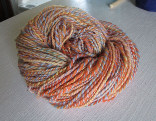
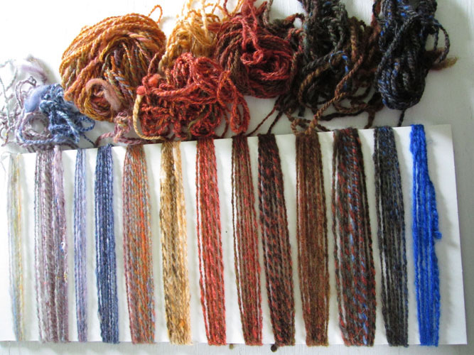
Or spin a skein of yarn just to play with multiple color ways,

2 ply spun wool that I hand dyed

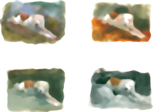
If I'm working on a commission, and the color choices aren't immediately evident, I often go back into my artistic “toolbox”, and pull out some help. With this portrait commission, I've got a white main subject from the client's reference photo. So what colours do I need to set off the subject the best? How to best “frame” the white subject, while keeping the portrait subject....the main event? One way to find out is to do little colour “doodles”.....and put them up side by side and see which one looks best.


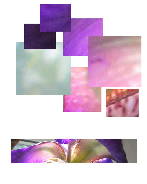
If on the other hand I want to paint from my own (or Frank's) photos that inspire me, just 'cause of their hues....then I might do something like this “purples” chart.....to help me see clearly just why I fell in “artistic luv” with an image. I have seen a few websites where they have a program to do this automatically, but I've been playing with doing it myself in Photoshop. I took one of my photos, and pulled out the colours that attracted me to the image
in the first place. This bitty chart is one is of a purple iris:

I did the same kind of thing when I was looking for a good gradient colorway for a spinning project. I made this chart to preview what different fibers would look like:


It doesn't matter what media you are using, paint, pencils or fiber.....if you have questions about colours....you can often find the answers in a bitty sampler “colorway chart”. It lets you have a colourful ,visual, conversation with yourselves......to help solve an artistic problem.


Tuesday, October 6, 2015

Creekscape.....or Washing Away Water (colour that is....) with Water.


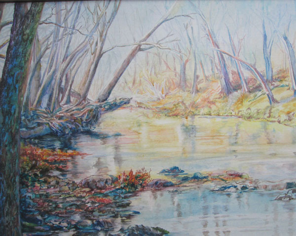
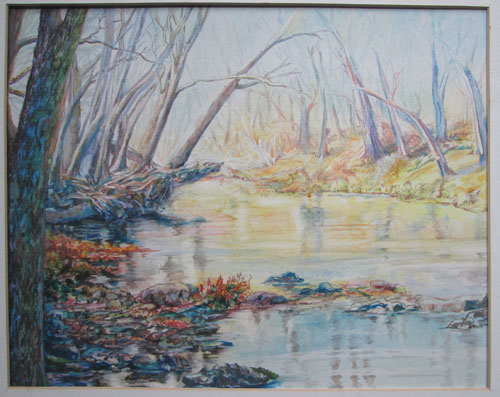
CREEKSCAPE 

16 x 20 colored pencil over watercolour
various brands of watercolours
various brands of coloured pencils (mostly Prismas and Polys)
Done on HiLine smooth illustration board
Photo by Frank Lyne, and used with his permission and approval

This time around I'm mixing watercolours with colored pencils.

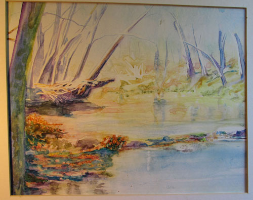
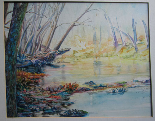
A while back, I was looking thru my UFO (UnFinished Objects) file, and came across this half way done watercolour sketch. I'd used a lovely photo that Frank had taken when he did a creek walk. My intent at the time was to use watercolours in a very hi key colour way for the underpainting, and possibly glaze over with darker colours to mute, but not hide, the bright colours. The only thing was, I'd used hot press illustration board (a thick paper surfaced with a slick coating) that kept the watercolours very “on the surface”. That coating didn't allow the watercolours to sink in as they would on regular watercolour paper. The watercolours threatened to wash right off when I tried to apply a second set of washes. So I laid this sketch back and forgot about it.


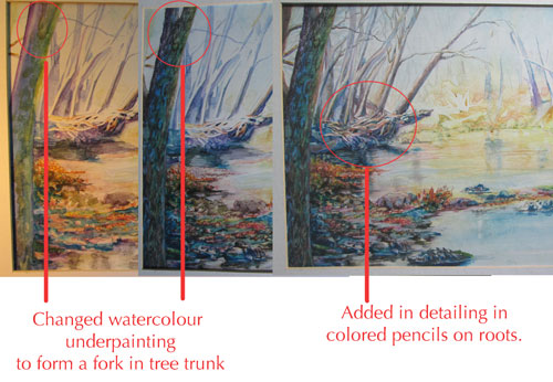
Recently I decided to “pick up” this watercolour sketch again, and see what would happen if I went over the “on the surface” watercolours with wax coloured pencils. My normal progression in coloured pencils is to go from left to right, keeping my right (and pencil) hand on waste paper to protect the watercolour washes already laid down. I penciled in some dark and more intense colours on the left hand tree trunk and foreground rocks and leaves. It looked OK......but the tree was a bit thick towards the top. I decided that I needed a fork in the tree top. Putting white colored pencil over the dark coloured watercolour (to form a fork in the top of the trunk) didn't seem like the best solution.....so I instead took a moist acrylic brush (slightly stiffer bristles than a watercolor one....but not too much!), and lightly went over the watercolour of the tree trunk. Lo and behold......the watercolour that was resting on the surface of the paper lifted right off.....and didn't leave a residue. I could then put in a bit of sky colour and voila! I had a fork in the tree.


You can see here the differences just a little water erasing and coloured pencil detailing can make. I went on to work on some of the mid ground trees,rocks and reflections. I could use the lovely detailing in the mid ground roots/branches but still keep it “mid ground” by detailing with greyed and muted colours. If a bit of watercolour got “in the way” of where I needed a tree branch.....all I had to do was wipe it off with a bit of water. Almost as good as the erase button on a computer!


As I progressed across the page, I decided that tho' I'd followed Frank's source photo, the foreground rocks were not exactly in the best composition for my framing. This is the point in every artwork, where the “needs of the artwork, over rule the original source image”. I changed the foreground rocks crossing the creek from a straight line, to a slight bow shape that echoed the far creek shore line. Again, it was quite easy to do, due to the slick surface. Just a bit-o-water and the watercolour rocks vanished, to be replaced with rocks just where they were needed.


I continued on detailing in coloured pencils till I was ready to “call it done”.


Saturday, September 12, 2015

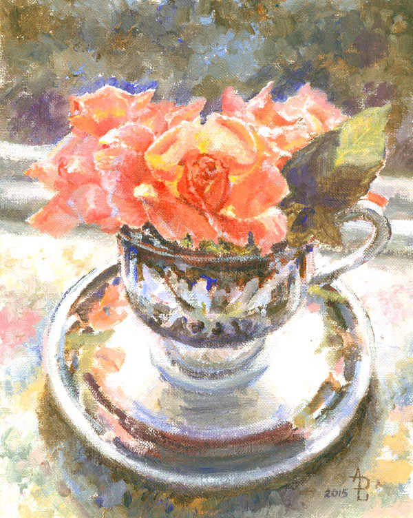
Tea Cup Rose.....Alla Prima in Golden Open Acrylics


Tea Cup Rose
8x10 inches-acrylic
from my own photo


This blog post is about my picking back up on an old and very popular technique.....alla prima...or painting all at one time. In this case I also am working impressionistically and eschewing as much detail as I can “artistically” stand.

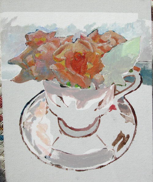
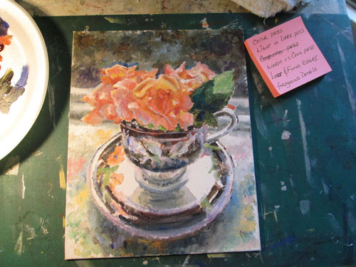
I took the source photo using a tea cup found at a antique shop, with some roses from the backyard, all backlit, resting on a needlepoint piece I'd done years ago. Since the roses were the “main character” here, I begin painting on them. I was using a few reds, a yellow and a blue of some Golden Open acrylics.....acrylic paints that closely mimic oils, both in their painting texture and in their “open” or wet time. I began daubing paint here and there, keeping all the colours in a “high” or light colour register. I finished most of the flower colours, but wasn't too impressed with the painting yet. I didn't take a pic at that point but this Photoshopped one shows it about right.


There just wasn't a lot of “oomph” to this so far. But then I started to lay in the background of the darkened windowsill to the outside shrubs, and the shadowed leaf and the black accents of the tea cup......and the sunlight began to shine! The darks (blue with a brown) became black and the background (greyed blues and browns and greens) began to make the peaches of the flowers POP!


I'd been inspired to try this technique by an article in a magazine, which offered the advice for this kind of impressionistic, opaque-paint painting of starting out with your darkest value then keeping in a “mid range” for as long as possible and finish up with highlights. The fact that I was also painting on a canvas board, (a rarity for me.....) helped a bunch when I wanted to paint in more details and more details, but the painting “said” it wanted to be more about colours than details.

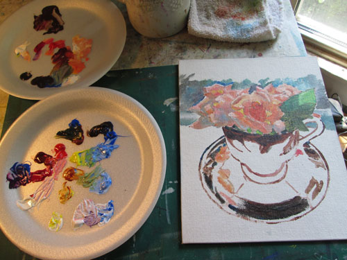
After I got most of the rest of the painting laid in, I stepped back to see what else needed to be done.....


As you can see in the pic I made up a bitty list of the things I wanted to check over before I called it “DONE”! I wanted to concentrate my attention on:

Making one more “colour pass” to check and see that my colours were where they needed to be to successfully pull off the illusion of the tea cup and roses.

Checking again that my values were in alinement with the rest of the scene. I intentionally kept the roses and tea cup a bit lighter in all over values to keep the lively colours in the shadows.

Tilted the back windowsill just a bit more, to make sure that the composition wasn't too static, but still looked “right”.

Kept my warm reds/peaches in the sunlight, and the cooler versions in the shadows of turning petals. And added the blue reflected lights (of the sky) where the petals turned over.

Made sure that the petals further away from the viewer had “lost” edges (were blurred) and the ones closer to the center sharp focus were more crisp and sharp, or “found”.

Finally I allowed a bit more details on the petals of the foreground rose. I had to almost “slap” my own hand to keep from adding more details in the cup......but I managed to leave most all “well enough alone.”


Saturday, September 5, 2015

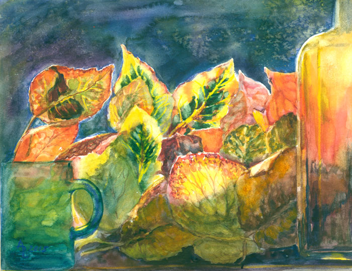
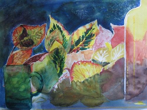
Windowsill of Leaves watercolour with just a pinch of colored pencil


Windowsill of Leaves
8 x 10 inches, 2 ply bristol board, various watercolour brands,
 liquid misket and a bit of Prisma coloured wax pencils, 
from my own photograph

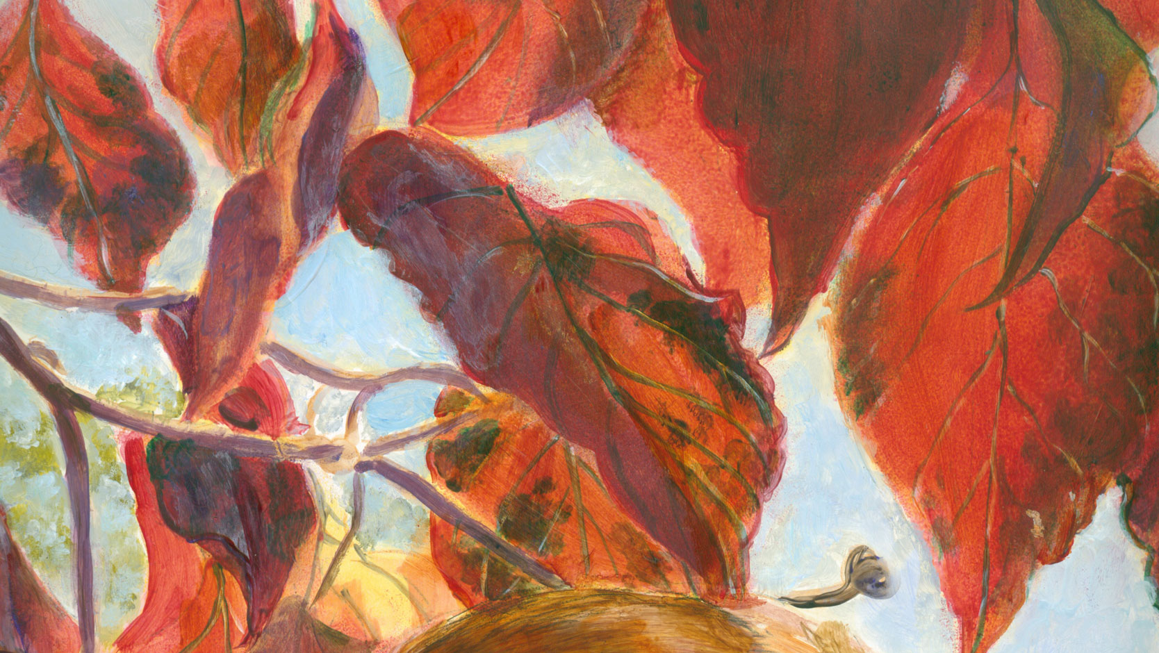
This time around I'm showing a small-ish watercolour I did from a pic I took of a bunch of fall leaves piled up in my kitchen windowsill. I put a green cup in one corner and a bottle of olive oil in the other, to hold them in place. I adored how the sunlight filtered thru the different layers of the multi-hued leaves.


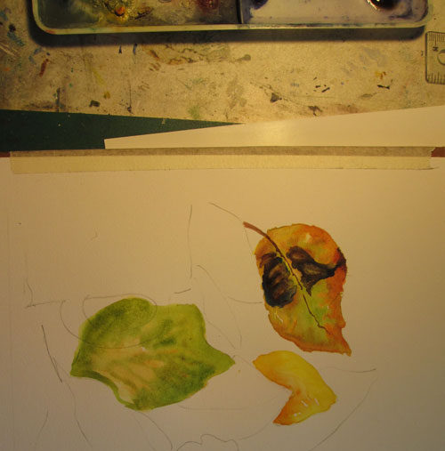
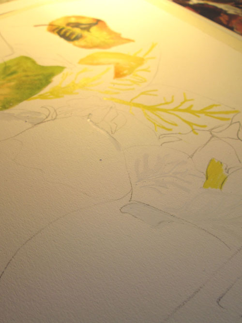
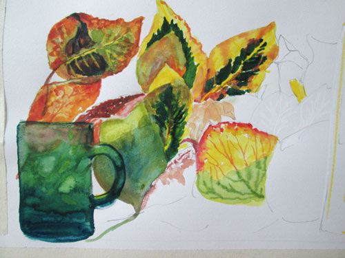
I was so in love with the leaf colours I just had to start right in on a leaf, the minute I had the composition sketched in. I decided I wanted to do a 360 degree turn from my poured wash technique of the past few watercolours. I “outlined” the first leaf in water, using the water's surface tension to define the borders for the orangey green colour. I then dipped in the tip of a color heavy brush into the water and pushed it around, then let it dry. I repeated that with the next colours and the following leaf.


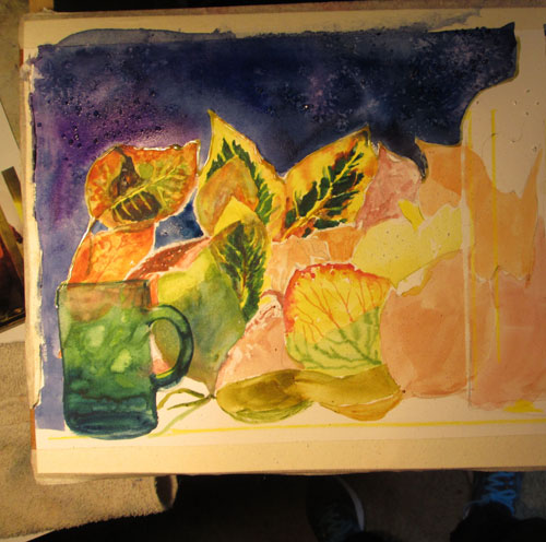
I knew that I wanted the window to be dark to provide a foil for the sunlit leaves, so I ran a bead of misket around the upper leaves and the olive oil bottle. I also wanted to use some light coloured wax colored pencils to “reserve” lights for the veins in the leaves and sunlit halos on the edges of the leaves. I also drew in some defining lines in the olive oil bottle.


I continued on doing each leaf separately, and adding in the green glass cup over the background leaves.


After getting the leaves roughed in, I put in the dark blue/purple window background. The bead of misket kept the wash just where I wanted and not in the leaves. In a couple of the smaller bits of background, I just used the wax white coloured pencils as a resist to the watercolour wash.

Now that I had the darkest darks in the picture, I could see how I wanted to finish up on the further leaves and their shadowed forms. The olive oil bottle was coming along nicely. After I laid in the background shadowed leaves, all I had to do to recover the bottle's glow, was run a damp brush over the wax coloured pencil line, and the dark watercolour lifted off like magic. There were some spots, like the highlit veins in the leaves that were drawn in almost too thick with the wax coloured pencil. I just painted in the leaf colours right over the coloured pencil lines. After it was dry I just removed the thickness of the leaf vein that I wanted, leaving the rest of the too thick line underneath the darker watercolour.
I'd drawn so many leaf veins that I'd sorta forgotten exactly where they all were. Each time I finished up on a leaf, I'd try removing some watercolour for a vein, and was delighted to find a “saving” wax coloured pencil mark just where it needed to be!


Saturday, August 29, 2015

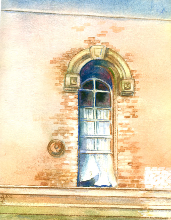
Window Study...or a New Coat of Paint


A New Coat of Paint
8 x 10 inches on 140 lb watercolour paper, using various watercolour brands,
some watercolour pencils, and a bit of acrylic paint. Reference is my photo.

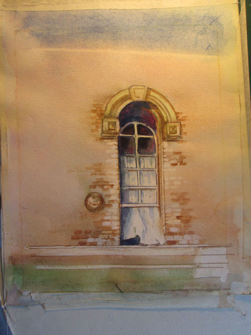
On the heels of my previous piece, Grackle-attitude, I wanted to continue to explore uses of wax coloured pencils with other media. I decided I wanted to do a watercolour piece that had architectural elements needing straight lines. I picked an old photo of a historic Nashville building, that was going under renovation. The window that was my focus was an old double hung sashing.....it was open both from the top and bottom allowing a breeze to flow thru.


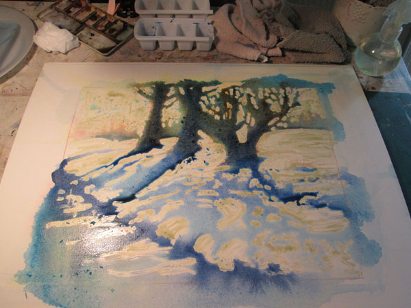
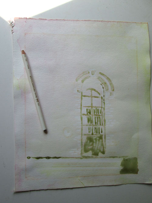
I sketched out the window and laid in lines and curves of the window and curtain with liquid misket....showing here as a greenish grey. In addition I lined off some of the straight lines and bricks with a white wax coloured pencil. If you look closely you can see the bricks embossed with the white coloured pencil.


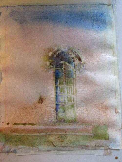
I wet the paper and slapped it onto plexi glass, and taped it all down after applying my first washes. You can easily see where the white wax coloured pencil resisted the watercolour wash on the bricks, in addition to where the liquid misket was located.


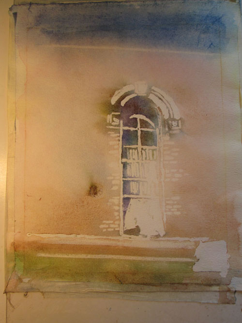
After a couple of more watercolour washes, I removed the liquid misket and lightly erased on the colored pencil bricks to remove puddled dried watercolour. Now I could see where I needed to go next to firm up the window and surrounding wall. I was especially pleased with the top portion of the window, showing the upper arch's depth. I had done a line of the wax white coloured pencil just under the frame, that got covered with my wash. I later was able to gently lift that watercolour residue off the white pencil line. It made it look half in and half out of shadow.

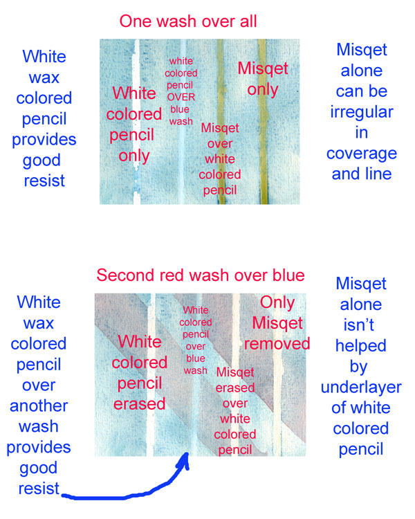
Before I finished the watercolour study, I took a waste piece of watercolor paper, and drew four lines. The first one was a white wax coloured pencil line. Next I left blank. Then I drew a white wax coloured pencil line and I put a bead of liquid misket on top of that. Then finally I drew a line of misket only. I did a light wash of blue over all four lines. When dry, in the blank space I'd left, I drew a line of wax coloured pencil over the blue wash.

After that I lightly brushed a second red watercolour wash diagonally across the paper and lines.When that dried, I erased the first colored pencil line and it came off very clean. The next line over wash I also erased, and again came off very nicely, showing the blue wash underneath. I removed the last two misket lines, and found not a lot of difference in the line. I think that the reserved white from a wax coloured pencil line is most effective when I want that line to remain white (or whatever color I've used). If I want to just “reserve” the white to later apply watercolor over then misket seems the best, tho' the line won't be as straight as the wax coloured pencil. I also like the idea of using the wax colored pencil OVER an already laid down watercolour wash. All these bits of info will play into my next watercolour project.


For the finish of this piece, I added in additional “bricks” of various hues around the picture's main focal point. I had reserved the white paper for the new coat of paint on the lower right ledges, but felt it needed something else to 'splain the title. I took a dab of white acrylic paint and applied it over a regular square of bricks to signify that the old distressed bricks were getting a new coat of white paint.

I enjoyed fooling around with the watercolour and the wax colored pencil. It's yet another neat tool in my artistic toolbox.