Saturday, August 22, 2015

Grackle-attitude or Experiments in Ink, Colored Pencil, Acrylic


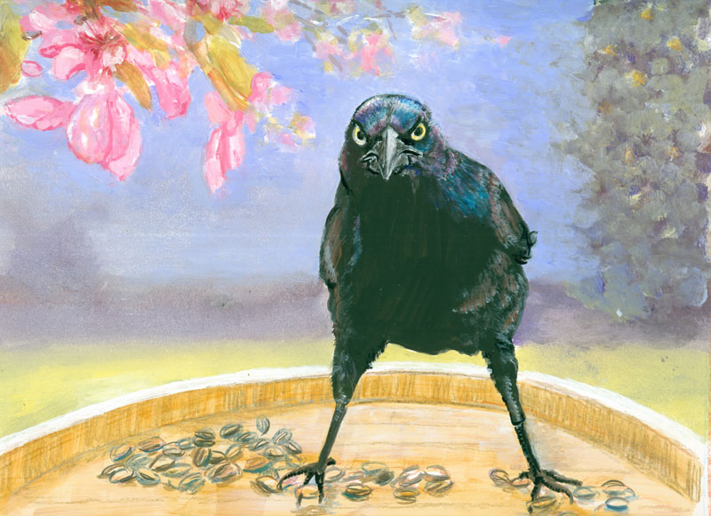
Grackle-Attitude
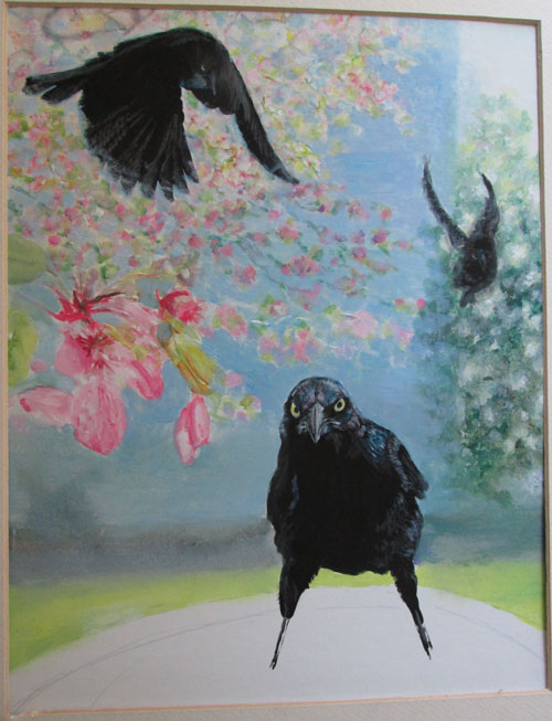
8 x 10 inches ink, coloured pencil and acrylic paints on illustration board from Frank Lyne and my photos.

This time around, I'm showing some stuff that did........ and didn't work, for this portrait of the ultimate “angry bird”.....the grackle.

I started out with a wonderful photo that Frank took this winter of a really intense grackle, guarding his part of the bird seed feeder. I'd gotten some fun pics of a bunch more grackles jockeying for position to get to another feeder. I combined those photos with one I'd taken of some crab apple branches in part shade/part sun.

I'd read of an art technique where a black india ink silhouette was made of the figure, in this case the three grackles. I positioned them so's one was extreme foreground, one was flying in and a third was in the background.
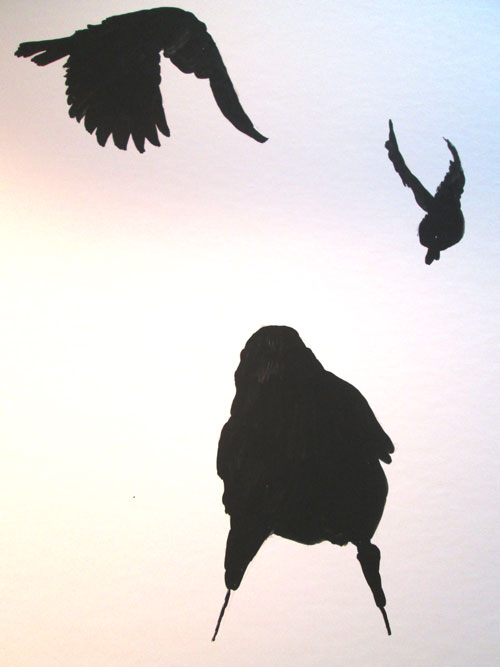

After the india ink dried, I drew in the eyes, beaks, and feathers of the three birds with coloured pencils. The first pass of the wax coloured pencils went on well, the india ink coating accepting it just fine. Then, in traditional coloured pencil style, I went over things again to emphasize the first lines. This time nothing happened, no flaking....but no increase in the intensity of my lines.
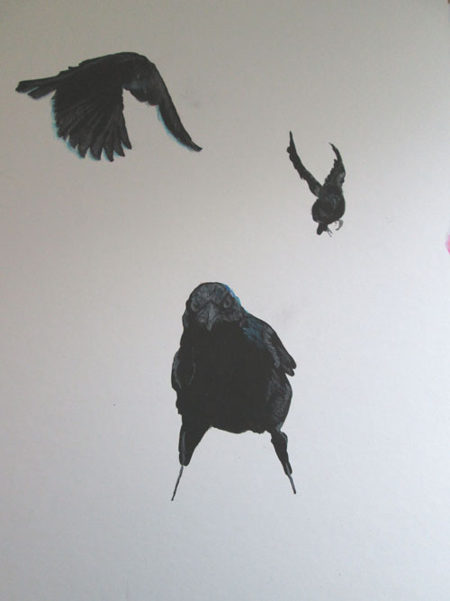


So I went back to what I KNEW would work....acrylic paints. I went back over my coloured pencil lines with thin coats of acrylic paints to draw out the sharp beak, the intensity of the yellow coloured eyes of the bird. I also did very fine brush lines for the iridescence of the grackle's head and wings. I painted them in mostly white at first, to provide a base for acrylic glazing of the final colours.
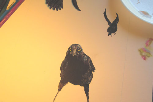

As you can see in the pic above.....off to the right a bunch of little pink/green/blue spots....I “auditioned” both coloured pencils and acrylic paints for the next step of the painting.....the blurred background of the crab apple blossoms. I decided on acrylic paints, as I had a large-ish area to cover, and burnishing (smoothing with hand pressure layers of wax coloured pencils) that much coloured pencils would be considerable wear and tear on my hands! I started in painting the blurred background of the crab apple blossoms.
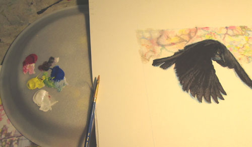


After I'd painted in the background, I stepped back and looked at what I'd done so far. I wasn't too impressed with the composition, now that I'd gotten it filled in. Drastic measures were called for!

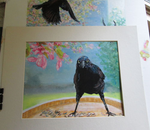
Sometimes you just have to go ahead and paint something to be able to judge when it IS and ISN'T working. I grabbed a smaller mat and begin to “frame” a different part of the painting to see if it would work better just showing a part of the original composition. I ended up liking the horizontal “landscape” view the best.


Saturday, August 15, 2015

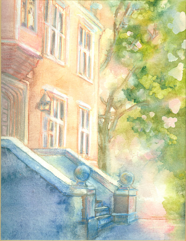
Building Study......Stretch and Staple Watercolour Paper


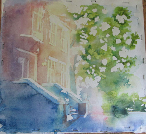
Building Study
approx 8 x 10 - done from my photo reference
on 140 lb watercolour paper - various watercolour brands with some watercolour pencils

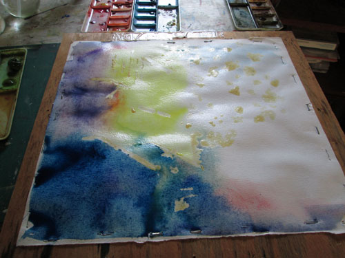
This blog post is the second in a series of watercolour experiments. I'm playing with different ways to keep watercolour papers flat while working on watercolour pours. Last time I did “Soak and Slap”.....this time I'm trying “Stretch and Staple”. This method for prepping watercolour papers is a traditional one that I thought I “didn't have time for”. But after some disappointing mishaps with watercolour boards.....I've decided to try the technique out.

The first thing is to soak your watercolour paper in water for five to ten minutes. Pull it out of the water and briefly drain. Lay it on some masonite/particle board or other, and gently flatten it out. Then take a stapler/staple gun and beginning at the center edge, staple about every inch or so, gently stretching the paper flat. Continue working out from the center edges flattening and stapling the paper. When done let it dry. It should dry drum taut and flat.

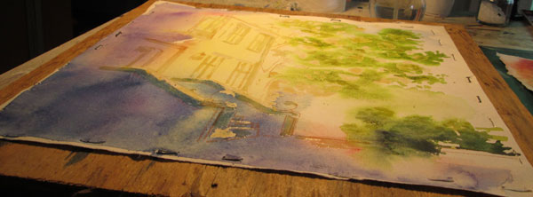
I put in some misket on spots I wanted to reserve in white, then throughly spritzed the entire sheet. I then began pouring on a yellow, a rose madder genuine and a blend of different blues. As you can see it buckled a lot!


Looking at the buckles and the valleys where the watercolour was pooling I despaired of a smooth blending of colours. BUT I remembered another component of the “pour” technique......MOVING the watercolour around on the paper and finally pouring the excess watercolour off the paper. So I proceeded to do just that, I tilted and turned the board till I had gotten a good wash and then poured the rest off into a cup. Almost immediately the buckles began to subside. As the paper began to dry just a bit......it also began to flatten back out.


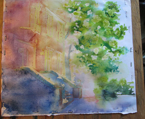
By the time it was dry it was once again totally flat, and the wash I'd done was pretty even!
I wanted slightly stronger colours.....remembering that watercolours always dry lighter than when wet. So I did a coupla of more washes, repeating the pouring method, with the same results.....a flat sheet when dry.


Once the washes were dry I removed the misket. It was skewing my eye when evaluating the wash placements. I went on to line in with watercolour pencils more of the details of the building and the tree branches. I was not as pleased with the stark outline of the misket on the leaves and scrubbed out some of the more harsh lines. The misket had also not stayed straight on building highlights that really needed to be straight. But all in all this study has been a ball to do. I've gained valuable know how about basic watercolour painting and very much enjoyed bringing a bit-o-colour to a sometime plain brick building.


Saturday, August 8, 2015

Dragon Illustration: “I Choose YOU!”


Dragon Illustration:"I Choose YOU!"
Approx 8x10 inches - watercolour-various brands, acrylic paints with paper cutouts 
on 140lb watercolour paper -Text added digitally

This blog post is about some watercolour experiments I've been doing over the summer. This time I've been experimenting with ways to treat watercolour papers while painting. My first goal was to see how much watercolour pours different watercolor papers would take. I decided to try out different ways to use watercolour on papers, and end up with a flat piece of art.....not the art.....but the actual paper!

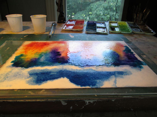
The technique I started out with was one I've nick named “Soak and Slap”. It's quite simple really......you take a smallish piece of watercolour paper 8x10 or 10x14 inches and soak it in water for five or ten minutes. Take out of water, drain slightly and slap it onto a slightly larger piece of plexiglass.....smoothing it down all around. The water suction holds the soaked paper in place and you are ready to paint. The paper is already wet so it will accept watercolor washes poured over the wet paper......mingling beautifully as the colour moves over the paper. It's as simple as that!


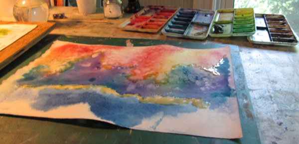
I let the paper get almost dry, while applying some salt blooms, then I peeled it off the plexiglass. By the time I had applied some misket on spots I wanted to preserve.....the paper had started to buckle. 


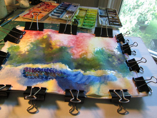
So I tried an alternate method to keep things flat. I spritzed the back of the paper and clamped it all down and worked on things a bit more. But the paper stayed buckled.


So I went back to the original “drawing board”.... the plexiglass. I heavily spritzed the back of the drawing and slapped it back down on the plexiglass. I added a bit of masking tape all around the paper.
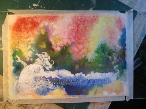
I had decided that this piece would be a children's book kind of illustration. I sketched up a dragon and decided on the action I wanted. I worked on laying in the white acrylic “underpainting” for the dragon. While I was working on the dragon, the paper gradually began to dry.....but stayed FLAT!!


So.....leaving the paper where it was......I painted in the dragon in acrylic glazes over the white underpainting. On a separate piece of paper I painted a little girl in a pink pajama set. I cut her out and taped her down, placing her exactly where I wanted her, on the watercolor painting. Once everything was dry I scanned in the whole thing, took it to Photoshop, and put in the text.....”I choose YOU!” and was finished.
This time around I've learned that when I use the “Soak and Slap” method of painting on watercolour paper.....keep it there through out the entire painting process.
On to the next method......”Stretch and Staple”.


Friday, July 31, 2015

Wet Paint.....or How I learned to LUV watching paint dry.


Wet Paint
approx 8 x 10 inches
various watercolour brands, bit of acrylic paint, and some salt
on approx 140 lb watercolour paper, unknown brand
done from my drawing


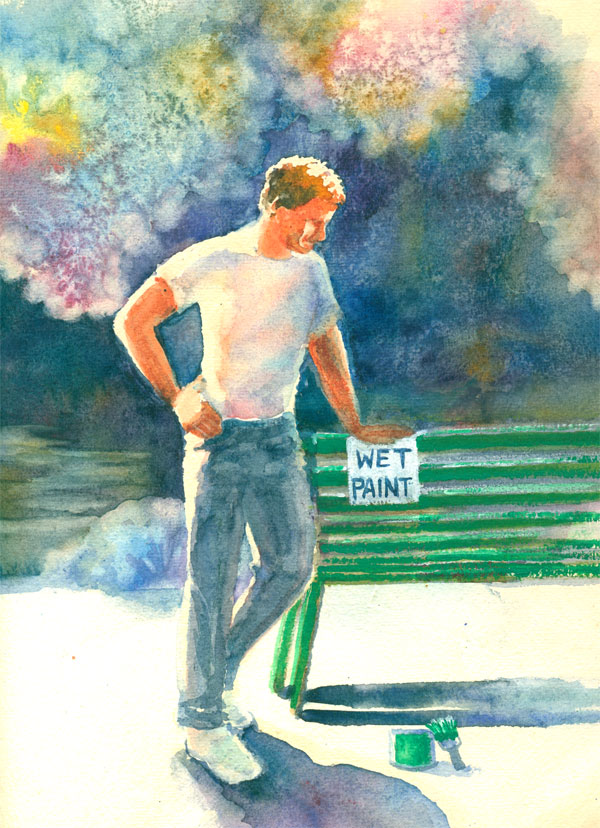
Both this blog post and watercolour sketch comes from an experimental watercolor piece that came to be Wet Paint. It started out from an old phrase.....”That (whatever is being disparaged) is just about as exciting as watching paint dry”. Well I happen to luv to watch paint dry. I can learn a lot from the experience.
I have a very old stash of various sizes, weights and kinds of watercolour papers. After my disastrous experience with some watercolour board, a kind soul on a FB forum reminded me about stretching watercolour papers.

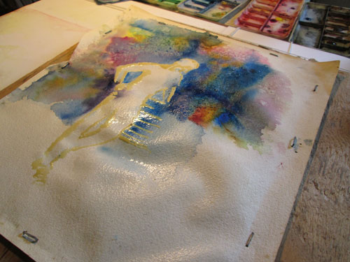
So off I went on a watercolour voyage of re-discovery. I took a 11 x 14 piece of approx 140 lb watercolour paper and tried holding it down with binder clips and masking tape. I decided I wanted a figure and to do a lot of washes for the background. I took a figure drawing I had, and laid in liquid misket for the whites and started wetting the paper for a watercolour pour. Even tho it was held down it immediately began to buckle. The washes of colour pooled in the “valleys”. So I took the paper and put it on an old piece of chip board and proceeded to staple it down stretching as I went along.


The second wash buckled as well. So more random colour pools. But the paper did dry flat....after the washes got really random. If I'm gonna get smoooooooth transition washes, I marked that in the “need more research” column.

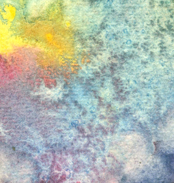
So I went with the random colours. The next item I wanted to try was salt blooms. Since I'd never really given this a “scientific” trial, I did multiple doses of salt. This resulted in a LOT of salt blooms in just one piece. But I did sorta kinda learn just when to drop in the salt. It does leave a lovely random lacy pattern.


The next thing I learned was not to be timid when mixing darks. I really went wild with multiple watercolour hues.....holding mostly to blues and purples. They stained the deep colours without too much pigment remaining on the surface. I called that trial a win!
I then went onto “rub outs”......where you take a hard bristle brush and a lotta water and rub on already painted paper and remove some of the already applied colours. It results in a soft ghostly outline and is a lovely effect.


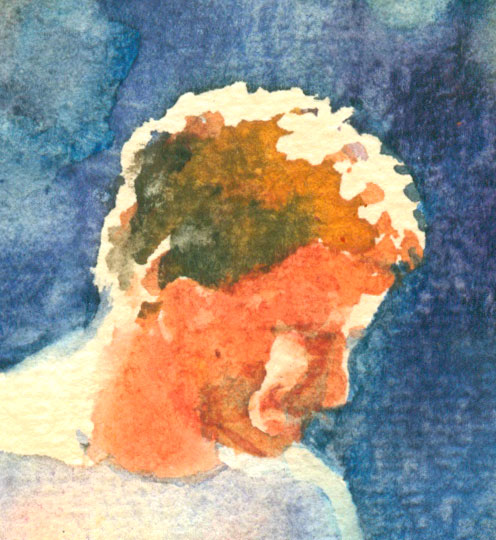
After everything else dried, I then removed the misket on the figure's face. Here I wanted to try just emphasizing the main features and expression with as little details as possible. As it measured only less than an inch....it wasn't too hard to do. Just a bristle brush of paint could change everything. I finally convinced myself to “let it alone”! Yet another lesson learned.


I next went onto a colour “lesson” I'd learned in acrylics....but wanted to try in watercolours. The figure had a white T shirt most of which was in shadow. I wanted that shadow to be luminous so I ghosted in yellow/rose madder genuine/cobalt blue in a light wash. Once the misket was removed....it glowed!

Finally at the bottom I wanted a real intense shadow. I laid down misket on either side and really poured on the blues/purples. When I thought, “This is too much paint” I stopped. When it dried.....it “matched” the rest of the painting's light perfectly!


So to recap:
I need to learn more about watercolour paper prep.

Drop in the salt on barely wet paper....not too wet and not too dry. Really helpful, right?

You can't overdo the watercolor color for a deep color wash....it never is TOO much.

Rub outs” are a lovely way to find your “soft edges”.

If I can make myself “leave things alone”.....just a few bit of shadow can “tell my story”.

Ghostings of the three primaries will give a lovely glow to a “white” shadow.

Let graduated colors of a watercolour wash “do the work for you” when working on shadows.


Sunday, July 26, 2015

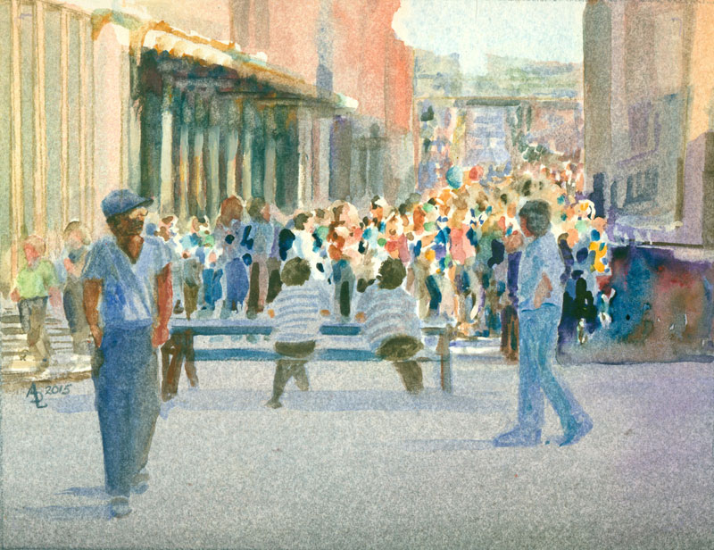
Street Scene or Lemon into Lemonade


watercolour, 8x10 inches,various watercolour brands with a bit of gouche
my own photo reference

This watercolour is the result of a “lemon” kind of thing that happened to my watercolour board......which led to my title for this blog post.
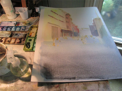
I started out with my reference photo of a long ago street fair in Nashville. I wanted to focus on the crowd scene so I positioned that in the center of my composition. I've done plenty of buildings before so I figured I would ghost in some architectural details and let sunlight do the rest. I started out with my pour technique.....laying down some misket to reserve whites and pouring a yellow, then a red and finally a blue. This was done with a lot of water sprayed on the board.....and the very liquid watercolour wash done on top.

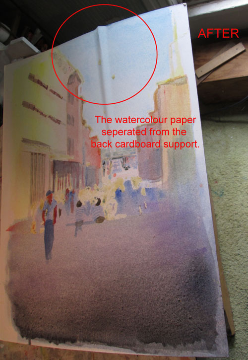
So far so good. With the multiple washes I'd laid down, the board (watercolour paper bonded to a cardboard backing....bought as a unit for watercolour painting) began to bow a bit in the middle. After it was dry I attempted to slightly bend it in the other direction, and went on painting, thinking no more about it.....BAD move! The next day I walked into the studio and found this:

In the center of the paper, the watercolour paper had separated from the cardboard backing. I tried to flatten this buckle down, by spritzing the buckle and letting it dry under heavy books....but no dice. The buckle was there to stay. So this is where the lemon = lemonade part comes in. I took a deep breath, and cut out the crowd portion of the watercolour board. It was not affected by the paper buckle. This section had the extra added attraction of really being the part of the whole painting I was really interested in, painting wise.

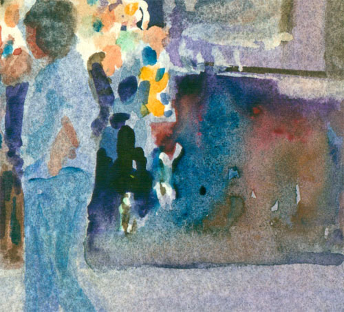
I was really pleased with what I'd already done on the street portion of the painting section. This older watercolour board had a tendency to show granulation (even dots of watercolour instead of a smooth wash) in some sections, so I went with that for the shadowed asphalt in the foreground. I had wanted to experiment with colourful shadows so I did a controlled heavy wash of dark compliments (a blue, red, and yellow gold) and let them meld together in this shadow space.

I did a lot of sputters and dots for the background crowd. I carefully drew the foreground walking men and the seated women to give a focus for the foreground. I wanted a really deep wash for the small columns under the awing, leaving the shadows to emphasize the crowd line. My misket wasn't as straight as it shoulda been, so the architectural detail was not convincing. So I did an experiment by wiping out some of the warm shadowed lines under the awning and relined the highlit columns more or less straight with a bit of gouche. The watercolour bled into the gouche and melded everything together. Not the highlights I would have wanted, but it read OK as that wasn't the main focus of this watercolour piece.

This watercolour piece has been a lot of fun to paint, as I was relieved from taking it too seriously....I mean it was just a salvaged piece of a painting....no biggie...right? This led me to a kind of “free place” to experiment with different kind of painting techniques without pressure. I may have to “ruin” more small watercolour pieces.....just to see how many different kind of techniques I can try!


Friday, July 17, 2015

Blue Vase or Waiting for Springtime.


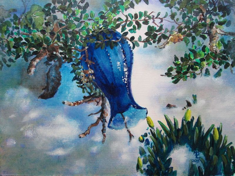
Blue Vase
Acrylic 9x12 inches from my own reference photos

Now that it is high summer, this is about the last of the snow paintings I've got planned for this year. I took this pic of a cobalt blue glass vase, an antique store find, in last year's snow just as it was melting. I added in the “jump the gun” daffodils for the chance of a bit of yellow zing in all that cold snow.

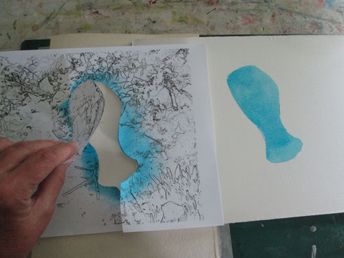
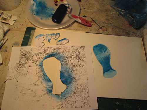
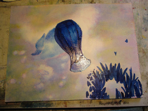
I put the daffodils beside the blue vase in photoshop, liking that just the tip of the daffodil bud kissed the lip of the glass vase. I then ran the image combo thru a coupla of photoshop filters to just get a quick black and white outline. I printed up two copies on paper and I was ready to start. I wanted to emphasize the intense colour and transparency of the glass bud vase. I cut out the bud vase in the printout....and viola! I had a ready made stencil. I laid down my first acrylic glaze with a sponge roller brush.


I continued on with my glazing and moulding the shape of the vase.....just using my paper stencil. I painted in the glazes using both roller brushes and makeup sponges to lay in the various cobalt,phthalo and anthraquinone blue acrylic glazes. In between some of the blue glazing, I also laid in some layers of just clear glaze....mounding it up a bit on the vase's ridges. Clear glazing on top of coloured layers just gives extra punch to a glaze. That's why a top varnish on a painting can “perk up” the colours.


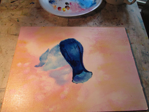
After I finished the vase it was time to start on the background. I decided I wanted to emphasize the shimmery glow of the reflected snow. Everyone “knows” snow is white.....but what about the shadows? I knew that three primaries red,yellow, and blue would make a grey if I mixed the paints on the palette so the same should hold true in glazing. So I painted over the shadow areas with first a yellow glaze, and here, a lite pink glaze and I am just getting ready for the final blue glaze.


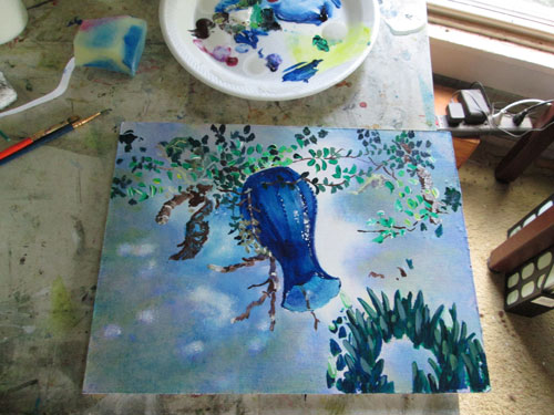
Now that I've gotten in my shadow glazes it's time to start in on the foreground daffodils and background foliage. You can see in this photo angle the result of my raised clear glazes on the vase.....it shows off the ridges in the vase's design.


You can see here I'm closing in on the finish of this colourful painting. I'm putting in the background foliage and twigs. I've painted the daffodils and am working to even out the shadows and glittering highlights of the snow.


Monday, June 29, 2015

Coyote Sunset


Coyote Sunset
12 x 18 inches
Acrylic


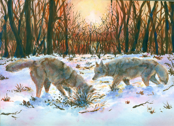
This post is a continuing of my (warm weather) interest in painting all things snow. Frank got me some lovely snow shots this winter and the last, and I've been pushing back against 90 degree temps and humidity, by painting all sorts of snow scenes that I just couldn't even contemplate while the temperatures were 0.

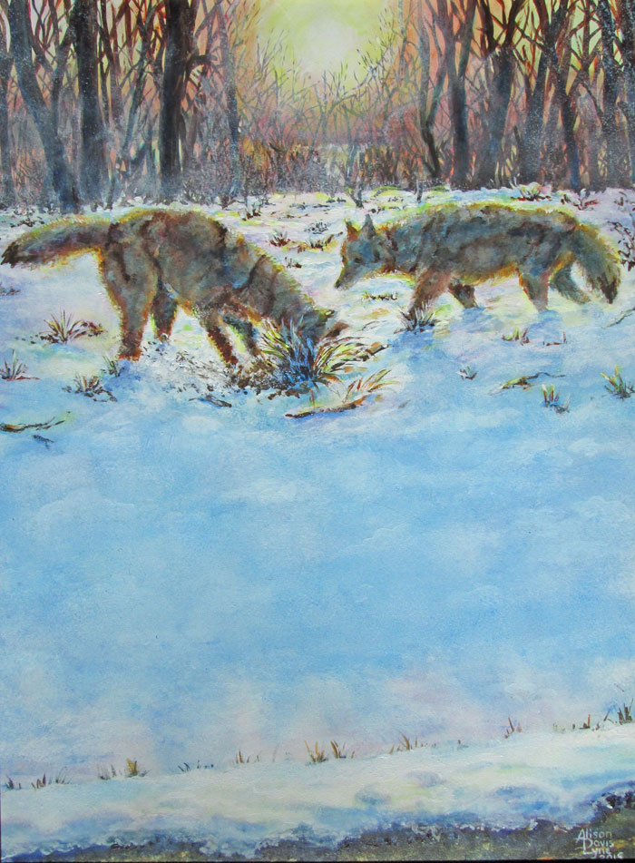
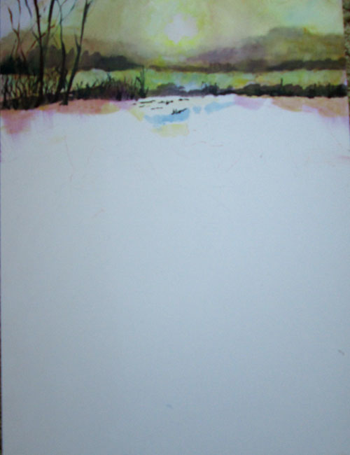
For this painting, I choose a late sunset snow scene, and paired it with a couple of shots of coyotes, that Frank had gotten a few years ago. I wanted to work in acrylic paints, using them both impasso style and glazing. I started out with glazing the late afternoon colours in the background trees, to get the translucent atmosphere of a late winter sunset. I painted in more of the background trees, leaving the mid ground alone.


After that had dried I began with opaque impasso painting of the coyotes. I purposefully choose the reference photos because they DIDN'T have a lot of detail. I tend to really add in details, which sometimes is a good thing.....and sometimes it can work against the “feel” of a painting. In this case, compositionally, I wanted the main action to be in the upper third of the painting, leaving the other two thirds for the snow shadows. This put the coyotes in the middle/back ground. In addition, with the low light of the sunset, the coyotes were going to be backlit, and have a sunset “halo” in their fur.


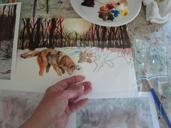
Instead of sketching the coyotes' form on the canvas then painting “within the lines” I used an outline drawn on a sheet of acetate......laying it over the painted broad strokes of colour......to make sure that I kept the ratio of head/body/legs in check. I would repeatedly lay this over my painting to make sure that the coyotes' form stayed true to the reference photo. This helped me to identify different colored masses of the coyotes' forms.....without getting too fiddly with the paint.

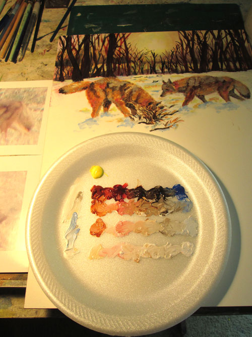
I painted both coyotes impasso style.....i.e. With broad strokes of colour to mould their forms, fur and all, and leaving off details. I used earth colors for most of their forms, but left the “raw” reddish hues of sienna and umber, since I was going to glaze over it later. Since I was using "open acrylics" i.e. slow drying acrylics, I made a quickie color value grid on my palette.


After I got the coyotes to suit me, I began the glazing process for the coyotes' shadowed sides. I glazed cobalt blues over the coyotes and snow shadows. I followed that with some red glazing and finally a bit of yellow glazing for touches of the setting sunlight. I alternated this with heavy white impasso painting where the snow mounded up and interrupted the shadows. I finally “brushed” out the coyotes' coats all around their outline for the “haloed” effect of the backlighting sun, using a bit of yellow glaze for the final effect.


After finishing the coyotes, it was (ahem!) all downhill. Literally! I sponged in the foreground blue shadows of the hill of the right away, and the corresponding dip up to the road, leaving white sparkles for the bit of snow hit by the sunlight. I had fun making the small lacy slush piles by the road and their corresponding shadows. I alternated white paint and blue glazing, with just a touch of a red glazing with the sunlite yellows, to show the effect of the mounded snow. A few multi colored glazes finished off the black sunlit pavement. I felt that this painting had a really nice mix of painting styles and colours and had a blast doing it!