Monday, June 29, 2015

Coyote Sunset


Coyote Sunset
12 x 18 inches
Acrylic


This post is a continuing of my (warm weather) interest in painting all things snow. Frank got me some lovely snow shots this winter and the last, and I've been pushing back against 90 degree temps and humidity, by painting all sorts of snow scenes that I just couldn't even contemplate while the temperatures were 0.

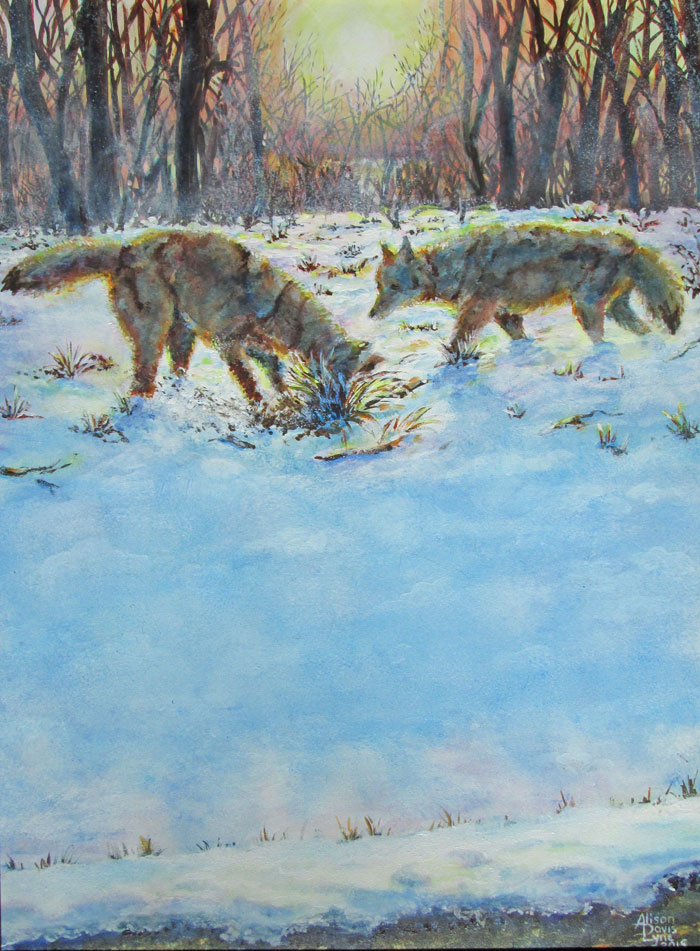
For this painting, I choose a late sunset snow scene, and paired it with a couple of shots of coyotes, that Frank had gotten a few years ago. I wanted to work in acrylic paints, using them both impasso style and glazing. I started out with glazing the late afternoon colours in the background trees, to get the translucent atmosphere of a late winter sunset. I painted in more of the background trees, leaving the mid ground alone.
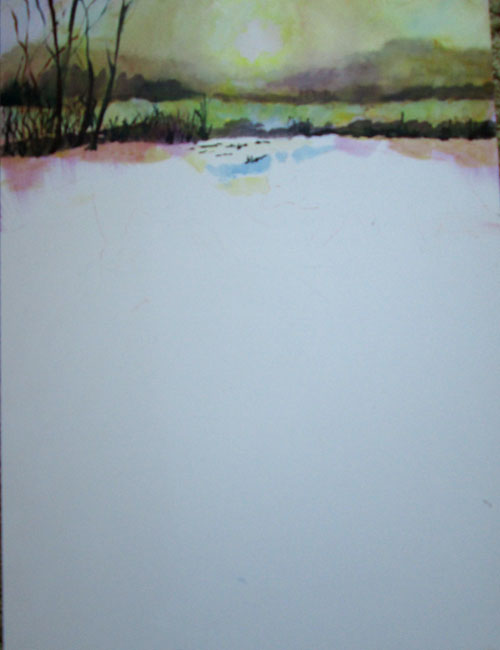

After that had dried I began with opaque impasso painting of the coyotes. I purposefully choose the reference photos because they DIDN'T have a lot of detail. I tend to really add in details, which sometimes is a good thing.....and sometimes it can work against the “feel” of a painting. In this case, compositionally, I wanted the main action to be in the upper third of the painting, leaving the other two thirds for the snow shadows. This put the coyotes in the middle/back ground. In addition, with the low light of the sunset, the coyotes were going to be backlit, and have a sunset “halo” in their fur.
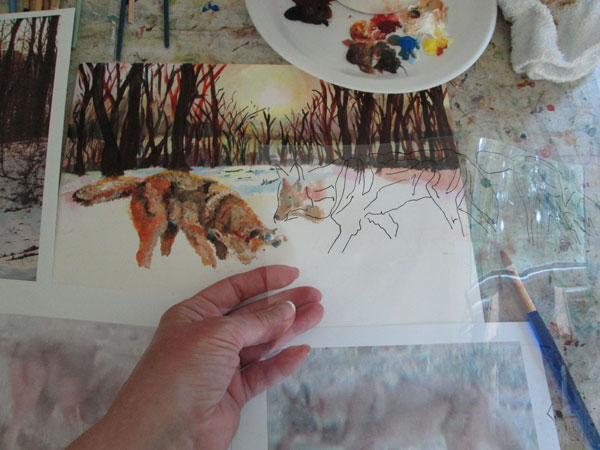


Instead of sketching the coyotes' form on the canvas then painting “within the lines” I used an outline drawn on a sheet of acetate......laying it over the painted broad strokes of colour......to make sure that I kept the ratio of head/body/legs in check. I would repeatedly lay this over my painting to make sure that the coyotes' form stayed true to the reference photo. This helped me to identify different colored masses of the coyotes' forms.....without getting too fiddly with the paint.

I painted both coyotes impasso style.....i.e. With broad strokes of colour to mould their forms, fur and all, and leaving off details. I used earth colors for most of their forms, but left the “raw” reddish hues of sienna and umber, since I was going to glaze over it later. Since I was using "open acrylics" i.e. slow drying acrylics, I made a quickie color value grid on my palette.
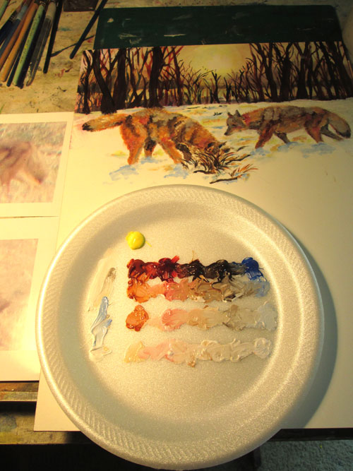


After I got the coyotes to suit me, I began the glazing process for the coyotes' shadowed sides. I glazed cobalt blues over the coyotes and snow shadows. I followed that with some red glazing and finally a bit of yellow glazing for touches of the setting sunlight. I alternated this with heavy white impasso painting where the snow mounded up and interrupted the shadows. I finally “brushed” out the coyotes' coats all around their outline for the “haloed” effect of the backlighting sun, using a bit of yellow glaze for the final effect.
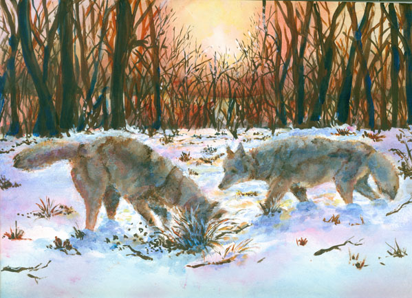


After finishing the coyotes, it was (ahem!) all downhill. Literally! I sponged in the foreground blue shadows of the hill of the right away, and the corresponding dip up to the road, leaving white sparkles for the bit of snow hit by the sunlight. I had fun making the small lacy slush piles by the road and their corresponding shadows. I alternated white paint and blue glazing, with just a touch of a red glazing with the sunlite yellows, to show the effect of the mounded snow. A few multi colored glazes finished off the black sunlit pavement. I felt that this painting had a really nice mix of painting styles and colours and had a blast doing it!


Tuesday, June 23, 2015

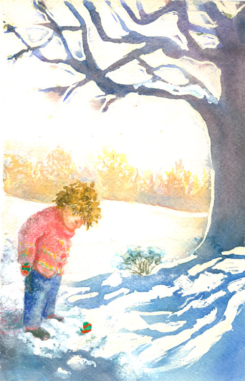
Mitten Found! Or Watercolour “Ooopsies”


MITTEN FOUND!

7.5 x 11 inches on 300lb rough watercolour paper 
Various watercolor brands, acrylic paint, colored pencils 
with a touch of red gouche for mitten stripes

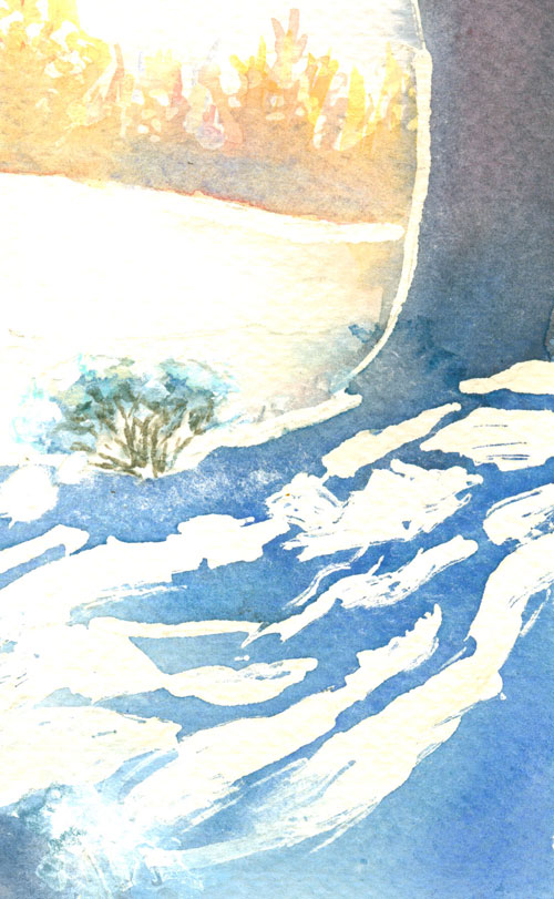
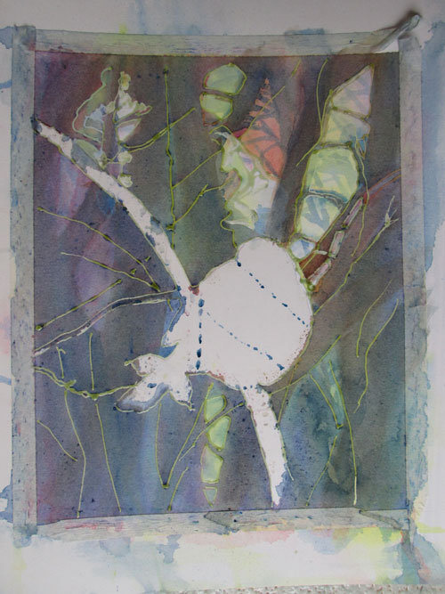
I started this illustration right after finishing WinterGlow. I wanted another shot at pouring on tree trunks and snow shadows. I didn't really have a composition in mind, but figured I'd see where this went. I quickly “sketched” off a tree trunk and the snow portion of the shadows in misket (laytex rubber liquid mask quickly applied with a wooden stirrer), let it dry then poured a blue mix (phthalo,dk. cobalt and a bit of purple)over the tree trunk, and continued pouring on down to the snow shadows with cobalt only.

After this had dried I pulled off the misket lines and found I'd let a bit of the wash drift over into the sky.......but I kinda like the “wood cut” look this “watercolour oopsie” left. I marked out a horizon line in more dots and daubs of misket and laid in some warm pastels, yellows, rose madder genuine with just a touch of cobalt in a very wet wash for a background line of trees.


I went back in to the snow shadows and decided to “soften” the hard edges left with the misket, so I took a stencil brush (a very short stiff bristle brush) and with clear water rubbed the paper to remove some of the hard edged watercolors. During this I noticed that a little patch of misket had taken a bit of my watercolour paper up when I'd removed it. Oooopsie! So I drew in a few lines for branches and made it into a snow covered bush.


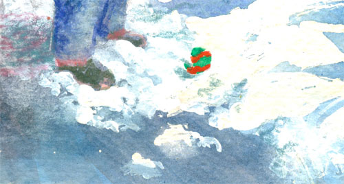
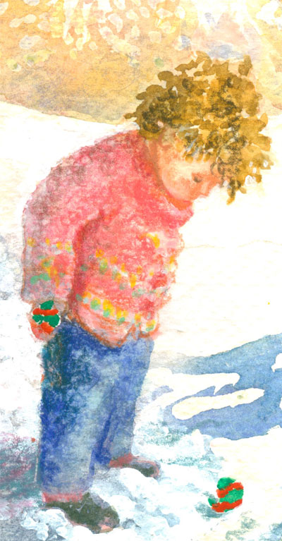
I decided that I wanted a little boy standing on the left to balance out the composition, and that he needed to be dressed in a warm colour (pun intended). Warm clothes, yes! since he's out in the snow, but also a warm colour, red in this case. I wanted a warm colour to balance the cool blues elsewhere in the picture. I then turned my attention to the snow around the yet to be drawn in little boy's feet. I wanted to show the roughed up snow that the little boy's boots had kicked up, but all that was there was poured blues. Oopsie! So I drug out my handy white acrylic paints and smudged in a bunch of snow over the watercolour. The acrylic paint often won't quite cover a dark colour underneath.....which in this case was a definite plus. It made the snow just that more believable. Since I had the white acrylic out, I went ahead and put a bit of “snow” on the oooopsie bush.


Now I decided what I was going to use for the little boy. I'd found a really old family snapshot of a little one looking down at his feet. He was all bundled up in snow gear. This little one would compositionally “connect” the snow shadows and the background trees. I sketched him in in watercolours and added some textures in with coloured pencils. I just indicated his face and hair without too many details. But I still needed some reason for him to be looking down. I settled on a lost mitten that he'd found. The mitten really needed to stand out, so I grabbed a tube of red gouche that I knew had a lot of “kick” in the color department. I finished the mitten and called it done!  


Monday, June 15, 2015

Face in the Glass....Acrylic Glazing


Face in the Glass
16 x 20 inches
acrylic paint

I started this painting in the dreary heart of last winter. I was so needing some really intense rich colours in my “world view”, and this painting sure fit the bill. The photo I was working from was one I'd taken a while back of a still life setup featuring a teensy antique perfume bottle surrounded by some reflective easter eggs. I choose this view because of a reflection that I saw when viewing the greatly enlarged photos on the computer screen. Just above the gold reflection band, I spotted a reflection that just looked like an eye, and a bit of a nose and mouth right below......and viola! my sub conscious read it as a face. Much like seeing a dragon in clouds or a puppy in random specks on wall paper.

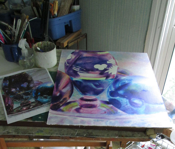
So I decided I'd run with that. I gridded the photo I'd printed out, made a corresponding grid on my gessoed masonite board and got to work sketching. At the same time I made some paper “templates” of different objects in the painting. I knew I wanted to use sponge brushes (both square and roller) to evenly spread my acrylic glazes. Using paper cutouts to mark off the working areas was a technique I'd used many times before in my illustration work.

I really luv using acrylic glazes (acrylic paint thinned with a Golden Acrylic glazing medium) to get a graduated glaze of intense transparent colours.


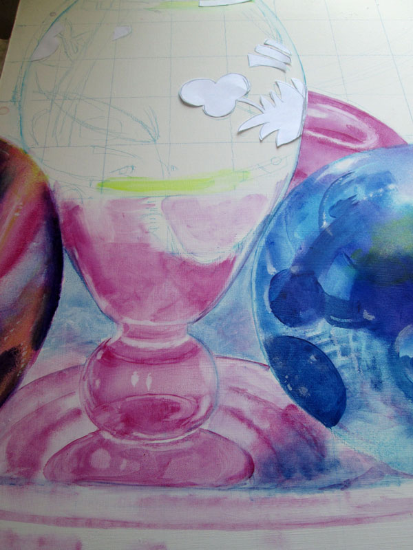
In this pic I've begun the glazing process for the vase and two of the balls. Following the photo reference, I've put down the first glaze defining the reflections for the blue ball on the right. I've just about finished the magenta glazes on the “red” ball on the left. I've put in the base glaze for the magenta vase. Note the blue watercolour pencil gridding that I used for sketching the main components of the picture. I've also blocked out with paper, the etched flower design on the vase. I'll paint that in later, as it should only need one light glaze of blue.  


I continued on with my glazing process. I alternated Phthalo blue glazes with Anthraquinone blue(a navy blue) glazes and magenta (P.V 19/122) glazes. I used Hansa light yellow and Quinacridone Gold for the gold touches. This was a primary triad (red,blue,yellow) with blue as primary. As I progressed with the glazing I needed a bit of a different surface glaze for the etched flowers and the gold bands. I'd “reserved” their white spaces with a bit of paper taping their cutouts down on the canvas. I removed the paper masks, and begin glazing over these reserved spaces with the appropriate colours.

This whole process for the reflected glass surfaces and round balls is done with a technique similar to watercolour.....working from light to dark......covering the painted surface with veils of colour. But in the case of acrylics, I'm using a sponge brush on my canvas...to mimic the flow of graduated watercolour over the paper. And also different from watercolours, once an acrylic layer is dry....it is totally isolated from the next layer of colour. In addition, if I loose a bit of white needed for a highlight I just paint in plain white acrylic and off I go. Those highlights can also be adjusted with more glazes.

I continued to adjust the blues and purples till I was satisfied with the 3d look. The colors were deep in a low light, and rich in full sunlight. For a bit of a change up, I switched to totally opaque paints (white plus phthalo blue, magenta, yellow) for the background in a heavily brush stroked blend.


Monday, June 8, 2015

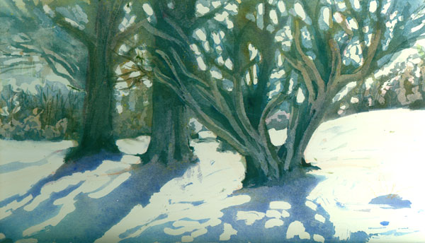
WinterGlow or Pouring it on.


WINTER GLOW
16 x 20 inches watercolour

This blog post has a winter theme, now that it's like about 85 degrees out. I couldn't seem to get to this painting until I'd thawed out from the winter chill, which was when the reference photo had been taken.

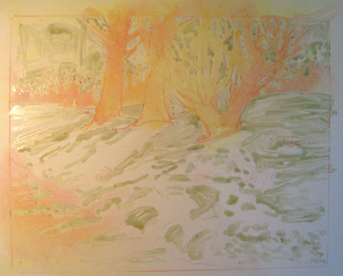
I'd recently been looking at some old painting books and decided to try out some of the techniques they suggested. A couple of watercolour books by Roland Roycraft especially caught my eye, “Fill Your Watercolors with Nature's Light” and “Fill Your Watercolors with Light and Color”. They featured a lot of snow scenes, and low and behold, I just happened to have a LOT of snow photos. I pulled up a shot of late afternoon snow and trees and began the set up. I lightly sketched in the trees with a watercolor pencil on a Crescent watercolor board, a very thick board covered with a medium smooth watercolor paper. Following Roland Roycraft's general technique I outlined the trees and the main foreground shadows with a liner misket covering the snow areas. Then I started to have fun.

His technique called for three successive watercolor washes to establish a sunlit glow. And I'm talking real washes! I mixed up three deep wells in a discarded plastic ice cube tray, one of lemon yellow, another of rose madder genuine, and a third one of cobalt blue. I sprayed water over the whole board to give the watercolor places to run and make the “glow” I was after.

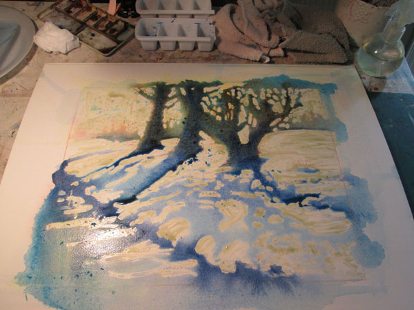
I first poured the yellow on the tree shapes and foreground water, and let it dry a bit then poured on the rose madder genuine and let them both dry completely.


After those two washes were dry and room temp to the touch, I poured on the cobalt blue wash, and encouraged it to run on the trees and the foreground shadows. I also poured over the entire water area on the left, and a bit in the background trees. I then direct brushed some deeper blues, prussian, indigo,phthalo blue on the tree trunks and shadowed water areas. When most of the water had dried I direct brushed some burnt umber on the tree trunks only. THEN I let everything dry overnight.


The next day, I pulled off most of the misket and reapplied a bit more on the background trees and the foreground branches, and reapplied some more blues. After this dried I “lifted” (wet stiff brush over the darkest colors) some lighter tree trunk areas on the right hand tree/bush area, leaving the background darks for other branches.


All that remained was adjusting the different shadows, rubbing some out, and adding more shadows where needed.

I'd also used this technique for Jeeves the Glamour shot......


where I'd misketed over the bird outline then poured on the background tree trunks and branches.


This is a really fun technique and I anticipate exploring it further!

Saturday, May 30, 2015

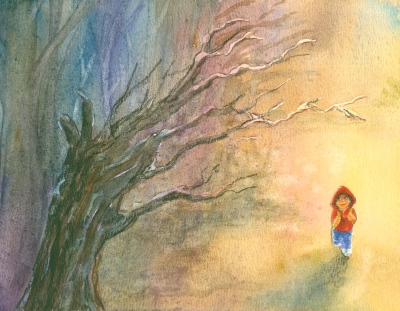
Little Red Riding Hoodie goes to the woods....or A Story in Three Panels.


This blog post is about a small experiment in watercolour, cut paper and sequential art.

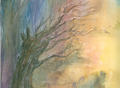
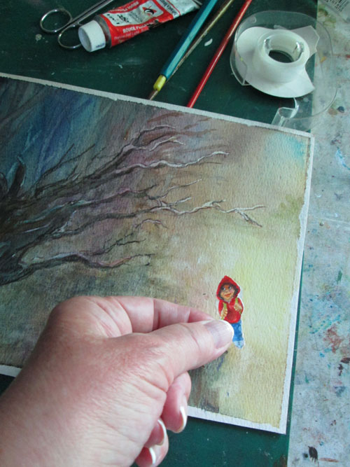
I was playing around with a watercolour pouring technique.....laying down some fine lines with a masque pen misket then running blue, red, and yellow washes over all. When dried I lifted out (using a water soaked brush only) some background trees and removed the misket with an eraser. I ended up with a small (5 x 8 inch) pretty passable landscape.


But what to actually DO with the landscape? It was pretty bland just by it's self. So......I started to play around with a scenario involving a Little Red Riding Hoodie character I'd made up a while back for a book dummy. I painted a 1 ½ inch drawing of Little Red Riding Hoodie warily entering the woods. So working old school, in real life, I cut the Little Red Riding Hoodie out and taped her where she needed to be in the landscape, and scanned it in. Viola! I had the beginnings of a story.


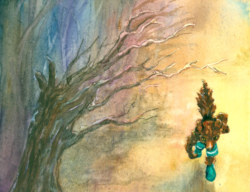
But then I thought of a “next step”. I decided, for the story “drama” Little Red Riding Hoodie would be followed into the woods by the Big Bad Wolf, in brite green shoes and biking shorts. So I did a 2 inch drawing of the green shoed Big Bad Wolf, and taped him in place of the Little Red Riding Hoodie drawing,and scanned it in. 


So now I had Little Red Riding Hoodie going into the woods to Grandma's house. And the menacing Big Bad Wolf following her into the dark forbidding woods. So far so good, but what about a resolution or story ending?


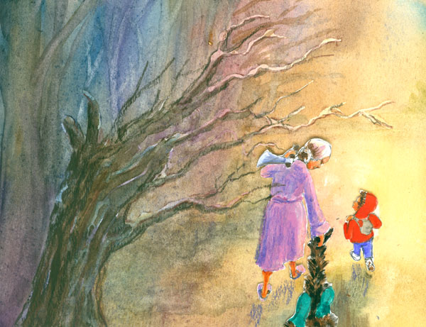
Contrary to most of the Little Red Riding Hood stories I decided to give a bigger role to Grandma. I wondered what would it look like if instead of being a “victim”, what if Grandma was made of sterner stuff and decided to go on the offensive? So I wanted to see what the Grandma character would look like if she went all "Van Helsing" on the (were)Wolf. I contrasted Grandma in her pink fluffy grandmotherly robe and slippers,white hair in a bun, with a big shinny axe slung over her shoulder. The same axe that she had used to defeat the Big Bad Wolf, who she is dragging, by the tail behind her.

So I painted up the Grandma character, dragging the Big Bad Wolf behind her as she and Little Red Riding Hoodie left the scary woods behind them. I taped the three characters down in place of the previous Big Bad Wolf character, and scanned it in.


So these three panels are the result of the same watercolour experiment (used in all three scenes), along with three different cut out figures, used for three different “scenes” to tell a itty bitty story. I had a ball trying out this Little Red Riding Hood version.


Monday, May 25, 2015

Surprise! Lilies or A Splash of Watercolour and Dashes of Colored Pencils


SURPRISE! Lilies
Watercolour and Colored Pencils
11x14 inches from my own reference photo

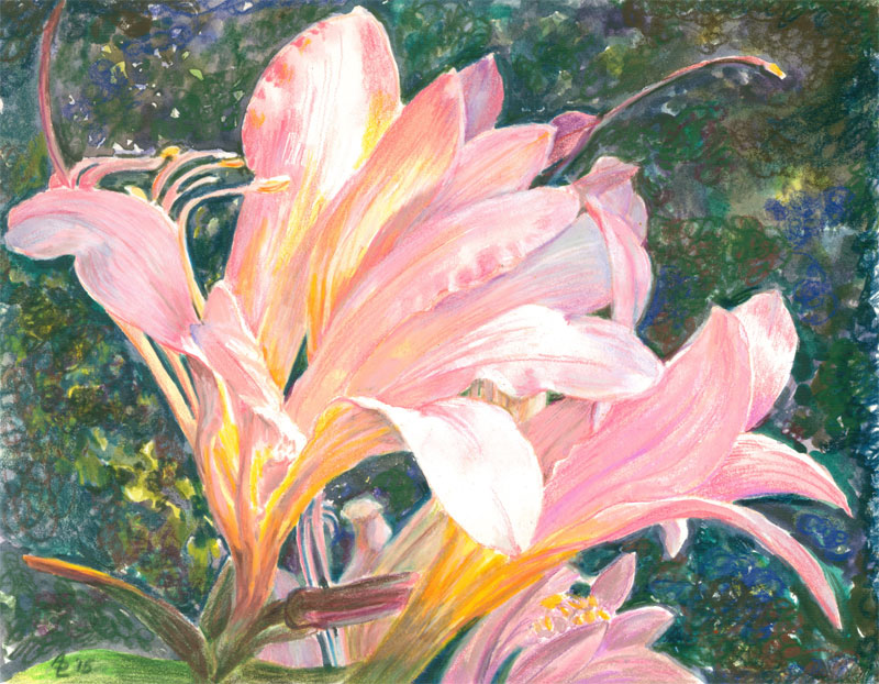
This time I'm talking a bit about a recent watercolour/coloured pencil piece, Surprise! Lilies. I began this piece with a concept I'd had......I wanted to showcase the morning light coming thru the trumpet petals of some of our surprise lilies that bloom each August. In case you aren't familiar with surprise lilies, they are blubs that send up daffodil-like leaves in the early spring. And that's ALL they do in that season. But, come late August, when things are dry and the most that's around are roses and goldenrod......up they shoot....(It's a SURPRISE in this season).....a half a dozen or so foot tall stems, and soon they bloom into these lovely lilies.

I'd watched them on my morning walks, and noticed that at a certain time in the early morning, the sun shown into the lovely blooms, and made the loveliest glow shine thru. So I took photos......and more photos.....and more till I got the glow just right. Then I got to work painting.

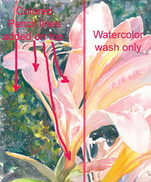
Partial detail showing parts of the watercolor wash before and after the colored pencil layer.


I laid in the dark background, with a watercolour wash, then went over it all with colored pencil circles. Just drawing small circles of various dark coloured pencils, till I got the blurred textured background I wanted.

I did the same with the blooms, I laid in a watercolour wash for the intense pinks and yellows of the blooms. Watercolour was perfect for this layer, because of the gradient you can get with a wash. I also was able, after the first layer was totally dry, to wash over some blue shadow values over the pinks without dulling the first layer.

Then I started in with various pink/peach/yellow colored pencils over-lining the blooms. This particular flower petal's structure actually did have faint lines going from the center almost out to the ends of the petals. They gradually disappeared towards the tips of the petals.

I had a ball using both media, coloured pencil and watercolour, for exactly the results that each excels in........watercolour for it's gradient colour washes, and colored pencils for it's texture and definations. It was a win-win!  


Tuesday, May 19, 2015

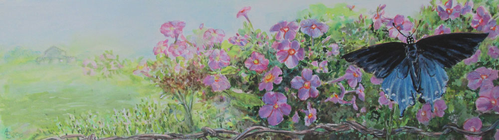
Butterfly


Butterfly
10 x 20 inches - watercolour/coloured pencil/acrylic paints

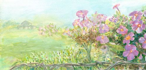
This blog post is about a mixed media piece I recently finished. My inspiration for this painting was a photo Frank took of a Pipe Vine Swallowtail. I used the pink phlox the swallowtail was perching on as a background......I added in some more flowers along a fence line to extend the composition. And of course that led to a far off background shot of our barn.


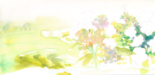
I started this piece off with watercolour washes. I really wanted to capture the delicate colours of the spring phlox. I thought the slightly backlit flowers would make a great foil for the intense black and blue iridescence of the butterfly. 


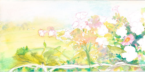
I continued on with strengthing the colours of the phlox foliage with more watercolours and began putting in detail darks with coloured pencils.


I then worked on the phlox blossoms themselves.....using both watercolours and colored pencils as needed.


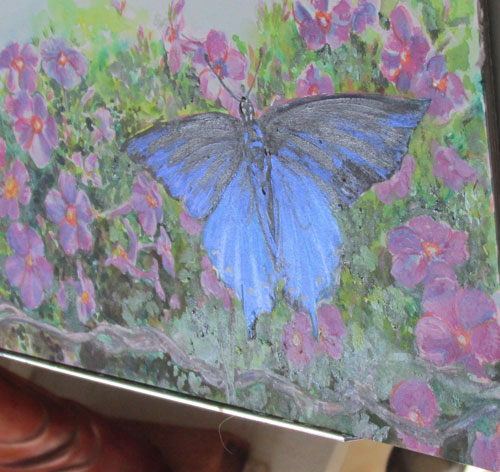
FINALLY, after getting the flowers in order, I could work on the main event.....the butterfly. I started off with painting the black of the upper butterfly wings in opaque acrylic paint....using only a thin coat of paint. I wanted to be able to go over it with colored pencils if needed. I also glazed over the lower part of the butterfly with phthalo blue glazes, keeping it intense and dark, so's the interference paint would have a suitable backdrop. I finally ended up using a interference blue (iridescent paint) over the black and blue wings.....to give the butterfly some of it's ethereal color. This appearance of changing colours happens when the painting is viewed from different angles.