Tuesday, March 17, 2015

Jeeves.....in the beginning.

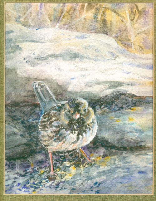
Jeeves  
11 x 14 inches
watercolor and colored pencil

This is my first portrait of a winged guest we've been hosting since December. Frank first saw this off season visitor, which we named Jeeves, in early December. He is a Harris Sparrow, and is a VERY RARE sighting here in Kentucky. In the months since, we've had numerous human visitors, of the bird watching variety (sorta like Jeeves groupies), all come to catch a sighting of this rare avian visitor.

Frank and I have SO enjoyed talking with the Jeeves “groupies”, and Jeeves has shown his appreciation for the attention (or maybe just for the corn and sunflower seed offerings) by showing up for the human visitors, with no one going away without seeing Jeeves. We named him Jeeves, because at the time we had been binge watching an old PBS series, “Jeeves and Wooster”, and the Harris sparrow with his crisp feathers, just had to be called the valet's name of Jeeves.

I did this watercolour/colored pencil Jeeves portrait from an early photo taken by Frank. Jeeves is very good at hiding out among other birds, but his white breast and bold black chest feathers and pink bill, are the key to his identity. Frank had spotted him, on a gloomy low light December day, and knew immediately he had found something special. In the succeeding weeks, Frank made up various rock feeding “stations” with corn or other types of bird seed feed, to convince Jeeves to hang around. Luckily for me, the “corn rock” and larger sunflower seed rocks “framed” Jeeves in the photo I used for reference of the painting.

I used watercolor to give a bit of light and colour to the mostly monochrome background brush, which is a favorite hide out for Jeeves. Colored pencils were great for picking out the details on Jeeves and to delineate some of the seed details in the foreground.

Just recently, Frank has gotten some superb Jeeves' photos, and I am working on another painting of our visitor......it is gonna be his “glamour” portrait.

You can see more of Frank's photos of Jeeves, and numerous other bird visitors here on Frank's Flickr site: https://www.flickr.com/photos/123438032@N04/


Thursday, March 5, 2015

Colored Pencil Geek-dom


OK.....I admit it.....I'm an artist geek! I luv figuring out ways to make my art work “work” better. Recently I was going thru some old International Artist mags, and my eye lit upon a ten year old article about colour. The part that caught my eye was about the importance of value (lights and darks) in colour work.

I've been experimenting with colored pencils over watercolour washes. I've enjoyed using colored pencil marks to join together disparate washes, while providing “grace notes” of color for highlights.

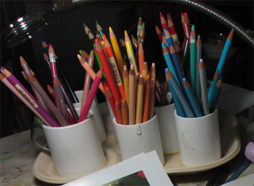
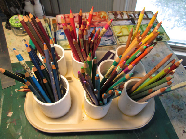
I've noticed that when I go to my colored pencil holders I more often than not, go for colours associated by lights/darks. Instead of worrying as much about the hue (color) or local color of an object I look for values. My pencils had been arranged loosely by hue or color (i.e. reds, blues, greens, purples etc)

After reading this article, I rearranged my colored pencils by value....lights, brights,medium and dark values....irregardless of colour.


When I tried this system out, it made it SO much easier when I reached for a pencil for a highlight.....or to blend in a face shadow......or wanted to wake up a dull patch on cloth. It had the added advantage of forcing me to remember about temperature of colours......and consider reflected lights.

There is an old adage: “You are what you eat”. Well in my case, “I am (in colored pencil work) how I “organize” my colours.”


Thursday, December 18, 2014

Stick Tight to me, Baby!

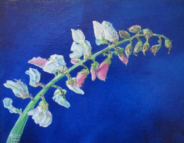
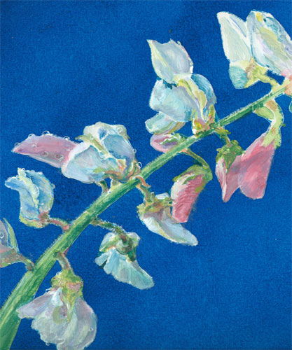
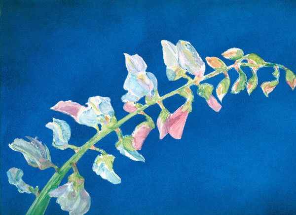
Stick Tight to me Baby!
acrylic on gessoed masonite
11x14 inches

This blog is to introduce my last painting for 2014.....Stick Tight to me, Baby. (This title is supposed to be delivered in a Jerry Lee Lewis voice.)

All during the spring/summer I took photos of just about every flower we had in the yard/fields. I became fascinated by the range of luscious colours to be found in flowers, great and small.

These stick tight flower blooms grow all along a ridged stem. Both the flowers, buds and stem are covered in microscopic hairs. Those microscopic hairs make the stem, buds and resulting seed head “stick tight” to anything or anyone that brushes against them. This transfers the seeds to animals which in turn spread stick tights far and wide. The tiny flowers are maybe a quarter inch, but are bursting with lovely colours. They start out pink and move to lavender then, of all things, blue right before they wither and fall off. They leave behind a pod that contains a triangular seed.

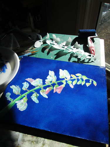
I started out with the background. I wanted a simple but dramatic background, so I decided to glaze multiple layers of cobalt and pthalo blue in a simple pattern. I used an old illustrator trick of masking off the stem and flowers with frisket, then painting on the glazed background with a sponge roller brush.


After all was dry, I peeled off the frisket and began painting the stem and blooms.

For a while I have been drooling over the loverly alla prima paintings that my friend Connie McClennan http://www.connie-mclennan.blogspot.com/ does, and wanting to work in that style. I can't seem to let go of my glazing style entirely........but I can pair the two styles. So I began to paint the delicately colored blooms in a more painterly style. Using the paint a bit heavier than I usually do, I painted the lovely mix of colours on the painting itself, rather than mixing colours on the palette.


I continued to work on the blooms, from the bottom up to the top buds. I followed the pattern of light and dark I'd laid down in my first pass at painting the blooms. You can see I've done the first three blooms on the left......detailing the petals and even the drops of dew. The surface tension of the teensy tiny dew drops seems to hold even better on the microscopic hairs of the stem.


I had a blast working on this painting, especially playing with the subtle colours of the paint, and working alla prima with the acrylic paints themselves.


Wednesday, December 3, 2014

Trying that “Writin' Thang” Again.......


I seem to keep on coming back to that “writin' thang” time and again.

I laid my last writing venture back in the “pending” file back in 2012. I figured it needed time to cure, so to speak. And, at that time, I found myself needing to do my own artwork (actual paintings.....with paint.....on wooden boards...with lotsa subtle colours)

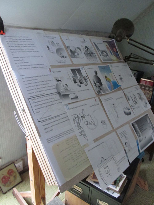
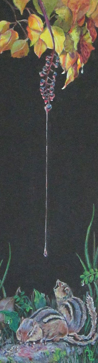
But then I started to “break out into story” even as I was painting/drawing my “actual” paintings:

  
"Raindrops Keep Falling on My........"

The last week or so, I've had a coupla reminders that writing might be something fun to jump back into. A lot of my friends have done (and met their goals and won!) the PiBoIdMo http://taralazar.com/piboidmo/ challenge.....and Susan Eaddy, the SCBWI Midsouth's ever so capable Illustrator Coordinator, has come up with a lovely workshop on PB writing/illustrating.

So's I'm off on a “writin' thang” again.......but this time I'm also gonna keep on with the painting “thang”.......and the needle arts “thang”.......working on the balancing act (juggling all those “thangs”) that is a creative life WIP.

Monday, November 24, 2014

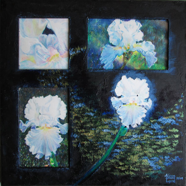
THE ANSWER for $200 is---

Iris x 4
colored pencils on bristol (under glass)
and acrylic paints on the frame.
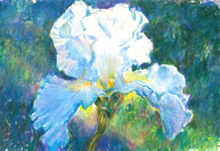
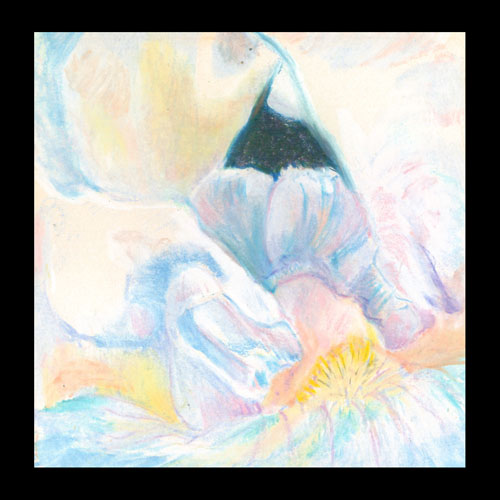
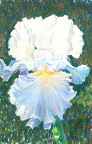
My reference photos

 "This is “Iris x 4”

blaaaaat!”(buzzer sounds)

Sez I:  "And the question is, Mr. Trebek:

What starts out with:


adds to that …....


and finishes off with......?”


Tuesday, November 18, 2014

I Gots a Brand New Toy or DOTZ!


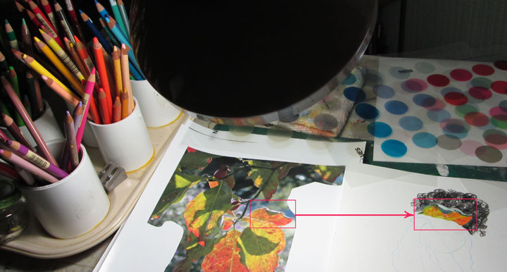
I just got an order from Ann Kullberg's website http://AnnKullberg.com and it's a lovely Color DOTZ System-Color Choice Tool that was designed by Kathee Nelson. The “system” is actually 5 pages of transparent acetate with a host of 1 inch diameter transparent dots. They are arranged in groups of blues, greens, yellows, reds and black gradients. Since I paint/draw or w/c with transparent glazes......I couldn't wait to try this system out.

I got my reference photo of some backlit leaves and traced three of them off onto a small bristol sheet. I wanted to try DOTZ out with colored pencils first. Many colored pencil artists have a bit of grief over choosing background colours. It's especially difficult to make a choice that results in hour(s) of painstaking work, only to step back from your colored pencil picture and decide that the background just isn't what you wanted. Painting over the offending background just isn't an option in colored pencils!

So I began with one of the green/gold/orangy leaves. I drew and colored it in, then began work on a graded background of heavier and lighter black scribbles. I needed the background values in place to see if my leaf looked right. I had to “reserve” a teensy white outline to show the backlit halo. Now onto colour.....

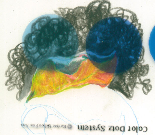
I first tried a bluish DOTZ circle.....nope! Then I tried a bluish purplish circle.....better. (Colour theory sez that an opposite color on the color wheel will get you the best “pop” of two colors side by side.) 


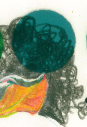
I also tried a greenish bluish dot.......nope!


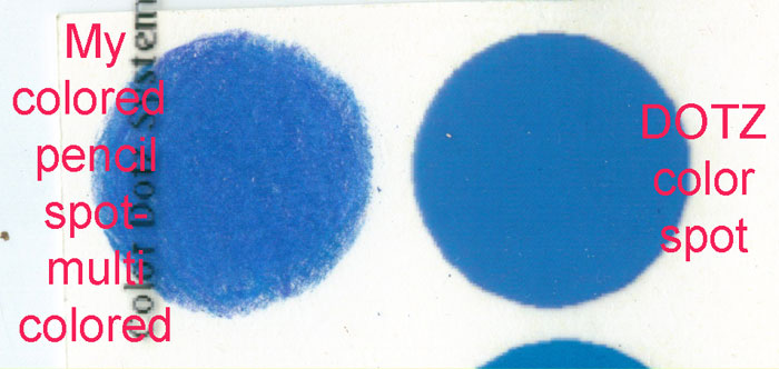
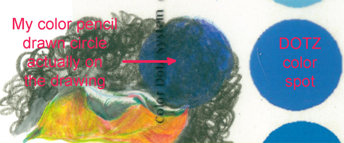
So the blue purplish dot it was. I then had to figure out the colored pencils I needed to blend to get as close of a match as I could. I laid the color DOTZ sheet over my colored pencil drawn test circle to see how close I'd gotten. Do keep in mind that.......DOTZs are pigment on acetate sheets.....which I've photographed then imported into a computer screen (LED lights on a computer screen). If you in turn printed the picture out.....that would be ink pigments printed onto paper. Whew! It's no wonder we artists talk about a “close” and not an “exact” match when talking colors.


And finally I went back to my drawing and worked a dot of the correct color over the black background scribbles......and blended things in. I laid the color DOTZ transparent sheet over my drawing to check and see if I'd gotten the color match correct.


I luv this idea. And I'm already planning how I can use this in watercolors and in acrylic painting. I think I can make up some of my own DOTZs by painting acrylic dots on my own acetate sheets. It would let me know what some of my favorite acrylic colours would look like. It would also give me a quick reference as to which DOTZs closest correspond to my acrylic paint pigments.

I see more charts in my future!


Monday, November 10, 2014

If it don't work right the first time......do it again!

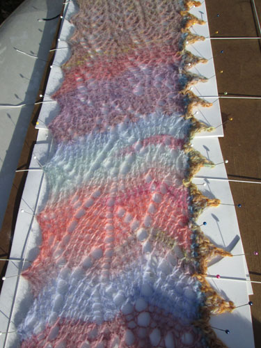
A while back I finished a knitting project.....a knitted lace sampler scarf.

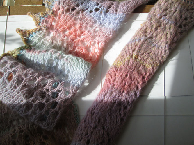
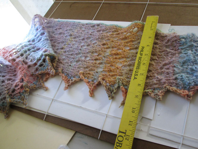
At the time I did what all good little knitters are supposed to do, I wet blocked the scarf and it looked pretty good. As I began to wear it, the selvages began to “roll under with wear”, as you can see from the right hand section of the scarf.

Grrr!......this hid all my hard work on knitting the fun lace patterns.....well, shoot!

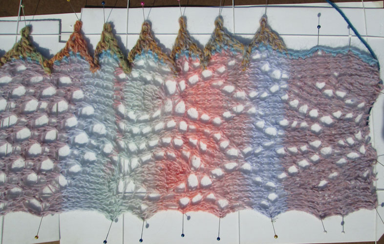
So recently I added onto one selvage a simple crocheted edging in a slightly heavier wool two ply. The scarf was from a LionBrand singles yarn. I began to wet block it for the second time.


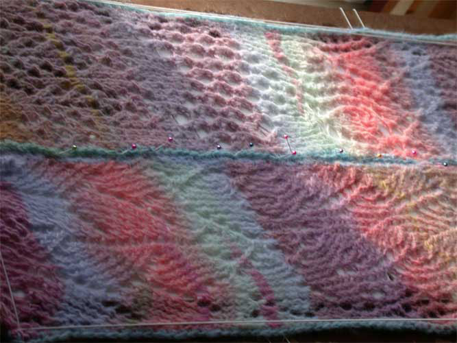
I found the longest piece of masonite I had and began to stretch and pin the loooooong scarf.......


After I finished the first half, I compared the re-blocked side with the single blocked side.....and found I'd gained 2 or 3 inches, just by re-blocking. Now lets see if the added border and re-blocking will work better, when I pull the ends together for an infinity scarf.