Friday, October 3, 2014

Ladybugs: 3 , Brown Thrasher: 0


Ladybugs: 3 , Brown Thrasher: 0

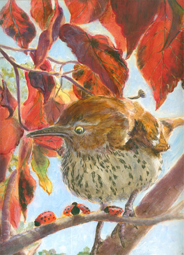
This blog post is a “finally finished” post for “Ladybugs: 3, Brown Thrasher:0.” It is done in acrylic paints, with a bit-o-colored pencils thrown in. It measures 11x 14 inches

I started this painting with a couple of goals in mind.....I wanted to “mix my media” and techniques....using both acrylic paints and colored pencils. I also combined opaque and glazing painting techniques.

Plus I wanted to tell an itty bitty story......a bemused bird (brown thrasher) gently taunted by three ladybugs, who knew they were safe. 'Cause the brown thrasher wouldn't eat them since they taste so bad.

Besides I really liked the photo that Frank had taken of the backlit brown thrasher. And it worked beautifully with the photo I took of the backlit fall leaves. The ladybugs were drawn from (un-fond) memories of being dive bombed last spring by some of their tribe. The only way I could get them to stop was to promise to include them in a future painting. Well.....promise kept!

Enjoy!

Tuesday, September 30, 2014

Colored Pencil Brown Thrasher in an Acrylic Painting or Mixing My Media, Again


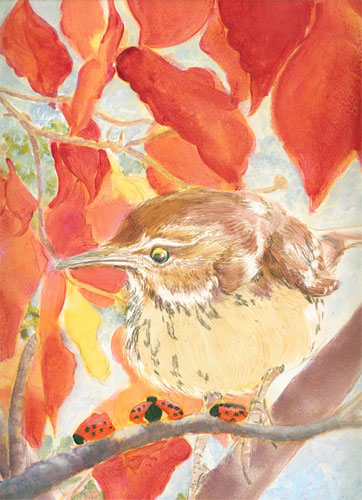
This blog post is a bit about an experiment I'm doing involving mixing techniques and media. In my current painting, “Ladybugs:3, Thrasher:0” I have used both differing painting techniques, (opaque painting and glazed painting) and mixed media,(acrylic paints and waxed based pencils). I talked a bit about the different painting techniques I used in past posts, and now I'm “show and telling” about mixing colored pencils with acrylic paints. I don't have any evidence of the archival-ness of this mixing of media, but I think it should work OK. I used wax based pencils in between two coats of acrylic glazes and will follow that up with a top coat of acrylic medium/varnish when finished. That should hold it to the canvas just as the paint pigments are bound to the canvas by the acrylic medium.

The image above shows the brown thrasher sketched in with very thin acrylic glazes in brownish red and buffy......the “native” colors of the bird. I'm painting on a prepared very smooth gessoed piece of masonite. Light acrylic glazes (acrylic fluid paints mixed with an acrylic glazing medium) dry pretty quickly and keep their “tooth”. If acrylic paints are applied without a glazing medium or applied thickly, when they dry will assume a plastic texture and wax colored pencils won't adhere to that surface.


I drew in the individual feathers on the upper body of the bird, along with detailing the staring “stink eye” he's giving the ladybugs. (“Stink eye” is appropriate as ladybugs stink to high heaven when squashed.....something the thrasher seems to know!)


At the same time you can see that the glazing of the backlit dogwood leaves is progressing.


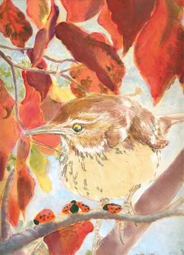
Since I wanted to judge how dark to glaze the surrounding leaves, I darkened the thrasher's buffy front and underbelly, with a glaze of transparent brown and cobalt blue. After that dried I drew, with a sepia wax colored pencil, the individual brown stippling on the bird's belly. I covered that with another light blue glaze and checked the effect of the glazed “shadow”.


Now I just have to tweak details, and I will show the finished piece next time.


Monday, September 22, 2014

Drunk on Color; Part Deux

Drunk on Color, part Deux

This blog post is a continuation of my “ode to colour” for the painting in progress, “Lady Bugs:3, Thrasher; 0”

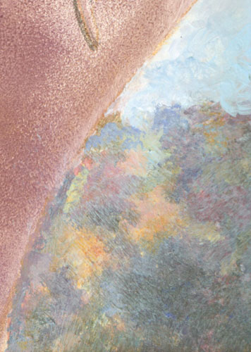
Last time I wrote about the joys of painting colorful foliage in the far background. I painted this foliage in opaque colors, using a progression of hues from light to dark values. This kind of painting has a unique charm all it's own. It is direct, in other words “WYSIWYG” (What You See Is What You Get) and yet the progression of values of the colors is planned.

In this next segment of the painting, I switched to my current favorite painting style, acrylic glazes. This style of painting is similar to Photoshop layers of colour, with the medium an acrylic glazing medium rather than the layers in the computer program. This takes multiple layers painted separately and dried, before the next layer is applied. This avoids muddying of colors that can sometimes happen when painting opaquely.

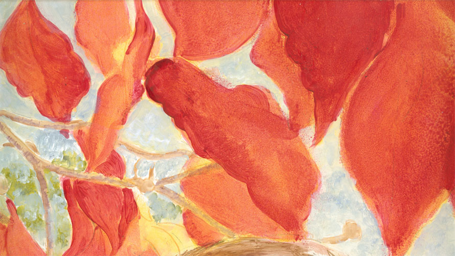
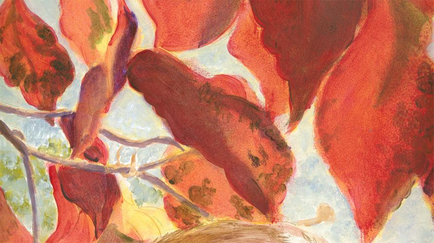
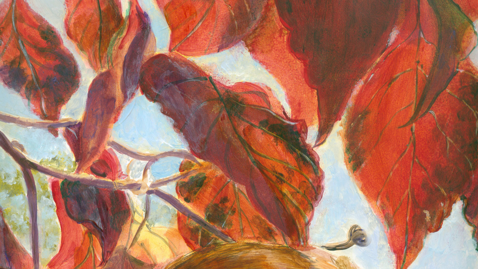
This is the mid ground section composed of fall dogwood leaves, backlit in morning sunlight.  


A layer of hansa yellow and quinacridone crimson have been applied. The fluid acrylic paint has been mixed with an acrylic glazing liquid that thins it without diluting the color load of the pigment. The finish of the paint film has a slight “tooth” and is not rubbery, like normal “full bodied” acrylic paints.

I laid in more layers of the crimson, with additional hints of yellow and green:


And finally I laid in a third layer of colours, including some purples (mixtures of crimson and cobalt blue) and greens. I laid in some detailing of leaf veining, and leaf outlines.....but didn't want too much detailing to derail the middle ground illusion.


I usually try to paint “locally” i.e. concentrate on individual portions of a painting, but try to remain aware of the “global” aspect of the painting.....i.e. How each segment relates to the whole “illusion of reality “of my paining.

It's been fun to use two different styles of painting, opaque and glazed, in the same painting. They do two different jobs, background and mid ground quite well. Next time I'm pulling things altogether with the focal point.


Tuesday, September 16, 2014

That's MY Parking Space! or One Way I Mix my Media

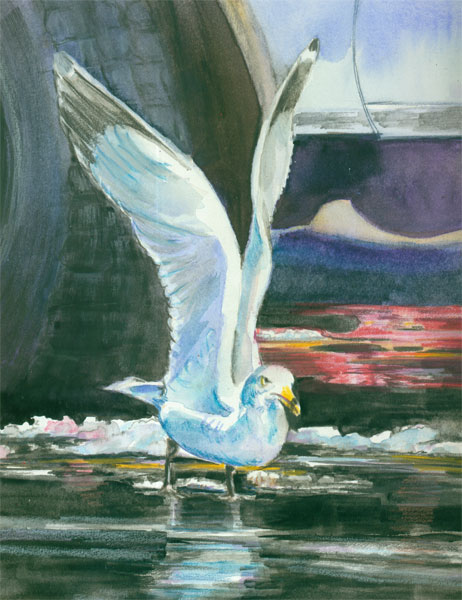
That's MY Parking Space

This post is about one way I mix my media.
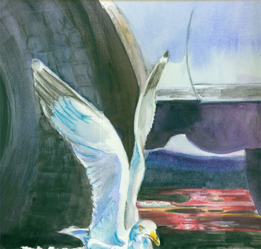
That's MY Parking Space!” Is painted from yet another one of Frank's wonderful photos. This one was shot in a parking lot of landlocked Russellville, KY.
It's painted with a mix of traditional tube watercolor, along with watercolor pencils and Prisma wax colored pencils. It measures 10 x 13 inches on watercolor board.

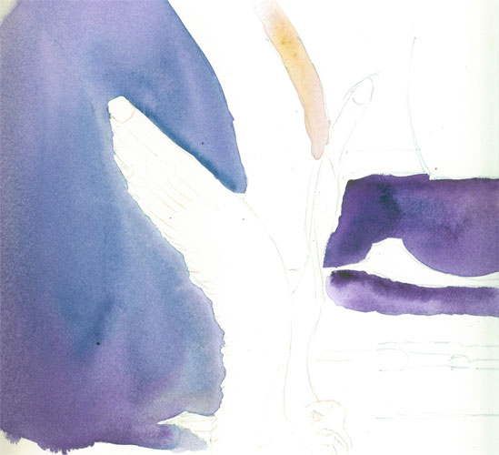
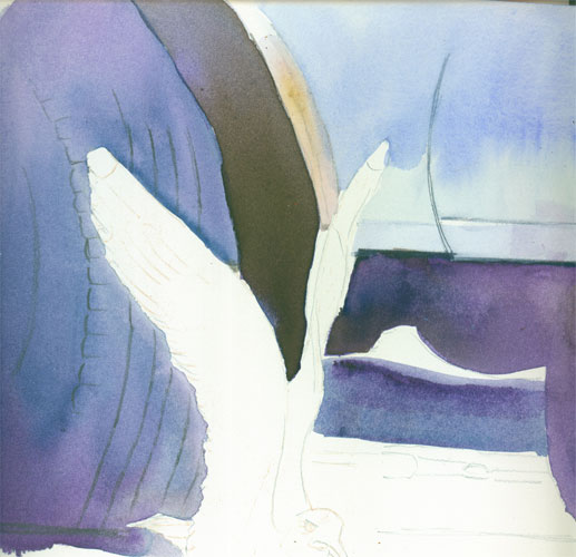
I started with watercolor washes, using a mix of indigo, and purple for the underpainting of the tire and some pavement. I carefully “outlined” the gull's wings with my initial wetting of the dark spaces I wanted to fill. A lot of time this is all you need to reserve watercolor whites.


I followed this first wash up with some general outlining of details with a dark grey watercolor pencil, so's the line could be “washed away” with my next watercolor layer. I then laid in the pale blue for the car door. After that I laid in the deep shadow of the wheel well, using a complementary brown umber. (Umber is basically a realllllly dark yellow, which is opposite on the colour wheel of the color purple.....equals a dulling, greying of the shadow without using black.


After that I worked on the gull itself. I'd left a good portion of the gull with just the white of the paper. But I choose to “outline” the left edge of the gulls feathers with a white Prismacolor wax pencil. The wax in the colored pencil can act as a “resist” to the watercolor wash. I also outlined the white outline in a black watercolor pencil to which I then added a bit of water to “pull” the black back out into the tire form. This let me safely refine the white feathers against the black of the tire. I learned this trick from Paint Radiant Realism by Sueellen Ross. She has a lot of cool tips to mix your media.


I went on to model the gull with light cool blues, using colored pencils to define some of the wing forms. I finished off the tire with lightened tire tracks in Prismas. I laid in the background reflected reds with more colored pencils, so's I could have total control of where the color went. I finally used a “Peach Black” from Holbein that I've found to be very nice for a true black that isn't too harsh. In most nature paintings I never use black, preferring instead to use combination of washes to get a more “natural” looking dark color. But in this case, since I was painting asphalt.....I went with a “un-natural” black.

And this is the finished painting:


Tuesday, September 2, 2014

Drunk on Color


OK.....my name is Alison and I admit it.....I'm a Color-oholic. There I've said it!

My story is, I recently got a bit-o-time in between projects....and I decided to try some color experimentations with a current painting. The design called for some far away foliage in the lower background.
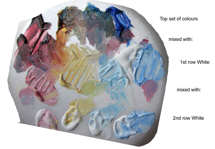
I had long had in the back of my mind a color explanation/experiment I'd seen in a book  ages ago. I dug out the book from my stash, and based on the points I'd read I tried this:

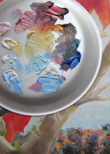
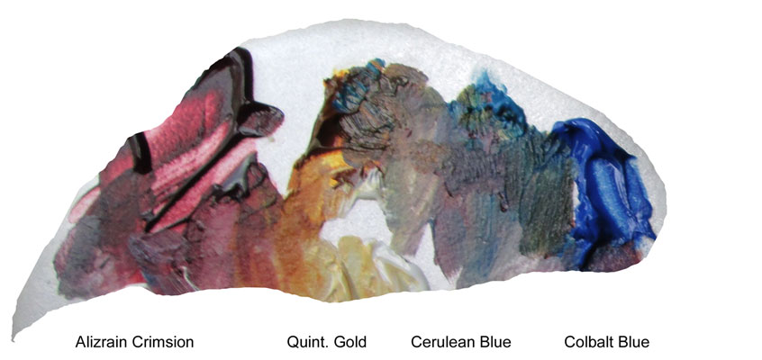
I squeezed out a bit of alizarin crimson, cobalt blue, cerulean and quinacridone gold.....i.e. A cool red, medium blue, greenish blue and a yellow. I then squeezed out a bit of white for all four colours, and mixed the colors with the white.


Then I did it one more time. The article I was working with said to do it for five piles of colour, but since I am working with fast drying acrylics in this case, instead of oils.....I stuck to the abridged version.

After I had my colours set out.....and in the beginning they were in nice organized piles! I proceeded to play. And the first thing out I found I needed a green for bits of the far away foliage. So's I immediately pulled together the cerulean blue piles and the gold piles.....and viola I had a green.


Then I needed a purple, and mixing the alizarin with both the blues gave me both a dullish violet (alizrain +cerulean = dullish violet 'cause the cerulean leans towards green which means it's automatically got a bit of yellow in its composition. And we all know yellow is the complimentary of violet which equals instant greying of the violet's intensity).....and a vivid violet (alizarin + cobalt = vivid violet 'cause cobalt and alizarin both lean towards the purple side of the spectrum and no yellow or warm color involved so no complimentary dulling)

After a lotta messing around, I started painting with leetle dabs of paint here and there following my photo reference. And I thought I could stop doing this “pointillist” type painting in spots of color......but I found I couldn't just stop at one bit of color here......I had to smudge it, then I found I needed a bit of it's compliment just beside it.....and I couldn't stop!


But of course, since I'm typing this blog post.......I DID step away from the palette....I CAN stop with colours.....I can......Oh wait! Is that a tube of Phthalo Blue? I wonder what that would look like on........

To be continued.......... 

Friday, July 11, 2014

Illustrators, Writers and the Needle Arts They Love


This bitty blog post is a "step further" of a blog post “Spinning Yarns” http://yaoutsidethelines.blogspot.com/ by a dear friend, Tracy Barrett. She is an accomplished young adult author who is also a knitting enthusiast. Her blog post lists some of the similarities between writing and knitting. After reading it, I thought I might carry it a step further, and list a few of my thoughts on similarities between illustrating, writing and the needle arts many of us love.

No matter the discipline, (illustrating, writing, knitting, crocheting etc) anyone that engages in such pursuits is creating something that did not exist before.

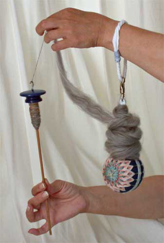
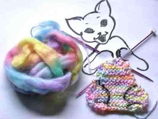
Whether it is spinning yarn out of sheep's wool,


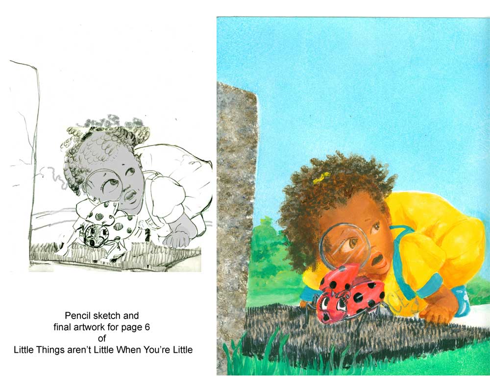
or writing a manuscript that I can illustrate,


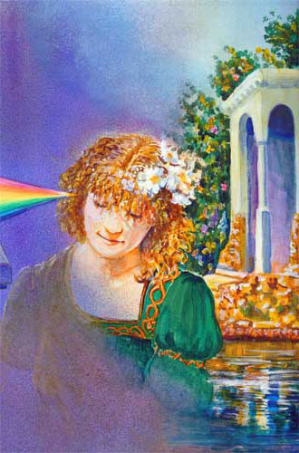
we are creating something from our own imagination......


Little Knittin' KItteh

or “knitting an idea into being”.

Whether we use simile: “Her imagination came to life.......just like she was really there “


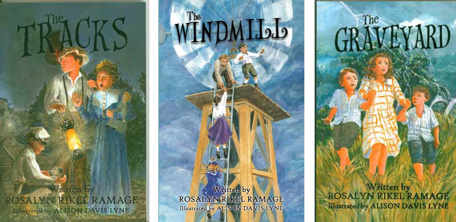
or color/setting consistency (like this series of book covers)


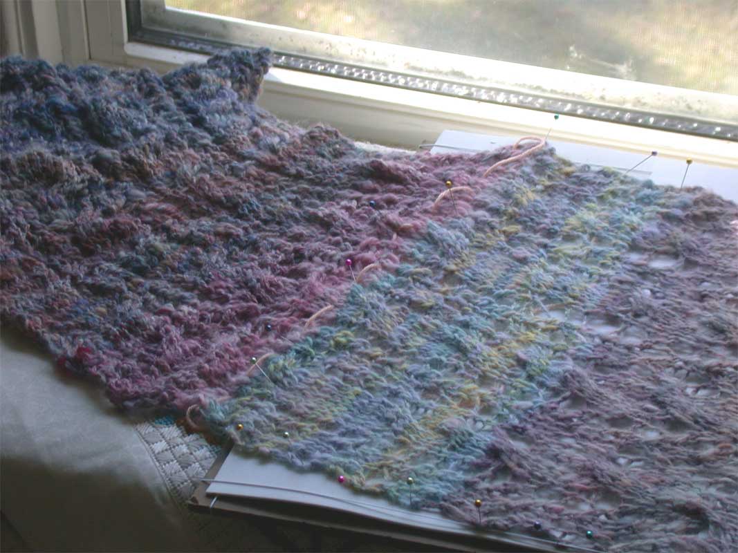
or a knitting pattern repeat,


we are saying that this is like that, and" that" makes a pattern, and tells part of a story.

I've always thought that writing, illustrating, knitting et al, are all parts of a story of creating.....no matter the medium you work in,........no matter the discipline that you follow, it's all making something!


Wednesday, July 2, 2014

Art on display at Logan County Library during month of July

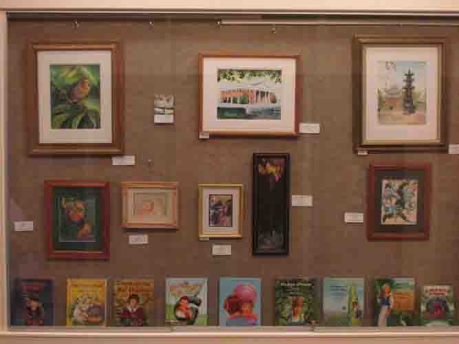
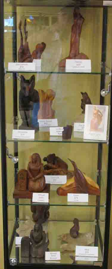
These pics are of Frank and my artwork currently on display at the Logan County Library in Russellville, KY.  They will be there through out July.

My paintings and select list of my published illustrated children's picture books are located in the foyer of the new library building, in a lovely display case.  You can see full size images of the artworks, by going to our website and clicking on the various pages that show a particular image you might be interested in.  The same holds true for Frank's sculptures.


Art show at Logan County Library

Frank's sculptures are located inside the building, by the newspaper reading chairs,  in a beautiful display case.....


Frank's sculptures at Logan County Library

If you haven't already, please stop by and see the lovely new library building, and while you're there take a look at our artwork too!

Thanks SO much to all the kind folks at the library for their help......and just for being such all round nice people!