Tuesday, May 27, 2014

Paint My World

Paint My World
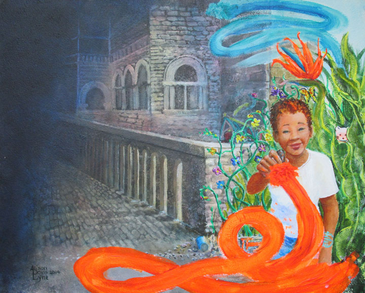
16 x 20 acrylic paint

This recent painting is a bit out of my comfort zone. It features some realistic elements, but has combined them in more of an abstract style.

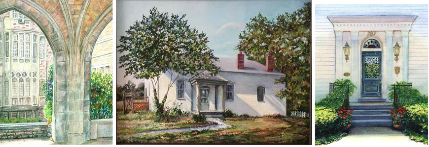
I like painting realistic historic buildings, like these:


but I usually paint the entire building.

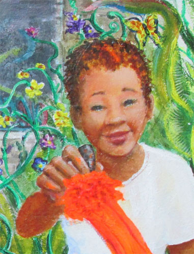
In Paint My World, I decided to show just a section of the stonework of an old building, receding into the shadows of “times gone by”. I showed the young girl painting her ideas (plants, flowers, florescent colors) over the dull cold stones of the past.

I like the combination of buildings and people to tell a story or show a viewpoint. Using this kind of “story telling” lets me indulge in painting “some of my favorite things”. I also like the idea that, in our own minds at least, we might color the world to express our dreams.


Wednesday, May 21, 2014

I can't seem to stop myself....I HAVE to tell a story

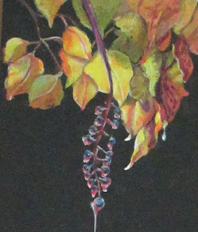
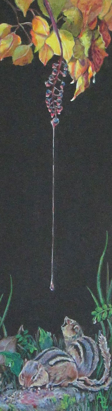
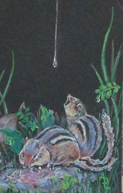
Detail of Raindrops Keep Falling on My.....

I started out working as a “fine artist”.....i.e. I painted for myself and to enter juried shows and sometimes show at sidewalk art fairs. I painted in one of the three standard genres....still life, landscape or portrait. I loved realistic painting, and painted mostly from my photos. So far so good.

Then little bitty stories began creeping into my compositions. At an early age I'd been exposed to all the great historical illustrators thru National Geographic magazine, with lush many page painted spreads. So in my own painting, I began to go outside the “fine art” genre, and painted things with historical themes. In painting historical, I was well on my way to telling stories.....about history.

Fair enough. So.......I began to segue over to illustration. Here, I was commissioned to actually “tell” stories, whether for magazine covers, cards or children's books. But I was still using the “fine art” style to tell stories. This is both good and bad. Good because the “fine art” look did indeed find favor with certain publishers.....bad 'cause it takes a LOT of time to complete final artwork.

Lately I've been having my cake and eating it too, (no calories involved)! I've been planning colored pencil pieces that combine aspects of (still life, landscape or portrait) with a quicker “illustrative” style I.e. “telling an itty bitty story.” My style is still mostly real.....sometimes with just a bit of artistic license. And I'm working hard to “find my whimsy”.

Case in point,this recent colored pencil piece......”Rain Drops Keep Fallin' on My.......”.


It has elements of a still life (leaves), landscape (surrounding ground) and portrait (chipmunks), yet these three things put together, with some red coloured rain drops dripping off a polk berry branch does tell a itsy bitsy story.


To the great amusement of his grinning friend, a busy, full cheeked chipmunk is about to get splashed with a colorful bit of nature. I showed how I got such highlights on the top leaves in this post: http://lyneartblog.blogspot.com/2013/12/white-on-blackhow-do-you-get-there.html

It's a side step from other work I've done..... I'm learning a lot......and it's a lot of fun to boot.

So I guess “it's a good thing” that I just can't stop myself!


Tuesday, May 13, 2014

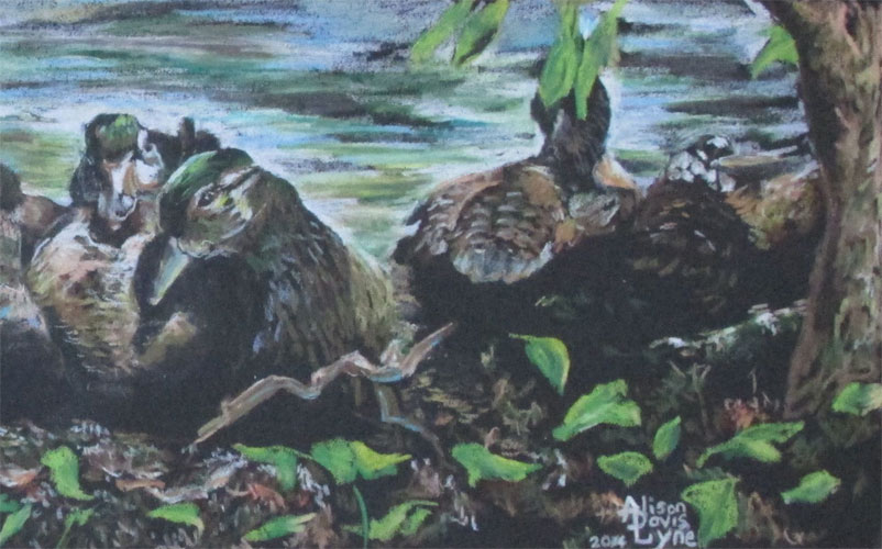
All my Ducks in a Row


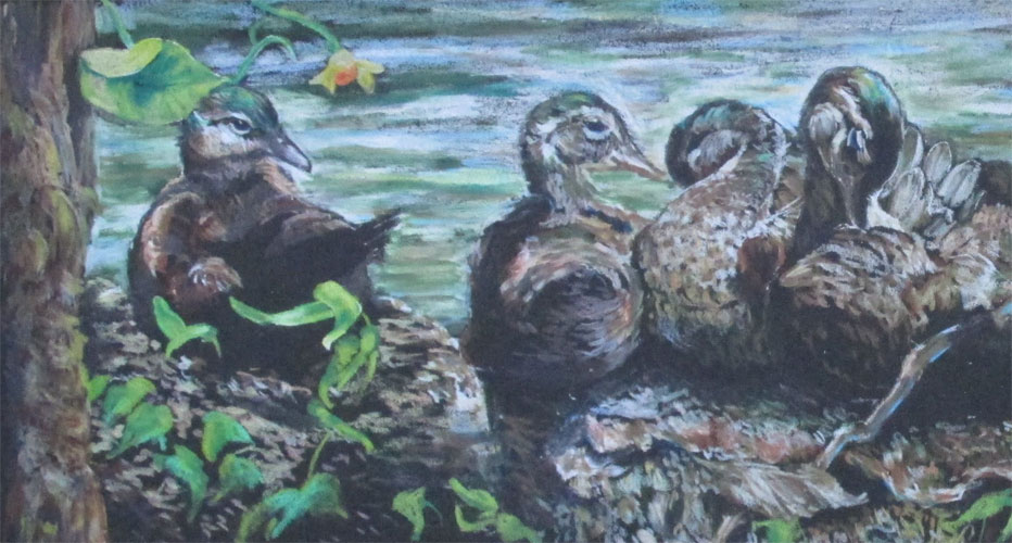
Detail of All My Ducks In A Row (left side)

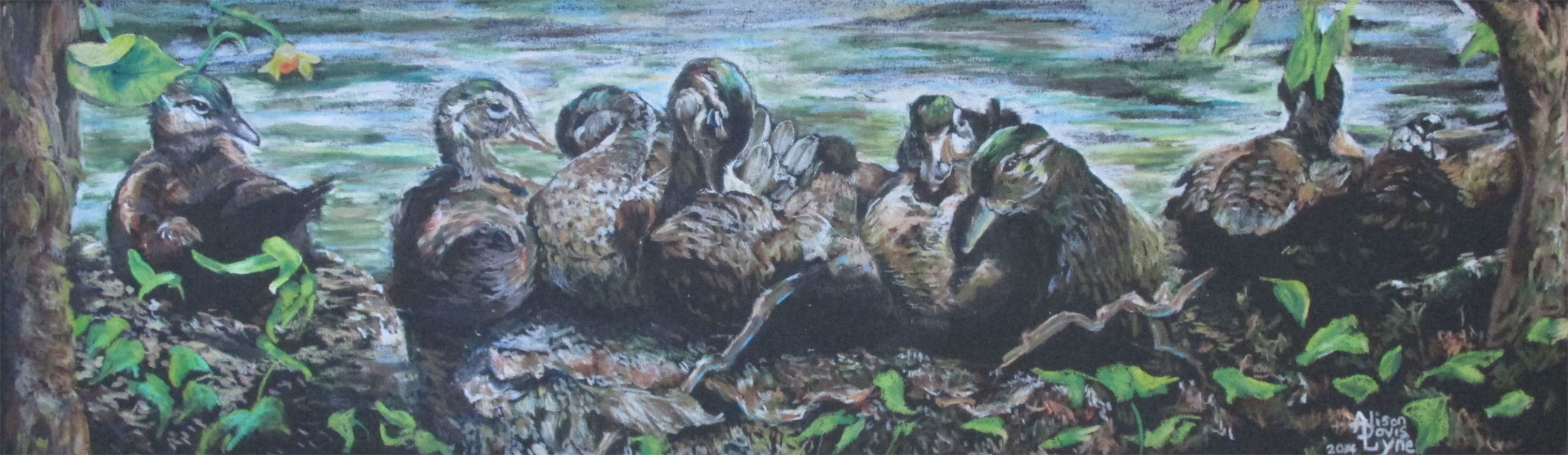
This is just a bitty post about a recent coloured pencil piece, All My Ducks in a Row.
7 inches by 20 inches
Colored pencil (with a dab of gouche) on black illustration board


(This is the full piece.....it's a bit long for the blog format.)

I finished it just in time to get into the U.S. Bank Celebration of the Arts 2014 Art Show, at the Kentucky Museum in Bowling Green Kentucky....and even managed to score a itty bitty award for “Works on Paper”. I so appreciate the Kentucky Museum's and U.S. Bank's hard work to make a lovely show “happen”. 

Detail of All My Ducks in a Row (right side)

I wrote a brief post http://lyneartblog.blogspot.com/2013/11/how-not-to-draw-to-make-your-picture-pop.html about this piece, while it was a WIP.


Wednesday, April 9, 2014

Interview with children's author, Nancy Kelly Allen


Today, I have children’s author Nancy Kelly Allen as a guest.

ADL:  Welcome back to my blog. I know it's exciting to have TWO books released this spring. One is a folktale and the other is a middle grade novel. Tell us about your experience writing a folktale.

NKA: Hi Alison. Thanks for inviting me back to your wonderful blog. I’m a retired school librarian, so I’ve been exposed to numerous folktale retellings. These stories were originally told orally to explain the mysteries of the world. The child in me still loves a good mystery. Like kids, I’m curious. Storytelling is an intricate part of many cultures and each culture has its own tales. When I read the Cherokee folktale, First Fire, I was immediately captivated. My great-grandmother was a Cherokee so the story resonated with me on a personal level, but also on a storytelling level. The story has a problem to solve that seems impossible, a moment of high tension, an unlikely hero, and a satisfying conclusion. This creation story tells how animals captured fire for Earth, and in the meantime, each animal that tried to capture fire returned home with unique characteristics. The snake is black, owl has red eyes, etc.

ADL: Did you find that writing a folktale was different from writing a fictional or nonfictional picture book?

NKA: The basic story was already developed, but I wanted my imprint added. I did that by with details. As a writer, I was tempted to enhance the story with elements I invented, but the folklorist in me disagreed and demanded that I remain true to the original version. My folklorist side won the argument. I spent time studying the Cherokee culture and talking with members of the Cherokee Nation to give credence to the retelling and deliver accurate details. FIRST FIRE: A CHEROKEE FOLKTALE, was fun to write and I feel honored that I can pay tribute to my Cherokee heritage with this book. Sherry Roger’s illustrations added colorful realism. This book was published by Sylvan Dell Publishing. The publisher just changed names and is now Arbor Dale Publilshing. http://www.arbordalepublishing.com/


ADL: I, too, love folktales and look forward to reading FIRST FIRE.


Now about AMAZING GRACE, your first middle grade novel. Why did you choose to write this story?

NKA: AMAZING GRACE ( A KENTUCKY GIRL WITH GUMPTION DURING WWII), has a short title with a long subtitle. This book has been a 15-year-long project. The story began as a picture book. I sent it to some editors, and several recommended that I make it into a long story. I rewrote it as a chapter book and got basically the same feedback. The story stayed tucked away, and about three years ago, I decided to write my first middle grade novel. I remembered the feedback I’d received so I decided to revise the story once again.


ADL: Since the setting is during WWII, I imagine you had to do some, maybe a lot, of research.

NKA: I love research and it’s a good thing I do since AMAZING GRACE required a massive amount of it. I began the process by reading fiction and nonfiction books about WWII and life on the home front during the war. I tooled away at the keyboard bouncing between researching and writing. Much of my research was centered on D-Day and facts relating to the troops. Another even larger research effort was based on the Kentucky home front: what people ate, what they grew in Victory Gardens, common WWII phrases, newscasts, school activities, automobiles, and everyday life for families who were helping with the war effort.
My father and uncle both served in WWII. The book is dedicated to them.

ADL: Tell us about the story.

NKA: Eleven-year-old Grace Ann Brewer’s comfortable life is torn apart when her father joins the Army in 1944 during WWII. Her family moves from Hazard to Ashland, Kentucky, to live with her grandmother. Grace enrolls in a new school and is immediately forced to deal with a bully, but the greatest challenge is to keep a positive outlook as she fears that her father has been injured—or worse—when his letters stop arriving in the mail. Gumption, that’s what Grace’s grandmother tells her she must have,but gumption isn’t easy to grasp when she listens to the wireless, a radio, that keeps the home front updated with the frightening events of the war. Grace finds solace in writing letters to her father and even more comfort in talking with her dog, Spot. With amazing strength Grace fights her own battles on the home front. Meryl Shapiro’s black-and-white illustrations depict the characters and setting in small bursts of art scattered throughout the book in each chapter. This book was published by The History Press. http://historypress.net/

ADL: Congratulations, Nancy, on the publications of FIRST FIRE and AMAZING GRACE.

Nancy’s books are available in bookstores nationwide and on Amazon.com and Barnesandnoble.com

Thank you for visiting my blog and good luck with the books.

To learn more about Nancy, please visit her website http://www.nancykellyallen.com and blog http://nancykellyallen.blogspot.com/

Saturday, January 11, 2014

Chubby Cheeks: A Colored Pencil Bright Spot


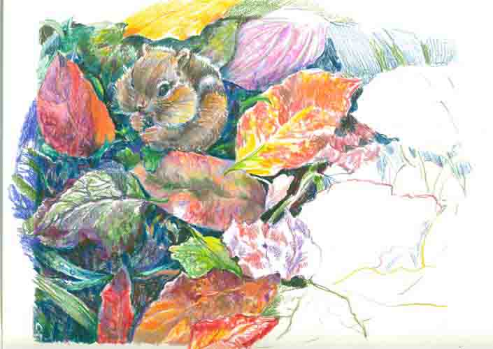
CHUBBY CHEEKS
8x10 inches Colored Pencil

I used as reference for this colored pencil piece, a photo taken by my husband Frank. Frank photographed this little guy while he was eating his breakfast of a sunflower seed.  I used another photo I'd taken of some fall leaves to draw the leaves that liven up the surrounding grass.

I had a ball doing this very intricate piece.  I've found that doing a complicated piece like this is  almost like doing a  jig saw puzzle.  As you can see from the  "work in progress" pic below, I usually finished each section/leaf almost fully before proceeding onto the next.  It was about at this stage that I decided it worked better as an oval than the originally intended rectangle.  It's fun to "go with the flow" of what the artwork wants to be!


Thursday, December 19, 2013

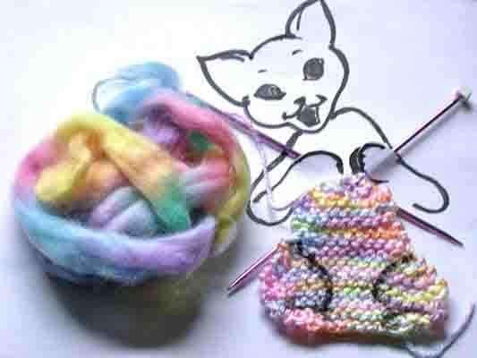
Little Knitta Kitteh - Found Object Doodle


LITTLE KNITTA KITTEH

This is my just finished doodle in the "found object doodles" game started by  Debbie Ohi.  I saw on FB what cute doodles she and Hazel Mitchell  had come up with.....and I just had to try it out.
My Little Knitta Kitteh is busily knitting herself up.....from her tail up to her waist so far.....she's making herself up in rainbow colored yarn.


Tuesday, December 17, 2013

White on Black.....How do you get there?


This is a itty bitty blog post about the color white. As in how do you get a really good white base to work on, in the middle of a BIG black colored pencil board?

I've started another colored pencil piece using black illustration board as my base. It's sorta like the old Elvis prints on black velvet......an artist gets to take advantage of allllll that lovely black background to paint or draw on. Any colour we use will just POP! Right off the canvas.

My coloured pencil piece called for some areas of really brite colours and others need to be a bit more subdued . I figured a bit of experimentation was called for. I wanted to try a combination approach, but keep the piece mostly all in slightly to really subdued colours.

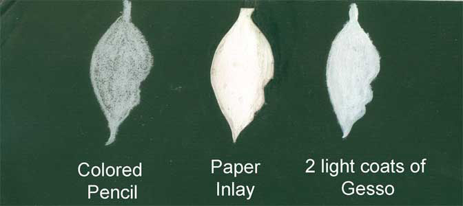
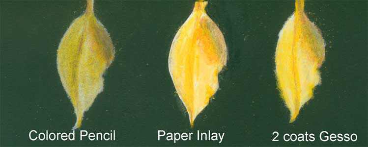
I took a waste piece of board and laid out three leaf shapes. The first was just a filled in outline of a white coloured pencil base coat. The second was a thin bristol board inlay. The third was a two very light layers of gesso. Gesso is an acrylic primer that painters use on their canvases to seal the fabric canvas and to make it extra white.

The white thin bristol board inlay was done by laying the bit of white bristol board over the black illustration board, and using an Xacto knife held perpendicular to the boards, cut out the entire leaf shape, thru both surfaces. When finished I had the white bristol board cutout EXACTLY the same shape as the shallow cutout in the black illustration board. On the black board, I took the knife and gently pulled up the top black layer of the illustration board, spread a bit of glue (in this case acrylic gel medium) and inserted the white bristol board in the hole. After a bit of burnishing around the edges, I had a lovely inlay of white bristol board in the sea of total black illustration board.

I then drew the yellow leaf with a bit of shadow, in coloured pencil, using the same colors on all three sample leaves.


The first coloured pencil leaf was the most subdued of the three, but just fine if you wanted to stay with coloured pencil throughout the entire piece.
The second leaf (with white paper inlay) ended up being both the brightest and the cleanest in shape. I don't know about the archival quality of this technique....but I have to assume it would be about the same as the entire piece. 'Bout the only drawback is I sometimes would run over the slight ridge of the inlay. Next time I might use a brayer to further flatten the surface and get it flush with the black illustration board.
The third leaf, with the gesso coating as a foundation fell somewhere in between in terms of brightness.

For the inlay technique, I wanted to give a hat tip to Rob Howard, who wrote the Illustrator's Bible. It was originally published all the way back in 1992, but many of the traditional media art techniques it gives still hold up today. This was waaaay before Photoshop saves of today. His index didn't even list computers! He gave the inlay technique as a way to save an illustration “gone bad”.