Wednesday, November 27, 2013

Ruffy: A Portrait


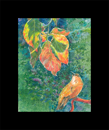
I recently finished this 8 x 10 inch mixed media portrait of Ruffy, a female rufus hummingbird that stayed with us from October thru the morning of December 31 1 2011. She was supposed to have flown to Mexico in the fall but showed up at our feeder on a bluff and blustery October day. She stayed with us through out the fall and early winter, up to December 31 very early in the morning. Which it turns out was just long enough to be counted in the Christmas Bird count that Frank was involved in that winter. She definitely earned her daily hummingbird sugar water!
Frank had taken loads of wonderful photos of Ruffy, and I just had to use one for a “mostly” colored pencil piece.

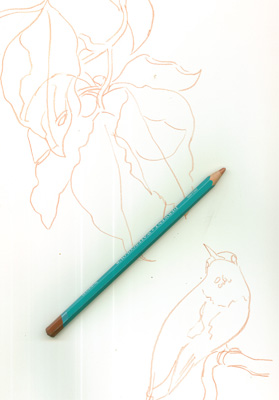
I started off doing a sketch of Ruffy which I combined with a sketch of my photo of some fall leaves backlit with morning sun. I sketched on bristol board with a light colored watercolor pencil.....so's I could erase the lines later with just a bit of water.

After that I decided I wanted the background to be pretty dark, to highlight the sunlight coming thru the leaves. I made a couple of paper “masks” of the shape of the leaves and of Ruffy, and sponge painted over the rest of the uncovered background with a bit of acrylic paints mixed with a lot of glazing medium. This covered the background quickly, with a surface I could still draw on with Prisma color (wax based) pencils.
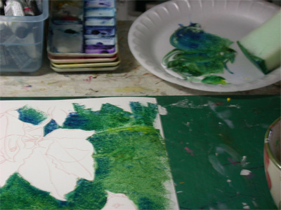

The drawings of Ruffy and the backlit leaves are left pure white Bristol board to keep them the brightest part of the drawing. The outlines I “erased” with dabs of water as I got to them.
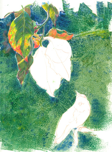

I started filling in the lovely colours of the backlit leaves and the form of Ruffy, with Prisma color pencils in multiple layers.
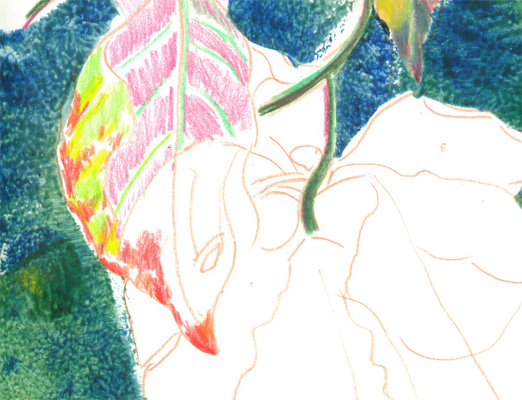


After the leaves and Ruffy were finally finished I went on to add “splashes” of colored pencils in the background. I especially wanted to darken (and make bluer) the areas around the golden leaves and orange tinged Ruffy, to provide color contrasts. I also added a lot more color bursts of muted colors in the background to subtly “activate” the background, but keep it “in the background.”

As a final grace note, on advice from Frank, I added a touch....literally.....of gold leaf to the Rufus hummingbird's gorget. The gold leaf is no bigger than the width of a colored pencil lead, but it catches the light just a little bit.....so very much like the reflective feathers on the hummingbird's throat. We were graced with watching (and watching out for) Ruffy for nearly 3 months.....and we learned so much, and enjoyed her stay greatly.


Friday, November 22, 2013

How NOT to Draw to Make your Picture POP!


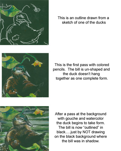
This is just a small post about a current colored pencil WIP “All My Ducks in a Row”. This WIP is from a series of photos my husband, Frank, took on a recent nature photo shoot. He found a group of young ducks preening on a huge log, and took a wonderful series of photos. I took them, and with a bit of rearranging, came up with a design I liked. I choose a looooong horizontal frame format, and cut out black illustration board to match.

I traced off the duck images onto the illustration board, using white tracing graphite paper. I dusted it off a bit with an kneaded eraser, and started to work.

My first pass of coloured pencils laid in the brite green leaf to outline the duck's head. As you can see in the second image, the colours were laid in, but the image doesn't really “come together”.

To “outline” the main image I needed to ghost in the background water, which I did using a lite swash of gouche. I found that coloured Prismas go over lite gouche wonderfully, mushing the gouche particles around with very little effort, allowing me to add bits of colour gradually.

By remembering to NOT COLOUR in the black areas surrounding the duck's head, I allowed the figure to POP out against the background and attain it's proper form.

It's a bit of a “backwards thinking” kind of trick, but is essential to remember where “not to paint” to work on a black background. Sorta like working a colored pencil crossword puzzle.

Wednesday, November 13, 2013

Visual Art Tip: Family Jewels-Old family photos can be a treasure trove of inspiration.


Visual Art Tip: Family Jewels-Old family photos can be a treasure trove of inspiration.

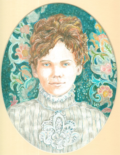
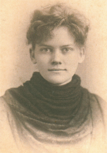
I've always been the type of person that just can't leave “well enough alone”, especially when it comes to painting. Going thru a box of old family photos, I came across a lovely old sepia portrait of a young girl.


As you can see from the photo, it looks like she stopped by a old tyme photo booth, and sat for a photo. (Around this period of time, photographers might set up a mini booth at a county fair.) It looks like she just covered her dress with a cloth drape, much like they used to do to us for a high school photo.

I immediately decided that she would make a charming colored pencil portrait, even though her identity remains uncertain. Since red/auburn hair runs in our families, I decided to go with that for her hair color, and used a very fair complexion. So that in turn, gave me the background colour of green. I picked out a suitable (1900's ) complex background wallpaper design.....and a very complex lace dress design of the same period. I wasn't too worried about a total likeness......I just used her as a jumping off point for a "period portrait".

Colored pencil is superb for tons of detailing.....yet works lovely for a smooth peaches and cream complexion. I had a ball taking a relatively routine old photo and giving it detailing and a color 'PUNCH'. I think it's fun to remind ourselves that not everything in history is just plain ol' black and white or sepia. Our ancestors lived in FULL color, just like we do... they just didn't have iPhones to record it.

Check out your own photo archives.....you never know what bits of treasure you might find to bring up to full COLOR!


Tuesday, November 5, 2013

DIDJA KNOW....Since ancient times artists have used precious metals to create or enhance artwork.


Since ancient times artists have used precious metals to create or enhance artwork. Both gold and silver, among other metals, have been used in making art.

From medieval times to the present, silver has often been used in making delicate expressive drawings. One of the most often used techniques is “silverpoint”. This is where a thin pointed strand of silver wire is used as a drawing instrument. Sorta like the lowly graphite pencil of today, the silverpoint tool was used both in “sketching” outlines for further painted artwork and to complete “finished” pieces of art. The silver that was rubbed off the piece of silver wire, with each stroke, stuck to the treated surface (paper, gessoed canvas etc). Over a period of weeks, the silver would tarnish, just like silver candlesticks do today. The soft grayed silver tarnish would give drawings a lovely “glow”. This is a nice Wikipedia article on the practice: http://en.wikipedia.org/wiki/Silverpoint

One of the most enduring metals used in art is gold.....leaf to be exact. As opposed to silverpoint's use of silver wire to make a drawing, gold leafing has been used as a covering, in both 2D and 3D artworks. It can be applied both to a surface of a canvas or paper and onto a sculpture with many details. The main technique for gold leafing is to make the surface you want to cover “sticky” with some sort of liquid adhesive, and apply the extremely thin sheets of gold leaf. After it is dry, a gold leaf coat can be “burnished” to enhance the smoothness of the leafing, and increase the shine. Of course as with any medium, there are a multitude variations on how the gold leaf can be finished, with many different effects. Usually, after the gold leaf is completely finished, a varnish is applied to protect the fragile surface.


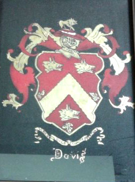
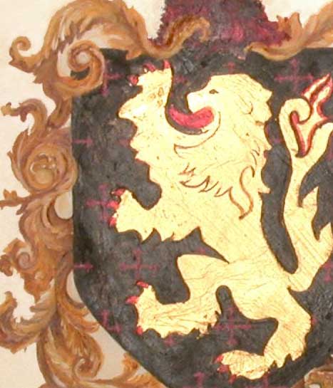
This detail of a coat of arms shows how lovely a bit of gold leaf can be. Incorporated into a graphic design, like a coat of arms, gold leaf is a beautiful highlight, that will make most anything look richer. If left un-burnished, the gold leafing will refract light in small sparkles. If the gold leaf is burnished.....or smoothed.....then it will be more mirror like in it's shine.

The coat of arms at the top of this post was completed using gold leaf and oil paints. It has the extra added twist of being done in a “reverse glass” technique. This is painting on glass, but on the reverse side of the glass than it will be viewed. This means that all the normal order of painting is also reversed.....details are put on first, then middle ground items and finally background items. The gold leafing is added last. If you don't go crazy first.....it's a great quirky technique!

Wednesday, October 30, 2013

Visual Art Tip: Cross Purposing Colored Pencil


This post is a little about needlework, and a lot about colored pencil work. A while back I started out playing with and learning about colored pencils. The Prisma color pencils I use are a wax based pencil. This means that they have a wax base into which different colored pigments are mixed, which mixture is then put into the centers of a wooden casing. The resulting pencil is easy to stroke onto paper surfaces.
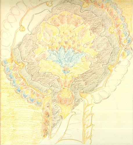
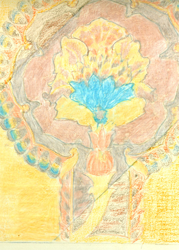
I usually start out with a outline of the main points of my drawing. I then begin lightly sketching in the various color sections, much like a paint by number kit. You can see my initial outline sketch and light color sketching on the center of this image.


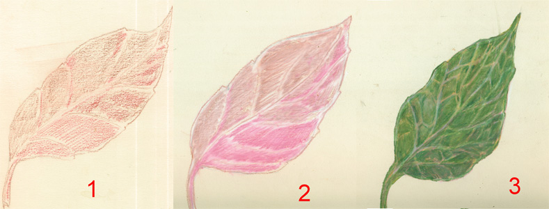
I then lay in a second layer of color pigment over the first one, to deepen the colors. You can also lay in different colors to make a “color blending” happen, in the next step.


Often you want to change or augment one color from the pigments of just one pencil......which you can easily do by layering different colors on top of each other. This sketch of a leaf is a good example. Leaves are really reddish underneath the green chlorophyl. That's why you see reddish colors in the leaves in the fall, when the chlorophyl dies off. I started off with this sketch using dull reds, then layering over some greens. This makes the final green leaf much more realistic in colour than the manufactured pigments often allow.


After you layer your colors, then comes the “magic” of a technique called burnishing. This technique takes advantage of the wax/pigment mixture that makes up the Prisma color pencils. What you do is take a pencil of the final color you want the current section to be, and stroke over and over that section. This repeated firm stroking will slightly melt the wax/pigments already on the paper surface. You end up mixing the previous layers with your color strokes. You can get lovely colours and great detail with this method.


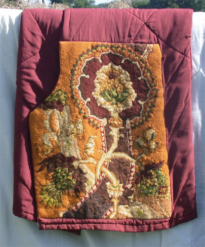
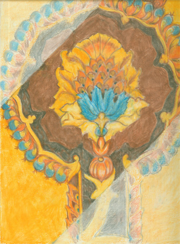
Oh and about the needlework reference? Well these samples of colored pencil steps I did for a talk I presented.....I actually did to decide on colors I wanted to use for a wool needlework cross stitch piece. The design was a 17th century cloth design from a Dover book. I wanted to decide on the colors using colored pencils to draw me a color “map”. You can see the result at the top of the post.

Colored pencils come in wax, ink and watercolor versions, each with it's own speciality. Colored pencils of any type, are a great tool for crafters, artists and illustrators!


Thursday, October 17, 2013

It's All About the Style! Whether it's colored pencil, acrylic or watercolor.....it's your style that will make the artwork.


It's All About the Style! Whether it's colored pencil, acrylic or watercolor.....it's your style that will make the artwork.

As an illustrator, I am a “Jill of all mediums, mistress of none” to para-phrase an old saying...Jack of all trades, master of none. In other words, I try to learn about as many different media as I can, so's I can use the best parts for my illustrations.

This has made me a avid art technique collector. Much like a cook collects food recipes, I collect art techniques.....try them out.....and then use various parts of different techniques to “get the job done”


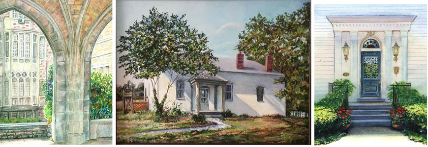
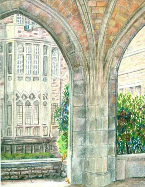
Church Gallery with Sparrows  8x10  colored pencil

This colored pencil building “portrait” is a prime example of what makes colored pencils SO popular. Colored pencils deliver bright, intense controlled color, yet can be blended with just a bit-o-pressure of the pencil strokes, and most importantly.....you can use a ruler to get all those straight lines....well....straight!

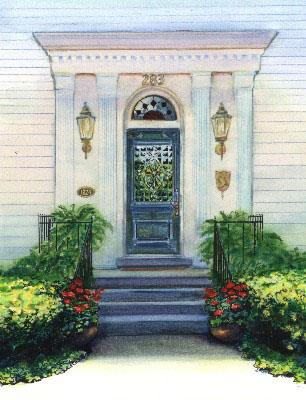
Washington House Doorway  8x10 watercolor

Then there is watercolor. It delivers glowing washes of color....with graduations of colour that are quick and easy to attain, if you let the water do it's natural “thing”. And even better, there is a whole line of watercolor PENCILS.....so you can get those straight lines needed for structures. Yet those very watercolor pencil lines can themselves be moistened and blended!

Kentucky Provencal  18x24 Acrylic

And finally, one of my favorites,... acrylic paints. Acrylic paints have finally “matured”, in that they have been improved to the point that they can mimic watercolours or oil paints, yet remain one of the best mediums, IMHO,for rendering just about anything. This building portrait was painted in a realistic style, with plenty of sunlight, using both impasso (opaque layers of paint) and glazing (multiple layer of transparent paint) techniques. And those straight lines......were a fine brush laid alongside a ruler!

I firmly believe that any artist's body of work reflects their own artistic vision, no matter which medium (or how many or how mixed) you use to make your artwork. And tho' I usually aim to sell my artwork, the journey of learning and discovery in that painting, is a whole “end” in and of itself!


Thursday, October 10, 2013

Smooshing my Morning Glories


This post is a bit about my colored pencil work. A while back I found out just how much fun colored pencils can be. I came across a set of prisma color pencils in my husband's old art materials, and thought I'd try them out.....as a nice change of pace from acrylic paints.

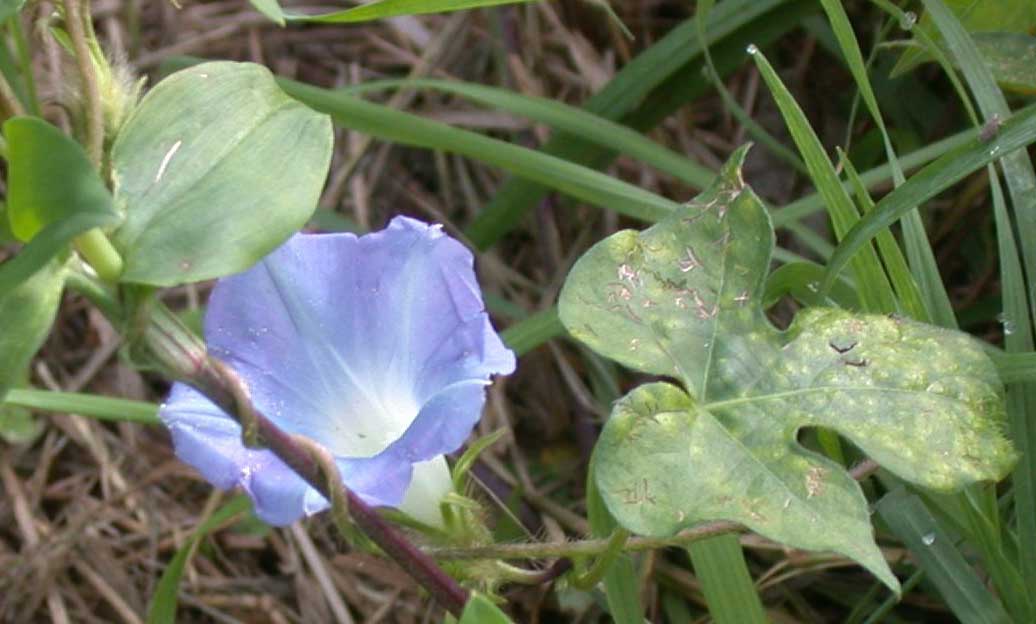
I gathered my reference photos of some morning glories …..


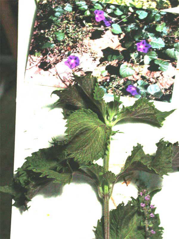
and real life props of some rattlebox, a lovely purple and green “weed” that sports lacy ruffled leaves in the fall.


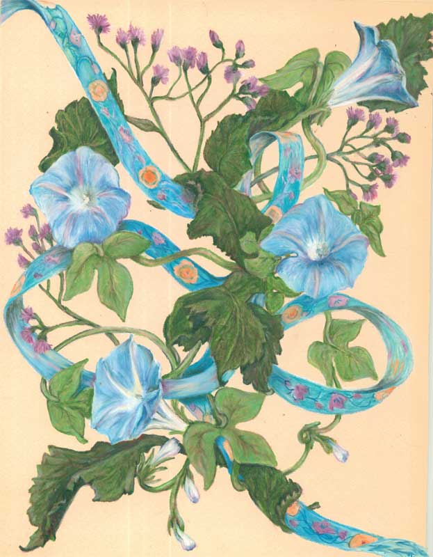
I started in outlining the morning glory blooms randomly on a piece of beige matt board, then added in some rattlebox leaves and twines of the morning glory vines. I decided to add a colored ribbon to.....tie....things all together.

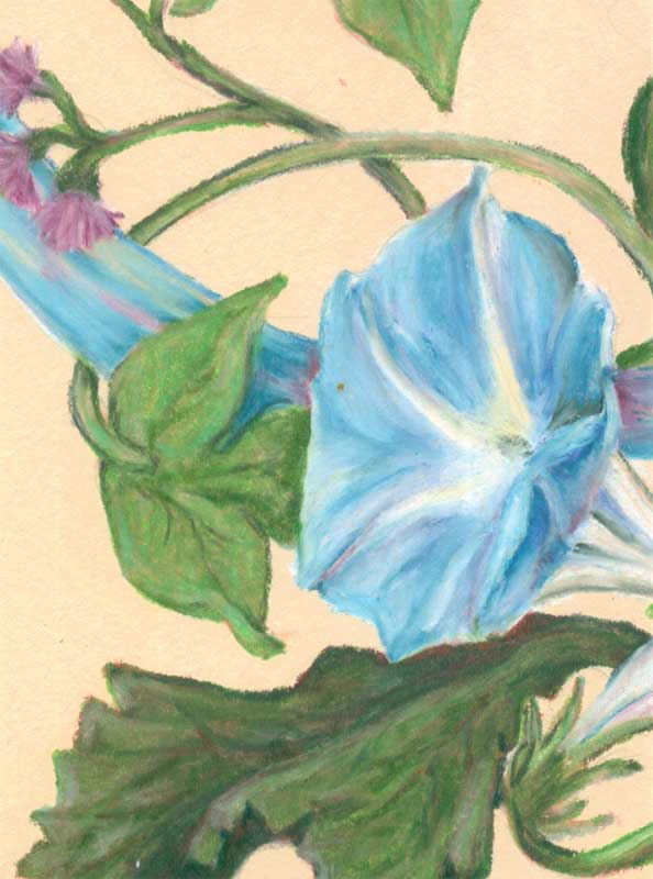
I then started on the “fun-est” part of coloured pencil work for me, the moulding of the blooms and leaves. I laid in a couple of layers of colored pencil color then got to the.....and I'm using a real technical term here.....”SMOOSHING”....of the colored pencil layers. “Smooshing” is just pressing really hard on the layers of colored pencil you have applied. The pressure and movement of the next colored pencil strokes makes the wax of the colored pencil melt a bit, allowing you to move and blend the colors you've laid down. You can also use a colorless blender pencil, one that is just wax, no pigment. It makes some of the smooshing process a bit easier.


You continue smooshing all your forms till you're satisfied with the result. With colored pencils you've get great details and total control over your blending!

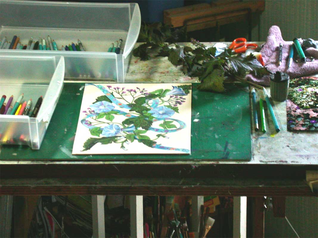
This is a pic of my setup for Morning Glories