Wednesday, October 30, 2013

Visual Art Tip: Cross Purposing Colored Pencil


This post is a little about needlework, and a lot about colored pencil work. A while back I started out playing with and learning about colored pencils. The Prisma color pencils I use are a wax based pencil. This means that they have a wax base into which different colored pigments are mixed, which mixture is then put into the centers of a wooden casing. The resulting pencil is easy to stroke onto paper surfaces.
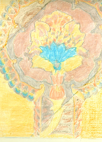
I usually start out with a outline of the main points of my drawing. I then begin lightly sketching in the various color sections, much like a paint by number kit. You can see my initial outline sketch and light color sketching on the center of this image.
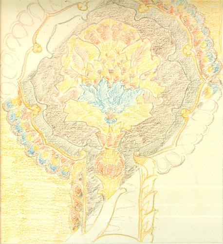

I then lay in a second layer of color pigment over the first one, to deepen the colors. You can also lay in different colors to make a “color blending” happen, in the next step.

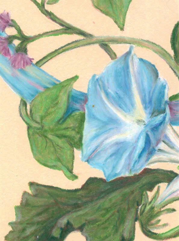
Often you want to change or augment one color from the pigments of just one pencil......which you can easily do by layering different colors on top of each other. This sketch of a leaf is a good example. Leaves are really reddish underneath the green chlorophyl. That's why you see reddish colors in the leaves in the fall, when the chlorophyl dies off. I started off with this sketch using dull reds, then layering over some greens. This makes the final green leaf much more realistic in colour than the manufactured pigments often allow.
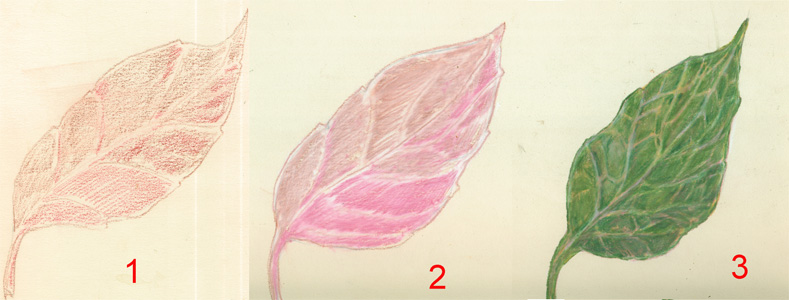


After you layer your colors, then comes the “magic” of a technique called burnishing. This technique takes advantage of the wax/pigment mixture that makes up the Prisma color pencils. What you do is take a pencil of the final color you want the current section to be, and stroke over and over that section. This repeated firm stroking will slightly melt the wax/pigments already on the paper surface. You end up mixing the previous layers with your color strokes. You can get lovely colours and great detail with this method.
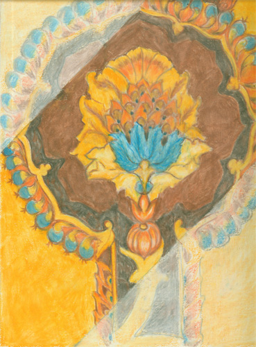

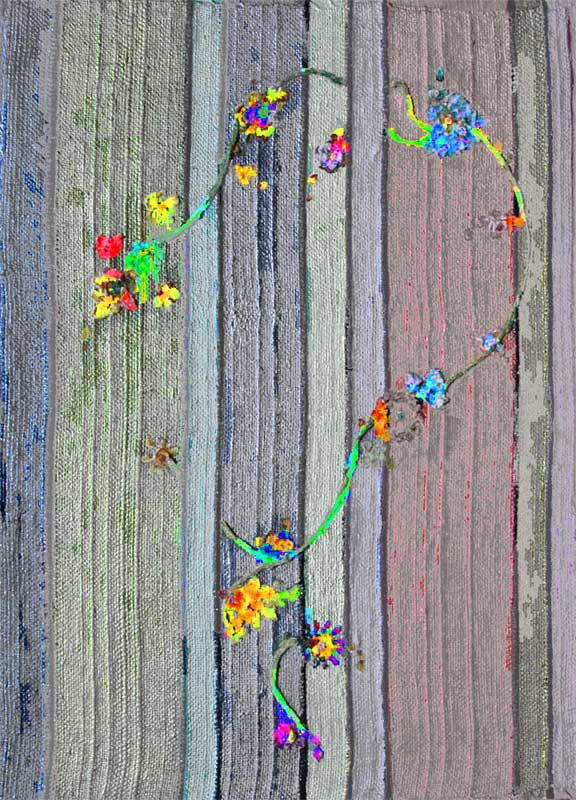
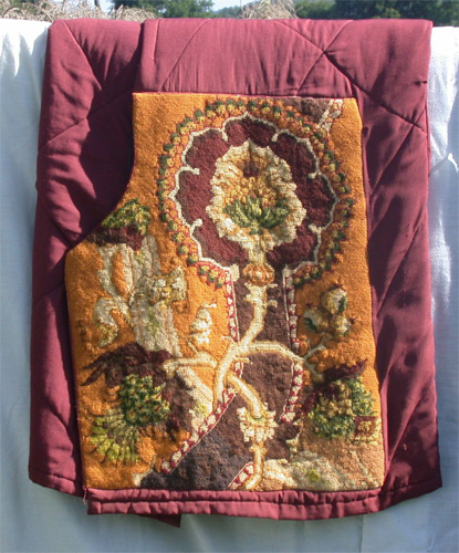
Oh and about the needlework reference? Well these samples of colored pencil steps I did for a talk I presented.....I actually did to decide on colors I wanted to use for a wool needlework cross stitch piece. The design was a 17th century cloth design from a Dover book. I wanted to decide on the colors using colored pencils to draw me a color “map”. You can see the result at the top of the post.

Colored pencils come in wax, ink and watercolor versions, each with it's own speciality. Colored pencils of any type, are a great tool for crafters, artists and illustrators!


Thursday, October 17, 2013

It's All About the Style! Whether it's colored pencil, acrylic or watercolor.....it's your style that will make the artwork.


It's All About the Style! Whether it's colored pencil, acrylic or watercolor.....it's your style that will make the artwork.

As an illustrator, I am a “Jill of all mediums, mistress of none” to para-phrase an old saying...Jack of all trades, master of none. In other words, I try to learn about as many different media as I can, so's I can use the best parts for my illustrations.

This has made me a avid art technique collector. Much like a cook collects food recipes, I collect art techniques.....try them out.....and then use various parts of different techniques to “get the job done”


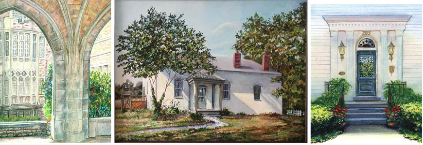
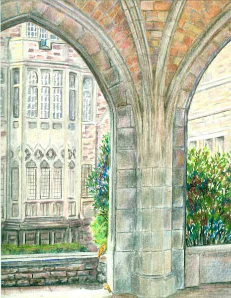
Church Gallery with Sparrows  8x10  colored pencil

This colored pencil building “portrait” is a prime example of what makes colored pencils SO popular. Colored pencils deliver bright, intense controlled color, yet can be blended with just a bit-o-pressure of the pencil strokes, and most importantly.....you can use a ruler to get all those straight lines....well....straight!

Washington House Doorway  8x10 watercolor

Then there is watercolor. It delivers glowing washes of color....with graduations of colour that are quick and easy to attain, if you let the water do it's natural “thing”. And even better, there is a whole line of watercolor PENCILS.....so you can get those straight lines needed for structures. Yet those very watercolor pencil lines can themselves be moistened and blended!

Kentucky Provencal  18x24 Acrylic

And finally, one of my favorites,... acrylic paints. Acrylic paints have finally “matured”, in that they have been improved to the point that they can mimic watercolours or oil paints, yet remain one of the best mediums, IMHO,for rendering just about anything. This building portrait was painted in a realistic style, with plenty of sunlight, using both impasso (opaque layers of paint) and glazing (multiple layer of transparent paint) techniques. And those straight lines......were a fine brush laid alongside a ruler!

I firmly believe that any artist's body of work reflects their own artistic vision, no matter which medium (or how many or how mixed) you use to make your artwork. And tho' I usually aim to sell my artwork, the journey of learning and discovery in that painting, is a whole “end” in and of itself!


Thursday, October 10, 2013

Smooshing my Morning Glories


This post is a bit about my colored pencil work. A while back I found out just how much fun colored pencils can be. I came across a set of prisma color pencils in my husband's old art materials, and thought I'd try them out.....as a nice change of pace from acrylic paints.

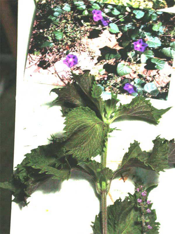
I gathered my reference photos of some morning glories …..


and real life props of some rattlebox, a lovely purple and green “weed” that sports lacy ruffled leaves in the fall.


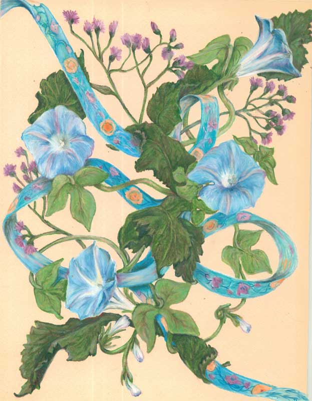
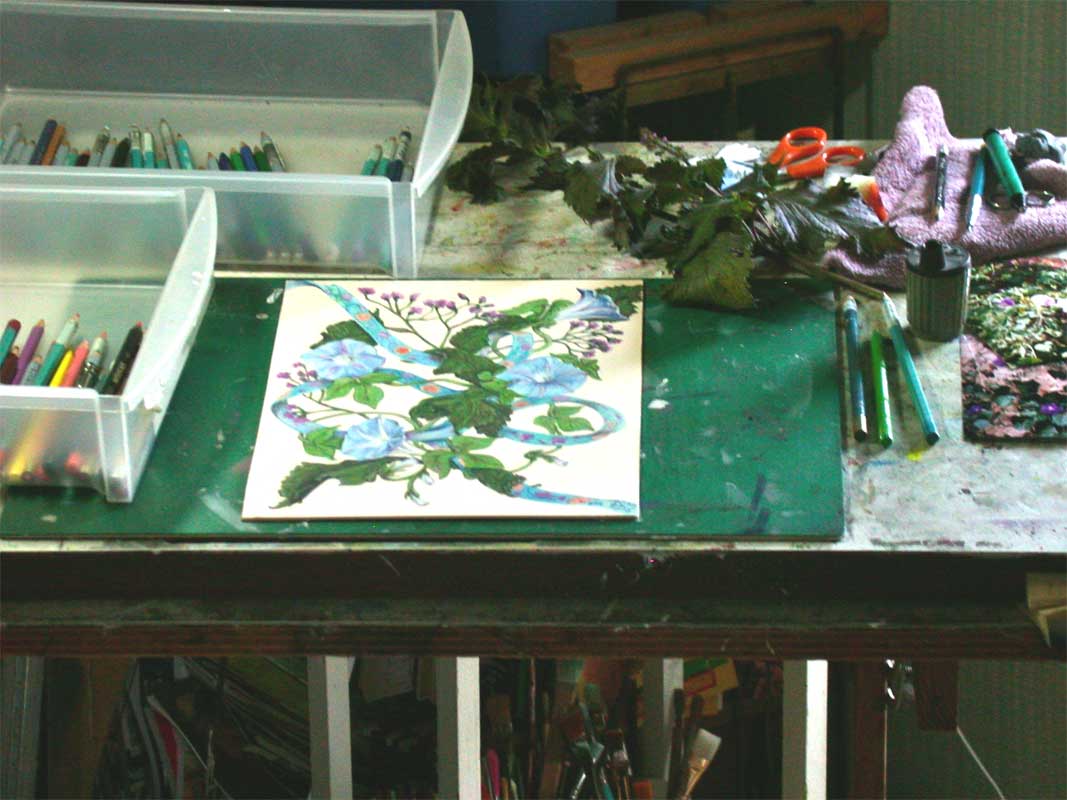
I started in outlining the morning glory blooms randomly on a piece of beige matt board, then added in some rattlebox leaves and twines of the morning glory vines. I decided to add a colored ribbon to.....tie....things all together.

I then started on the “fun-est” part of coloured pencil work for me, the moulding of the blooms and leaves. I laid in a couple of layers of colored pencil color then got to the.....and I'm using a real technical term here.....”SMOOSHING”....of the colored pencil layers. “Smooshing” is just pressing really hard on the layers of colored pencil you have applied. The pressure and movement of the next colored pencil strokes makes the wax of the colored pencil melt a bit, allowing you to move and blend the colors you've laid down. You can also use a colorless blender pencil, one that is just wax, no pigment. It makes some of the smooshing process a bit easier.


You continue smooshing all your forms till you're satisfied with the result. With colored pencils you've get great details and total control over your blending!

This is a pic of my setup for Morning Glories


Friday, October 4, 2013

Name that PBP (Picture Book Person) : "I have become a pirate, and then come down with a bad case of stripes......"


Figure out the answer to the riddle and you'll learn a bit more about PBs today.  Every time you click on a cover or read a review, or even flip thru a PB in the bookstore, you add a bit more to your knowledge base, which can help you to figure out just where YOU could fit into the current publishing scene.  Whenever I see a neat book (PB or otherwise) at a bookstore......I can almost bet it'll be in my library ASAP.....usually without me even asking for it!  And those few I do ask for.....they gets them.  Your local library is an excellent place to start researching the PB industry.
I have become a pirate, and then come down with a bad case of stripes, not to mention having everyone hollar at me: David,No!.  I've painted everyday life with a sketchy cartoon style, and painted extraordinary impossible things in a realistic style.  My best seller was a Caldecott Honor book with this publisher.  Who am I???

I'll post the answer tomorrow!


The answer to Riddle is David Shannon.  He has both illustrated numerous picture books, and won a Caldecott Honor Book Award  for  "No, David!"  I found another in the series , "David gets in trouble" at my library.  His "little boy gone bad" books are done in a very cartoony style, with a lot of the outlines left showing under the acrylic washes.  Yet for other picture books, like "A Bad Case of Stripes" he paints realistically....at least within the story frame. He's also illustrated a book with his brother Mark, called "The Acrobat and the Angel" which has lovely historical elements, yet he still keeps his own unique stylization of his main characters, within lovely oil settings. His publisher is Scholastic. He is a great example of a multi-styled illustrator.

Thursday, September 26, 2013

ArtView: MINE! illustrated by Patrice Barton and written by Shutta Crum


MINE! By Shutta Crum and illustrated by Patrice Barton published by Penguin Random House. Images used by permission of the publisher.

In most all the reviews for children's picture books, the main portion of the review discusses the writing......well I'd like to reverse that in my reviews....and concentrate on a review of the illustrations, from an artist's perspective. I'll try to tell a little about the book, and then highlight how I see the illustrator "building" the story with his/her illustrations. I'd love to hear if you agree with my summery.....or have other comments.

When I first picked up this almost wordless picture book, I was drawn by Patrice Barton's darling little toddler on the cover. Then I flipped thru the book, and did it again, and counted all of 9 ½ words....repetitions of “Mine!”....... and the puppy saidth “Woof!” once. I would have thought that this kind of book would have been written and illustrated by the same person.....not so! My next thought was just how would that manuscript look????

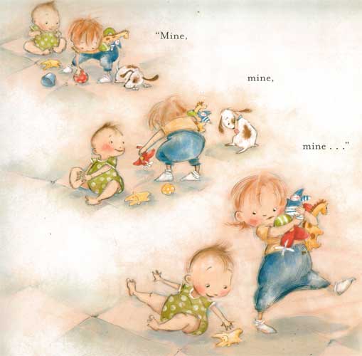
I went thru the book again and began to appreciate how Patrice Barton had taken the author's “action notes” and woven a lovely playful swooping story of how a toddler proclaims everything is hers......while a giggling, crawling sibling looks on.....and a puppy plots to grab some of the fun for himself! After much grabbing, giggling, splashing, we come to the “punch line”.....er.....word, which is.....you guessed it: MINE! The picture has the giggling, “just taking his first step”, sibling pouncing on the toddler and announcing that she belongs to him! (I'm arbitrarily assigning him/her to the engaging toddlers.....it could go either way)


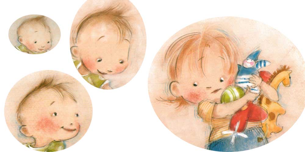
Patrice Barton's gestural drawings are fantastic....she captures the fluid motions of little ones giggling, solemn watching, then going single mindedly for whatever catches their attention. I've loved Patrice's expressive faces ever since Rosie Sprout's Day to Shine.....and she catches these two little one's glee and giggles with brite eyes and smiles that show every little thought in their quick silver minds. From their poofs of angel fine hair to baggie jumpers the black “pencil” strokes just barely contain these little ones. With what looks like soft pastels colour in the toddlers' faces....there is a blush on every cheek....that really helps round out the little faces. The soft surrounding colours of the floor give this such a sense of safe, soft, giggling fun.


This is such a lovely blending of the author's intent and the visual creativity of the illustrator. It's like they were both “on the same page” in telling this story. The action swoops, and giggles and bounces around.....and only uses 9 ½ words!

Here is a link to Shutta Crum's webpage on MINE! with a darling book trailer and a video featuring Patrice Barton.


Wednesday, September 18, 2013

Name that PBP (Picture Book Person)


Figure out the answer to the riddle and you'll learn a bit more about PBs today.  Every time you click on a cover or read a review, or even flip thru a PB in the bookstore, you add a bit more to your knowledge base, which can help you to figure out just where YOU could fit into the current publishing scene.  Whenever I see a neat book (PB or otherwise) at a bookstore......I can almost bet it'll be in my library ASAP.....usually without me even asking for it!  And those few I do ask for.....they gets them.  Your local library is an excellent place to start researching the PB industry.
I'll post the answer to the riddle tomorrow!

Name that PBP:
I've answered three Russian questions, and with Stillwater have considered the zen of shorts,ties and ghosts.  I let watercolor flow thru my stories, both in black and white strokes, and purpled shadowed colour, with plenty of white space for balance.  My AD is Saylor with a  press as wide as the blue sky.  Who am I?? 


The answer to riddle #2 is Jon Muth.  He both illustrates other's stories and writes and illustrates his own.  The books of his that I first saw were Zen Shorts, Zen Ties and lately Zen Ghosts.  All of them feature his whimsical Stillwater, a zen fable spouting, panda bear.  He lets Stillwater tell little fables (in oriental style, black ink brushwork) illustrating some basic zen concepts.  He manages to infuse a huge black and white playful panda bear with wonderful color, and lets him cast beautiful shadows that connect the different parts of a scene.  His watercolors are a lovely mix of realistic light and shadow, and  beautifully designed images with lots of  white negative space. His publisher is Blue Sky Press, an imprint of Scholastic, with David Saylor as his Art Director.

Here's a link to one of his bios:  http://www.scholastic.com/teachers/contributor/jon-j-muth


Friday, September 13, 2013

Cover Continuity or Visually Brand Your Work

Cover Continuity


If you are lucky enough to get to work with the same author on a book series one of the things you might want to think about first is Cover Continuity. Most book series are written with a over reaching story arch for the entire series.....meaning all the books in a given series might have a continuing set of characters and an ongoing time frame or period for the stories to take place. When you work on book covers for a series it's up to you, the illustrator, to continue that series' “visual identity.”


In an ongoing series of middle grade books by Rosalyn Rikel Ramage, The Tracks, The Graveyard and The Windmill, I've kept the same feel....slightly dark.....and some of the same characters, siblings Emma Mae, Edward front and center on all three covers. And by the author's request all three covers feature “transition” points in all three stories, where the “real” story events make a transition into a bit of fantasy.

Look at all three covers lined up above......they all seem to “hang” together with the same kind of feel and design.


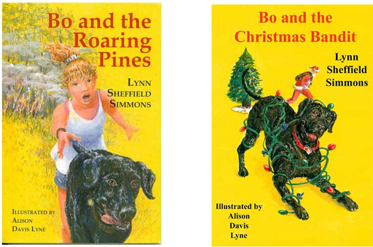
For the next two covers, Bo and the Roaring Pines and Bo and the Christmas Bandit, I used the main character Bo, a young black lab....hero of these middle grade books from Pelican publishing written by Lynn Sheffield Simmons. Bo's all black shiny coat makes a wonderful foil for the brite yellow cover background. That color was suggested by the author. She said that over many author signings and school visits, she'd tried out different backgrounds for posters....and found that the brite yellow color attracted more attention than any other color. So she suggested that yellow as a “branding tool” for her Bo series of books.

Visual branding is a valuable tool that shouldn't be under-estimated in today's “battle for consumers' eyes” and dollars.