Thursday, September 26, 2013

ArtView: MINE! illustrated by Patrice Barton and written by Shutta Crum


MINE! By Shutta Crum and illustrated by Patrice Barton published by Penguin Random House. Images used by permission of the publisher.

In most all the reviews for children's picture books, the main portion of the review discusses the writing......well I'd like to reverse that in my reviews....and concentrate on a review of the illustrations, from an artist's perspective. I'll try to tell a little about the book, and then highlight how I see the illustrator "building" the story with his/her illustrations. I'd love to hear if you agree with my summery.....or have other comments.

When I first picked up this almost wordless picture book, I was drawn by Patrice Barton's darling little toddler on the cover. Then I flipped thru the book, and did it again, and counted all of 9 ½ words....repetitions of “Mine!”....... and the puppy saidth “Woof!” once. I would have thought that this kind of book would have been written and illustrated by the same person.....not so! My next thought was just how would that manuscript look????

I went thru the book again and began to appreciate how Patrice Barton had taken the author's “action notes” and woven a lovely playful swooping story of how a toddler proclaims everything is hers......while a giggling, crawling sibling looks on.....and a puppy plots to grab some of the fun for himself! After much grabbing, giggling, splashing, we come to the “punch line”.....er.....word, which is.....you guessed it: MINE! The picture has the giggling, “just taking his first step”, sibling pouncing on the toddler and announcing that she belongs to him! (I'm arbitrarily assigning him/her to the engaging toddlers.....it could go either way)
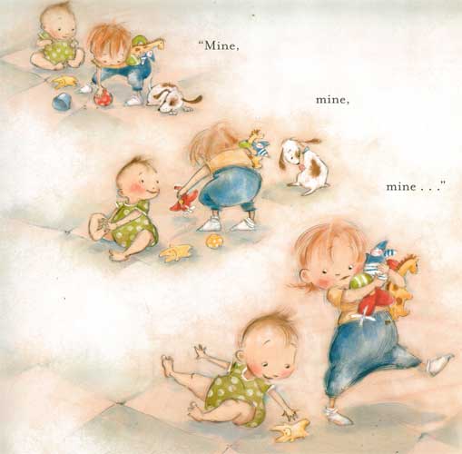
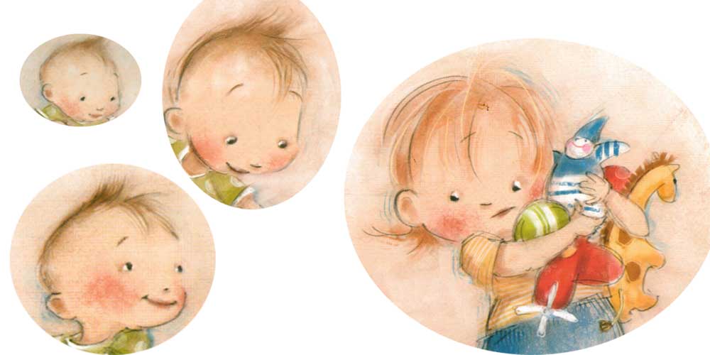

Patrice Barton's gestural drawings are fantastic....she captures the fluid motions of little ones giggling, solemn watching, then going single mindedly for whatever catches their attention. I've loved Patrice's expressive faces ever since Rosie Sprout's Day to Shine.....and she catches these two little one's glee and giggles with brite eyes and smiles that show every little thought in their quick silver minds. From their poofs of angel fine hair to baggie jumpers the black “pencil” strokes just barely contain these little ones. With what looks like soft pastels colour in the toddlers' faces....there is a blush on every cheek....that really helps round out the little faces. The soft surrounding colours of the floor give this such a sense of safe, soft, giggling fun.


This is such a lovely blending of the author's intent and the visual creativity of the illustrator. It's like they were both “on the same page” in telling this story. The action swoops, and giggles and bounces around.....and only uses 9 ½ words!

Here is a link to Shutta Crum's webpage on MINE! with a darling book trailer and a video featuring Patrice Barton.


Wednesday, September 18, 2013

Name that PBP (Picture Book Person)


Figure out the answer to the riddle and you'll learn a bit more about PBs today.  Every time you click on a cover or read a review, or even flip thru a PB in the bookstore, you add a bit more to your knowledge base, which can help you to figure out just where YOU could fit into the current publishing scene.  Whenever I see a neat book (PB or otherwise) at a bookstore......I can almost bet it'll be in my library ASAP.....usually without me even asking for it!  And those few I do ask for.....they gets them.  Your local library is an excellent place to start researching the PB industry.
I'll post the answer to the riddle tomorrow!

Name that PBP:
I've answered three Russian questions, and with Stillwater have considered the zen of shorts,ties and ghosts.  I let watercolor flow thru my stories, both in black and white strokes, and purpled shadowed colour, with plenty of white space for balance.  My AD is Saylor with a  press as wide as the blue sky.  Who am I?? 


The answer to riddle #2 is Jon Muth.  He both illustrates other's stories and writes and illustrates his own.  The books of his that I first saw were Zen Shorts, Zen Ties and lately Zen Ghosts.  All of them feature his whimsical Stillwater, a zen fable spouting, panda bear.  He lets Stillwater tell little fables (in oriental style, black ink brushwork) illustrating some basic zen concepts.  He manages to infuse a huge black and white playful panda bear with wonderful color, and lets him cast beautiful shadows that connect the different parts of a scene.  His watercolors are a lovely mix of realistic light and shadow, and  beautifully designed images with lots of  white negative space. His publisher is Blue Sky Press, an imprint of Scholastic, with David Saylor as his Art Director.

Here's a link to one of his bios:  http://www.scholastic.com/teachers/contributor/jon-j-muth


Friday, September 13, 2013

Cover Continuity or Visually Brand Your Work

Cover Continuity


If you are lucky enough to get to work with the same author on a book series one of the things you might want to think about first is Cover Continuity. Most book series are written with a over reaching story arch for the entire series.....meaning all the books in a given series might have a continuing set of characters and an ongoing time frame or period for the stories to take place. When you work on book covers for a series it's up to you, the illustrator, to continue that series' “visual identity.”


In an ongoing series of middle grade books by Rosalyn Rikel Ramage, The Tracks, The Graveyard and The Windmill, I've kept the same feel....slightly dark.....and some of the same characters, siblings Emma Mae, Edward front and center on all three covers. And by the author's request all three covers feature “transition” points in all three stories, where the “real” story events make a transition into a bit of fantasy.

Look at all three covers lined up above......they all seem to “hang” together with the same kind of feel and design.


For the next two covers, Bo and the Roaring Pines and Bo and the Christmas Bandit, I used the main character Bo, a young black lab....hero of these middle grade books from Pelican publishing written by Lynn Sheffield Simmons. Bo's all black shiny coat makes a wonderful foil for the brite yellow cover background. That color was suggested by the author. She said that over many author signings and school visits, she'd tried out different backgrounds for posters....and found that the brite yellow color attracted more attention than any other color. So she suggested that yellow as a “branding tool” for her Bo series of books.

Visual branding is a valuable tool that shouldn't be under-estimated in today's “battle for consumers' eyes” and dollars.

Wednesday, September 4, 2013

LITTLE THINGS AREN'T LITTLE WHEN YOU'RE LITTLE--Hot off the press!

Lookee what just arrived on my doorstep.......first copies of Little Things Aren't Little When You're Little.  I couldn't be more excited and pleased at how it turned out!  


Just arrived box of Little Things Aren't Little When You're Little!

To see more about the book check out this previous post   

Monday, August 26, 2013

Riddle Me This: Figure out the answer to the riddle and you'll learn a bit more about PBs today.


Figure out the answer to the riddle and you'll learn a bit more about PBs today.  Every time you click on a cover or read a review, or even flip thru a PB in the bookstore, you add a bit more to your knowledge base, which can help you to figure out just where YOU could fit into the current publishing scene.  Whenever I see a neat book (PB or otherwise) at a bookstore......I can almost bet it'll be in my library ASAP.....usually without me even asking for it!  And those few I do ask for.....they getz them.  Your local library is an excellent place to start researching the PB industry.

Today's Riddle Me This:
I am an Aussie with a love of enigmas. I paint with details and color and great animal characters in mind. My publisher and I both head up the alphabet. Who am I? 

I'll post the answer tomorrow!

The answer to yesterday's riddle is Graeme Base. His current PB is the Legend of the Golden Snail. With this PB he is advancing into the world of the App and 3D side of illustrating.  One of his recent PBs is Enigma. It's a lively riddle all in itself, and is drawn with the author's wonderful color sense. It is chock full of engaging animal characters. The publisher is Abrams.

Thursday, August 22, 2013

VISUAL ART TIP: Sponge Brush Painting is good for both illustrations and paintings


Sponge Brush Painting
This Visual Art Tip is a little about my technique of sponge brush painting as it applies to "fine art" painting. I developed my technique to accomplish a certain look for some illustrations I was working on.....but sponge brush painting can easily work in many "fine art" situations as well.
My initial problem was to get nice smooth graduations in a monochromatic background for a page in an alphabet book. For the illustrations for Easter Day Alphabet, I'd come up with the concept to paint designs as a kind of "wallpaper" background with the main image, text and large alphabet letter going on top.I wasn't using any computer graphics for this particular book, I don't use an airbrush, and I was working in acrylics....not known for their ease of getting a smooth graduation in colours. Unwanted visible brush marks being one of the main problems.
I hit upon the idea of using sponge brushes after looking at a home dec magazine, and reading about faux finishes. You can see more about it in a previous post: I Never Met a Art Technique I didn't like.....
I found that if I puddled a bit of the glazing liquid on my palette then dropped in a drop of fluid acrylics and mixed with a knife.....I got a lovely looking glaze

Smooth sponges allow me to graduate colours. After one coat of glaze dries I can easily smooth on a different colour and seamlessly blend the edge. All this without any muddying of the two colours, as the dried acrylic glazes stay separate. I usually use a gessoed ground on masonite board for my fine art paintings. This accepts the glazing especially well....the light just goes right thru the acrylic glazes and bounces off the white gesso and returns outward with a lovely glow.
For landscapes in the "fine art" mode, I found that skies would be luminous done in layers of acrylic blues and greens, just as Maxfield Parrish discovered using oils. When I wanted to fill in foliage for trees and such, I just grabbed a sea sponge and dabbed away. First using a blue base for shadows, and covering with a variety of greens for the background foliage. Then (following Maxfield Parrish's technique) I would dab on pure white for highlights on leaves, which would later be glazed over with various colours as needed....i.e. oranges for fall, yellow for summer etc. I used this technique for this painting:
LAND'S END 

among others: It was the perfect technique for grasses, clear skies and flowing water.


Thursday, August 8, 2013

COLORING BOOK PAGE - G is for Grits

Here is a brand new FREE coloring book page just for G is for Grits.  Just click on it and print!  Enjoy!