Saturday, July 13, 2013

Visual Art Tip: Pinball Machine Effect; One Person has an idea who tells another person.....

Visual Art Tip

PinBall Machine Effect: One person has an idea, who tells it to another person, who takes it, and changes it and comes up with another idea, and "bounces" it on to someone else.
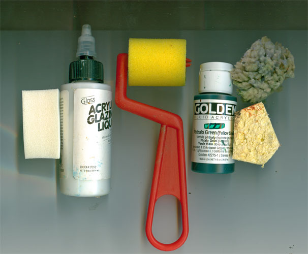
This visual art tip is the result of a verbal/visual "pin ball machine" effect. Some while back I'd posted a verbal art tip on the usefulness of combining media, in this case acrylic glazes and watercolor. A few months later I got an email from Connie McLennan that read in part:
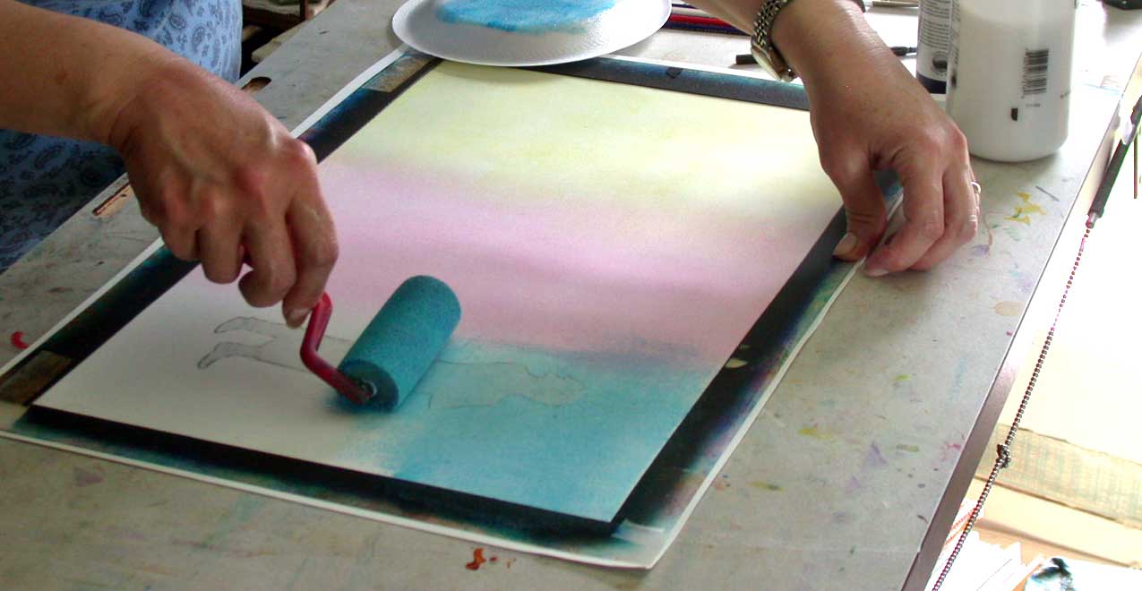
I did just have a revelation triggered by reading the word "glazing" in your recent tips thread, though! I have been struggling with creating flow-y blobs that look like ink dispersing in water, which are also permanent enough to allow me to paint the color of the water around them. Have been experimenting with watercolor and dyes, and was planning to spray them with workable fixative before overpainting -- before I read your thread and realized/remembered I could do exactly what I needed to do using thinned acrylics for the flowing blob colors, letting them dry, and painting the color of the water around them (hand slapping forehead.)
Which of course pleased me no end!
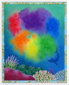
The subject that Connie McLennan was painting were pages for her book Octavia Octopus and her Purple Ink Cloud Sylvan Dell Publishing ISBN 0-9764943-5-3 April 2006. This is the title page showing the floating ink blobs that the book's heroine, Octavia, had made. It shows Connie's success in keeping the coloured "ink blobs" separate, and not mixing and dulling the rainbow effect, and keeping them "in the water", but not mixing with the blues.


Connie was kind enough to allow me to use her images that show the use of her version of this "art tip" on keeping the flowing feeling of the "ink colors" while surrounding it with water,and not have the two mix. She also said about the pages below: 

"It was particularly important that the edges of the orange-yellow-red colors not mix with the (opposite) blue color of the water."
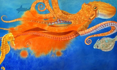


Reprinted by kind permission of Sylvan Dell Publishing and the illustrator Connie McLennan.


Thursday, June 27, 2013

DIDJA KNOW? That since the seventeenth and eighteenth centuries, Indian Yellow had been imported from the East


DIDJA KNOW? That since the seventeenth and eighteenth centuries, Indian Yellow had been imported from the east to Europe and used extensively by many famous painters. It's transparency and golden “glow” was highly prized. In the late nineteenth century T.N.Mukharhji wrote he had uncovered the origins of the pigment “peori” or Indian Yellow. It supposedly came from cows that had been fed ONLY mangos.Their urine was heated, which precipitated the solids that made up the pigment. He said that in 1890 legislation was passed to end the practice.
A wikipedia article on the subject says that a later day researcher could find no evidence of this practice.


The actual pigment colorant was a magnesium salt of an acid released by the mango.
Today Inidan Yellow is mostly replaced by quinacridones (discovered in 1896) and nickel azo in varying mixtures. A Raw Siena gives a pale warm colour to a glaze and anything with a quinacridone or diaryide in the paint will give a robust yellow/gold color.


Wednesday, June 5, 2013

MY NEXT BIG THING: Little Things Aren't Little When You're Little, illustrated by Alison Davis Lyne, written by Mark Burrows


My Next Big Thing

The Next Big Thing is a global blog tour, started in Australia, to showcase authors and illustrators and their current work. I was tagged by the whimsically creative Mary Uhles!

So now I'll answer some questions about my newest book, then pass the Q & A along to  others who'll pick up the tour June 20th:


What is the working title of your next book? My next book out is Little Things Aren't Little When You're Little, written by Mark Burrows and is due out in September 2013.

Where did the idea come from for the book? I got tapped for this book by Pelican Publishing Company for new picture book author Mark Burrows. He is a songwriter of materials for children, so his text sounds really good read out loud, besides being a blast to illustrate.

In what genre does your book fall? Little Things Aren't Little When You're Little is listed as JUVENILE NONFICTION / Curiosities & Wonders, in other words a colorful picture book for young children.


What actors would you choose to play the part of your characters in a movie rendition?Well....since I chose to tell my LITTLE story with an ensemble cast....the list of actors could get a LITTLE long!


What is the one-sentence synopsis of your book? Adults may see many things in life as small, but to young children, those little things aren’t small at all.

Who is publishing your book? Pelican Publishing Company


How long did it take you to write the first draft of the manuscript? Since I'm the illustrator I'll take that question by substituting “artwork” for manuscript: It took me 2 ½ months to do the rough sketches and another 2 ½ months for the artwork.

What other books would you compare this story to within your genre? Well it's NOT Three LITTLE Pigs, nor is it Stuart LITTLE, and it hasn't anything to do with LITTLE Red Hen or even Chicken LITTLE. It's just a LITTLE story about how kids look at things from their own unique viewpoints. 


Who or what inspired you to write this book? Since I'm the illustrator I'll answer about how the illustrations developed. Mark's text had about a dozen little vignettes contained within his verses, so I broke them up into two vignettes for each of my six characters. I started off with the black and white character studies of the actions in the text. I then added details with an eye to having as much contrasts in the colors of each double page spread. I wanted each character to have characteristics that would “play” off the situations in the text, thus the little red haired boy who gets “a little off the top” haircut has a mop of brite red curls that really shows off his new “hairstyle”. Then there is a little girl who goes all diva when faced with a “little bite of green beans” and is always in pink and wears a tiara.


 What else about the book might pique the reader's interest? My favorite set of drawings comes at the end....where “just a little hug” allowed me to show just a few of the many ways we can give a hug....both big and LITTLE.

Thank you for stopping by here to help me celebrate my "Next Big Thing." Now onto the next candidates who will post on June 20th.

Lisa J Michaels   
Rebecca Solow
Nikole Brooks Bethea 

 I'll update with direct links then!

Thanks so much for stopping by for My Next Big Thing!


Wednesday, May 29, 2013

ART VIEWS - Art Centered Picture Book Reviews


In most all the reviews for children's picture books, the main portion of the review discusses the writing......well I'd like to reverse that in my reviews....and concentrate on a review of the illustrations, from an artist's perspective. I'll try to tell a little about the book, and then highlight how I see the illustrator "building" the story with his/her illustrations. I'd love to hear if you agree with my summery.....or have other comments.


The Worry Stone
The Worry Stone illustrated by Sibyl Graber Gerig  and written by Marianna Dengler is a delightful story, within a story, within a story. The story concerns the connections between generations, told via an American Indian folk tale about a worry stone. Ms. Gerig has paced the story in single, full page illustrations, with the text appearing on the facing page. Her luminescent watercolor illustrations use both large multi colored washes and very tight detailed drawings, which are a delight. She contrasts the flowing landscape colors with her detailed people portraits. She has the skill to flow in pinks,blues and yellows onto a white blouse....and still have it read white. She also uses enough darks, like the grey/black watercolor mixtures in Amanda's hat to provide foils for her white hair.


Ms. Gerig varies her viewpoints through out the book, with her best work showing through on the wrinkles of the grandmother (Amanda) contrasting with the smooth turn of the cheek of the young boy, Jason, who listens to her tale of the worry stone. She sets the opening scenes in a park then switches to flashbacks telling (her) Amanda's story. Within those flashbacks, she also tells the American Indian folktale of the source of worry stones. She identifies the historical story with a lovely intricate basket weave border around the folk tale pages. You can see her medical illustration background in the detail of the accompanying baskets that echo the design of the border.

THE WORRY STONE
Text © 1996 by Marianna Dengler
illustration © 1996 by Sibyl Graber Gerig
Used by permission from Rising Moon
ISBN 0-87358-642-5


Monday, May 20, 2013

JUST SPINNING AROUND.......


Even tho' I spend my workday dealing with paints and drawings, I can't seem to let it go at night.....so I've taken up spinning as a way to enjoy color even in the evenings in front of the TV.  And of course to do something with the yarn I spin, I've had to take up knitting, crocheting, and that was just the gateway to other nefarious needlework activities.  Shoot......I've even done some temari.
  
I've put together a coupla page primer on how I work my spinning activities.....

I got the idea to roll these mini-batts from an article in Spin-Off magazine, "On A Roll with Pseudorolags" by Susan Z. Douglas and Rosemary S. Thomas in the Spring 2011 issue.


Friday, May 10, 2013

Visual Art Tip

I've Never Met an Art Technique I Didn't like.....


I've been painting/drawing for almost as long as I can remember.  I've been a freelance illustrator since 1996 and have illustrated ten+ children's books and have artwork hanging in both private and public collections.
My artwork is mostly realistic.....tho' I am trending towards a looser style in my illustration work.  Over the years I've experimented with a LOT of different art techniques and materials.  Everything from a disappointing stab at printmaking to oil paintings to acrylics and then pencils, with a few stops along the way for watercolors and fiber arts.  With each new technique I've tried I've learned so much.
I've found that if I run up against a problem with one media I'm using.....often a change or addition of another media with be just the ticket.  
From time to time I hope to post a VISUAL ART TIP to help other artists remember a forgotten technique that just might help them out of a tight spot on a project.  

Here's a brief overview of one of my favorite techniques.....acrylic glazing.


  I had been studying the work of a 20th century illustrator Maxfield Parrish, and found that he tackled the problem of smooth backgrounds with glazes "pounced" with a large soft brush. Since he worked in oils (i.e. a time before acrylics), he used linseed oil as his glaze medium, and layers took foreeeeever to dry. I am lucky to be living with acrylics, so I could update the technique for my illustrations. I also didn't like the look of pounced glazes....still too many marks in the paint surface.

I hit upon the idea of using sponge brushes after looking at a home dec magazine, and reading about faux finishes. AHA! here was the way to get my smooth colour graduations without any visible brush marks. I bought a collection of different sponges....all the way from sea sponges (which have beautiful textures, when that's what you want) to roller sponges from the paint store to makeup facial sponges sold to apply makeup.


I went thru my paints and found a sample of Golden (brand name) Glazing liquid and I had numerous bottles of Golden fluid acrylics. Fluid acrylics have the same pigment load as regular paints, but are cut with more clear acrylic so they are the consistency of cream as opposed to regular paints which are more like toothpaste. I found that if I puddled a bit of the glazing liquid on my palette then dropped in a drop of fluid acrylics and mixed with a knife.....I got a lovely looking glaze, that would be accepted readily by the sponge.


I was working on 3 ply bristol board at the time. I ran the sponge brush over the entire board and let it dry. It bent a bit at first, but with some adjustment to the liquid load....the board dried nice and flat. I could then apply another coat if I wanted to modify the colour in some way without any lifting that occurs in watercolours. As an extra added benefit, I found that the "tooth" was just perfect for coloured pencils, without the plastic effect that acrylics normally have.
I ended up with the best of all worlds. I could get my graduations without computer or an airbrush. I could also add texture just by changing the sponge brush I use. And any additional artwork I wanted to put on top would be accepted without any problems.

Thursday, May 9, 2013

First Post of a New Blog
I'm starting this blog as an accompaniment to my newly updated website  www.lyneart.com .

I want to use this blog as a place to post different aspects of my interest in illustration.  I've found that if I "explain" something in writing, I end up understanding it better myself!