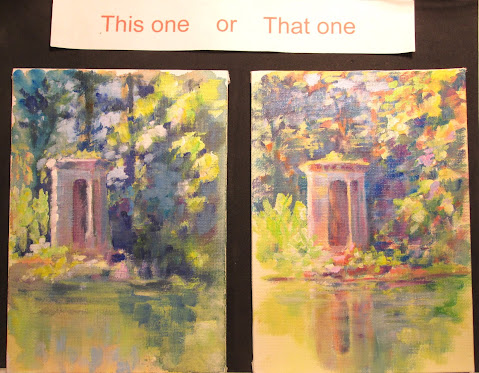
Two 5 x 7 inch acrylic sketches on canvas board
This time around I'm painting some small colour comps to explore the same subject with low key and high key colours.
I've posted a couple of 5x7 inches acrylic sketches of a “castle” my husband Frank Lyne (sculptor) built, by hand, beside a pond on our farm. Below you can see my painting set up....plastic palettes with colour wheel mixes.....a colour gamut …...and some source photos I took.
For both sketches, I started out with an under painting of washes....blended using acrylic flow medium. This medium loosens the acrylic binder so the tube paint acts like a watercolour wash. I then switched to acrylic glazing medium to put in more precise shadows, keeping with the maxium to paint shadows transparently when possible. I try to use only one colour at a time, let that dry then go onto the next colour, until I get the value of shadow that I want.
Finally I switched to all Golden OPEN paints for the semi-opaque and opaque lights and high lights. I adore the sparkle that comes from using warm and cool colours side by side.
I painted both scenes keeping in mind that a 4 point spread on the value chart results in the effect of sunlight....so if an object had a highlight of 1 then the shadow would be a 4 or darker to get the effect. Value is necessary to have a cohesive image.....but a wider range of effects can be had when you also use warm and cool colours to enhance the image's depth.
The darker or more low key (THIS ONE) version looks closer to the photograph and more realistic to the value compression by the camera. I tried to use mostly the darker set of values on the ten point value chart.
The lighter or more high key (THAT ONE) takes a bit more license with the lights' colours to emphasize the “glow” of the scene. I used mostly the value scale steps in the ligher register. I tried to add back colours that the camera had replaced with black, in that particular exposure.
Which one do you like better??


No comments:
Post a Comment